How Bruce Springsteen Inspired My Creative Process

I’ve just seen the Bruce Springsteen biopic (Deliver Me from No Where) at my local cinema (Act One). I rushed out on Friday straight after work to see it, catching the early evening show starting at 5:40.

Just one other person was sitting in screen one. Or was it screen two? I was delighted to have the screen to ourselves. Yet I was still worried about disturbing the person in the next row with the rustle of my crisp bag. Although we had the screen to ourselves, I noticed how Act One Cinema is buzzing these days. They had a sell-out event in the lounge. I expected to see a fuller theater. I began to wonder why there weren’t more people attending. There were only two of us watching. This turned out to symbolize a parallel experience to the main story in the film. We were two lone viewers watching the film about Bruce Springsteen’s solitary segment of his journey as a songwriter. We were thus not alone.

I imagine that the film’s marketers would say that I might not be a typical fan of The Boss. This is because I am a 60+ black British female. I deduce this because I rarely see people who look like me in the video glimpses I catch of him singing to his massive audiences. But. I’ve always loved the Rolling Stones. I have even been to their Hyde Park concert in the early 90s. Nevertheless, I never went to a Bruce Springsteen concert.

I received the Act One cinema newsletter announcing the film. Instantly, I wanted to see the movie and booked it.

The ticket booking then took me on a nostalgic journey. I remembered days playing some of Springsteen’s popular tracks on a couple of albums. This was while I worked in Qatar many decades ago (early 80’s). We played Springsteen tunes at dizzy expatriate parties.

I also played his album during moments when I felt alone there. The songs provided comfort when, as a 22/23-year-old, I was far away from home. Many of his lyrics expressed my feelings about home. They made me realise I missed my home folks. They also highlighted my need to celebrate identity. I felt this way even though I wasn’t born in the USA. During those lonely times, Bruce Springsteen’s songs made me feel connected and uplifted.

unmemorable purchase

When I think about buying the album on cassette, I now wonder if it wasn’t a knockoff from the souk. Or perhaps it was an acquisition made during a frenzied shopping moment at the airport duty free. This could have been during one of the trips we did to Dubai or Bahrain. I certainly didn’t buy the Bruce Springsteen album in a cherished way from Tower Records. It wasn’t bought from HMV on Oxford Street. And it definitely wouldn’t be a connoisseur-like buy of a vinyl album. Back in those days, vinyl was what your dad’s music collection was on. Cassettes were the thing in the 80s.

The no Bruce years

When I came back to the UK in 1990, I don’t think I played any more Bruce Springsteen tracks. I recall one cheeky friend critiquing and questioning why I had Bruce Springsteen in my music collection. Then yesterday, I listened to the Nebraska track on Spotify. I was inspired to do this after watching the movie on Friday.

Making sense of the story

This morning, I watched a review of the Springsteen film on YouTube. It was by Mark Kermode and Simon Mayo. They, too, seemed to enjoy watching the film. The reviewers wondered whether the film that was centred on a specific part of Bruce Springsteen’s life had mass appeal. They thought it might be too nerdy among a couple of other things.

I can answer their query by saying that the film did indeed appeal to me. This is true even though I am outside the artist’s obvious main catchment group. I found observing the film’s depiction of Bruce’s creative process mesmerising. It was also very connecting. It really gave me a boost and encouragement around my own creative process. I resonated with the solitude and deep reflection shown in his music writing. He makes cultural connections using TV, film and news. His songs also draw from architecture and childhood memories. These inspirational elements resonated with me. Bruce Springsteen helped me feel less alone about my creativity once again. This time, it concerns the journey and who should be there in my creative process.

Antecedents to the creative process

In the film, there was also an important piece about subconscious messages and depression. It explored how the creation is the product of those surfaced thought processes. It made me recall something interesting I had read. Theresa Amabile, a creativity professor at Harvard, reminds us that Freud said creativity is the sublimation of repressed complexes.

I particularly connected with the character and musician in scenes where he was searching for his dad. His dad was hearing voices and undergoing mental health challenges. Additionally, dealing with the worry of family members taking their medication was significant for me. It resonated with me. I also went on a journey to find my dad. He faced mental health challenges, too. The film depicted a paradoxical longing for family or home town connection. This longing persists despite being fearful of what you might find when you draw closer. It also showed the physical sickness and nausea felt when we draw near to the conflict. It is a terrifying task that is at hand. The complexities in the relationships with the people we want to support add to this challenge. The film depicted the mess and tensions around these fraught relationships well.

The sickness scene when he was driving to LA matches my memories. I remember using the sick bag on the plane returning to the UK. It wasn’t because of eating something bad. It was due to fear of reconnecting with my old town (London) and family.

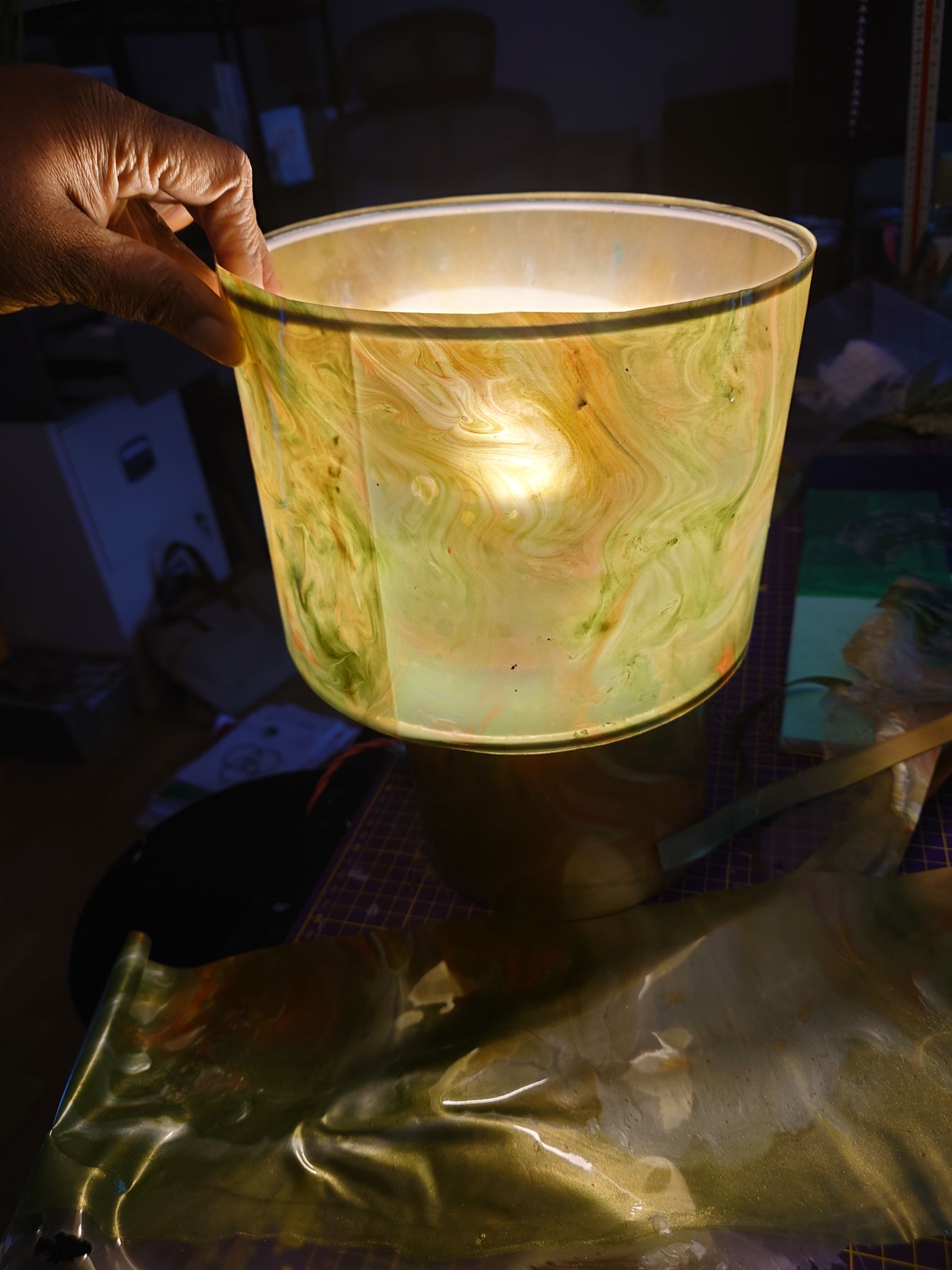
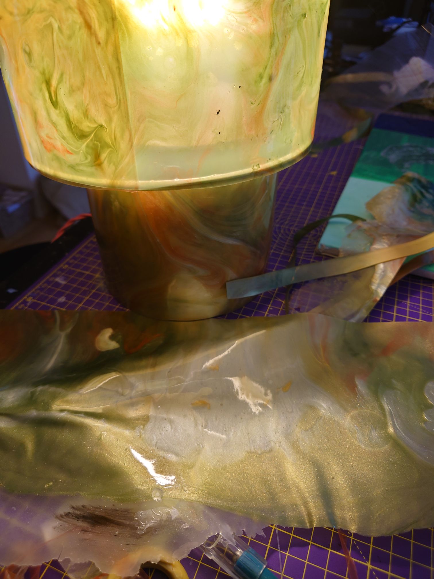
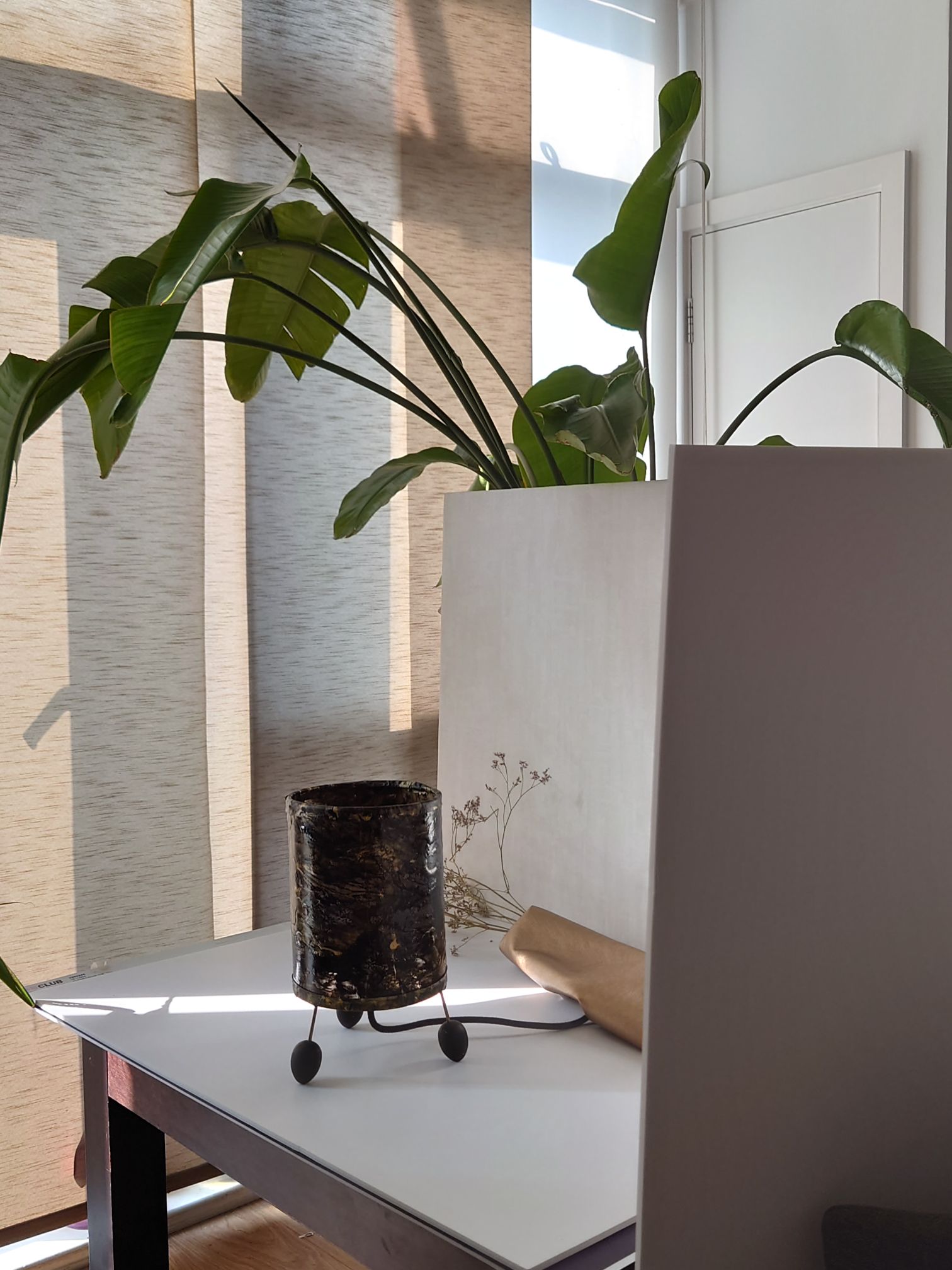
My small series of poured-ink paintings and poured art conveys the complex, messy feelings about belonging. Figuratively, these also show the sickness and tensions felt in navigating relationship conflicts on the journey towards achieving psychological safety.

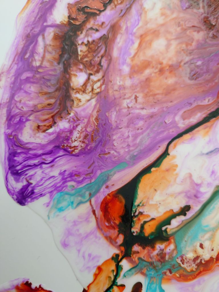
The above shows two segments from my series of poured paintings using alcohol inks or acrylic inks

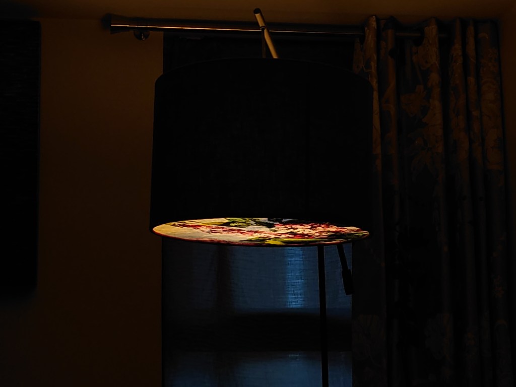
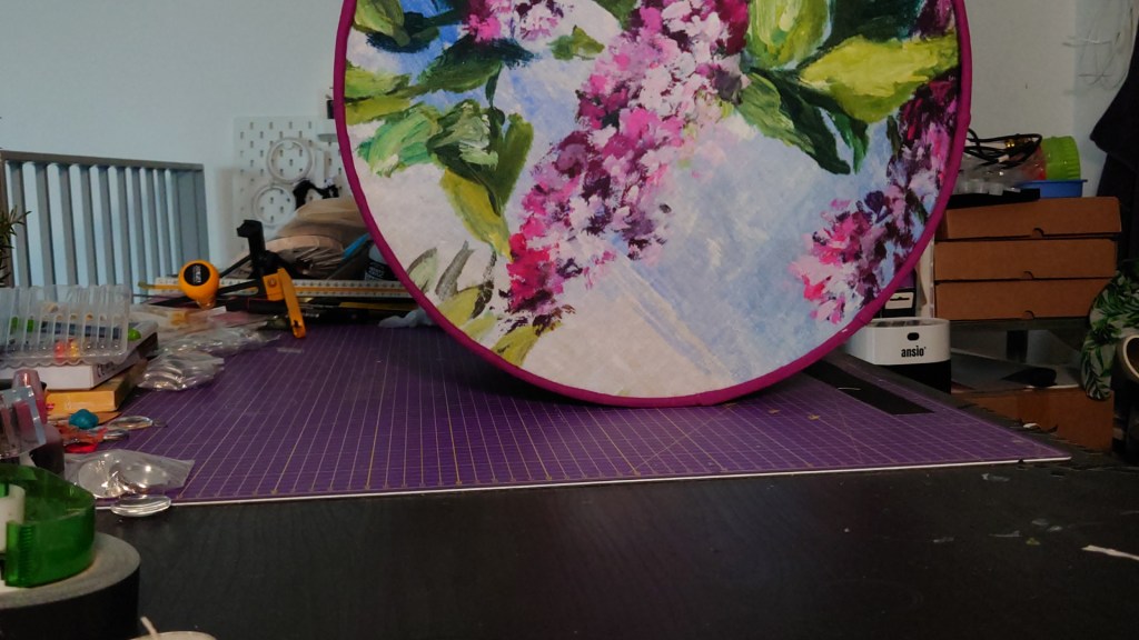
I’m planning to create a set of stationery and training/meeting room desk decor from these poured paintings. Follow to learn about when these are released. Thanks for reading thus far.

Have you seen the film yet? What did you think?

Autumn reflections on the summer of Transforming Paint Skins into Unique Jewellery, Alcohol Ink art Experiments and asserting my statement

Even with a busy 9-5 schedule, I’ve managed to find some time to experiment. I focus on recovery and taking care of my well-being during downtime. I’ve experimented with creating new items, like transforming my paint skins into brooches, necklace pendants, and cuff links.

I’ve also been painting with alcohol inks and love the wispy ethereal abstract results I get.

I’ve started to understand the ethos of my mark-making. This allows me to start asserting the components of an artist statement for my creations. It’s all about providing an opportunity to focus on the mess.

What do you think about choosing art that portrays the reality of messy situations vs clear, crisp representations of things? It speaks to my critical realism.

From Aesthetics to Authenticity: Rethinking Office Decor

This week, I went to a nice office space in London. You can see that some of the fixtures and fittings nod to the architecture. At first glance, they give off an air of coziness and comfort. Very welcoming for visitors and gives you a sense of being a great place to work.

I also visited a local hotel for my Birthday. While I was at the reception waiting for my family to return, I did some people watching. I noticed a pattern in styling the lamps and floor lamps there, too.

The lighting was closely intertwined with botanical elements. This created interesting shadows and shapes. It seemed to enhance the structure of the original lighting. It gave off an air of consciousness about nature, the environment, and the planet.

This architecture magazine shows how botanicals are now part of the vernacular in office reception design. https://www.arkitectureonweb.com/o/adaptive-media/image/14864267/copertina-hd/NU-MEIS-0511-LoRes.jpg?t=1682673790130

The video below I took when I was people watching in a hotel shows:

Reception areas: the curated threshold where first impressions land. Botanical spill from corners, carefully selected to whisper “we care.” Earth tones, soft lighting, ergonomic chairs—all designed to wrap visitors in the illusion of wellbeing.

But then, I stay a little longer. I ask questions. I meet the people behind the desk and beyond the break-room. I watch the team dynamics. Servers struggle to keep up.

And I begin to wonder—are we decorating over discomfort?

The lush ferns say “eco-conscious.” The velvet sofas say “psych safety.” But I’ve noticed that behind the foliage, the culture doesn’t always flourish as much as the greenery does. I talk to the workers. In some places, it seems that the aesthetic of care has replaced the practice of it. Cozy decor doesn’t always mean corporate kindness. Indeed, green doesn’t mean that the management is grounded.

True sustainability starts not with plant walls—but with people.

I hope to demonstrate that I have created shelf art and wall decor. This art beautifully illustrates the ugly reality of corporate work. While working from home, we can express ourselves through our choice of decor. We can also quietly convey the complexities, tensions, and messiness that our fantastic work emerges from.

Re-imagine your work-from-home space through the lens of truth.

My products are meant to feel like a breath of fresh (and slightly rebellious) air. They are created as pieces that don’t just sit pretty, but speak (like me). They offer a kind of visual activism. It is right at eye level for your bookshelves. This way, you can lead through the screen with authenticity.

Behind the Scenes: Crafting a New Shape from Inspiration Part 2

Last week I mentioned how I was inspired by a new shape from a luxury hotel I visited.

This week you see me make the new shape

.

It’s also an unusual pattern. This is Designers Guild Floreal fabric

The full video of me making this will be launched on 28th here https://youtu.be/IVrA5qEsfvo

How to Assemble Stunning Diffusers for Your Lampshades

This week, I created a YouTube video to show buyers how I create the beautiful diffusers for my lampshades.

Though Edison-style lightbulbs are available, they don’t always suit every interior style scheme, especially if you’re going for a more cosy, less industrial look.

Watch how easy it is to assemble a diffuser for your lamp shades. I’m considering having these as kits in my shop as an alternative way to hang and present my artwork.

Light at the End of the Tunnel: A Unique Lighting Approach

This week, I focused on fusing my artist and lighting creator skills. I found a solution to reduce the glare from the table light I made earlier this month.

In the video, you will see how I used another layer of foundational material. I did this to reduce the glare from the lightbulb yet allow some of the light to shine through in a unique way that you don’t typically get from table lamps.

You also see the sliver of clearer light that I start to create to make things interesting. I think the clear light signifies the light at the end of the tunnel for those in that manifestation and professional development space.

Below is a link to the video coming up on YouTube on 17th February.

And here is a sneak peek of what you will see.

Here is a link to the video due to be posted on 24 February showing my thoughts on the type of trim and what I plan to do next time.

My Musings on Making and Colors in Lamp Design: Upcoming Video

My latest video will be released on 10th Feb. It is about how I overcame certain challenges while making my lampshades and table lamps.

The latest explains how I find solutions for the gold paint chipping. It also includes my musings about colours and possible elements.

You see me delight at finished articles while also hearing my disappointment when I don’t like something in particular.

Here is a sneak peek.

Full video scheduled for release 10th Feb at 12 noon

Subscribe to the YouTube video to see more of my videos as they’re released.

Enhance Your Virtual Background for Confident Video Calls

This video explains why I started creating and making items to help virtual working professionals stage their on-camera backgrounds to emanate meaning about how they work with people, on projects, and in programmes, so they can confidently always feel proud to switch their cameras on.

Transforming Leadership Through Art: Join My Journey

Welcome to 2025.

I continue logging my now developed practice and process of sharpening my artistic talents. The first half of the year will see less written content from me. Instead I shall be creating more videos and providing links of what I have uploaded from my you tube channel.

I also integrate more of my insights from my executive team coaching course that I did as I found I can use my practice as an artist and maker to help senior executive teams and virtual teams become more effective. Look out for the calls for participants to the inaugural art led executive team coaching programs, that I will personally offer and deliver early to mid 2025.

So for this week, enjoy this video of me taking down my Christmas decorations from my own home office backdrop. It might perhaps be symbolic of marking the end of an era as this year I integrate more of my talents into on sophisticated offering to the world.

Subscribe and ask questions about how I integrate art and playful practices into developing leadership teams.

Festive Tips for a Welcoming Virtual Office

This week I was delivering professional development training and facilitated workshops in Manchester in the north of the UK and back down in London.

Me setting down after leading a one day professional development workshop about successful meetings

On the way back home I noticed how all the HQ buildings in the area had beautiful Xmas trees. Next year I will do a post on the line up of Xmas trees at corporate HQ buildings.

AI generated image

It told me something about how just putting up a Christmas tree in the spacious reception areas of these building is important for converting a sense of arrival and welcoming.

Seeing how the facilities teams of these massive organisation seriously consider the decorations made me realise that when we work from home we must also create our version of the well dressed welcoming Christmas tree for people that join our meetings online in virtual meetings.

My photo of Ashridge house Xmas decor
The beautiful tree in the entrance to the learner’s breakout area at Ashridge House
Me using the decor backdrop of Motel One in Manchester

3 top tips for more festive spirit in your virtual and online office scene

  1. Print off a printable Jolly leadership quiz to have some festive fun amongst other managers to bring some cheer to the workplace and available in my Etsy shop this holiday season.
  2. Hang a stocking on your book shelf to signify and mark the festive season has begun and start conversations about being ready for Christmas and build rapport conversations about Xmas gift giving habits
  3. Arrange some baubles on your shelf to give your audience something to break the ice about when joining your online meetings

What will you do decor wise this season to bring cheer to the office and team?

Eclectic Inspirations: From Ancient Crafts to Modern Brands

Look up from the main hall at Ashridge house and you will marvel at the amazing craftwork and design choices of those with an eye for style and culture hundreds of years ago.

Overall my visits this week made me notice the extent of my eclectic appreciations, I can be enthralled by ancient design and crafts through to being captivated by 21st century crafting of our cultural practices from brands like Formaly Known as Hackles.

Creating a Unique Light further Inspired by Museum Displays

I recently visited the V&A museum and took these two photos that caught my eye.

Elaborate hanging at reception, seems to be made of glass hand blown no doubt
The members room beautifully appointed where we sat and chatted the entire time. Such a lovely place to be.

These images caught my eye because they reminded me of the structural architectural importance of lighting and ceiling hangings.

I am in the middle of making a light that combines these very elements. `It has its own base and completely integrated. It is as if the above images combined to make a table lamp. See images below.

Where do you go for lighting inspiration.

This one will be available in the shop soon.

For other marbled painted lamps I created and sell, click on this.

Improving Corporate Training Room Design

I visited a beautiful training room this week but it was hiding several problems. The issues found made me want to share some tips on training room design for architects, interior design team, facilities managers.

The beautiful training room I visited had fancy comfortable seating, very nice wide desks on wheels, natural looking carpet all the modern technology with two big screens in the front that I could can easily log onto. There were also two beautiful side cabinets storing other trainer’s accouterments like post it notes, marshmallows. There was even room for me to store my coat and bags to keep the room tidy.

Image created with AI based on the word in this post

Style over substance: The impractical training room layout

However one thing I noticed about the room, even though it was large, was the lack of circulation space. The session was originally booked for 14 max but they thought they’d squeeze another two people in. This meant that arranging tables in a U shape pinned everyone to the walls leaving a large expanse of space in the middle. This is not conducive to group working because no one could move around easily.

Style over substance: Training room walls that would not stick

This beautiful training room had deep sage green walls stylishly painted up to seven eights of the wall with a coordinating ivory colour for the last eighth and the ceiling. It reminded me of a beautiful cosey shaker style kitchen. But when it came to me sticking full flip charts up to remind learners of the points we had covered so far it could not be done because the walls seemed to be anti tack. I guess somewhere in the building’s history the facilities manager got fed up of trainers using blue tack to stick things on the walls.

Photo by Blue Bird on Pexels.com

Why training room walls are important

Having anti tack walls is understandable if you have previously spent loads of time and resources getting the cleaners to remove blue tack using the recommended direct heat like a hairdryer on the blue tack itself.

Photo by Liliana Drew on Pexels.com

But having anti tack walls creates a corporate learning & development and organisation development problem. You see we trainers need the walls to showcase learning. To show case learning is to have a tangible artifact of ideas generated in the session and that is more than one flip chart stand can do.

Photo by Ron Lach on Pexels.com

How corporate trainers showcase learning

We show case learning in the corporate training room in various ways. We typically (display gallery style) the completed flip charts that everyone has done. Learners throughout the day then reread what some of the ah ha’s and moments of epiphany are within the room at moments that suits them. It helps to reinforce diversity in learning & development.

Photo by RDNE Stock project on Pexels.com

We also show case collaborative working through the post it notes that get stuck on the walls.

Photo by SHVETS production on Pexels.com

We use the wall to display analytical and creative thinking when working in a group. Walls help to magnify the writing space. Walls expand the written canvas from the individual’s perspective out to the group’s perspective.

Photo by Mikhail Nilov on Pexels.com

Therefore a training room festooned with used flip chart pages and written on post it notes from brain writing sessions, or creation activities or problem solving sprints serves as visible and physical evidence of the individual and group learning work that has gone on in that room.

Photo by Alena Darmel on Pexels.com

The Future Design of Corporate Training Rooms

I’ve seen great examples of corporate training rooms as I travel around the world delivering leadership and management development . The more advanced training room decor takes account of trainers/ instructors needing to use the wall by replacing the inner walls with glass panels and providing white tack for the rest of the walls. .

Photo by Gustavo Fring on Pexels.com

Glass walls are then perfect for sticking sticky flip chart or post it notes to the walls. I’ve also seen other kinds of vinyl decor panel used. Learners can even write directly on the glass walls, which support creativity and enhances the problem solving process.

Photo by RDNE Stock project on Pexels.com

But ultimately it would be great if corporate office training room designers could consider installing more white boards and screens so that opportunities to showcase learning is on all four walls, without the need for desks.

Image created with AI Prompt corporate training room like featured image but with screens one windows and all walls with glass wall looking out to greenery and big plants internally. And comfortable seating for eight.

Leadership and management development consultants/instructors and trainers are now in an era where, we no longer want to get managers in a room where they just sit and stare at one square light at the front of the room for six hours.

Image created with AI prompt corporate training room in U shape without desks

We no longer want executive development shaped by the the training room’s limitations. Indeed some of the problems that companies face with with building inclusive working, collaboration or the depth of thinking that is required might be down to the amenities of the training room. The training room is a visible cultural artifact subtly symbolising “the way we do things around here”.

How professionals can make training rooms add value

We now need interior designers and architects of corporate headquarters, campuses and head offices to show deeper consideration of the design of the corporate training room. See my top 10 tips as a summary of this post.

10 Tips to Improve Training Room Decor & Design

  1. Room aesthetics are important but should not devalue function
  2. Create a room with a view of nature
  3. Design in glass panel walls to showcase learning
  4. Plants are nice for oxygen and neuro-aesthetics
  5. Cabinets could be built into walls so they don’t get in the way of circulation space needed for group work
  6. Integrate screens on three walls
  7. Install whiteboards on three walls (if no glass walls)
  8. Design, plan and build writable four walls
  9. Enable table or desk free room for management development suites and executive development zones
  10. Always consider how the training room acts to symbolise the desired culture

Please follow for more. Each week for the rest of 2024 I shall be visiting corporate training rooms of all shapes and sizes up and down the UK. I will post more ideas about best practice and ideas for improvements to corporate training room design, decor and space planning, in the weeks to come.

Comment below on your good or bad experience of corporate training room decor.

Organisational Aesthetics: Unconventional Influence of Spa and Beauty Industry

This week’s AI generated featured image gets an 8/10 it resembles the mess when you are doing product photography.

This week, I was reminded of my academic interest in the Journal of Organisational Aesthetics, which comes out of the highly lauded Tavistock to explore how human senses and artistry inform businesses and many other company practices found in charities and government.

Since I currently work at the intersection of art and organisational behaviour creation, I thought my take on organisational aesthetics might be unique and was looking forward to presenting a couple of papers to this scholarly community.

However, I later discovered that the very thing informing the presentation of my art practice is mostly from my experience in my first career, where appealing to the customer’s five senses was what we were all about in the world of the five-star spa.

I had an intense weekend. Synthesizing a range of ideas in  re-doing some product photography. I had to fit in with Etsy’s new rules for sizing from listening to some of their reasserting of the preference of the algorithm for light backgrounds, in pictures. I also had to remember what my shelf styling class taught me about arranging items with natural materials. Additionally I integrated what the product photography coach said about getting good lighting with proper window positioning and using tools to get filler light to remove shadows and cast secondary light on areas of the product. Those are the three main main pieces of aesthetics advice that Etsy sellers get. It’s given as a recommendation of appealing to customers and selling more items. And the practice would appear to be in the thick of organisational aesthetics, however the scholars do say they distinctly focus on beauty for the sake of engaging the senses and not just for profit or sales.

I dug deeper into what organisational aesthetics might mean to me and the art I do and how I present it. I asked myself:

Q: What is this Aesthetic that I create and cannot avoid repeating? Where does it come from?

A: It comes from within and some of it might be the imprint of your spa and beauty years.

Hidden Letters: Purple Haze Abstract Mixed Media against lighter background.
Poured pain skin presented around a table lamp frame.
Hidden Letters Beach Blue: Abstract Mixed Media against lighter background.
Hidden Letters: Orange haze Abstract Mixed Media against lighter background.

After a few struggles and wondering why my arrangements do not look corporate in the slightest, no matter how many books and staplers I insert. I then realised my style comes from an imprint from my early career induction into the interior design and decor values of five star spas, Mayfair clinics/ treatment centres head offices and London’s West-End retail (my first proper Saturday job was Miss Selfridge in Knightsbridge).

It also dawned on me that this is a group (except the West End retail) that might welcome some help. I remember being a sole trader in my city of London treatment room, unsure how to fit out the space I was renting. However, my friend Rachel helped to wallpaper in Timinney Fowler and fit the blush-coloured carpet at the reception. I just had a flashback of getting the electrician to install a gothic lamp and fill up our IKEA cabinet; it would have been nice to have someone to discuss shelf displays that might make the products look more appealing through storytelling other than piling the boxes boxes of moisturiser and serum high.

If you are an independent trader or sole operator in the beauty and spa world and agree that product houses could help more with your displays please comment below.

If you are in any other industry and a sole operator and wondering how you learned to present your professional and personal brand and how organisational aesthetics fits with what you do, please comment below.

How did you come to know what your style or aesthic preference is? How does your organisation use organisational aesthetics not only to bring in revenue but just for the value of having something beautiful to look at?

Below is a list of the posts you might have missed from August

Continue reading “Organisational Aesthetics: Unconventional Influence of Spa and Beauty Industry”

Innovative Mixed Media Art: Abstract Monograms and Textured Paintings | Completed

The AI created the above featured image after a few attempts of not getting it quite right. I then asked it to show me an image of a black woman doing finishing touches to artwork and photography. I give it 8/10 this week.

This week I was able to do finishing touches, like mounting an abstract painting on paper onto canvas and setting up for product photography. I also completed the remaining x15 A5 sized artworks on art board.

It has taken over a year to complete the series of about 30 + mixed media artwork featuring paint skins for texture.  I’m also glad to have come up with the concept of paint skin to create abstract versions of the monogram underpainting.

Making an abstract monogram from sculpted paint skins

I love the interesting mix of textures that the offset mosaic like arrangement in the colleage creates.

The knife-sculpted paint skin allows me to extend the boundaries of the canvas, reminding me of overgrown nails. 💅🏽, which I later trimmed down. This has inspired future works.

What things did you finish off this weekK?

Poured Paint Sculpture Lamps: Embracing New Artistic Influences and Future Creations

The featured image above was generated by AI after it analysed all the images on this post. Interesting 🧐 not sure I like it this week.

Now that all the lamps have their feet attatched the look is completed. I like that the feet echo the organic black shapes in the poured skin that surflaces the barrel of the lamp.

In creating a series of painted and poured skins and assembling each onto lampshade making backing I first thouhgt I was a bit crazy, but I didnt mind because people had volunteered that they loved what I had created. I later discovered that I am not solitary in making sculpural forms out of paint integrating a clear foundation for a more etherial spirited look. I had learned about sculptural skins before as we were taught that in my mixed media class at Central Saint Martins. But I hadnt come across an artist who had had integrated the clarity of acrylic sheeting in their work.

Poured paint sculpture lamps: The first trio with all their feet fitted, allowing paintings to be formed into semi transparent tablelamps
15 cm acrylic abstract poured on PVC formed to tablelamp signed on the back..
20cm poured acrylic and ink laminated on PVC framed with black cotton formed to tablelamp

Yet, this week I found new company for this sculpural element of my artwork in the work of Lillian Thomas Burrell. This American artist born in 1927 and five years younger than my mother, wrote a book called From Painting to Painting as Sculpture: The Journey of Lilian Thomas Burwell, by Lilian Thomas Burwell, Hampton University Museum.1997. I have orded a signed copy of it.

I learned about her this week, when Kitty Gurnos-Davis of @artistic.identities posted a reel on IG (16th August 2024) talking about the work of Lilian Thomas Burwell (saying she was ashamed to not yet had discovered her). From watching this reel, I entered into a new world. My internet research took me on a journey. I discovered the images of her sculptures made of painting canvas over a wooden form. There are also images and videos of her use of acrylic sheets with wood in her paintings on canvas.

The Lillian Thomas Burrell exhibition at Berry Cambell Gallery from You Tube

My prior career as a management academic allows me to understand the importance of asserting and connecting with the seminal works in my field. I know that using paint skins is something that is a constant in all my work. Seeing and using paint’s sculptural potential is what only a few artists do. It was encouraging to digitally meet the work of Lilian Thomas Burwell this week. I’ve downloaded the book to discover more about this genre and even asked for a signed copy so I can have it to hand for future reference and inspiration..

I shall be making more of these poured paint sculpure lamps in other colours. Purple and gold was requested on instagram and I might do a deep red and organic green and even a yellow and blue later.

What colour would you like to see?

Intensive Pigment Palettes: Creating a Moody and Cozy Home Office Aesthetic

When it comes to home office decor themes I discovered that have my preferences.

I don’t like the cold, stark, hard surfaces office look. It might seem futuristic (very 21st century to us Baby-boomers). But those images used to be the standard result of search for office decor or desk style as far back into the early 2000’s.  It felt boyish, channeling teenage son lone woolf, building code and gaming in their bedroom and I just couldn’t relate.

White office chair, mac computer on white desk with view to city centre scene
Home Office” by Matt Bango/ CC0 1.0

To the other extreme I do not like the overtly feminine big frilly country kitchen table, make shift office desk and ramshackle bookshelf disorganised recipe books; propped up iPad against tiny metal pots of lavender look. That was a trend for a while, fitting in with a cottage core or rustic chic.

English country garden with green teapot and two cups of green brown looking tea in glass cups
Photo by Jovan Vasiljević on Pexels.com

There is also the girl boss look, I see with some YouTubers which is less chintzy but has neon name signs on white walls and lots of fluffy textures incorporated whether the a macrame wall hanging or stringy plants dangling from shelves or wall (for the backdrop). These are combined with sheepskin covered chairs or armrests. It does give off a dreamy fantasy of what a girl’s world of business could be like (pink fluffy and pretty). It seems to be playing at being in business and those of us women working in corporate or refugees from freelancing know that, it sure ain’t no game. However I get the need to convey the light ethereal fantastical vision contrasting the hard realities of our capitalist system.

Woman sitting at a desk with white wall and wispy flower in mint green vase. She wears baby pink dress and has half drunk coffee and white macaroon on saucer
Photo by Moose Photos on Pexels.com

Instead, I like a style that that emanates wisdom, elegance and being grounded. The moody and cozy home office style is indeed a theme on Pinterest. When you look at those images you see a bold cohesive comfortable and elegant look.

The cozy home office

Be mindful, though. This look isn’t that shining high polished look that you might find in Dubai, Knightsbridge or Belgravia show houses where our top interior professionals produce. Perhaps akin to what you see in TV show Buying London (Netflix 2024). No, this cozy home office look is somewhere that you and I will feel comfortable doing everyday business because it is as if our friend down the road was the cabinet maker and our interior design pal (old friend from local comprehensive/ grammar school) helped with sourcing of fabrics for the wall and space planning of our furniture.

Continue reading “Intensive Pigment Palettes: Creating a Moody and Cozy Home Office Aesthetic”

ANCIENT CLASSICS: MY STYLE TOO

I realised how much I appreciate some classical English stately home decor from my trip to Ashridge House in Hertfordshire recently. I was surprised as I thought a lot of my style comes from my Caribbean heritage and London urban living and my immersion in corporate training.

But I discovered how much I love the juxtaposition of earthy stone tones with the bling of gold frames that can be found in some English Stately homes like Ashridge.

The amazing thing about Ashridge house is that it used to be where Henry the VIII and Elizabeth 1st lived. It is also famous for various films like Beauty and the Beast, Malificent, killing Eve and More.

Continue reading “ANCIENT CLASSICS: MY STYLE TOO”

Cultured Complexities Series Released

Welcome to this months’s edition of the newsletter. The cultured complexities series is being released and listed on Etsy this week. Artwork is ready to purchase.

The Cultured Complexities series is of about 30 mixed media painting made small enough for shelf display. It is a series that took me one year to complete as I started April 2023. Below are images that show the processes.

Continue reading “Cultured Complexities Series Released”

Lakeside Photo inspo

I’ve always loved those American films that feature a beautiful house by the lake. Films like, On Golden Pond, What about Bob, The Lake House and Cape Fear. I was recently reminded of my fantasy of experiencing a break by the lake and log cabin living last week, because my 9 to 5 took me to the lake region of New Hampshire USA, for a conference.

Drive by image of lake Winnipesaukee New Hampshire

But it wasn’t until I came back that I had an epiphany about my aesthetic values when doing the final tweaks of the photographs.

Continue reading “Lakeside Photo inspo”

Rediscovering Organic & natural

I’d been noticing how my eye has been drawn to organic and natural materials recently. Then later discovered that this is not a recent phenomenon. Natural and organic has been the core of my decision making around decor and product design but it sometimes got hidden. This is the story of the uncovering.

Recently I’d been playing with the idea of natural trimmings, naming it, my natural calling while trying to figure out what this means for future designs products and art.

Some of my recent inspirational pieces were the Samuel and Sons jute trimming collection. There is something quite ironic around having the basic and most ancient of materials used in contemporary and extravagantly decorative ways.

Continue reading “Rediscovering Organic & natural”

Nashville Tennessee Culture Tour

Last week I visited Tennessee USA, to carryout business for my employer. On my rest and travel day I was taken on a tour of Nashville and naturally sought out the art and culture areas. I’m not such a fan of music venues, being from London we get a lot of those around here. Instead I was more intrigued by Belmont and Vanderbilt campus area and the lovely community around there. I went to the Parthenon where they had an artist on show that I have begun to admire because I feel a sense of affinity.

Continue reading “Nashville Tennessee Culture Tour”

Designing Certificate of authenticities

I’ve designed the back of my paintings so that proprietors get suggestions for styling as well as a certificate of authenticity and more.

Continue reading “Designing Certificate of authenticities”

growth Signs: After 6 years Art practice

This blog is about six years old. Since 2018 this space has been the anchor to me keeping my artistic practice going as if some form of curious web based accountability buddy that is silently coaching me along.

I was reading what I originally wrote in the About section. It’s what PR folk would say is ‘the origin story’ and how my blog and art practice started with a couple of tubes of WH Smith paint in a used Charlie Bingham box. Looking back at the images I think my practice has grown and developed.

Below are more photos of artefacts portraying the growth in my art practice. You will see how I have graduated from storing things in a used Charlie Bingham tray to now using seven Haeckles Innovation boxes to store my paints and all kinds of other artistic bits and bobs.

Continue reading “growth Signs: After 6 years Art practice”

Dreamy Shelf Styling

Write about your dream home.

When people think about their dream home, they often think about the broad architecture. They might also dream about the interior space, structure and design. But their imaginings often miss considering the tiny decor details like the composition and likely colours needed in styling their shelves, open storage and library bookcases. Instead those finer details are left to chance. Then what we see at best their shelf display is about arranging things neatly. And at worst the shelf seems to curiously be like an exposed front draw with tens (or 100s) of items drowning in layers of sticky dust.

This post gives a few ideas for styling your shelf. It especially shows you how to use pieces of shelf art to anchor the colour scheme and inspire what items should go on the shelf and how to artfully display them so the scene is an amplification of the art.

Continue reading “Dreamy Shelf Styling”

Abstract Botanicals: Doing Final touches on Artwork

This week I was doing the final varnish and layering on of skins for my artwork while making sense of what the series should be called and the concept behind it.

This first series has taken me over a year to make and there are over 30 mixed media 7” x 5” (178 x 127cm) pieces in the series. I thought of all kinds of names to acknowledge that the pieces express the underlying complexity and tensions I see in organisational life, as I’ve gone about helping workers with changing the corporate landscape. There is an overall name for the series which is abstract botanicals. But..that would be the more appealing acceptable name.

I was encouraged to hear another artist speak of her work conveying the horror and disgust that she experiences with another phenomena. And I realised that this is what my art is conveying too. Thus although this first series shows bright and colourful, botanical patterns of barely recognisable trees, plants and flowers (apparently I’m good at transubstantiation, necessary for abstract work), it sure ain’t pretty.

Continue reading “Abstract Botanicals: Doing Final touches on Artwork”

Incorporating my urban landscape

I live in West London. These are photos of the wintery views this week. I was mesmerised by the ghostly set of buildings arising from the Olympia vicinity. I was transfixed on the building cluster in the distance that seemed to appear and sometime not appear, as if a mirage.

Foggy atmospheric day the Olympia complex is looking ghostly as the future of the area becomes apparent.
Continue reading “Incorporating my urban landscape”

Why Transitional Art? On Emerging from an Architectural Imprint

Looking at photos of houses that were once my home I noticed a common theme. The commonality might be about the London Building vernacular. But I’m beginning to think 🤔 more about my home style choices and preferences and how that is expressed in my artwork and making.

Our place in Hackney, I was brought here from the hospital. From year O till about age 4 or 5. We lived on the top floor but we used the whole house and the garden because the landlady was nice and liked our family.
Continue reading “Why Transitional Art? On Emerging from an Architectural Imprint”

Botanical Mesmerisation

Here is is one picture series for the product showcase, ideally. But these images of new pieces of work are placed here for now until I get my new laptop and can access the product showcase part of my blog again. I’ve already asked WordPress about such a strange anomaly, they said they’re working on it.

Blogging via phone 🤳🏽 the last few months has been interesting but it has its limitations. Nevertheless it’s a short one this week to give my thumbs a rest.

Main message is that I love plants and it shows up as if by magic in my art.

Continue reading “Botanical Mesmerisation”

Cardiff Castle Inspo 🏰

I visited Wales this week and happened to drive by Cardiff castle 🏯.

Cardiff Castle

I first noticed all the Japanese business people walking past and admiring the different gargoyles and statues on the castle as they walked hurriedly in their smart business dress. I too thought about the makers of the stone and metal castings and carvings. But I wondered about their daily toil. I imagined the working conditions of those aged artisans who made their creative marks luckily lasting 100s of years.

Continue reading “Cardiff Castle Inspo 🏰”