How Bruce Springsteen Inspired My Creative Process

I’ve just seen the Bruce Springsteen biopic (Deliver Me from No Where) at my local cinema (Act One). I rushed out on Friday straight after work to see it, catching the early evening show starting at 5:40.

Just one other person was sitting in screen one. Or was it screen two? I was delighted to have the screen to ourselves. Yet I was still worried about disturbing the person in the next row with the rustle of my crisp bag. Although we had the screen to ourselves, I noticed how Act One Cinema is buzzing these days. They had a sell-out event in the lounge. I expected to see a fuller theater. I began to wonder why there weren’t more people attending. There were only two of us watching. This turned out to symbolize a parallel experience to the main story in the film. We were two lone viewers watching the film about Bruce Springsteen’s solitary segment of his journey as a songwriter. We were thus not alone.

I imagine that the film’s marketers would say that I might not be a typical fan of The Boss. This is because I am a 60+ black British female. I deduce this because I rarely see people who look like me in the video glimpses I catch of him singing to his massive audiences. But. I’ve always loved the Rolling Stones. I have even been to their Hyde Park concert in the early 90s. Nevertheless, I never went to a Bruce Springsteen concert.

I received the Act One cinema newsletter announcing the film. Instantly, I wanted to see the movie and booked it.

The ticket booking then took me on a nostalgic journey. I remembered days playing some of Springsteen’s popular tracks on a couple of albums. This was while I worked in Qatar many decades ago (early 80’s). We played Springsteen tunes at dizzy expatriate parties.

I also played his album during moments when I felt alone there. The songs provided comfort when, as a 22/23-year-old, I was far away from home. Many of his lyrics expressed my feelings about home. They made me realise I missed my home folks. They also highlighted my need to celebrate identity. I felt this way even though I wasn’t born in the USA. During those lonely times, Bruce Springsteen’s songs made me feel connected and uplifted.

unmemorable purchase

When I think about buying the album on cassette, I now wonder if it wasn’t a knockoff from the souk. Or perhaps it was an acquisition made during a frenzied shopping moment at the airport duty free. This could have been during one of the trips we did to Dubai or Bahrain. I certainly didn’t buy the Bruce Springsteen album in a cherished way from Tower Records. It wasn’t bought from HMV on Oxford Street. And it definitely wouldn’t be a connoisseur-like buy of a vinyl album. Back in those days, vinyl was what your dad’s music collection was on. Cassettes were the thing in the 80s.

The no Bruce years

When I came back to the UK in 1990, I don’t think I played any more Bruce Springsteen tracks. I recall one cheeky friend critiquing and questioning why I had Bruce Springsteen in my music collection. Then yesterday, I listened to the Nebraska track on Spotify. I was inspired to do this after watching the movie on Friday.

Making sense of the story

This morning, I watched a review of the Springsteen film on YouTube. It was by Mark Kermode and Simon Mayo. They, too, seemed to enjoy watching the film. The reviewers wondered whether the film that was centred on a specific part of Bruce Springsteen’s life had mass appeal. They thought it might be too nerdy among a couple of other things.

I can answer their query by saying that the film did indeed appeal to me. This is true even though I am outside the artist’s obvious main catchment group. I found observing the film’s depiction of Bruce’s creative process mesmerising. It was also very connecting. It really gave me a boost and encouragement around my own creative process. I resonated with the solitude and deep reflection shown in his music writing. He makes cultural connections using TV, film and news. His songs also draw from architecture and childhood memories. These inspirational elements resonated with me. Bruce Springsteen helped me feel less alone about my creativity once again. This time, it concerns the journey and who should be there in my creative process.

Antecedents to the creative process

In the film, there was also an important piece about subconscious messages and depression. It explored how the creation is the product of those surfaced thought processes. It made me recall something interesting I had read. Theresa Amabile, a creativity professor at Harvard, reminds us that Freud said creativity is the sublimation of repressed complexes.

I particularly connected with the character and musician in scenes where he was searching for his dad. His dad was hearing voices and undergoing mental health challenges. Additionally, dealing with the worry of family members taking their medication was significant for me. It resonated with me. I also went on a journey to find my dad. He faced mental health challenges, too. The film depicted a paradoxical longing for family or home town connection. This longing persists despite being fearful of what you might find when you draw closer. It also showed the physical sickness and nausea felt when we draw near to the conflict. It is a terrifying task that is at hand. The complexities in the relationships with the people we want to support add to this challenge. The film depicted the mess and tensions around these fraught relationships well.

The sickness scene when he was driving to LA matches my memories. I remember using the sick bag on the plane returning to the UK. It wasn’t because of eating something bad. It was due to fear of reconnecting with my old town (London) and family.

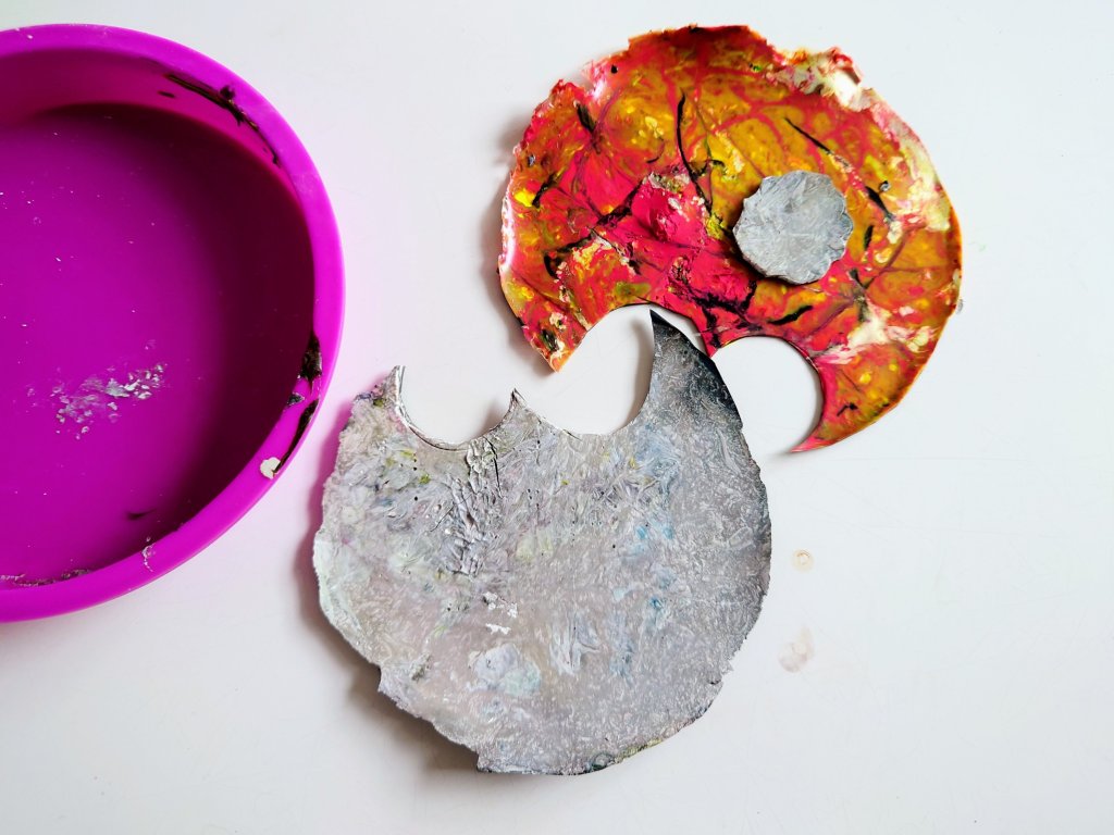
My small series of poured-ink paintings and poured art conveys the complex, messy feelings about belonging. Figuratively, these also show the sickness and tensions felt in navigating relationship conflicts on the journey towards achieving psychological safety.
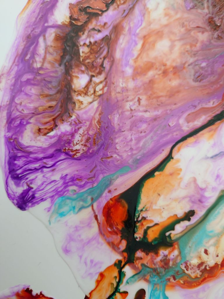

The above shows two segments from my series of poured paintings using alcohol inks or acrylic inks

I’m planning to create a set of stationery and training/meeting room desk decor from these poured paintings. Follow to learn about when these are released. Thanks for reading thus far.

Have you seen the film yet? What did you think?

The Healing Power of Art in Your Workspace

Visiting my local hospital I found it enjoyable to pause and explore the art.

Charring Cross Hospital uses art well. The images below are what captured my thoughts this week when I visited the hospital for a check up.

Not only was I mesmerised by the colours, the vibrancy of the paintings, I noticed how easy it was for me to feel calmed and be part of a community of gallery viewers enjoying the art at my local hospital. You saw it, it made you contemplate when when you walk through their corridors or approached the lifts.

David Wiseman’s huge artwork on the first floor of Charring Cross hospital
Lovely small artworks on display at Charring Cross hospital in the main entrance
The wide array of artwork at the entrance of the hospital in Fulham

I never noticed the art before, it was a stressful moment for me but the art helped me to feel calmer. But it is a lesson to us all about the role that art could play in our own workspace.

Art is known to uplift, bring joy, elevate, bring hope or help our racing thoughts pause from its meditative transfixing properties.

So don’t forget to include art purchases if you are renovating your own home office and wanting to style your shelves.

Let me know in the comments, how many pieces of art do you have in your home office? How many on your shelves? How much art is on your wall to create an aesthetic virtual meeting backdrop?

If you want to see the art I created small enough to display on shelves, click on this link to browse the art that I sell on Etsy.

Poured Paint Sculpture Lamps: Embracing New Artistic Influences and Future Creations

The featured image above was generated by AI after it analysed all the images on this post. Interesting 🧐 not sure I like it this week.

Now that all the lamps have their feet attatched the look is completed. I like that the feet echo the organic black shapes in the poured skin that surflaces the barrel of the lamp.

In creating a series of painted and poured skins and assembling each onto lampshade making backing I first thouhgt I was a bit crazy, but I didnt mind because people had volunteered that they loved what I had created. I later discovered that I am not solitary in making sculpural forms out of paint integrating a clear foundation for a more etherial spirited look. I had learned about sculptural skins before as we were taught that in my mixed media class at Central Saint Martins. But I hadnt come across an artist who had had integrated the clarity of acrylic sheeting in their work.

Poured paint sculpture lamps: The first trio with all their feet fitted, allowing paintings to be formed into semi transparent tablelamps
15 cm acrylic abstract poured on PVC formed to tablelamp signed on the back..
20cm poured acrylic and ink laminated on PVC framed with black cotton formed to tablelamp

Yet, this week I found new company for this sculpural element of my artwork in the work of Lillian Thomas Burrell. This American artist born in 1927 and five years younger than my mother, wrote a book called From Painting to Painting as Sculpture: The Journey of Lilian Thomas Burwell, by Lilian Thomas Burwell, Hampton University Museum.1997. I have orded a signed copy of it.

I learned about her this week, when Kitty Gurnos-Davis of @artistic.identities posted a reel on IG (16th August 2024) talking about the work of Lilian Thomas Burwell (saying she was ashamed to not yet had discovered her). From watching this reel, I entered into a new world. My internet research took me on a journey. I discovered the images of her sculptures made of painting canvas over a wooden form. There are also images and videos of her use of acrylic sheets with wood in her paintings on canvas.

The Lillian Thomas Burrell exhibition at Berry Cambell Gallery from You Tube

My prior career as a management academic allows me to understand the importance of asserting and connecting with the seminal works in my field. I know that using paint skins is something that is a constant in all my work. Seeing and using paint’s sculptural potential is what only a few artists do. It was encouraging to digitally meet the work of Lilian Thomas Burwell this week. I’ve downloaded the book to discover more about this genre and even asked for a signed copy so I can have it to hand for future reference and inspiration..

I shall be making more of these poured paint sculpure lamps in other colours. Purple and gold was requested on instagram and I might do a deep red and organic green and even a yellow and blue later.

What colour would you like to see?

Cosy Office Decor and Shelf Styling Trends – Wow House 2024

On search for design inspiration, I went to the Wow house, down the road from me at Chelsea Design centre. The exhibition is in its third year, which means that I was there at the first Wow house see blog link. But then I had used visiting the Wow house as a tactic to get me out of the house after my pandemic imposed social anxieties.

Now that those wowes are behind me I had a bit more pep in my step as I visited this time. Now, in 2924, I was purposefully looking out for the latest thinking about home office design and where the field is on shelf styling and lampshade trends. This post is about examples of home office styling and accessorising I saw. I have pulled together my top five to comment on.

Study One: Conceptualising Studio Spaces

Subscribers will remember that I love the fantastical in art and this studio by Fosbury Architecture has done it in room design, furnishings and finishings. They have ensured that all work surfaces receive the maximum levels of cosy because every office artefact, tool and piece of equipment is covered by the fabric of the sponsor Dedar. I loved the sumptuous nature of it. It certainly is an answer to the current calling for cosy office or cozy office decor as they say in USA. I later sat in this room with 20 other people when we were on the guided tour.

Conceptual Studio workspace created by Fosbury Architecture for Dedar Nicola Campri and Claudia Mainardi at Wow House 2024

Sitting there in the corner gave me a real sense of belonging and feelings of affinity with the others on the tour. It felt safe, cocoon like. It has given me some ideas about the future of training room design, that I have long complained to my colleagues about. Perhaps training room studios could be like this and the cocooning is the butterflies that will emerge from their day of corporate training.

Study Two: Functional Reality.

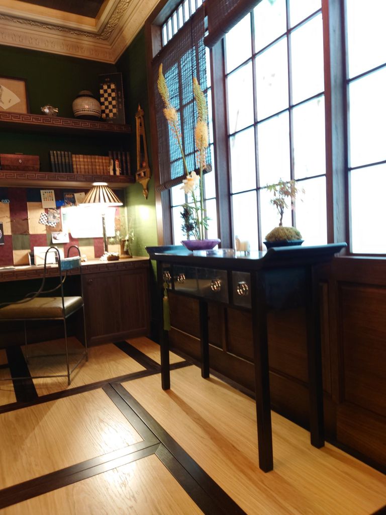
There were also office and study displays to be found in the showroom windows adjacent to the exhibition. The example below from Ligne Roset. This shows the reality of what people tend to buy. I do love the warmth of a dark walnut wood. It might be the new burled wood style that is coming in.

Study Three: Global Style Influences

East meets west. Japan has an influence in the room set up below. By Anahita Rigby’s cool office with a strange zen yet industrious feel. It was one of the rooms that enjoyed sitting in for a long time just absorbing all the textures.

Below are videos of lighter versions of studies.

Study four: How to elegantly place your desk in your bedroom

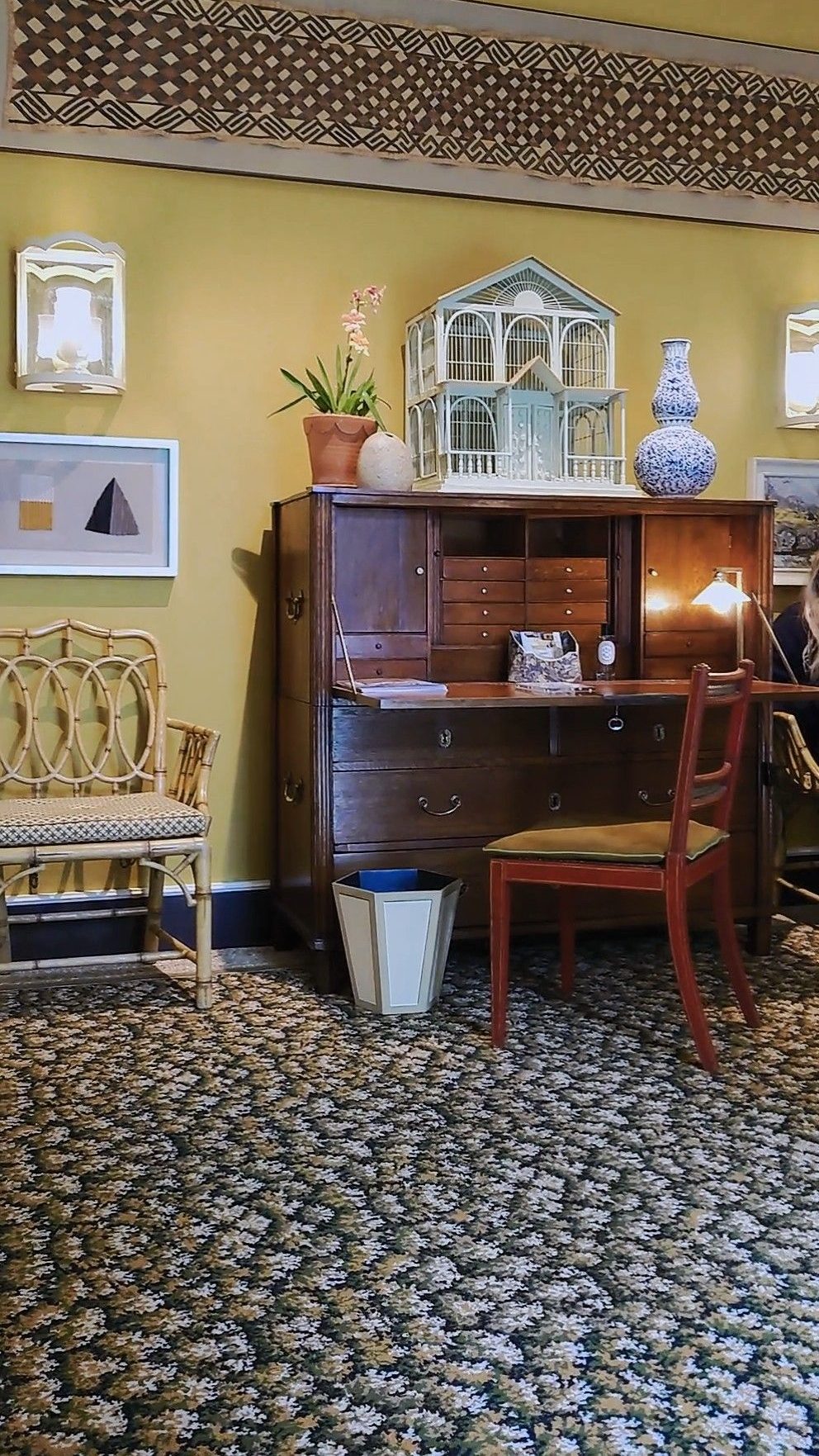
The exquisite desk arrangement in the Courtyard bedroom of Veere Grenney showing restrained elegance for Schumacher.

Veere Grennay’s elegant desk creating a study area in the Courtyard Bedroom

I think you can hear other viewers giggling about another room, they were hinting at how one of the rooms reminded them of a cosy country cottage. I left the sound on as the music seemed to find to fit the calm feel of this desk arrangement.

Study Five: Library Decor on Stage

And lastly putting on a grand appearance (his background explains why) is the Library by Andrea Benedettini. He used to be a Ballet Dancer and the Library was inspired Swan Lake and theatre curtains. I love the ballet and have seen many productions and this library setting was significant for me as it including floor to ceiling curtains to cover the walls. Andrea Benedetti is said (by the tour guide) to have been inspired by stage curtains for the wall draping. It was beautiful. I love that the overall look acknowledges the importance of presenting those bookshelves. And this room is a great exemplar for shelf styling cabinetry integrated into a room.

Andrea Benedettini Library

Overall I found I was full of wonder at the wow house. I was struck by how every study room appeared to use fabric as a wall covering. There was also deeply considered treatment of the ceilings as a feature or complement the room

Metal tended to feature in the lighting for all office desks and shelves so this might influence what I do with future lighting collections too.

Art was another big feature for shelf and desk displays, with nearly every room acknowledgeing the important role that art plays for personalising the space and conveying the inhabitant’s unique personality. I particularly loved how in the Martin Moore kitchen with Studio Vero (Romanov Brihi and Venetia Rudebeck) they purposefully curated and displayed green and organic themed art for shelves in their kitchen. It complimented the beautiful green and black marble surfaces they used, to make the space feel like a place to spend time and truly enjoy.

As a bonus i have added the Colefax and Fowler Morning Room by Lucy Hammond Giles. For some reason this was the room where everyone seemed to just want to sit in and rest and take in the decor.

Colefax and Fowler, Morning Room by Lucy Hammond Giles

What are the best office set ups or studies you have seen? What did you like about the five studies I’ve looked at?

Like or comment below.

Rediscovering Organic & natural

I’d been noticing how my eye has been drawn to organic and natural materials recently. Then later discovered that this is not a recent phenomenon. Natural and organic has been the core of my decision making around decor and product design but it sometimes got hidden. This is the story of the uncovering.

Recently I’d been playing with the idea of natural trimmings, naming it, my natural calling while trying to figure out what this means for future designs products and art.

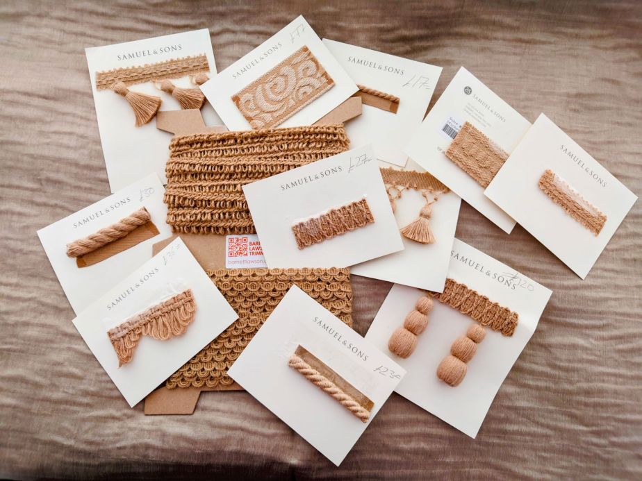
Some of my recent inspirational pieces were the Samuel and Sons jute trimming collection. There is something quite ironic around having the basic and most ancient of materials used in contemporary and extravagantly decorative ways.

Continue reading “Rediscovering Organic & natural”

Nashville Tennessee Culture Tour

Last week I visited Tennessee USA, to carryout business for my employer. On my rest and travel day I was taken on a tour of Nashville and naturally sought out the art and culture areas. I’m not such a fan of music venues, being from London we get a lot of those around here. Instead I was more intrigued by Belmont and Vanderbilt campus area and the lovely community around there. I went to the Parthenon where they had an artist on show that I have begun to admire because I feel a sense of affinity.

Continue reading “Nashville Tennessee Culture Tour”

Ethereal Experiments

I was thinking 🧐 of contrasts and reducing my colour palette recently. Below are a couple of images where I played with new forms and hues. This week I was struck by the work of Mexican artist Sandra del Pilar and British artist Sahara Longe. Both seem to assert figures of humanity in subtle ways. I like how their figures seem to give way to the paint and colour form.

My ink drops play for a ghostly theatre round abstract
Continue reading “Ethereal Experiments”

Noticing the artistic contribution in our everyday life.

I visited Covent Garden for a meal and did some shopping. There I also noticed how the artistic contribution features m in our everyday encounters. Sometimes we must look deeper to notice how the hidden artist gets to express their work through mundane things like our retail experiences and our eating out.

A balance of thought used to present this maple tart at Clos Maggiore.
Continue reading “Noticing the artistic contribution in our everyday life.”

A Dance Interval Epiphany

As I write ✍️, it is the first interval at Sadlers Wells on Saturday 16th September. We just finished watching the first act of The Alvin Ailey dance Roy’s Joys.

Photo shows. Interval activities, most get an ice cream, some read a book, I start to write a blog post
Continue reading “A Dance Interval Epiphany”

My Three Barbie Core Items

I saw Barbie and I’m conflicted. I didn’t always approve of the film because I read it with a critical mind and having been someone that has researched in the field of culture and youthfulness and beauty I didn’t approve. But speaking as the person who teaches corporate entrepreneurship, culture and marketing I did approve. I admired the genius it is for future sales of ordinary Barbie. Look out for the news stories about queues around Hamleys come Christmas 🎁. So I have mixed feelings about it and they run deep.

Continue reading “My Three Barbie Core Items”

Elegant Lampshade for Table Lamps: Remembering How it all began

Why did I start designing and making elegant lampshades that soften our office table lamps? Here I recall three parts of a conversation forming reasons why I found it vital to begin this quest and where I am now.

In 2012, I complained to an interior design/ architect friend (I was sharing a Chelsea office with) that we saw too much hard surfaces in office decor (albeit for durability and health and safety) when organisations should be enacting the softening up to echo their espoused prioritisation for well-being and more human side of organisational life.

Continue reading “Elegant Lampshade for Table Lamps: Remembering How it all began”

Putting Skin in My Art Game

I was thinking back on the course I did at CSM this week. Those thoughts helped my plans to integrate paint skins into more of my pieces.

I tried to review at least three of the big famous artworks that use skin, but I got distracted by the work of Frank Bowling. Tate. Arts seem to think he does it, and I need to investigate further. Perhaps it’s that he uses canvas-like skin. I still need to read more of that very long paper.

Continue reading “Putting Skin in My Art Game”

Art about Black Lives: It Really Does Matter Where Displayed

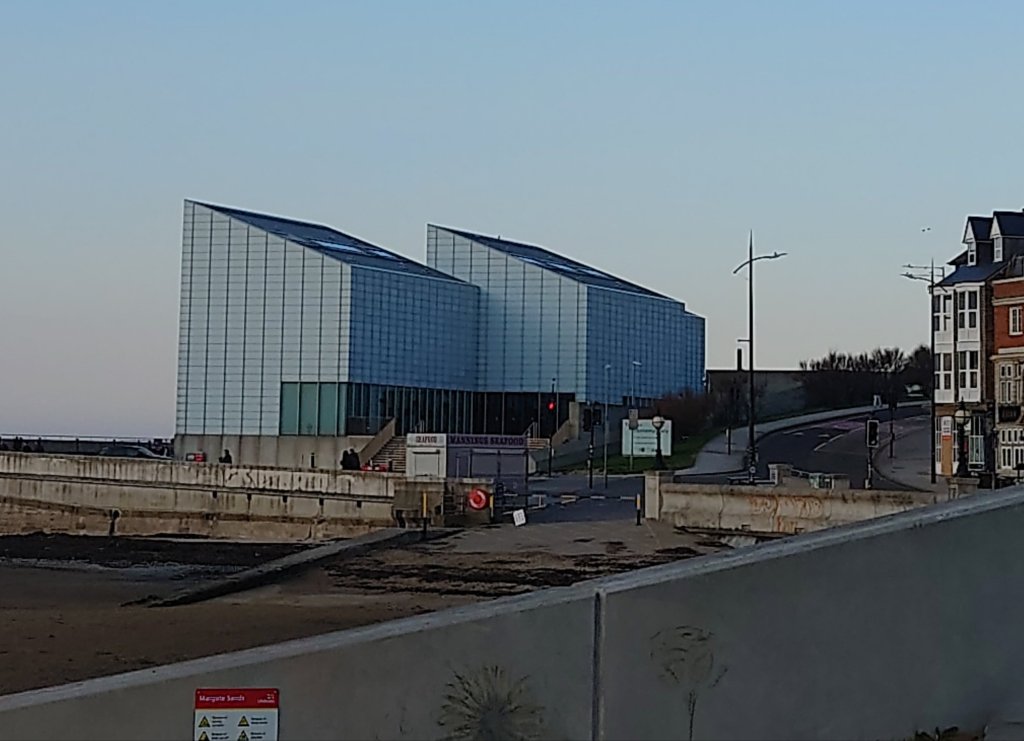
Who would have thought that Margate would be where I would discover a gallery floor full of art about the black lived experience. This blog tells the story of what I discovered and what it meant to my own future art practice, especially when considering how and where I would like my art displayed.

Continue reading “Art about Black Lives: It Really Does Matter Where Displayed”

Two Ways & One Why on Art for Home Offices: Modern Master, AI or Lowly Crafter?

This week I had time off from my 9 to 5 and immersed myself in making while fighting a head cold. But determined to stock up for my Etsy shop and develop the idea of a decor solution for people working from home. Realised that being a lowly crafter, artist and maker has advantages for pushing the art envelope further to improve how businesses work.

Continue reading “Two Ways & One Why on Art for Home Offices: Modern Master, AI or Lowly Crafter?”

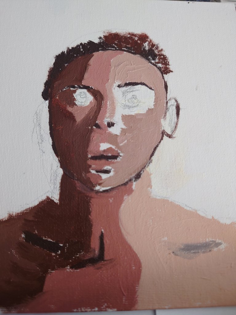
Why Painting Julian Opie Simplicity is Quite Hard

Our teacher took us through some portraits this week in my art class. The usual classics were there for us to study composition, tone, paint strokes etc. But I was struck by how much I was drawn into Julian Opie’s work.


I’d never seen his work before, and I noticed how my eyes were pulled into pattern finding.


However, I took on the challenge of seeing what my marks and finish might be like if I painted in the style of Julian Opie. I initially thought it might be easy; perhaps I was being lazy, but when I realised the attention to detail demanded in getting the contrasting tones right. Another hurdle I had to surmount was the light and the dark shapes to make sure those correctly gave the impression of light and shade. I discovered in class that trying to do this using oil colour is another difficulty because Julian Opie probably uses acrylics. But never mind, it’s all practice.

Admitting my 1960’s influence: Wednesday’s dance & Mondrain’s paintings

It was surprising to realise how much of my art is influenced by the mid-century decor, 60’s culture and Mondrain.

Inspo 1: Wednesday Dances Watusi 1964

This year’s memorable Christmas activity was watching the Netflix Wednesday series back to back. Watching it on so many levels was amazing as it helped me recall the 1960s version of the Adams family, which I enjoyed revisiting over the holidays. As a dance enthusiast, I was keen to find my favourite clip of Wednesday Adam’s original dance done by actor Lisa Loring.

My view watching Wednesday Lisa Loring’s lesser-seen dancing clip
Episode: Lurch, the Teenage Idol (1965) Adams Family Season 1, Episode 33- Director Sidney Lanfield Wednesday (played by Lisa Loring) dances to Lurch’s new pop song at 5 min 55 seconds. This snip is a different version of the more commonly found clip. The above is my favourite and is often shown in goth GIFs and David Bowie memes without the original soundtrack.

Seeing the clip was joyful. It reminded me of watching it the first time with my younger sister and being closer to Lisa Loring’s age. At the time, my sister danced a lot like her, and whenever I see clips of Lisa Loring’s Wednesday dance, it brings back happy memories of being that young in the 60s. I’m sure that’s one of the reasons why the current 2022 production of Wednesday on Netflix is doing so well. You see. The new version of the viral Wednesday dance might be boosted because it is enjoying the nostalgic visits from the Baby Boomers and Generation X, who remember the original dance scenes being so poignant for them at the time. I wonder if they have thought of that.

Interestingly, my friend Janet said she had been watching the Wednesday show with her 13-year-old daughter and younger son, She said it brought the family lots of joy. It made us smile as it shows how the Netflix series has mass appeal. Janet and I further discussed (wearing our education experts’ hats on) how the subtext of the 2022 and the original 1964 versions of these shows seem to share a positive narrative about neurodiversity and the tolerance, acceptance and management of difference. I didn’t watch the ’90s version so cannot comment further on that.

Most importantly for my art practice, the research I did and revisiting of the old Adam’s family clips have helped, this week. The images below show how I was influenced to create monochromatic elements and embrace the mid-century look I had created. The crisp white of Wednesday’s dress collar and its oblique triangle shapes is particularly meaningful and is expressed in my paintings this week (on reflection).

However, further analysis of the underpinnings of my painting makes me think of another of my 1960’s cultural influencers—the artist Mondrain.

Inspo 2: Mondrain’s mid-century vibe

If you were to research contemporary abstract art, you get blogs and google results showing what contemporary abstract art is.

However, I’ve been practising my experimentation with contemporary abstract art. I’ve long been influenced by the artist Mondrian. I like his crisp lines, clear shapes and simple play with colours. Some of my earlier works were too much on the simple side, akin to Mondrain’s primary-coloured iconic squares and grids. When I was 15 and doing my Art A level I recall my art teacher remarking how some of my work was like Mondrain. Below is a snap of some textile designs I created possibly influenced by Mondrian’s works. But at 15 I was probably more influenced by others that were influenced. It wasn’t until my art teacher saw my work that he introduced the artists to me. See below

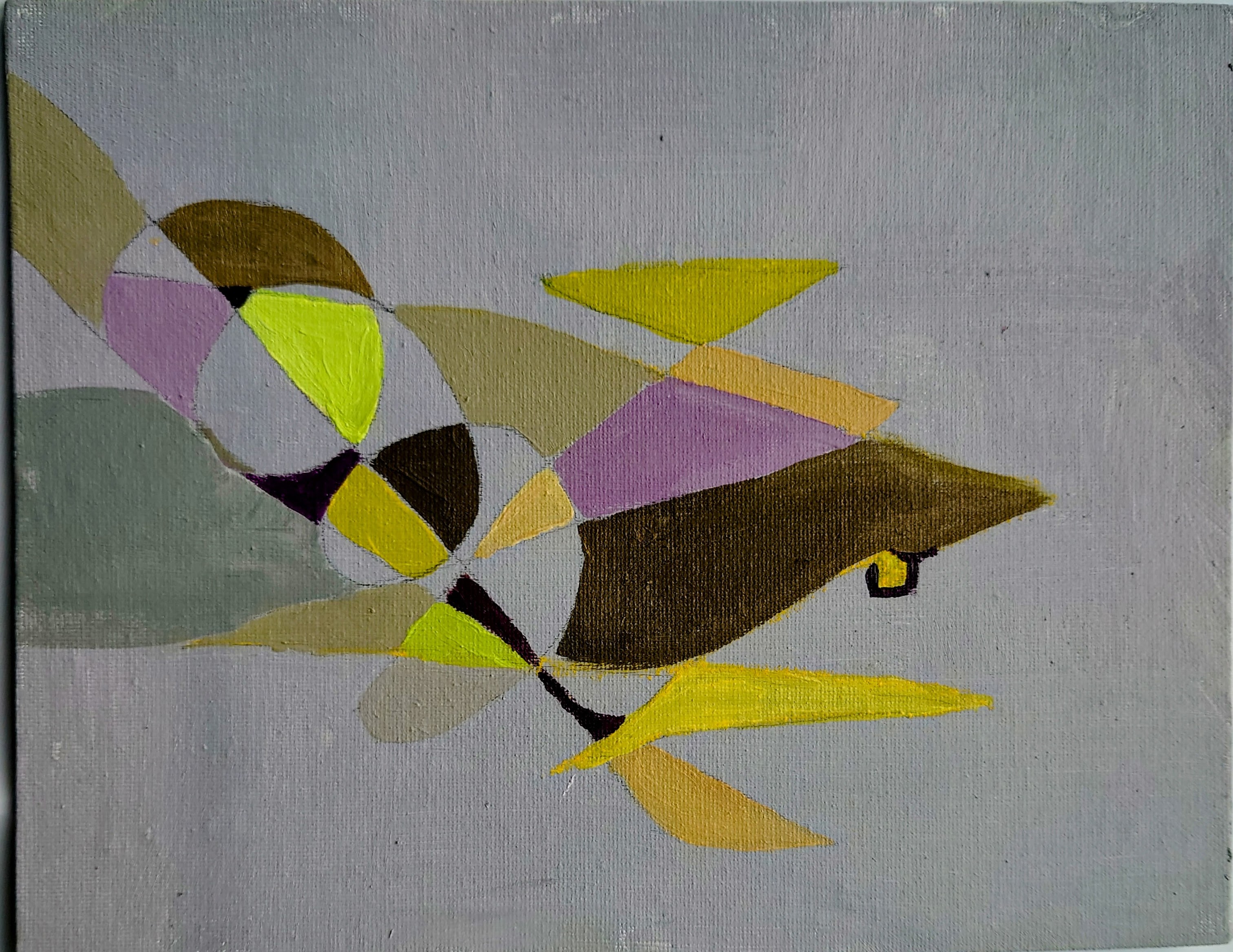
Recently, I’ve started a series of abstract shapes on a strong colour-drenched background with contrasting curvy forms and deep consideration of using analogous or complementary colours.

I love the combination of sharp and curvey shapes I created. These works show more of the training and reflections I have done recently. I’m looking forward to completing this series and listing them in the shop in the new year by 3rd January 2023. Being able to reflect on my 1960s cultural influences for my paintings is helping to give meaning and express the significance of my work. I never thought I was a mid-century enthusiast, but it seems to be leaking out. My age means that the 1960s, and 1970s did inform my aesthetic principles, perhaps more than I was prepared to admit. But I am happy to do so now. I guess my retrospective journey has led to some fantastical pieces.

Thank you for following my blog thus far. I wish you a happy new year and all the best for 2023. I look forward to interacting with you further down the road.

Finding Affinity in The Black Fantastical

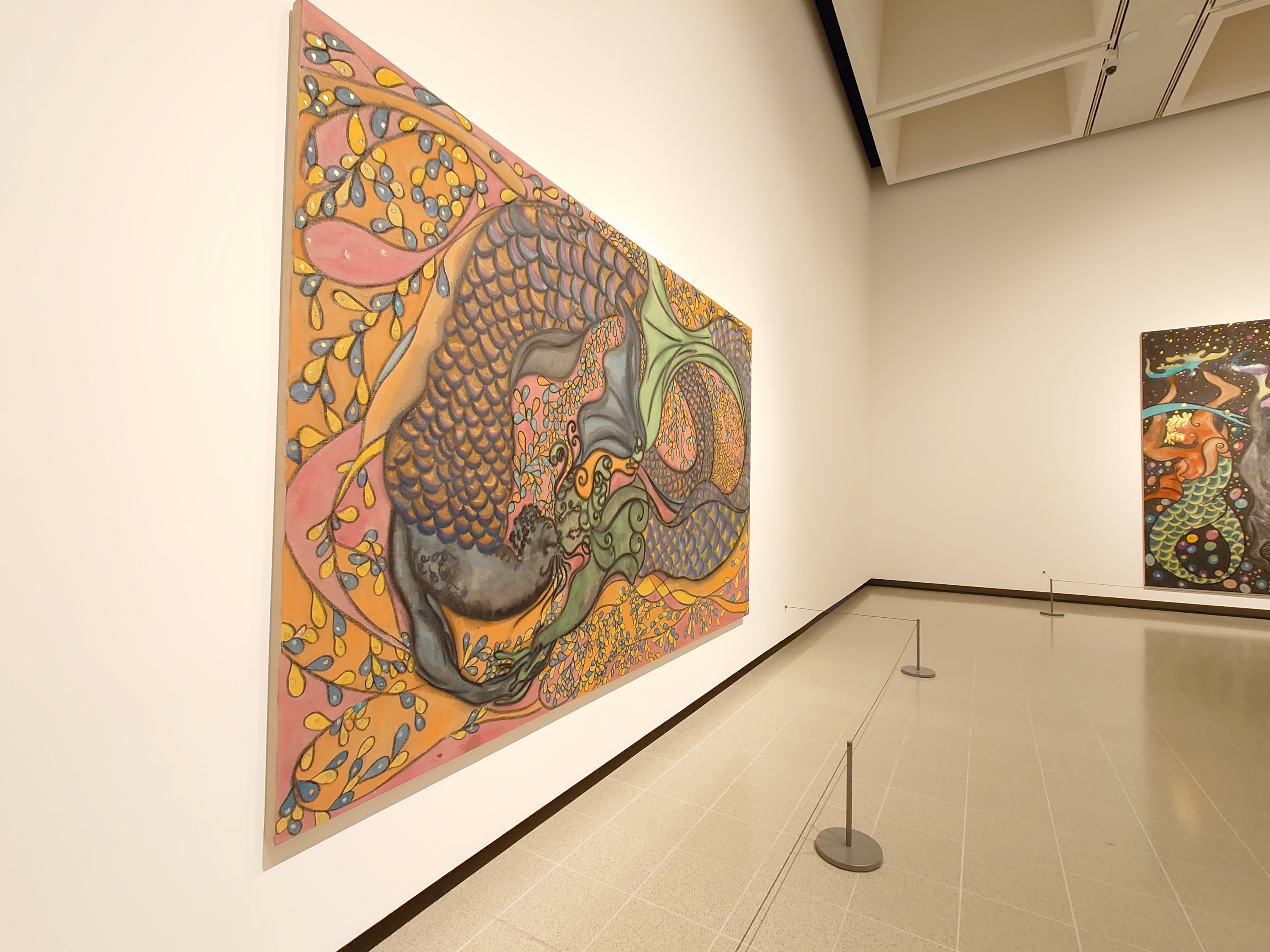
I saw the In the Black Fantastic exhibit at the Haywood Gallery. A big show of artists from the African Diaspora. Including Chriss Ofili, Nick Cave, Hew, Locke and others. Below is the full list of artists at the In the Black Fantastic

Artists at In The Black Fantastic

  • Wangechi Muto
  • Lina Iris Viktor
  • Hew Locke
  • Nick Cave
  • Tabita Rezaire
  • Rashaad Newsome
  • Ellen Gallagher
  • Chris Ofili
  • Cauleen Smith
  • Kara Walker

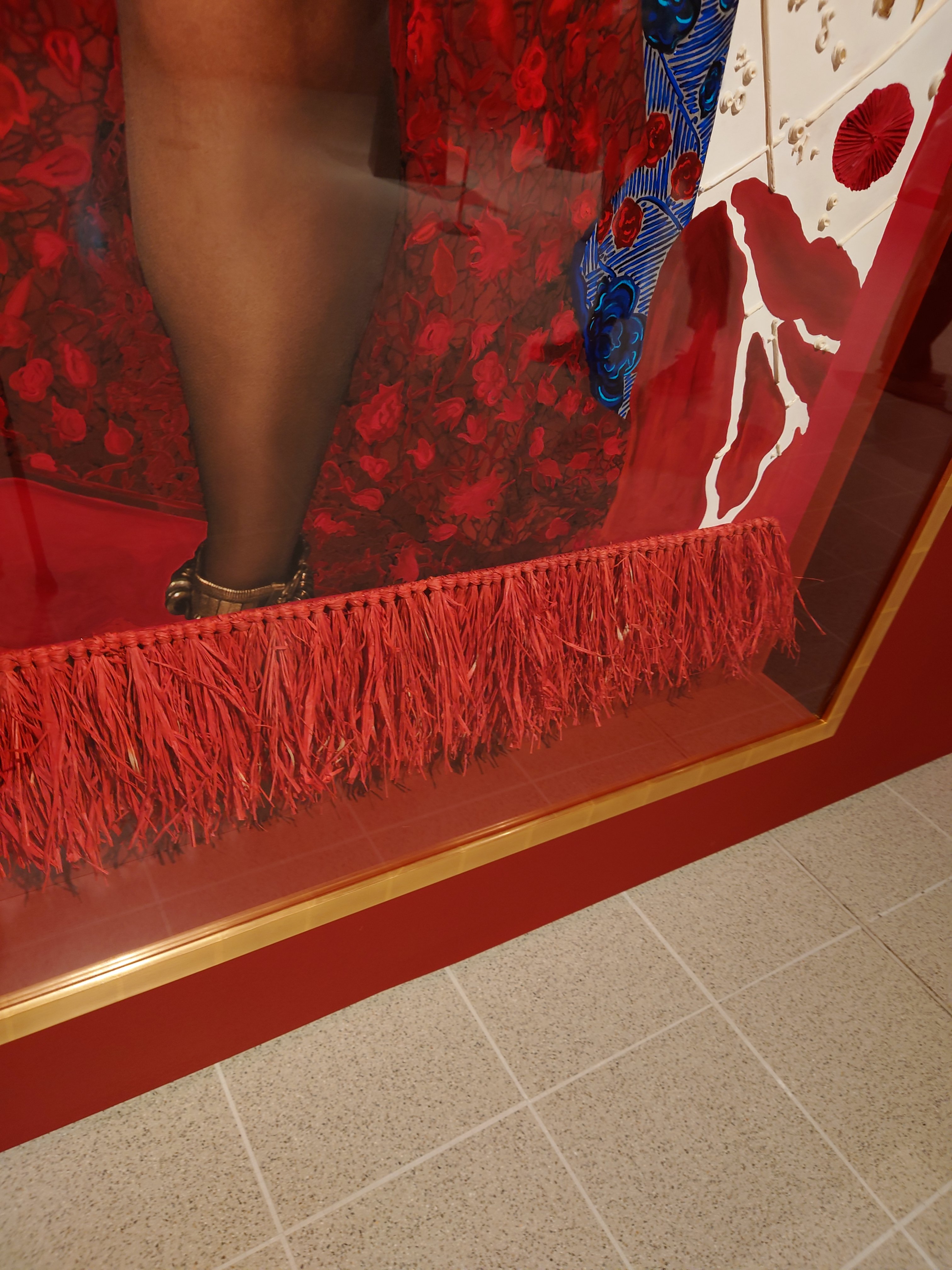
I was excited to feel a sense of affinity developing as I saw the work of these artists. That sense of like mind arose because many of these famous artists used gold or gold leaf, some used gems or Swarovski crystals. I saw gemstones sprinkled and how some used raffia trim as fringing on the edge of a painting. Others used fringing within the painting.
I loved the idea of fantastical art as it is an escapist emancipatory healing kind of space to work within as an artist.

I get a sense of hope, but it is not blind hope. It is the kind of surreal conceptualisation of the future that recognises the hurt that has gone before in a beautiful way.

In the Black Fantastic is showing at the Haywood gallery London until 18th September 2022. It is a little awkward to get there. The nearest entrance is on the south side of the Waterloo bridge,

Watercolour Conversations

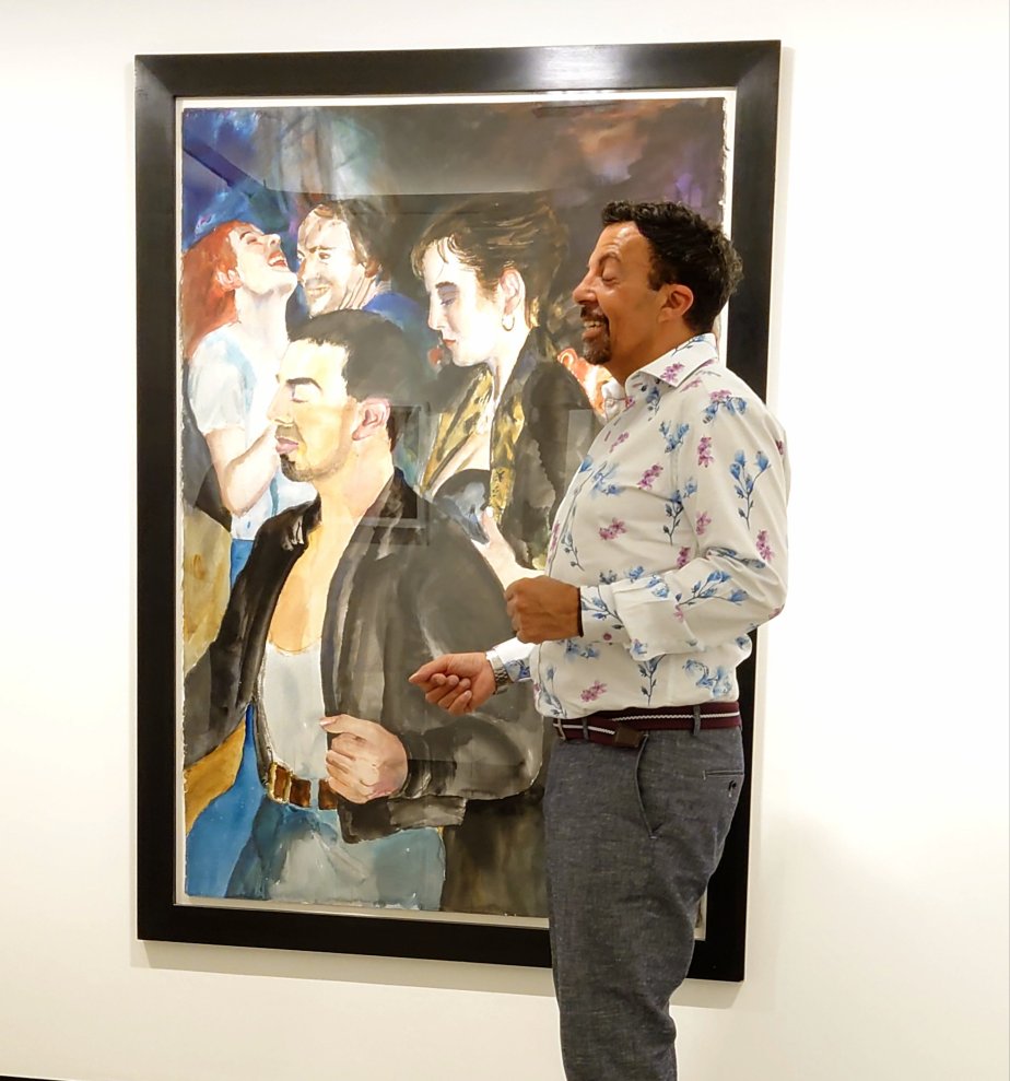
I recently saw the David Remfrey exhibition at the Royal Watercolour Society. I was invited to the exhibition by my old friend Rick who knows the artist. Rick was pleased to see his likeness in a couple of David’s paintings.

The images below show my friend Rick pointing and repeating the pose in the painting “What the Night Tells Me,” which is normally in someone’s private collection.

We also met another watercolour artist at the exhibition (viewing David’s work, I think he was from New York). We had wonderful conversations about the different characters found in David Remfrey’s work. My friend was very proud to see his portrait in the painting, and the back story was wonderful to hear. I had heard the story before but seeing the painting in real life while he explained how he knew David and his partner made the tale more significant and profound.

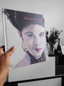
Visiting the exhibition was a real treat for me as a dance and art enthusiast. I was delighted to be given a signed copy of David Remfrey’s book there (it was my birthday). Book title is David Remfrey Watercolour by Royal Academy of Arts and Royal watercolour Society 2022.

I loved how exquisite the paintings were. The impromptu gathering of people was magical. It set off an intriguing, informative and interesting conversation about watercolour art. As someone that uses acrylics mostly, the visit inspired me to try out doing a watercolour series of paintings/ creations at a later point.

I might link back to this post when I post the pictures of watercolour items I create at that later point.