Look up from the main hall at Ashridge house and you will marvel at the amazing craftwork and design choices of those with an eye for style and culture hundreds of years ago.
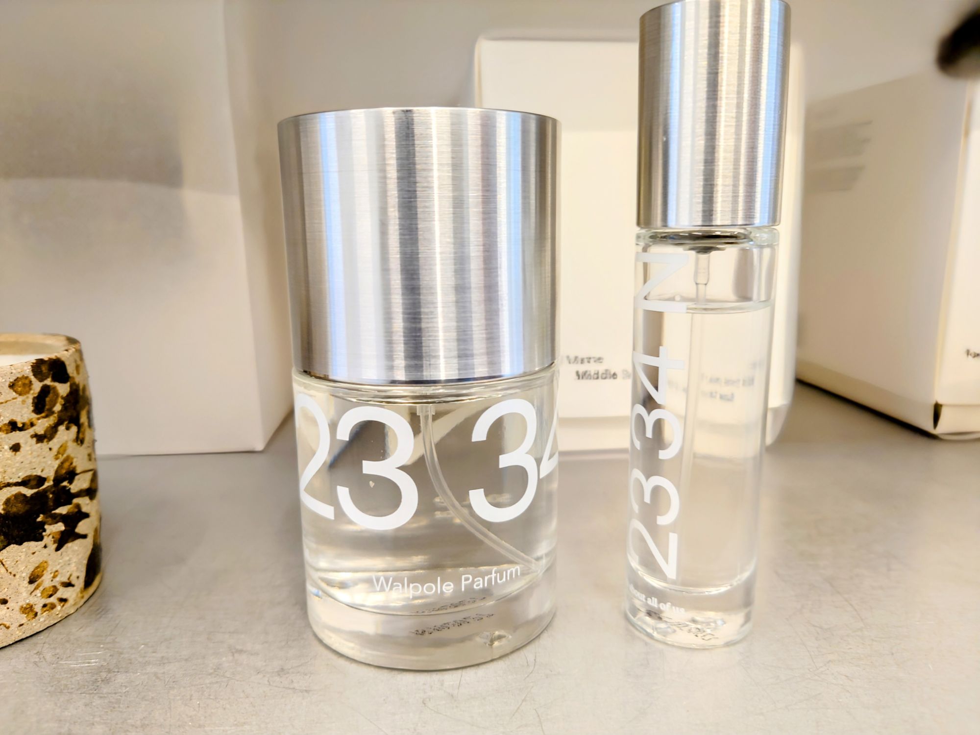
Love the smell of this had to take a photo so I can remembered it has Sweet PeaFast forward to November 2024 Really love what the brand formally known as Haekles is doing to assert their values around environment and social responsibility. They have changed their name and got new packaging that is not about creating a dressing table ornament. It is about creating a vessel for their product that is compost-able. It makes me love them even
Overall my visits this week made me notice the extent of my eclectic appreciations, I can be enthralled by ancient design and crafts through to being captivated by 21st century crafting of our cultural practices from brands like Formaly Known as Hackles.
This week’s AI generated featured image gets an 8/10 it resembles the mess when you are doing product photography.
This week, I was reminded of my academic interest in the Journal of Organisational Aesthetics, which comes out of the highly lauded Tavistock to explore how human senses and artistry inform businesses and many other company practices found in charities and government.
Since I currently work at the intersection of art and organisational behaviour creation, I thought my take on organisational aesthetics might be unique and was looking forward to presenting a couple of papers to this scholarly community.
However, I later discovered that the very thing informing the presentation of my art practice is mostly from my experience in my first career, where appealing to the customer’s five senses was what we were all about in the world of the five-star spa.
I had an intense weekend. Synthesizing a range of ideas in re-doing some product photography. I had to fit in with Etsy’s new rules for sizing from listening to some of their reasserting of the preference of the algorithm for light backgrounds, in pictures. I also had to remember what my shelf styling class taught me about arranging items with natural materials. Additionally I integrated what the product photography coach said about getting good lighting with proper window positioning and using tools to get filler light to remove shadows and cast secondary light on areas of the product. Those are the three main main pieces of aesthetics advice that Etsy sellers get. It’s given as a recommendation of appealing to customers and selling more items. And the practice would appear to be in the thick of organisational aesthetics, however the scholars do say they distinctly focus on beauty for the sake of engaging the senses and not just for profit or sales.
I dug deeper into what organisational aesthetics might mean to me and the art I do and how I present it. I asked myself:
Q: What is this Aesthetic that I create and cannot avoid repeating? Where does it come from?
A: It comes from within and some of it might be the imprint of your spa and beauty years.
Hidden Letters: Purple Haze Abstract Mixed Media against lighter background.
Poured pain skin presented around a table lamp frame.
Hidden Letters Beach Blue: Abstract Mixed Media against lighter background.
Hidden Letters: Orange haze Abstract Mixed Media against lighter background.
After a few struggles and wondering why my arrangements do not look corporate in the slightest, no matter how many books and staplers I insert. I then realised my style comes from an imprint from my early career induction into the interior design and decor values of five star spas, Mayfair clinics/ treatment centres head offices and London’s West-End retail (my first proper Saturday job was Miss Selfridge in Knightsbridge).
It also dawned on me that this is a group (except the West End retail) that might welcome some help. I remember being a sole trader in my city of London treatment room, unsure how to fit out the space I was renting. However, my friend Rachel helped to wallpaper in Timinney Fowler and fit the blush-coloured carpet at the reception. I just had a flashback of getting the electrician to install a gothic lamp and fill up our IKEA cabinet; it would have been nice to have someone to discuss shelf displays that might make the products look more appealing through storytelling other than piling the boxes boxes of moisturiser and serum high.
If you are an independent trader or sole operator in the beauty and spa world and agree that product houses could help more with your displays please comment below.
If you are in any other industry and a sole operator and wondering how you learned to present your professional and personal brand and how organisational aesthetics fits with what you do, please comment below.
How did you come to know what your style or aesthic preference is? How does your organisation use organisational aesthetics not only to bring in revenue but just for the value of having something beautiful to look at?
Below is a list of the posts you might have missed from August
I visited Covent Garden for a meal and did some shopping. There I also noticed how the artistic contribution features m in our everyday encounters. Sometimes we must look deeper to notice how the hidden artist gets to express their work through mundane things like our retail experiences and our eating out.
I had a few days of annual leave from my 9 to 5 this week. With this time I managed to make a few skins in preparation for bigger paintings and to help finish the smaller pieces.
Experimenting and playing with making skins
I managed to meet up with old friends for lunches and suppers. It was at these events where I later became struck at how much my social world influences or at least threatens to shape what I do with my art.
Cultural references
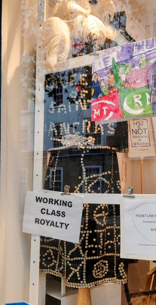
London Pearly Queen’s 👑 outfit seen while visiting Sommer Town Museum, this week. Triggered our conversations about class, place spaces belonging. It made me think about aesthetic traditions and whose aesthetic is most dominant in the art world and why. I also considered occasions when the aesthetic of the less dominant is allowed to shine and be expressed. I concluded that there is a virtuous story to tell about duty, goodness and working hard that I discovered my art was at risk of being embroiled in.
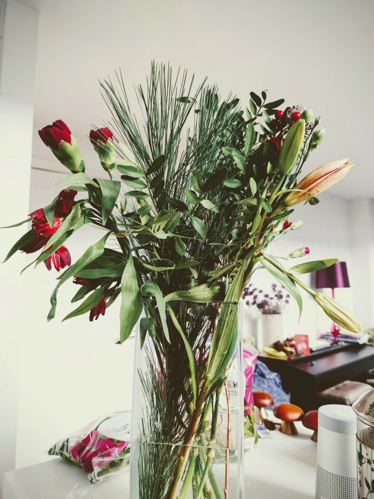
Even though we are post-COVID, more of us are out and about. Home is still proving to be an important part of our lives. I realised that I’d been taking home for granted and gave myself a few moments to stop and think about what random (not normally thought of) items make my home my home. Some images are below with captions that explain.
It’s Christmas time 🎄. I hope you had a good one. A few pics from ours are below. And some of my reflections are detailed and in longer form than usual.
With it being Christmas, I’ve been reflecting on how similar tools are used between artists and those performing in other fields.
I started noticing the supply links between various trades when I did the 14 day CSM course. At CSM, we used paraffin wax as a medium to create a ghostly effect on the painting. I told the CSM teacher that we used the same paraffin wax as a moisturiser for hands and feet in my early beauty training (I used it when I taught at LCF). I mentioned how interesting it was that the university might be ordering paraffin wax for many different uses.
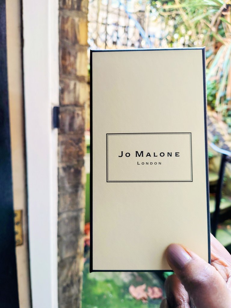
Jo Malone perfume is symbolic of the multiple cosmetics uses in artistic works and expressions of the self.
Another common tool I noticed that artists and hairdressers use this time is hairspray. Hairdressers use hairspray to fix the clients’ waves and curls. Similarly, in the courses I’ve been on for painting, we finish the painting if it’s done in charcoal with hairspray; if we use pastels, chalk or charcoal. It stops the marks from spreading so that it doesn’t get smashed when we roll up our work.
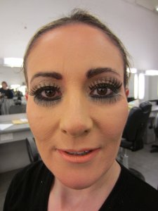
I mentioned in an earlier blog an insight about choosing your flesh colour and the right kind of mixing paint to get the right skin tones. I noticed how the class agonised about mixing reds and yellows to get the right kind of blue to get the right skin tone for painting a portrait. Then I realised I could be more effective if we did a shortcut by going straight to an industry that already had the skin colours right. My makeup artist instinct/ training is linked to these common artists’ dilemmas. The difficulty I faced in painting a life model’s portrait with acrylics is what I recall from trying to find the right colour for the model’s skin for a magazine’s front cover (BTW, I only did a couple of MUI gigs, for now, obsolete magazines, so don’t bother riffling through vogue to find me listed as the makeup artist). I asked the art teacher if she recalled any big cosmetic brands working with artists. Or if artists are working with cosmetic brands. The discussion generated our ponderings over projects like how reusing old foundations is useful because we’re trying to find the right skin tone to match this person’s skin. It’s a universal question between these artistic spheres.
My art teacher said she was unaware anyone was doing it and agreed this was a missed opportunity for some big brands to showcase and do some interesting work with the wonderful big range of colours they now use. She said she thought the problem would be getting the darker tones, and I said that now, big brands like L’Oreal are doing darker tones these days. , it will be a much easier thing. It was weird for me to struggle to find the right blue to turn yellow and red into skin tone colour varieties. The conclusion was that it could be more of an oil painting if I tried it.
So all this made me realise that the next course I need to take would be an oil painting class. So watch this space.
In addition, all these musings gave me this idea about collaborating with other trades doing paintings, doing both of them figuratively. I’m not a fan of figurative paintings (not yet sure why- it might be about labour intensity), but I’d like to experiment and see where I go with doing some portrait paintings using foundation instead of its traditional watercolour and your traditional acrylic. How ironic that it might be the very traditional oil painting class I might need to go on to bring forth a painting that is more meaningful and interesting for me.
It is Christmas time and I’m wishing you and your family every good wish for the season, no matter what kind of artist or creative person you are.
My art class this week got us to practise our portrait painting with a live model. It was the first time I painted a portrait. I had always been nervous about painting humans. I somehow felt incompetent.
But I realised I had been here before when I got into it. Flashback: I trained to become a beauty therapist when I left school. And no, I was not a beauty school dropout. Instead, I did well. But what people don’t know about beauty training is the amount of anatomy and physiology you must learn. I had exams in the skeletal and muscular systems and cross-sections of the skin. When I told the art teacher about this, I found myself recounting the Latin names of the muscles of the face. Surprisingly I even told her about each muscle’s insertions and origins. Didnt realise I still remembered those pesky exam type answers.
Muscles of the faces
First portrait
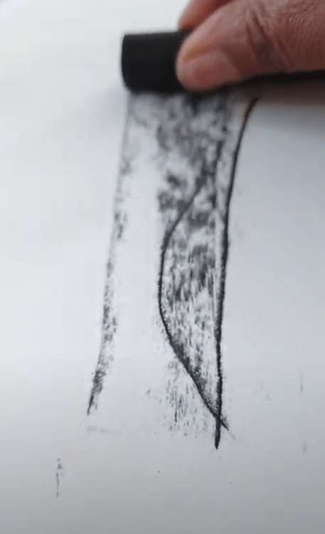
Drawing using charcoal
Getting the feel of the block
Drawing using charcoal flat
It was illuminating how my prior experience of understanding what is happening behind faces and below the skin surface was really useful for my drawing. I also remembered the story of Leonardo Da Vinci studying anatomy. It seems he used to study cadavers. But my study of faces was not of dead people. They were the heads of 1000 facials I had done in my 20s in salons and spas in London and around the world.
It was nice to get encouragement to continue still-life drawings. I shall.
An unfinished life drawing of a life model in charcoal.
I’m creating painted potions. They look good, feel good (because of the textures) and they’re full of ingredients that do you good.
In psychology, it is vital to integrate the self. I feel that the painted potions I create to uplift home office scenes express all of my talents and everything I am good at and love to do.
Some might say it is brut art because I didn’t go to art school (for fine art) and sometimes I use my hands. But I taught in a world-class art school for about 10 years, and I wonder whether those years count. I probably absorbed the artistic rules and principles while chatting to colleagues about student work and the issues in the industry.
Training in scientific aromatherapy over 25 years ago helps me to understand the chemical qualities of things like lavender and lemon verbena and what they are known to do to the body.
In the pictures are painted potions in the process of making. They take several days and weeks to make as I spend hours deciding how to build up the layers, aromas and textures for the desired effect. Close up. I like to use expensive fabric in my painted potions. Some of it is a bit of deconstruction another bit of it is about what they add aesthetically.
The painted potions I have been creating use helpful herbs like lavender, lemon verbena, rose and myrrh. They smell great. The painted potions also give a nod to crystal therapy as I’ve been using citrine, turquoise and other gemstones with their wonderful energy, so far. I have collected lots over the years.
One day I shall tell you about my early years as a therapist who used more fluid an unction, lotions and potions to uplift the spirits of stressed-out clients in spas salons around the world. But for now, let’s admire the notion of painted potions.
Those are the first two ways my experience is integrated within my panted potions.
Multimedia collage of fabric, acrylic paint herbs, gems and beads.
Next time I shall tell you about the work I’ve been doing around the workplace wellbeing for 10 years and how that has meaning for these painted potions too.
Does it look bashful to you? The fantasy flower in this painting appears to be slightly embarrassed.
I wonder why.
Perhaps it is because I used the big bold blusher brush to get all the emotion out to create those swirls.
There is no shame here. Be bold with your crimson connection. Personally I don’t see anything wrong with combining magentaish pink with understated and sultry coral.
I just finished this piece so that it will match my cushions and curtains.
In this piece, I layered the paint out on a base of red and then built up the colours, textures and shapes. I managed to create lovely rose gold. It was all to echo the beige/ taupe black and white pattern in my upholstery.
I took in what I learned from two professional acrylic abstract artists who sell their work for £300. And the up-cycling elements used were the brushes. Blusher brush for the black for smooth light application. Eyeshadow fan brush and eyeliner brush for the other colours.
But I was surprised at how oriental the piece ended up looking. Although there are some similarities between the painting and the cushions/ curtains. The painting seems to have an identity all of it’s own. And I am very glad for that.


![IMG_9381[1]](https://i0.wp.com/homeofficecharm.com/wp-content/uploads/2018/04/img_93811.jpg?w=612&h=459&ssl=1 "IMG_9381[1]")


You must be logged in to post a comment.