It’s my birthday today. I’m glad to quickly pop in and show I’ve returned. I’ve come to share an update. I’ll explain where I have been and where I am going.
I’ve been in my academic writing cave, completing around 12,000 words to earn my PG Cert in Executive Team Coaching. This meant I likely wrote 20,000 bad words first. Then, I had to reduce it and link it to my reading about the latest research on organisational cultures. I also related it to the most recent insights about group and team dynamics, top team behaviours. However, I particularly enjoyed writing about the significance of space, place, and the venue’s decor and artefacts. These elements of decor enable cultural cohesion in team-building away-day settings.
In fact I did a reflective LinkedIn post about it here.
I’m back to my usual Sunday making habit. I’m glad to say. I shall continue to post a written blog once a month. Images of my making will be posted weekly in the product showcase.
I’ll work to resume creating vlogs for my YouTube channel. I’ll expand on themes about the behind-the-scenes aspects of my making and well-being. I will also focus on doing deep collaboration work with corporate teams. This effort aims to enhance my creativity across a broader range of spheres.
Please sign up to the blog if you want to come along on the journey
Subscribe to the YouTube channel if you want updates on my video, I start those next week
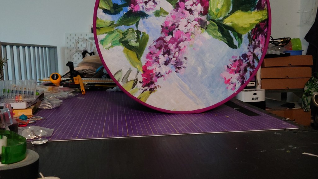
This week, I created a YouTube video to show buyers how I create the beautiful diffusers for my lampshades.
Though Edison-style lightbulbs are available, they don’t always suit every interior style scheme, especially if you’re going for a more cosy, less industrial look.
Watch how easy it is to assemble a diffuser for your lamp shades. I’m considering having these as kits in my shop as an alternative way to hang and present my artwork.
This video explains why I started creating and making items to help virtual working professionals stage their on-camera backgrounds to emanate meaning about how they work with people, on projects, and in programmes, so they can confidently always feel proud to switch their cameras on.
This week I worked in an amazing training room up in Scotland.
The beautiful and comfortable meeting space was on the Mezzanine and considerately designed by an architect. It had beautiful view of the sea.
The materials used for building the structure and decorating were also fascinating.
Some of the walls were made of painted straw board and massive bricks of pink salt, which gave off a beautiful light, and it felt good for my well-being, too.
I loved that the room had an eco-friendly vibe, which you could see when looking at the painted stringboard. The stringboard walls also gave it an industrial edge, and the painting of the stringboard made it feel a bit more glamorous than if it was left bare.
I loved the pink blocks of salt used in the wall construction. Apparently, there are many benefits to using pink Himalayan salt as a construction material, including its being inflammable, great for acoustics, creating healthier indoor environments, and reducing pollution.
The design and materials are fascinating because salt bricks are used a lot in spa salt rooms (spaces I used to know well).
From this, I began to understand why the space was good for my well-being. https://pin.it/69njtGSGy. I felt nostalgic and joyful when I realised a designer had considerably considered inner wall construction for building, aesthetic, eco, and well-being reasons.
Salt rooms have a range of untested physiological benefits, such as fighting infection, clearing coughs, and reducing stress.
I also liked how they used giant pink Himalayan salt discs to make the table’s legs.
Another innovative feature of the décor and design was the wall of pots that adorned the main wall. This cute crockery collection offered subtle branding for the business but, most importantly, emitted creativity, camaraderie, and cosiness.
The wall of themed crockery, I imagine, acts as a fantastic backdrop for when they are doing virtual meetings.
Overall, because of the many innovative features I found in this training room, it is one of the more remarkable spaces I visited to facilitate learning workshops this year.
Visiting this space, this week helps to justify integrating more natural elements in decor items in the future. Potentially looking at new ways to integrate pink salt into my making and shelf decor items. I shall also look at collections of items with small words that buyers can use on their walls for more meaningful virtual meeting backdrops.
Sleek and sophisticated fittings and Furnishings for Hard Working Zone
Boucle textured seating
Elegant breakout area
Japandi meeting room
Plants bring organic
An Effective abundance of textures
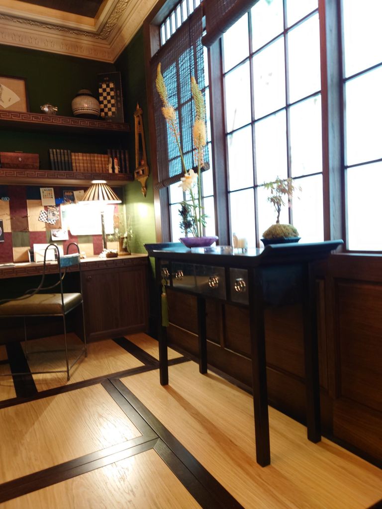
While visiting some London City offices recently, I found some authentic Japandi. Working as a facilitator corporate trainer/ instructor I was able to see how the combination of textures used in the external meeting rooms and breakout area fittings created a captivating and calming atmosphere. Colours are neutral and highlighted by the colours from natural elements such as metals and woods and watery looking glass panels.
A spacious training room with rubberised tableMinimalist and well considered details
Natural wood accents Beautiful combination of natural textures.
If you want to create the Japandi look in your home office here’s five things to remember
Natural elements wood, marble, wool and metal
Paired back details
Double the circulation space for that sense of spaciousness
Juxtaposition of natural textures such as mats verses glosses
Tiny elements of metal craftsmanship to admire
Comment below to share what your favourite elements are in Japandi office or home interiors. Do you like light Japandi or dark Japandi?
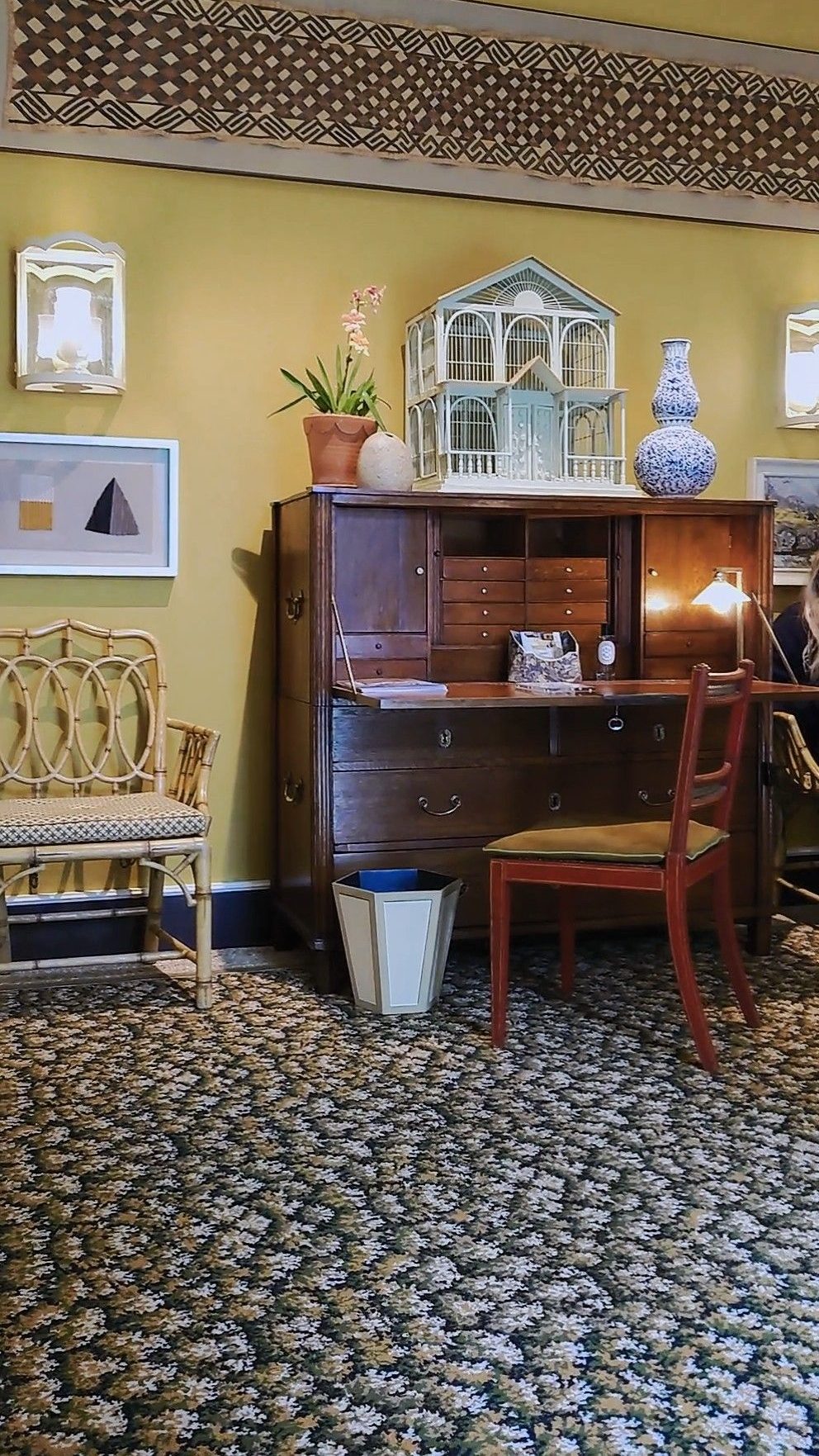
I visited a beautiful training room this week but it was hiding several problems. The issues found made me want to share some tips on training room design for architects, interior design team, facilities managers.
The beautiful training room I visited had fancy comfortable seating, very nice wide desks on wheels, natural looking carpet all the modern technology with two big screens in the front that I could can easily log onto. There were also two beautiful side cabinets storing other trainer’s accouterments like post it notes, marshmallows. There was even room for me to store my coat and bags to keep the room tidy.
Image created with AI based on the word in this post
Style over substance: The impractical training room layout
However one thing I noticed about the room, even though it was large, was the lack of circulation space. The session was originally booked for 14 max but they thought they’d squeeze another two people in. This meant that arranging tables in a U shape pinned everyone to the walls leaving a large expanse of space in the middle. This is not conducive to group working because no one could move around easily.
Style over substance: Training room walls that would not stick
This beautiful training room had deep sage green walls stylishly painted up to seven eights of the wall with a coordinating ivory colour for the last eighth and the ceiling. It reminded me of a beautiful cosey shaker style kitchen. But when it came to me sticking full flip charts up to remind learners of the points we had covered so far it could not be done because the walls seemed to be anti tack. I guess somewhere in the building’s history the facilities manager got fed up of trainers using blue tack to stick things on the walls.
Having anti tack walls is understandable if you have previously spent loads of time and resources getting the cleaners to remove blue tack using the recommended direct heat like a hairdryer on the blue tack itself.
But having anti tack walls creates a corporate learning & development and organisation development problem. You see we trainers need the walls to showcase learning. To show case learning is to have a tangible artifact of ideas generated in the session and that is more than one flip chart stand can do.
We show case learning in the corporate training room in various ways. We typically (display gallery style) the completed flip charts that everyone has done. Learners throughout the day then reread what some of the ah ha’s and moments of epiphany are within the room at moments that suits them. It helps to reinforce diversity in learning & development.
We use the wall to display analytical and creative thinking when working in a group. Walls help to magnify the writing space. Walls expand the written canvas from the individual’s perspective out to the group’s perspective.
Therefore a training room festooned with used flip chart pages and written on post it notes from brain writing sessions, or creation activities or problem solving sprints serves as visible and physical evidence of the individual and group learning work that has gone on in that room.
I’ve seen great examples of corporate training rooms as I travel around the world delivering leadership and management development . The more advanced training room decor takes account of trainers/ instructors needing to use the wall by replacing the inner walls with glass panels and providing white tack for the rest of the walls. .
Glass walls are then perfect for sticking sticky flip chart or post it notes to the walls. I’ve also seen other kinds of vinyl decor panel used. Learners can even write directly on the glass walls, which support creativity and enhances the problem solving process.
But ultimately it would be great if corporate office training room designers could consider installing more white boards and screens so that opportunities to showcase learning is on all four walls, without the need for desks.
Image created with AI Prompt corporate training room like featured image but with screens one windows and all walls with glass wall looking out to greenery and big plants internally. And comfortable seating for eight.
Leadership and management development consultants/instructors and trainers are now in an era where, we no longer want to get managers in a room where they just sit and stare at one square light at the front of the room for six hours.
Image created with AI prompt corporate training room in U shape without desks
We no longer want executive development shaped by the the training room’s limitations. Indeed some of the problems that companies face with with building inclusive working, collaboration or the depth of thinking that is required might be down to the amenities of the training room. The training room is a visible cultural artifact subtly symbolising “the way we do things around here”.
How professionals can make training rooms add value
We now need interior designers and architects of corporate headquarters, campuses and head offices to show deeper consideration of the design of the corporate training room. See my top 10 tips as a summary of this post.
10 Tips to Improve Training Room Decor & Design
Room aesthetics are important but should not devalue function
Create a room with a view of nature
Design in glass panel walls to showcase learning
Plants are nice for oxygen and neuro-aesthetics
Cabinets could be built into walls so they don’t get in the way of circulation space needed for group work
Integrate screens on three walls
Install whiteboards on three walls (if no glass walls)
Design, plan and build writable four walls
Enable table or desk free room for management development suites and executive development zones
Always consider how the training room acts to symbolise the desired culture
Please follow for more. Each week for the rest of 2024 I shall be visiting corporate training rooms of all shapes and sizes up and down the UK. I will post more ideas about best practice and ideas for improvements to corporate training room design, decor and space planning, in the weeks to come.
Comment below on your good or bad experience of corporate training room decor.
The featured imaged is AI. The machine computed what my blog was about and created a picture with that massive light with feathers. It made me chuckle 🤣.There is another AI generated image at the end of the blog. However, all of the images in the middle were taken by me.
This week I had some time mid week to wander around my favourite interior trade suppliers in Chelsea Design Centre. Being a West Londoner, hailing from Fulham Lots Road is very familiar to me.
Below shows more images of things that took my fancy. They show trimmings or lighting features that either conjured up excitement or a sense of cosy familiarity for me…
The current lampshade and lighting trend is for big white empires with the gathered version emerging as being a preference.
Above is an array of white neutral lampshades for table lamps in a variety of styles and forms, seen at the Design centre Chelsea during my Wow House visit.
However, please enjoy the feast of table lighting fashions taken from my recent trip to the various rooms in Wow House at Chelsea last week.
This white lighting trend at some areas of the Chelsea design centre appears to echo what I wrote about in my previous posts, especially the one anbout high street table lighting.
As a lampshade maker, I don’t make big white lampshades.
More white drum lampshades
Instead, I specialise in creating small lighting and shade accessories so that they both fit on a shelf system or bookcase arrangement on bedside tables adding a pop of colour, to support shelf styling and staging themes.
I’m here to support those whose tastes for colour are not yet met by monotonous style trends or lackluster supplier management tactics. Did the mainstream lampshade suppliers suddenly say you can have any colour as long as it’s white (just like Henry Ford said about cars in the early 1900s)? I also understand, the plethora of white lampshades might also be down to the minimalist’s quiet assertion and retaliation against the rise of maximalism.
Despite the dominant theme of white lighting, I was pleased to notice more bold and characterful displays of table and ceiling lighting for the home. These seemed to be more fun and cheeky suggesting a personality of their own. Alas, there wasn’t many of the colourful ones to find.
They are rare find indeed. I noticed that the more colourful ones were displayed in the trade shops in the Chelsea Design centre, while a couple of select dark red, purple hand sewn table lamps with or without gathers were thoughtfully placed in the Wow house display.
This was a development from previous years as those with colour in the Wow house previously were looking a bit anemic, washed out. Might we see more colourful table lamps in the Wow house next year?
Update: 1st July. Just Seen Homes and Gardens on Instagram just posted a thought provocation, asking scrollers to consider the whimsical style featuring colourful lamps and various colour palettes Homes and Gardens on Instagram thus we live in hope of the un-bland-ing of ambient lighting pieces.
The main thing to remember when selecting your lighting or designing your lights for ambiance within a colour scheme is to not be pulled in by what is obviously available. Dog deeper for more interesting suppliers. Go for colour drenching, harmonising or coordinating until you are happy that you are making your own mark and showing your personality.
Do you prefer a colourful light for ambient lighting or white lights?
Let me know in the comments, below.
Click on the link to view the colourful lighting I have in my Etsy Shop
Since it’s the end of the month here are links to the previous four weekly posts, just in case you missed them.
On search for design inspiration, I went to the Wow house, down the road from me at Chelsea Design centre. The exhibition is in its third year, which means that I was there at the first Wow house see blog link. But then I had used visiting the Wow house as a tactic to get me out of the house after my pandemic imposed social anxieties.
Now that those wowes are behind me I had a bit more pep in my step as I visited this time. Now, in 2924, I was purposefully looking out for the latest thinking about home office design and where the field is on shelf styling and lampshade trends. This post is about examples of home office styling and accessorising I saw. I have pulled together my top five to comment on.
Study One: Conceptualising Studio Spaces
Subscribers will remember that I love the fantastical in art and this studio by Fosbury Architecture has done it in room design, furnishings and finishings. They have ensured that all work surfaces receive the maximum levels of cosy because every office artefact, tool and piece of equipment is covered by the fabric of the sponsor Dedar. I loved the sumptuous nature of it. It certainly is an answer to the current calling for cosy office or cozy office decor as they say in USA. I later sat in this room with 20 other people when we were on the guided tour.
Conceptual Studio workspace created by Fosbury Architecture for Dedar Nicola Campri and Claudia Mainardi at Wow House 2024
Sitting there in the corner gave me a real sense of belonging and feelings of affinity with the others on the tour. It felt safe, cocoon like. It has given me some ideas about the future of training room design, that I have long complained to my colleagues about. Perhaps training room studios could be like this and the cocooning is the butterflies that will emerge from their day of corporate training.
Study Two: Functional Reality.
There were also office and study displays to be found in the showroom windows adjacent to the exhibition. The example below from Ligne Roset. This shows the reality of what people tend to buy. I do love the warmth of a dark walnut wood. It might be the new burled wood style that is coming in.
Study Three: Global Style Influences
East meets west. Japan has an influence in the room set up below. By Anahita Rigby’s cool office with a strange zen yet industrious feel. It was one of the rooms that enjoyed sitting in for a long time just absorbing all the textures.
Below are videos of lighter versions of studies.
Study four: How to elegantly place your desk in your bedroom
The exquisite desk arrangement in the Courtyard bedroom of Veere Grenney showing restrained elegance for Schumacher.
Veere Grennay’s elegant desk creating a study area in the Courtyard Bedroom
I think you can hear other viewers giggling about another room, they were hinting at how one of the rooms reminded them of a cosy country cottage. I left the sound on as the music seemed to find to fit the calm feel of this desk arrangement.
Study Five: Library Decor on Stage
And lastly putting on a grand appearance (his background explains why) is the Library by Andrea Benedettini. He used to be a Ballet Dancer and the Library was inspired Swan Lake and theatre curtains. I love the ballet and have seen many productions and this library setting was significant for me as it including floor to ceiling curtains to cover the walls. Andrea Benedetti is said (by the tour guide) to have been inspired by stage curtains for the wall draping. It was beautiful. I love that the overall look acknowledges the importance of presenting those bookshelves. And this room is a great exemplar for shelf styling cabinetry integrated into a room.
Andrea Benedettini Library
Overall I found I was full of wonder at the wow house. I was struck by how every study room appeared to use fabric as a wall covering. There was also deeply considered treatment of the ceilings as a feature or complement the room
Metal tended to feature in the lighting for all office desks and shelves so this might influence what I do with future lighting collections too.
Art was another big feature for shelf and desk displays, with nearly every room acknowledgeing the important role that art plays for personalising the space and conveying the inhabitant’s unique personality. I particularly loved how in the Martin Moore kitchen with Studio Vero (Romanov Brihi and Venetia Rudebeck) they purposefully curated and displayed green and organic themed art for shelves in their kitchen. It complimented the beautiful green and black marble surfaces they used, to make the space feel like a place to spend time and truly enjoy.
As a bonus i have added the Colefax and Fowler Morning Room by Lucy Hammond Giles. For some reason this was the room where everyone seemed to just want to sit in and rest and take in the decor.
Colefax and Fowler, Morning Room by Lucy Hammond Giles
What are the best office set ups or studies you have seen? What did you like about the five studies I’ve looked at?
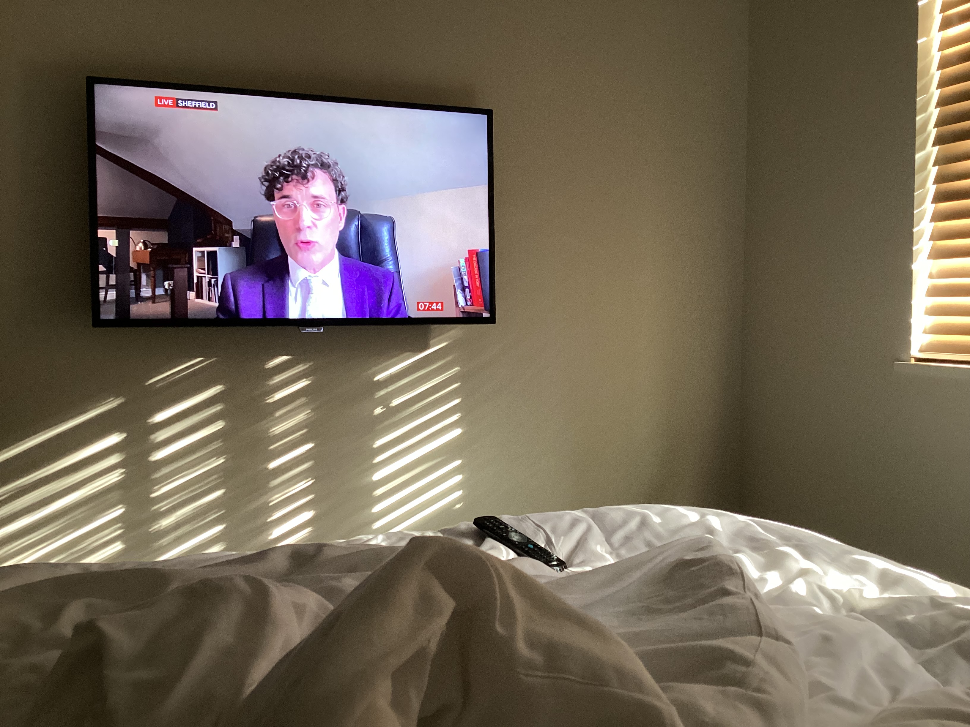
I was watching BBC news while away from home and noticed my eye drawn to what the presenter was saying. It was a psychology Professor in Sheffield interview on BBC.
I noticed how it seemed like he had carefully arranged how his office set up would appear on screen.
When it comes to home office decor themes I discovered that have my preferences.
I don’t like the cold, stark, hard surfaces office look. It might seem futuristic (very 21st century to us Baby-boomers). But those images used to be the standard result of search for office decor or desk style as far back into the early 2000’s. It felt boyish, channeling teenage son lone woolf, building code and gaming in their bedroom and I just couldn’t relate.
To the other extreme I do not like the overtly feminine big frilly country kitchen table, make shift office desk and ramshackle bookshelf disorganised recipe books; propped up iPad against tiny metal pots of lavender look. That was a trend for a while, fitting in with a cottage core or rustic chic.
There is also the girl boss look, I see with some YouTubers which is less chintzy but has neon name signs on white walls and lots of fluffy textures incorporated whether the a macrame wall hanging or stringy plants dangling from shelves or wall (for the backdrop). These are combined with sheepskin covered chairs or armrests. It does give off a dreamy fantasy of what a girl’s world of business could be like (pink fluffy and pretty). It seems to be playing at being in business and those of us women working in corporate or refugees from freelancing know that, it sure ain’t no game. However I get the need to convey the light ethereal fantastical vision contrasting the hard realities of our capitalist system.
Instead, I like a style that that emanates wisdom, elegance and being grounded. The moody and cozy home office style is indeed a theme on Pinterest. When you look at those images you see a bold cohesive comfortable and elegant look.
The cozy home office
Be mindful, though. This look isn’t that shining high polished look that you might find in Dubai, Knightsbridge or Belgravia show houses where our top interior professionals produce. Perhaps akin to what you see in TV show Buying London (Netflix 2024). No, this cozy home office look is somewhere that you and I will feel comfortable doing everyday business because it is as if our friend down the road was the cabinet maker and our interior design pal (old friend from local comprehensive/ grammar school) helped with sourcing of fabrics for the wall and space planning of our furniture.
My work as a corporate trainer/ instructor and coach this week took me for an onsite to our client in their new home in an amazing building. The Arbor Building is in Blackfriars Road in London, UK and it boasts that it is carbon neutral. There are neighbouring buildings and I’m told it is a fossil free development called Bankside Yards which is a major architectural, construction and interiors project feat. I was especially impressed at how beautifully the interiors echoed the sustainability ethos too. See the photos I took below
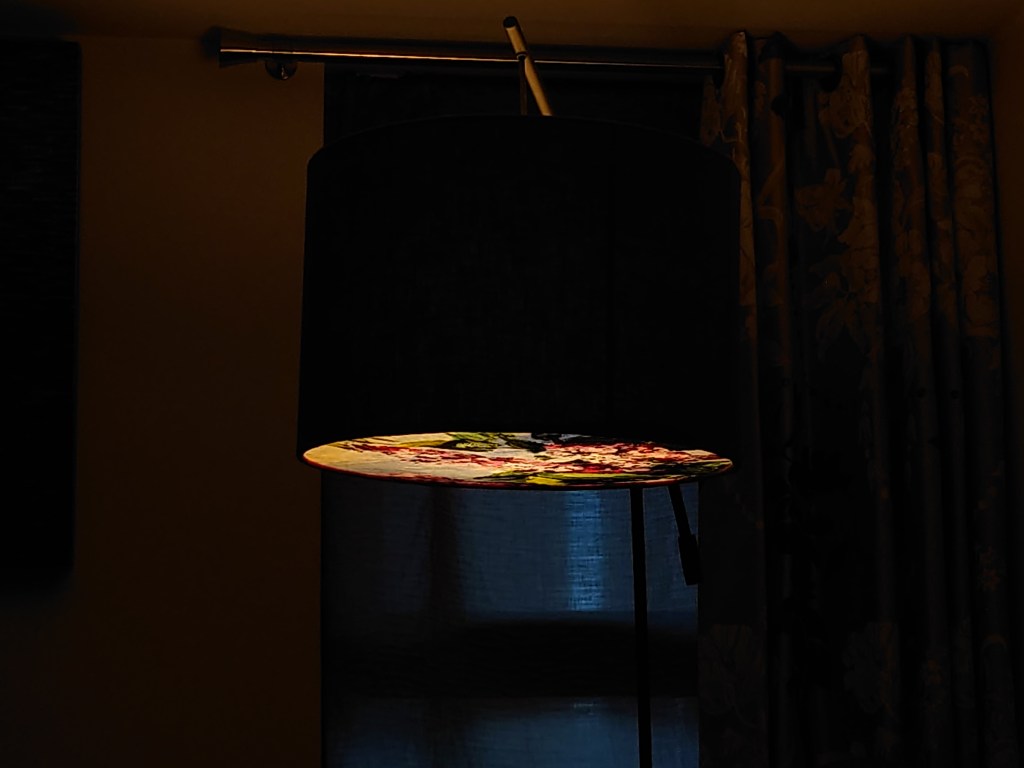
My return to and finding new uses for the small drum lampshades have sparked fresh creativity and renewed interest.
Currently the empire and coolie (more correctly conical) style of lampshade is all the rage. This created my dilemma, as fewer people were buying the drum shades, especially in the small sizes that I make. And I had made a lot to experiment and sharpen my practice of adding more decorative elements to them like the metal upholstery studs as I’ve always loved that classic look.
But, this week I set on a spree to rediscover what the styling options were for the plethora of small 15cm drum lampshades that I have in store (not all are in the online shop).
This blog is about six years old. Since 2018 this space has been the anchor to me keeping my artistic practice going as if some form of curious web based accountability buddy that is silently coaching me along.
I was reading what I originally wrote in the About section. It’s what PR folk would say is ‘the origin story’ and how my blog and art practice started with a couple of tubes of WH Smith paint in a used Charlie Bingham box. Looking back at the images I think my practice has grown and developed.
Below are more photos of artefacts portraying the growth in my art practice. You will see how I have graduated from storing things in a used Charlie Bingham tray to now using seven Haeckles Innovation boxes to store my paints and all kinds of other artistic bits and bobs.
This bloganuary prompt (what makes a good leader?) made me chip in mid week and roll over to Sunday. We are seeing more reports on successful leaders being able to follow a variety of elements within the organisation. Some of the elements include what their followers say is of concern. Leaders today also must follow guidance and advice from a range of stakeholders. Later you will read how important it is that leaders get the very soft and aesthetic elements right too.
Following rules for shelf styling. Clumping elements in threes, fives or sevens, Maximising the layers, using lighting, botanicals, colour and painting tactically to get an inspired feminine industrious vibe.
Zone into wellbeing elements like designer iconic candles and image on a brochure i liked.
This new year allowed me to reflect on how important our home office decor is. I was encouraged about its importance from recently watching the Jay Shetty conversation with Kelly Wearstler (famous interior designer) on You Tube 2nd October 2023. The messages about decor from their talk (Your space can affect your Mood) that I took away were:
The decor of your home needs to stand out and be distinctive to everyone else’s as so much of our interiors looks the same these days
Beautiful interior decor and careful styling can help to uplift your spirit as well as bring peace and calm
Everyone is looking at our backgrounds in online meetings and trying to make sense of who we are
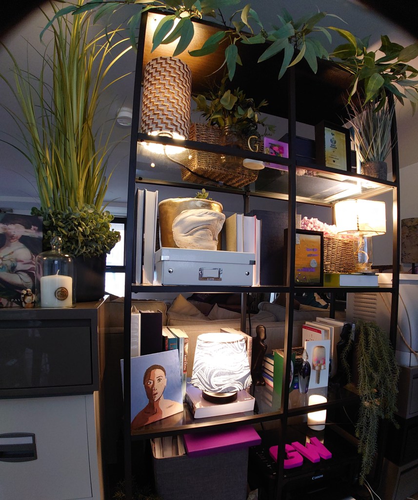
Picture is of my backdrop in the midst of a shelfie makeover. I was trying to get the books and outline aligned to the obligatory smile shape. Lighting of the bookshelf is also vital several reasons which I shall explain in other postings
Some of the other reading I have done say more. Since doing my interior styling course and reading more about shelfies and office decor, I note they all tend to stress the connections that people make about your decor and your identity. Our office decor then is an important piece of personal branding.
I even stumbled across a couple of old organisation behaviour papers that I shall share later in other blogs with you. These research papers point to the important role of artefacts like office decor on shaping and sending messages about organisation culture.
So this year some of my content will provide helpful hints and tips about home office styling that converts your online meeting attendees into people that start icebreaking conversations that are more meaningful.
Drop me a line. If there is anything particular you would like me to cover in my future posts about home office styling, shelfies, backdrops, cultural artefacts in organisations, then please let me know.
My last post of 2023. This balances out the product showcase post on Sunday 17th.
I went on an interior styling intensive course at Chelsea College of Art and Design. It strangely felt like revisiting my old employer twice. Once because I was previously course director of a MA programme at UAL and second because I worked for the Tate one summer in the membership department at the Tate Britain (Millbank) site in the 1990’s. My work at Tate Britain meant that I then went on to do my arts management dissertation comparing Tate and Art institute of Chicago’s membership strategies. Ahh, those were the days. Sorry I digress.
Anyway, last week, the tutor for my interior styling was the amazing Emma who took us through the practical steps of being one of those people who set up the shots for glossy interiors magazines as well as the communication collateral for big brands.


You must be logged in to post a comment.