Abstract Botanicals: Doing Final touches on Artwork

This week I was doing the final varnish and layering on of skins for my artwork while making sense of what the series should be called and the concept behind it.

This first series has taken me over a year to make and there are over 30 mixed media 7” x 5” (178 x 127cm) pieces in the series. I thought of all kinds of names to acknowledge that the pieces express the underlying complexity and tensions I see in organisational life, as I’ve gone about helping workers with changing the corporate landscape. There is an overall name for the series which is abstract botanicals. But..that would be the more appealing acceptable name.

I was encouraged to hear another artist speak of her work conveying the horror and disgust that she experiences with another phenomena. And I realised that this is what my art is conveying too. Thus although this first series shows bright and colourful, botanical patterns of barely recognisable trees, plants and flowers (apparently I’m good at transubstantiation, necessary for abstract work), it sure ain’t pretty.

Continue reading “Abstract Botanicals: Doing Final touches on Artwork”

Ethereal Experiments

I was thinking 🧐 of contrasts and reducing my colour palette recently. Below are a couple of images where I played with new forms and hues. This week I was struck by the work of Mexican artist Sandra del Pilar and British artist Sahara Longe. Both seem to assert figures of humanity in subtle ways. I like how their figures seem to give way to the paint and colour form.

My ink drops play for a ghostly theatre round abstract
Continue reading “Ethereal Experiments”

A Dance Interval Epiphany

As I write ✍️, it is the first interval at Sadlers Wells on Saturday 16th September. We just finished watching the first act of The Alvin Ailey dance Roy’s Joys.

Photo shows. Interval activities, most get an ice cream, some read a book, I start to write a blog post
Continue reading “A Dance Interval Epiphany”

Brushes with colour therapy

Recently I’ve been experimenting with colour intensity and they’re beginning to convey my sense about how we work and contemporary working environments.

Continue reading “Brushes with colour therapy”

Mixed Three Mixed Media Techniques

Short one this week as blogging from my phone as my laptop died and I cannot decide whether to buy an I pad or laptop.

Meanwhile I’m back in the swing of painting and making as I settle into my new 9 to 5 role. It’s amazing what a rested mind will do for art and creativity.

Continue reading “Mixed Three Mixed Media Techniques”

Two Ways & One Why on Art for Home Offices: Modern Master, AI or Lowly Crafter?

This week I had time off from my 9 to 5 and immersed myself in making while fighting a head cold. But determined to stock up for my Etsy shop and develop the idea of a decor solution for people working from home. Realised that being a lowly crafter, artist and maker has advantages for pushing the art envelope further to improve how businesses work.

Continue reading “Two Ways & One Why on Art for Home Offices: Modern Master, AI or Lowly Crafter?”

Nurture Your creativity: advice I would give to my Teenage Self

What advice would you give to your teenage self?

Sometimes I feel I have put off nurturing my creativity for too long. Other times I think it was seen in other parts of my life, like photography and property development.

My recent efforts with oil paints have highlighted the many choices I still must make around my style and my medium of choice.

I shall post an update on this painting when it is completed.

Urban Rooftop Landscape Oil Painting the Making

Why Painting Julian Opie Simplicity is Quite Hard

Our teacher took us through some portraits this week in my art class. The usual classics were there for us to study composition, tone, paint strokes etc. But I was struck by how much I was drawn into Julian Opie’s work.


I’d never seen his work before, and I noticed how my eyes were pulled into pattern finding.


However, I took on the challenge of seeing what my marks and finish might be like if I painted in the style of Julian Opie. I initially thought it might be easy; perhaps I was being lazy, but when I realised the attention to detail demanded in getting the contrasting tones right. Another hurdle I had to surmount was the light and the dark shapes to make sure those correctly gave the impression of light and shade. I discovered in class that trying to do this using oil colour is another difficulty because Julian Opie probably uses acrylics. But never mind, it’s all practice.

Urban winter sunrise inspires blue & yellow landscape in oil

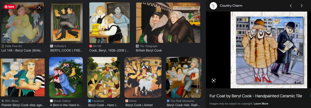
This week I started a landscape. It was based on one of my popular IG posts where we had a spectacular sunrise in London on Monday. From the images below it is clear to see that I am not a photo realist. There is a touch of impressionism, pop art and fantastical influences in my marks. It reminds me of the comical quality of British painter Beryl Cook.

Three-dimensional effect oil painting

This week I joined my oil painting class. It was interesting to join an art class online. We use Padlet to share our work after taking pictures using our phones.
I rather enjoyed experimenting with the different tones of yellow that could be seen and how the shade of the fruit was reflected in some of the shadows, and it was important to convey that in the paintings.
What surprised me was how long it took for the oil paint to dry. But I’m learning how oil painters appreciate the wetness so that you can keep returning and doing this magical chemistry work with the paint.

I noticed the magic as I became mesmerised by the texture, getting colours blended to do the highlights. I was chuffed with the teacher’s comment that she noticed a great 3D effect in my work.

Inspired by exaggerating skin features

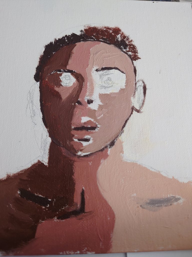
My art classes for drawing and painting ended last week and inspired a new focus in my portrait paintings.

I noticed the extent to which I’m interested in the deeper anatomical elements of the skin. For instance, I noticed I spent a lot more time than others in the class on the intricate details of features such as thread veins and fine lines.

While mixing the different colour skin tones, I got the idea of potentially using my cosmetic chemistry insights and knowledge to develop a series of figurative paintings in future. I will link back to this post when I have done the paintings influenced by insights I gained this week.

Character as the X factor in portrait paintings

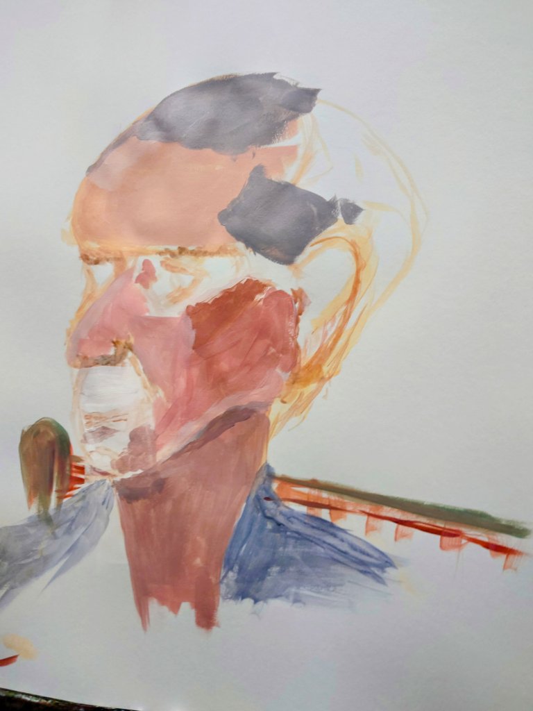
Less beautiful people make the best models. This week I discovered how people with more character in their faces contribute to making the most interesting paintings.

This picture is about a life model who had a very amazing head shape. In this painting, I am halfway through and hope to have finished it next Sunday.

I still have fine hair details to include and I must get the interesting skin tones and textures sorted.

Only time will tell whether I manage to do justice to this man’s interesting face. Whatever the outcome I shall post my result in a future post.

Well-manicured: Perfecting my brush strokes

In an earlier blog, I complained about how I wasn’t happy with the brush strokes on the green sauce boat. https://wordpress.com/post/homeofficecharm.com/2811

Since then I spent some time practising what I said I would do and remembered that inner manicurist in me. Thus I imagined that I was painting a very fussy client’s fingernails. That seems to do the trick because keeping the medium and paints nice and light and thin and applying several thin layers help me to create a lovely glossy transparent look. It appeared to be like the glossy effect of the original sauceboat

Getting gloss medium layers right

Top tip: I might inspect more paintings for the brushstroke work. It never occurred to me how much time and effort should go into getting the painted effect I want right. And thanks to my old career in beauty therapy and those manicures, french polishes I did I can gain confidence in my painting brush stroke techniques.