
I travelled to Margate and stayed at a lovely hotel behind Tate Contemporary.
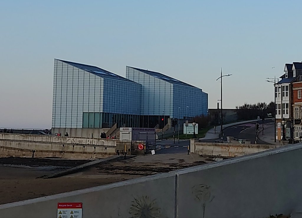
I saw lots of lovely sea views and sunsets. See eight more images below
Continue reading “Margate Photos & Sea-Themed Art in Cosmetic Head Office”One of a Kind Pieces for One of a Kind people

I travelled to Margate and stayed at a lovely hotel behind Tate Contemporary.
I saw lots of lovely sea views and sunsets. See eight more images below
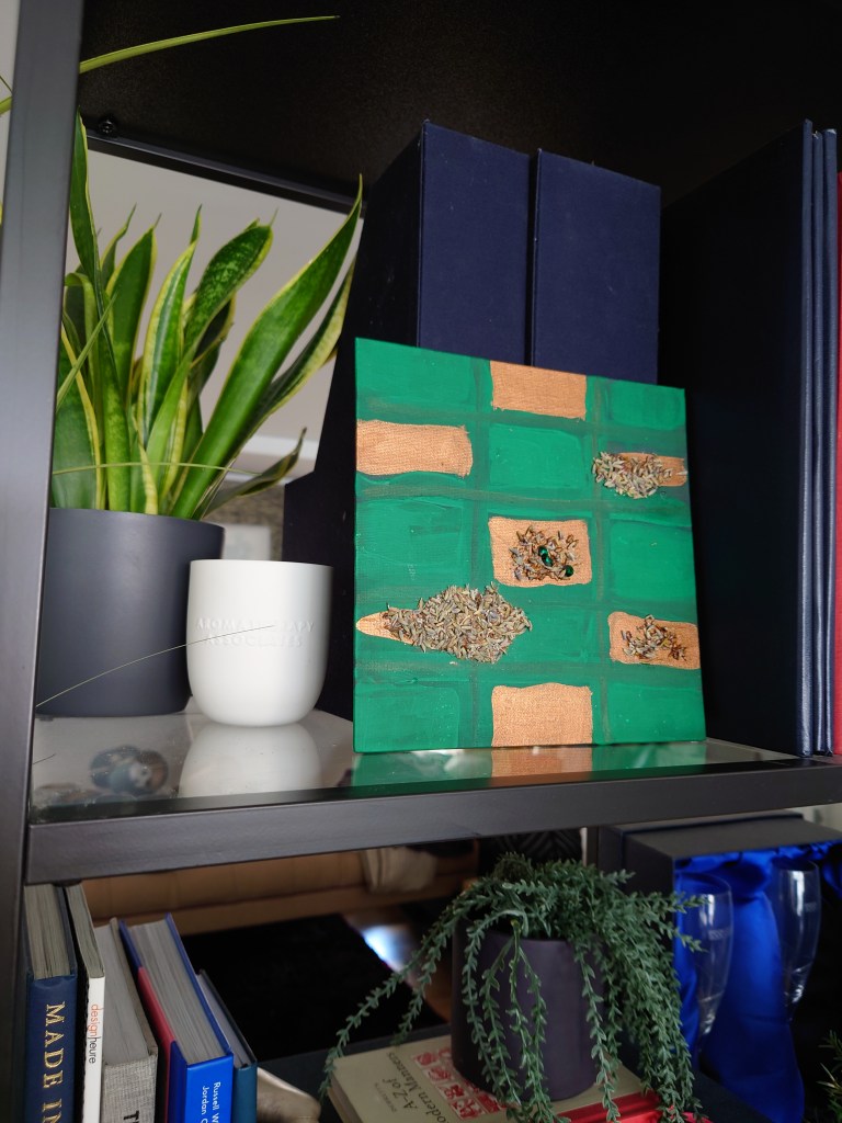
Continue reading “Margate Photos & Sea-Themed Art in Cosmetic Head Office”This week, my post will speak for itself. It is a movie. You can hear me thinking and stumbling on not being able to say Swarovski Crystals. In this video, you will see that I used emerald green Swarovski Crystals for this emerald green and copper checkerboard painting. I like to create paintings like this, so they are ready to prop on a bookshelf without buying a frame. The dried lavender makes the painting smell wonderful.
The link to the story video is here
Below is the after with a view of the painted potion on the shelf of my home office.
We all need something uplifting and sweet-smelling and natural on our bookshelves, don’t we?
I’m creating painted potions. They look good, feel good (because of the textures) and they’re full of ingredients that do you good.
In psychology, it is vital to integrate the self. I feel that the painted potions I create to uplift home office scenes express all of my talents and everything I am good at and love to do.
Some might say it is brut art because I didn’t go to art school (for fine art) and sometimes I use my hands. But I taught in a world-class art school for about 10 years, and I wonder whether those years count. I probably absorbed the artistic rules and principles while chatting to colleagues about student work and the issues in the industry.

In the pictures are painted potions in the process of making. They take several days and weeks to make as I spend hours deciding how to build up the layers, aromas and textures for the desired effect. Close up. I like to use expensive fabric in my painted potions. Some of it is a bit of deconstruction another bit of it is about what they add aesthetically.
The painted potions I have been creating use helpful herbs like lavender, lemon verbena, rose and myrrh. They smell great. The painted potions also give a nod to crystal therapy as I’ve been using citrine, turquoise and other gemstones with their wonderful energy, so far. I have collected lots over the years.
One day I shall tell you about my early years as a therapist who used more fluid an unction, lotions and potions to uplift the spirits of stressed-out clients in spas salons around the world. But for now, let’s admire the notion of painted potions.
Those are the first two ways my experience is integrated within my panted potions.

Next time I shall tell you about the work I’ve been doing around the workplace wellbeing for 10 years and how that has meaning for these painted potions too.
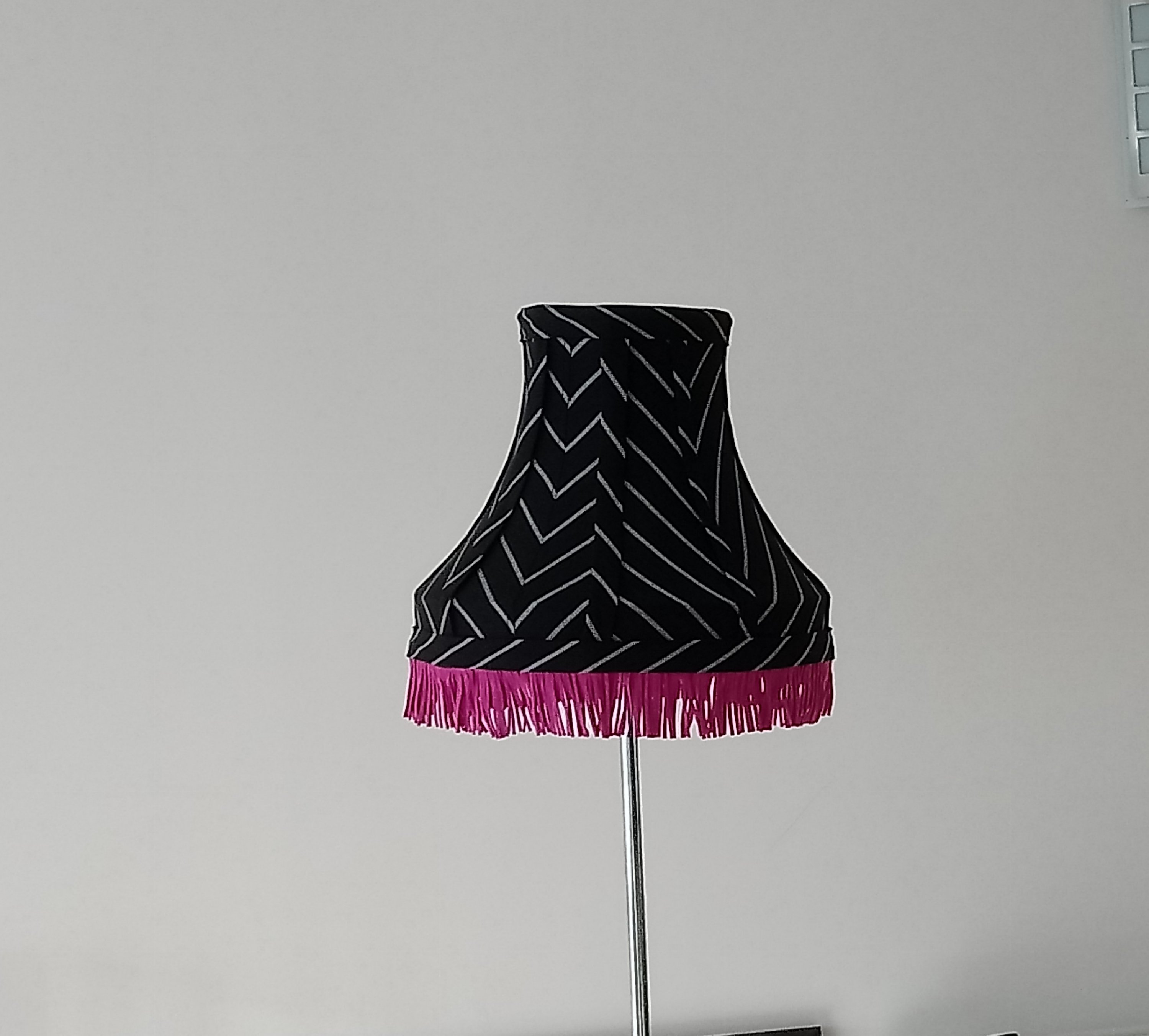
The trend for cloth lampshades is returning. Whether gathered, pleated or stretched over a frame, I love making fabric lampshades.
However, I noticed a dilemma because fabric tends to gather dust and is too delicate for hoovering with the crevis or upholstery attachment. I have to be careful that the home is as dust-free as possible with my asthma. The video below came after a sleepless night of wheezing and being convinced I had COVID-19 at worst or the flu. I then took the lampshade out of the bedroom and washed it under the tap. I was using ordinary gentle soap gently trickling over it. I slept better with no wheezing after that.
After rinsing, I let it drain on a un upturned empty Gu pot. A yoghurt pot will do. And it dripped dried on kitchen towels. The washing process brought the colour of the lampshade up back to its normal sparkly shimmer too.
It’s interesting how dusty old lampshades often end up in landfill. But just giving your old lampshade a wash could be both good for you and the planet.
Home Office Charm 2021

I’ts Christmas and I’m very excited this season to have designed and made these sustainable lampshades. I created them out of recycled upholstery nails and my favourite banana fabric. I mainly designed them to be a modern development to the traditional banker’s lamp. You know the one I mean, they’re the old green glass shade and bulbous brass lamp base that fit traditional victorian inspired office spaces.
These new desk lampshades I love because they are sleek, modern and fit the mid-century trend as well as fit in with traditional spaces as well as those with apartments with a minimalistic vibe. They will be available to buy on my Etsy shop Home Office Charm in early January 2020
I got the inspiration for the form of the new collection of the sustainable lampshade from a traditional handstitched version I did (see image below).

Over the years, I’ve enjoyed its warm golden glow as my bedside table lamp. I knew it would be appealing after hearing the reaction to it while I had it on display at West London interiors showrooms. It was also a favourite shade in my Etsy shop. I had to price it high ( the soft hand-stitched version) as it took me ages to make and it hurt my thumbs along the way. I vowed never to make it again. But I was so enamoured with the warm glow that the shade generated I wanted others to experience it too.
So to make it easier for more people to buy and so that I could make more of them while fitting in with my earth shiny vibe, I created the new collection. I dreamed up the new collection and experimented with these sustainable lampshades at weekends and evenings to fit around my full-time work. I attended courses this year on wiring and batch make them during high days and holidays. I’m so excited to hear what other people think of them when they get listed in my Etsy shop from January 2020.
I wanted to do justice to this standard lamp as its trimming update was long overdue.
It’s one of the pieces that I realise now was over designed. And recently I’d
been wanting to strip down the details always remembering the less is more rule. I continued to be Inspired by smart office dress and my mood board contained images from Pinterest.


Then the finished piece is is what I’m much happier with. Just need to get a new lamp stand. Thinking dark burnt oak or ebony wood.
It’s advent and continuing on from yesterday’s showing of upcycled plastic and fabric turned into glittering lights.http://earthshinearts.com/?p=569
This post helps you to see what they look like all lit up and in site.


Does it look bashful to you? The fantasy flower in this painting appears to be slightly embarrassed.

I wonder why.
Perhaps it is because I used the big bold blusher brush to get all the emotion out to create those swirls.

There is no shame here. Be bold with your crimson connection. Personally I don’t see anything wrong with combining magentaish pink with understated and sultry coral.

Be proud we say!
Here is what the detail of it looks framed.

Shine on with your cool bold emblushered self.
So is it a paradox or irony that I used moisturising masks and serums to help create rough textures in my paintings?

Whatever it is, I rather enjoy indulging in the strangeness of it all.
Some might think to use expensive cosmetics and skin care products is a sin.
Me I’m past caring about the culture of body shaming and image anxieties. So I use my old cosmetics in my paintings. Not to make them beautiful necessarily but to help the earth shine.
What I hate to think is that the excess and waste from the cosmetic industry has the potential of ending up as land fill.
Who knows what harm this could do to the soil, or animals so it’s better we make use of them and keep them on the land surface with us while decorating our houses and homes.

So I experimented last night I’ve been watching all these videos about acrylic pouring . I do like to see the finished results as these amazing sparkly Goldie blingy shiny paintings .

Doing an acrylic pour is one of the items on my activity wish list so I had a go and in this next series of five are the end results.

It’s not strictly an acrylic pour it’s a made up version. Normally a pour needs things like silicon and all kinds of bits added to make the the paint separate so that you get what they call cells.
So for the first one you can see in the next post that I added Environ face mask to it and I added a serum gel something I thought would be making the acrylic separation. But that didn’t work in the same way I would hope.
Instead what I do love is the smooth texture the my upcycled make up brushes make to the painting. Here I used the contour brush. I’m sure I would not be getting such a smoothly sumptuously painted surface if I used ordinary artists paint brushes.
So I did this one when I was chatting to Frances too https://earthshinearts.com/2018/06/29/a-3d-subconscious-painting-blue-and-green-that-never-should-have-been-seen-or-heard/
Words?
I have none. Except that it is upside down but looks better for it, I 🤔.


Surprisingly I painted this one while on the phone to my friend Frances. We were gossiping away and I had her on speakerphone and my hands started drifting over to the paints and brushes. While painting I didn’t want her to know that I was distracted so I was keeping my efforts quiet (but that wasn’t hard to do).
I was surprised that by the end of our conversation I had finished two paintings. The other one is in the next post. When I told her what I had done, she said oh you were multitasking. I later realized I was doing a subconscious painting
I also read that this process is called automatism I was painting using intuition and not letting my conscious thoughts about colour and form get in the way too much. Which is why I was surprised that I did put blue and green together. I saw how the forms of flowers and a definite landscape are starting to came together easily too, which challenged me as I always thought I was better at abstract. I never really wanted to paint flowers, meadows and sky, but that’s what came out when I wasn’t thinking to much about what I was doing. Interesting…
I also, in that stroke of madness cut open a lavender pillow (that I had made for my Etsy shop) and sprinkled the dried lavender content where my subconscious thought it was necessary to be on the painting.
I’m rather pleased with the finished product. It has a 3D side to it and smells of rose petals and lavender as well as looking pretty enough to adorn a cushion pad for a grand conservatory.
I’m starting to think about turning my paintings into home decor items. So a couple days after I finished this I was road testing how this image of flowers and some collected in a golden vessel would feel as a statement cushion cover.
So this is the same canvas that i showed you in my previous post. But I just painted over it. Feeling better about how this one looks.
I did this painting stopped, loved it. took a picture, but sadly it no longer exists. Only in digital form as below.

Why?
The problem is I then started adding to it. I added a bit of black there and a touch of orange here and I suddenly grew to hate it. I created an ugly monster by adding too much and remember my designer friends always saying less is more.
So infuriated was I, I then decided to start again on the same page. So I covered the whole page in white started again and the next blog post will show what happened after I turned the monster into a charming pink acrylic art piece.
So I experimented with recycling some old ESPA Optimal skin pro cleanser as a textured base to this painting. It makes it smell of bergamot or something citrus-y. Wow this has a beautiful fragrance as well as a being a nice looking art work. It also has a touch of Very Berry lip gloss by Jane Iredale in the chocoholic’s range to lend a bit of pigment depth mid range of the painting.
After finishing I stood back and thought how ironic that the optimal skin exfoliate gel mixes interestingly with the acrylic paints helping to add to the painting’s watery feel.
When using it I first thought I was saving the planet (the seas and protecting the lovely marine life- inspired by Blue Planet TV Show) from the scrubs little microscopic balls. Then I remembered that the miniature balls in this skin exfoliation product actually dissolves when worked around and rubbed into skin, they break down because they are soy oil balls.
So the discovery of the virtues of the Espa Pro Cleansing medium means that this skin scrub will come off my up-cycling/ recycling shelf and go back into my bathroom.
However I’m keeping my eyes open for those other offending micro beaded face scrubs. Why? Well because I need them to add to the texture of my future paintings while I do my bit in saving our beautiful blue planet.
On a final note I like how the blue skye in the painting is close in tone to the deep blue of our planet that we all love so much.
This abstract painting I created using a bit of old Jane Irridale lip-gloss as they have great pigments (not a lot of people know that). I love the colours in this one. I worked hard to get the right balance of textures, colours and a bit of gold bling.
The tools I used include pallet knife and surprisingly found that a lip brush as well as eye shadow fan brush was great for blending lines in. How intriguing that the Jane Iridale Chocoholics pack Chilli pepper pinky pigment lip gloss actualy adds some striking depth to the painting and helps to make this dark foreboding river scene look a bit more appealing.
My new tools are very fitting for the new paint mediums I’m using. I’m so glad I’ve found a way to upcycle old cosmetics as well as find a new use for the tools of my old very distant trade.
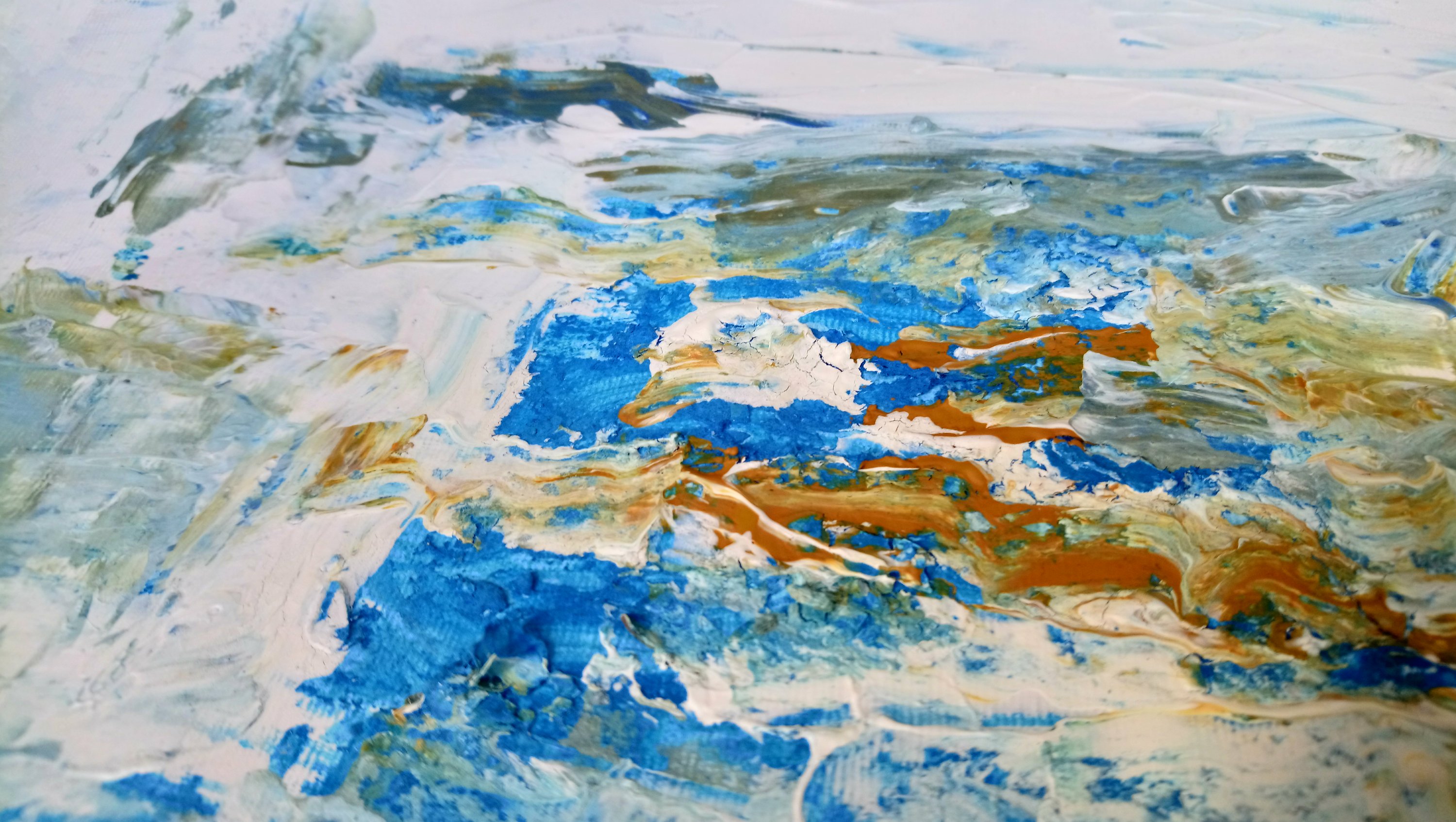
This painting I used powdered treatment face mask and moisturizing gel that I don’t use to help give some texture to the rough seas of this nautical themed abstract. It reminds me of a buoy, lifeboat and choppy seas.
I love this one I’ll let it speak for itself.
One for you to interpret. I was at first lost for words. Initially I liked the combination of reds greens, yellows and grey. Then I decided it looks like a cluster of spirited trees beside a lake.

The trees look like they are giving off their warm aura and in this fantasy landscape it is very possible that their aura is visible. In eastern medicine, the colour of the root chakra is red -Chakra – Muladhara and that is about safety, survival, grounding. According to http://www.chakras.info/chakra-colors/
How nicely surprising that my fantasy landscape lake trees are grounding or at least signify being grounded.
I’m influenced by Japanese paintings, I guess, by the look of these two. I do like doing subtle brush strokes and for this I mostly used the socket filler brush and a fan shadow brush.
Continuing my experiments with a painted grey background this fantasy landscape. I have no other words for it except that the marks are mesmerizing remind me of fine gold jewel like trees and a turquoise blue martian (perhaps) moon.
When looking at this its surprisingly easy to bring more images to from your imagination as you try to fathom out the landscape that might exist in the hinterland.
I feel I’m getting better at adding vertical and horizontal lines which is a real departure from the usual sweep curves across the page.
I’m calling this collection the fantasy acrylic landscape.
From an overnight thought of contemplating what painting would I have if I had a metal tarrarium and industrial chic furniture with rose gold metal legs.
So I created a collection of seven pieces within this theme. I was surprised to see how each piece appears to fit together nicely. Bit like the kind of wallpaper you’d see on 60 minute makeover.
So I had this idea to do a painting with just blue shades. In fact I wrote this bit before I started finding the colors.
The other idea I had was to do one in lime as Elle Decoration said that lime is the colour of the season so here goes.
So these are done with a mixture of acrylics and fabric paints and I used some acrylic pouring technique in the center to get a mottled look with some of the golds and greens.

These verticals, I think are curious brush strokes. And I am starting to call these pieces the Missoni influence. Since 1980’s I’ve loved the Italian knitwear designer’s collection.

I have to admit that Missoni does come second to my love of everything designers Guild or maybe they come third if I consider Andrew Martin. More on that in a later post.
You know I once bought a lot of Missoni fabric (of an amount I could afford) from the Shepherd’s Bush Fabric shop where all the fashion students go to buy for their cloth for their end of year shows.
Love their new collection for 2018 HERE
I digress. So here is the rest.
So I had a go at doing an abstract landscape. I imagined a foreground sky and middle ground all based on my imagination. No I wasn’t in a poppy field but I think i was conjuring deep pink red tulips and buds of poppies. I’m still undecided about this one. Though I’m a bit pleased I did something that resembles a flower slightly. I was encouraged recently when watched a channel 4 ( or was it a more four) program that spoke of American painters of the 19th and early 20th century. Watching their work I began to feel comforted to see that my brushstrokes were similar to what has gone before there. Sorry I cant remember the artist’s name. It will come……
Anyway looking at this work, I think I still need to learn about making finer marks for stems and the earth. Nevertheless, let me know what you think.
For me the color purple will rule all the time. So I did this work based on my pallet of pinks.
So I did this study in various shades of brown. It’s not really an on trend color but i was at the end of a painting spree and had quite a few shades left over.
When i took pictures of the painting and situated them in various parts of the the house I noticed how much it reminded me of African safari with a 70’s vibe. Again not a look that is on trend at the moment, unless you include the appetite for mid century. However I’m rather proud of this. It’s feels like the neatest and more balanced of my works so far.
This time last week, I brought this painting home. You see I had joined a deep art work project. I think the philosophy is about the functionality of art. But some of them described it as going deep into the painting and just switching off from the outside world, no distractions, they said and not phones. I kind of took that as my signal not to chat and paint at the same time. So I went deep ( you could say) into creating this with my fabric paints and some acrylics i had to hand like true red (which looks like magenta) and gold metallic.

When it can time to pass around the Minstrals (chocolate button sweets for sharing) then it seems were were able then come out focus to talk.
Many said they liked this. I rather like it too.
You see the day before I had learned how to do the special I painting method and how to put the colors together so that there was balance and an appealing composition. So far my learning about doing acrylic art paintings seems to be working. I think this is my favorite of all the pieces I have done so far.
Next time I shall use less fabric paint and more acrylic. But the mix is interesting as fabric paint gives a flat matt finish which helps the gloss of the acrylic and metallic gold stand out.
So this week i used some fabric to create a mixed media piece. I was being lazy and I had just watched a video on doing abstract art and the rule of thirds so I experimented with this rule and added some very expensive 100 percent purse wool chalk stripe suiting. I also added a tiny pit of fur that was passed down to me from a friend that got it from a vintage clothes shop in Nottinghill.

Not sure yet what it says. I guess I was experimenting with circles. And where I have incorporated the pinstripe fabric into the painting with pain it reminds me of braces. The red dots look like buttons an all that bling looks rather vulgar to me. It smacks of the ostentatious and excess and commerce for some reason. Perhaps the circles represent coins, money perhaps the red symbolizes blood I don’t know. I’ll have a think….
The up-cycled ( re used) easel came with two pots of fabric paints and I used them to experiment in some deep art work this week. Working among a group of other artists, I started this project on Tuesday and finished it off today (Sunday). The fabric paints on paper have a rather washed out look. But the black, premium red and gold acrylic give it the texture that I much prefer to see in paintings.
So note to self about using fabric paints only on fabric and not on paintings for walls and interior decoration.

I think it the painting looks like some post apocalyptic flower trying to burst through into a beautiful bloom. I wonder if it will make it.
Nevertheless, I am rather glad that I got the easel and the fabric paints from the show flat of the apartment block. Who knows where they might have ended up.


You must be logged in to post a comment.