Cultured Complexities Series Released

Welcome to this months’s edition of the newsletter. The cultured complexities series is being released and listed on Etsy this week. Artwork is ready to purchase.

The Cultured Complexities series is of about 30 mixed media painting made small enough for shelf display. It is a series that took me one year to complete as I started April 2023. Below are images that show the processes.

Continue reading “Cultured Complexities Series Released”

Urban winter sunrise inspires blue & yellow landscape in oil

This week I started a landscape. It was based on one of my popular IG posts where we had a spectacular sunrise in London on Monday. From the images below it is clear to see that I am not a photo realist. There is a touch of impressionism, pop art and fantastical influences in my marks. It reminds me of the comical quality of British painter Beryl Cook.

Maximal shape and colour time

This week I experimented with the new smart French bell-shaped lampshades in gorgeous vibrant colours and curious textures. These new pieces are a start of an impressive new collection. More cool in situ images of these lampshades will be on the Wednesday posts as they will be at the product showcase. I’m excited to share items in the product showcase posts every two weeks. And you can find the product showcase tab under its little tab on the website menu here.Click to find the product showcase

I’ve been immersed in producing decor items lately. It will be wonderful to finally share my most recent efforts with more people online as I list items for sale in my Etsy shop and insert fabulous images here. Below is a little taster of items coming up in the product showcase soon.

Burlap lampshade made of on-trend hessian. Coming to the shop soon.

See you next time.

Spotted: Lux Nail Head at F&M’s High Tea

I had the famous High tea at Fortnum and Mason’s to celebrate my big birthday this week. I was delighted to see in their 2012 refurbished Diamond Jubliee Team rooms that the chairs had lovely little strips of decorative nails.

The shop’s website tells us that the 300-year-old space (where the world comes for Afternoon Tea- when in London) was originally the Fortnum’s family apartment and the shop’s interior decor section before its refurbishment in 2012. So I felt really in good company. The significance came together when I spotted the clever use of nailhead trim, adding some classic lux detail to their beautiful teal upholstery.

Above are some examples of the coordinated tableware and beautiful tablescape that comes with High Tea.

What is the difference between English High Tea and Afternoon Tea?

The images above show how they gave us a nice portion of protein at my High Tea. I had a lobster omelette, and others had fish and strips of steak on light vegetables. It made a nice change from the sandwiches you get at Afternoon Tea. There, I learned the difference between English High Tea and Afternoon Tea.

Result of my Recent Creative Pilgrimage

The Journey

I took a short break to St Ives in Cornwall last week. The journey was full of adventures for many reasons. It was my first big trip after two years of lockdown. I had to practice being less anxious about social spaces.

My longest train journey yet: It takes 5 hours to travel from London to St Ives

Purpose

It was meant to be a creative pilgrimage as I was visiting Tate St Ives and Barbara Hepworth museum

Finding affinity

I was surprised to feel less alone with my design style because the hotel room decor was expressive of the cosey smart effect you get when combining pinstripe fabric with nailhead trim as I do in my lampshade collections.

Finding Inspiration

A picture of Barbara Hepworth in her studio. The museum is her studio, interestingly. I was impressed that she might have had lots of parties there. Downstairs is the kitchen and upstairs is the workroom. Similar to my set-up. I felt encouraged.

A chance to practice

The whole experience was affirming for me. I feel that I might be on the right track, after all.

There you are! Blue abstract landscape digital

I was inspired by Andy Morris’s Mysty mountain which produced this painting below. The Abstract Landscape course has been on my wish list and I hadn’t got around to watching the full course yet after watching the preview.

Then because my PC has died and I’m saving for a new imac and in homage to my emerging creative talents, I was left with just my phone to tinker around the edge of the painting to make it look more presentable.

So using the phone’s digital capabilities I was pleased to discover another dimension.

A mysterious path has been created instead.

Glamorous ghost on mysterious Moor path by Earthshinearts.com

The poor man’s pour in sky and sea blue

NoFor these painting ideas I used the pour method. But I have to admit it was the poor man’s pour because I haven’t got silicone and all kinds of oils to create cells .

So instead I used water and just wind as I gracefuly waved the painting around so that the liquid paint would just move languidly along the surface of the paper.

During this mesmerising time I watched as the trickles move down the sheet. On noticing the decorative dynamic I would be wondering what shapes they would make.

But hey presto the colours of sky blue and sea blue themselves nicely unite to form one of those popular wave scenes that we often see in acrylic pours.

I also did a bit of digital modification of my painting. See below. You see I discovered that with my new fangled phone I’m able to create artworks albeit basic but digital artworks just by using my thumb and finger and the different kinds of tools that the drawing app provides. I was pleasantly surprised to see that I was able to create more original work by blending my traditional acrylic painting skills with the more modern digital art technology that you can find on your mobile phone. It has helped me capture the drama of stormy seas and how vulnerable I would feel in a boat. I guess it is a nod to the need to respect the sea. These sea waters can look beautiful while being dangerous at the same time.

Blue: Rough sea high textured painting using mask and serum ironically

So is it a paradox or irony that I used moisturising masks and serums to help create rough textures in my paintings?

Painting using mask and serums by earthshinearts.com

Whatever it is, I rather enjoy indulging in the strangeness of it all.

Some might think to use expensive cosmetics and skin care products is a sin.

Me I’m past caring about the culture of body shaming and image anxieties. So I use my old cosmetics in my paintings. Not to make them beautiful necessarily but to help the earth shine.

What I hate to think is that the excess and waste from the cosmetic industry has the potential of ending up as land fill.

Who knows what harm this could do to the soil, or animals so it’s better we make use of them and keep them on the land surface with us while decorating our houses and homes.

Blue and green 3D subconscious painting that never should have been seen or heard

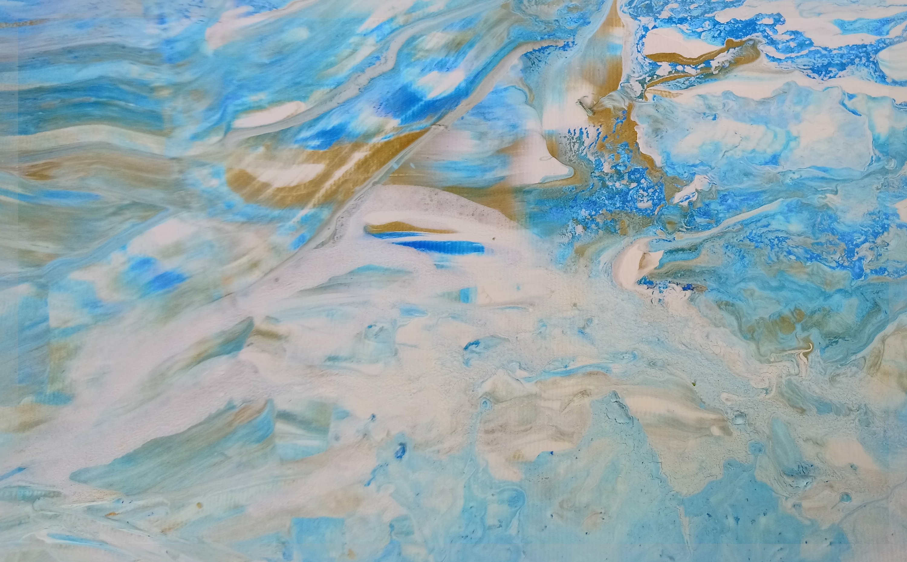
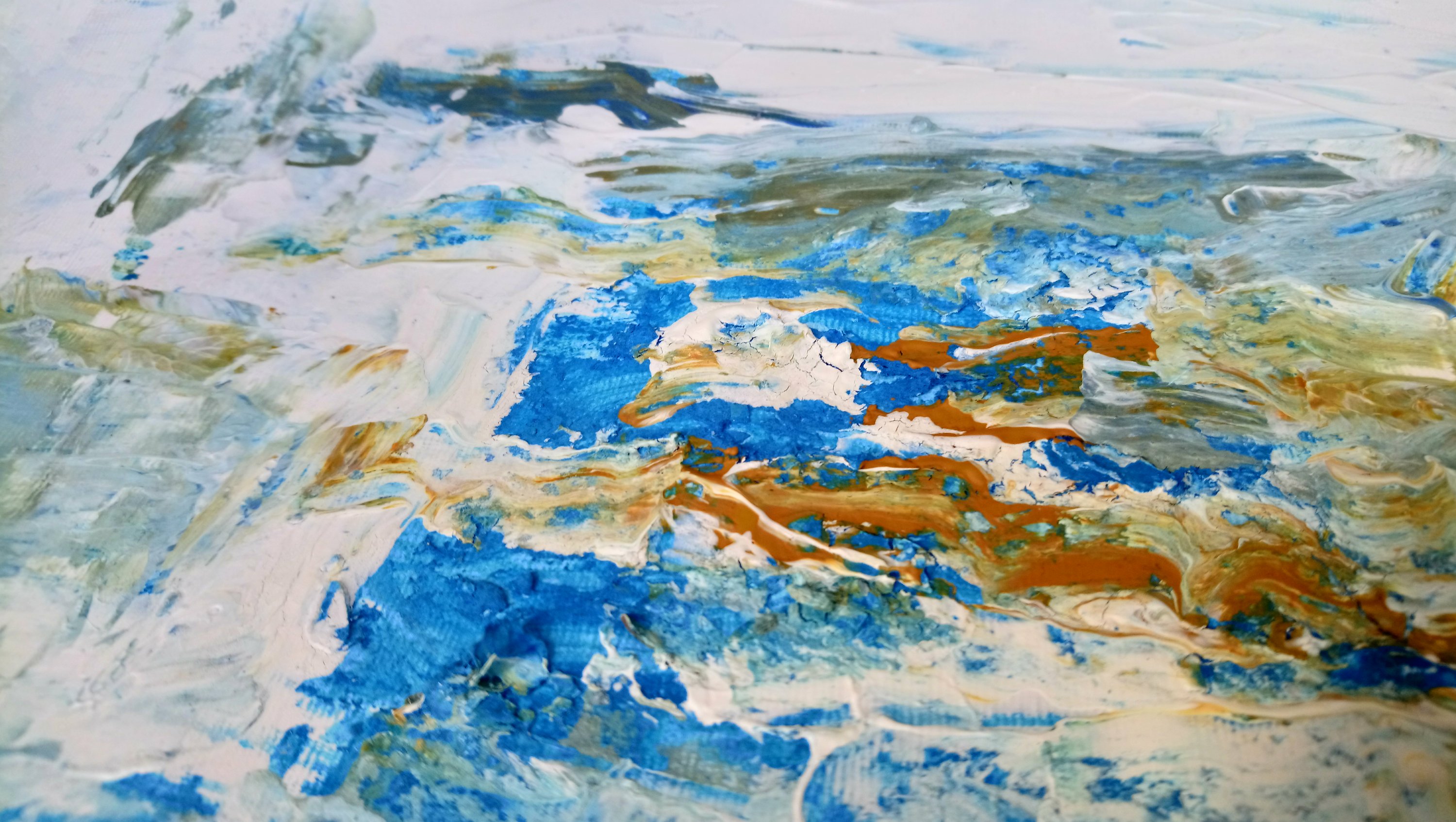
Surprisingly I painted this one while on the phone to my friend Frances. We were gossiping away and I had her on speakerphone and my hands started drifting over to the paints and brushes. While painting I didn’t want her to know that I was distracted so I was keeping my efforts quiet (but that wasn’t hard to do).

I was surprised that by the end of our conversation I had finished two paintings. The other one is in the next post. When I told her what I had done, she said oh you were multitasking.  I later realized I was doing a subconscious painting  

I also read that this process is called automatism I was painting using intuition and not letting my conscious thoughts about colour and form get in the way too much. Which is why  I was surprised that I did put blue and green together. I saw how the forms of flowers and a definite landscape are starting to came together easily too, which challenged me as I always thought I was better at abstract. I never really wanted to paint flowers, meadows and sky, but that’s what came out when I wasn’t thinking to much about what I was doing. Interesting…

I also, in that stroke of madness cut open a lavender pillow (that I had made for my Etsy shop) and sprinkled the dried lavender content where my subconscious thought it was necessary to be on the painting.

I’m rather pleased with the finished product. It has a 3D side to it and smells of rose petals and lavender as well as looking pretty enough to adorn a cushion pad for a grand conservatory.

I’m starting to think about turning my paintings into home decor items. So a couple days after I finished this I was road testing how this image of flowers and some collected in a golden vessel would feel as a statement cushion cover.


Blue Planet Saver Idea: Using ESPA Optimal Skin Pro cleanser granules in teal, gold and black acrylic abstract painting

So I experimented with recycling some old ESPA Optimal skin pro cleanser as a textured base to this painting. It makes it smell of bergamot or something citrus-y.  Wow this has a beautiful fragrance as well as a being a nice looking art work. It also has a touch of Very Berry lip gloss by Jane Iredale in the chocoholic’s range to lend a bit of pigment depth mid range of the painting.

After finishing I stood back and thought how ironic that the optimal skin exfoliate gel mixes interestingly with the acrylic paints helping to add to the painting’s watery feel.

When using it I first thought I was saving the planet (the seas and protecting the lovely marine life- inspired by Blue Planet TV Show) from the scrubs little microscopic balls. Then I remembered that the miniature balls in this skin exfoliation product actually dissolves when worked around and rubbed into skin, they break down because they are soy oil balls.

So the discovery of the virtues of the Espa Pro Cleansing medium means that this skin scrub will come off my up-cycling/ recycling shelf and go back into my bathroom.

However I’m keeping my eyes open for those other offending micro beaded face scrubs. Why? Well because I need them to add to the texture of my future paintings while I do my bit in saving our beautiful blue planet.

On a final note I like how the blue skye in the painting is close in tone to the deep blue of our planet that we all love so much.

Chili pepper lip-gloss pink helps create a black smokey river acrylic painting

This abstract painting I created using a bit of old Jane Irridale lip-gloss as they have great pigments (not a lot of people know that). I love the colours in this one. I worked hard to get the right balance of textures, colours and a bit of gold bling.

The tools I used include pallet knife and surprisingly found that a lip brush as well as eye shadow fan brush was great for blending lines in. How intriguing that the Jane Iridale Chocoholics pack Chilli pepper pinky pigment lip gloss actualy adds some striking depth to the painting and helps to make this dark foreboding river  scene look a bit more appealing.

My new tools are very fitting for the new paint mediums I’m using.  I’m so glad I’ve found a way to upcycle old cosmetics as well as find a new use for the tools of my old very distant trade.

Dark grey, lime, turquoise fantasy landscape acrylic painting

Continuing my experiments with a painted grey background this fantasy landscape. I have no other words for it except that the marks are mesmerizing remind me of fine gold jewel like trees and a turquoise blue martian (perhaps) moon.

When looking at this its surprisingly easy to bring more images to from your imagination as you try to fathom out the landscape that might exist in the hinterland.


I feel I’m getting better at adding vertical and horizontal lines which is a real departure from the usual sweep curves across the page.

A study in blue and lime: Acrylic painting

So I had this idea to do a painting with just blue shades. In fact I wrote this bit before I started finding the colors.

The other idea I had was to do one in lime as Elle Decoration said that lime is the colour of the season so here goes.

So these are done with a mixture of acrylics and fabric paints and I used some acrylic pouring technique in the center to get a mottled look with some of the golds and greens.

IMG_9443
Using mascara brush and pouring technique with gold and blue acrylic to get some interesting marks. Created by Earth Shine Arts


Fan Brush Stroke Painting II: Inspired by M

These verticals, I think are curious brush strokes. And I am starting to call these pieces the Missoni influence. Since 1980’s I’ve loved the Italian knitwear designer’s collection.


Ottavio Missoni By Giuseppe Pino (Kind concession of Missoni S.p.A.) [CC BY-SA 3.0 (https://creativecommons.org/licenses/by-sa/3.0)%5D, via Wikimedia Commons

I have to admit that Missoni does come second to my love of everything designers Guild or maybe they come third if I consider Andrew Martin. More on that in a later post.

You know I once bought a lot of Missoni fabric (of an amount I could afford) from the Shepherd’s Bush Fabric shop where all the fashion students go to buy for their cloth for their end of year shows.

Love their new collection for 2018 HERE

I digress. So here is the rest.


Maddening mix media

So this week i used some fabric to create a mixed media piece. I was being lazy and I had just watched a video on doing abstract art and the rule of thirds so I experimented with this rule and added some very expensive 100 percent purse wool chalk stripe suiting. I also added a tiny pit of fur that was passed down to me from a friend that got it from a vintage clothes shop in Nottinghill.

Mad mink mixed media painting gold and blue.jpg

Not sure yet what it says. I guess I was experimenting with circles. And where I have incorporated the pinstripe fabric into the painting with pain it reminds me of braces. The red dots look like buttons an all that bling looks rather vulgar to me. It smacks of the ostentatious and excess and commerce for some reason. Perhaps the circles represent coins, money perhaps the red symbolizes blood I don’t know. I’ll have a think….


The Painting Journey Begins

Thanks for joining me!

This is my first work. I was inspired by the colors of my sofa and cushions.  You might call it cliche but I did actually want a painting that matched my sofa.

So I did this  one. It’s a rehearsal to a bigger 2m version I shall do when I get a bit more confident. I up-cycled an 17 piece makeup brush kit to help create the minute marks in this painting. I used the blusher brush and eye shadow fan brush to provide the lighter strokes.  I also used the wooden trays of the gourmet takeaway brand. And the rest of the dish makes for a usable paint pallet.


Today I did a course that showed us how to plan our work and do something called Noting.

But I’m rather pleased with this one as it is picks up the sofa colors nicely so I think  it has been a success.