I realised how much I appreciate some classical English stately home decor from my trip to Ashridge House in Hertfordshire recently. I was surprised as I thought a lot of my style comes from my Caribbean heritage and London urban living and my immersion in corporate training.
But I discovered how much I love the juxtaposition of earthy stone tones with the bling of gold frames that can be found in some English Stately homes like Ashridge.
The amazing thing about Ashridge house is that it used to be where Henry the VIII and Elizabeth 1st lived. It is also famous for various films like Beauty and the Beast, Malificent, killing Eve and More.
It was surprising to realise how much of my art is influenced by the mid-century decor, 60’s culture and Mondrain.
Inspo 1: Wednesday Dances Watusi 1964
This year’s memorable Christmas activity was watching the Netflix Wednesday series back to back. Watching it on so many levels was amazing as it helped me recall the 1960s version of the Adams family, which I enjoyed revisiting over the holidays. As a dance enthusiast, I was keen to find my favourite clip of Wednesday Adam’s original dance done by actor Lisa Loring.
My view watching Wednesday Lisa Loring’s lesser-seen dancing clip
Episode: Lurch, the Teenage Idol (1965) Adams Family Season 1, Episode 33- Director Sidney Lanfield Wednesday (played by Lisa Loring) dances to Lurch’s new pop song at 5 min 55 seconds. This snip is a different version of the more commonly found clip. The above is my favourite and is often shown in goth GIFs and David Bowie memes without the original soundtrack.
Seeing the clip was joyful. It reminded me of watching it the first time with my younger sister and being closer to Lisa Loring’s age. At the time, my sister danced a lot like her, and whenever I see clips of Lisa Loring’s Wednesday dance, it brings back happy memories of being that young in the 60s. I’m sure that’s one of the reasons why the current 2022 production of Wednesday on Netflix is doing so well. You see. The new version of the viral Wednesday dance might be boosted because it is enjoying the nostalgic visits from the Baby Boomers and Generation X, who remember the original dance scenes being so poignant for them at the time. I wonder if they have thought of that.
Interestingly, my friend Janet said she had been watching the Wednesday show with her 13-year-old daughter and younger son, She said it brought the family lots of joy. It made us smile as it shows how the Netflix series has mass appeal. Janet and I further discussed (wearing our education experts’ hats on) how the subtext of the 2022 and the original 1964 versions of these shows seem to share a positive narrative about neurodiversity and the tolerance, acceptance and management of difference. I didn’t watch the ’90s version so cannot comment further on that.
Most importantly for my art practice, the research I did and revisiting of the old Adam’s family clips have helped, this week. The images below show how I was influenced to create monochromatic elements and embrace the mid-century look I had created. The crisp white of Wednesday’s dress collar and its oblique triangle shapes is particularly meaningful and is expressed in my paintings this week (on reflection).
However, further analysis of the underpinnings of my painting makes me think of another of my 1960’s cultural influencers—the artist Mondrain.
Inspo 2: Mondrain’s mid-century vibe
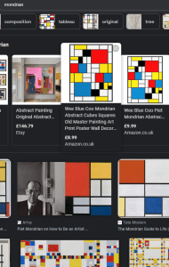
If you were to research contemporary abstract art, you get blogs and google results showing what contemporary abstract art is.
However, I’ve been practising my experimentation with contemporary abstract art. I’ve long been influenced by the artist Mondrian. I like his crisp lines, clear shapes and simple play with colours. Some of my earlier works were too much on the simple side, akin to Mondrain’s primary-coloured iconic squares and grids. When I was 15 and doing my Art A level I recall my art teacher remarking how some of my work was like Mondrain. Below is a snap of some textile designs I created possibly influenced by Mondrian’s works. But at 15 I was probably more influenced by others that were influenced. It wasn’t until my art teacher saw my work that he introduced the artists to me. See below
Screen grab of Google search Mondrain
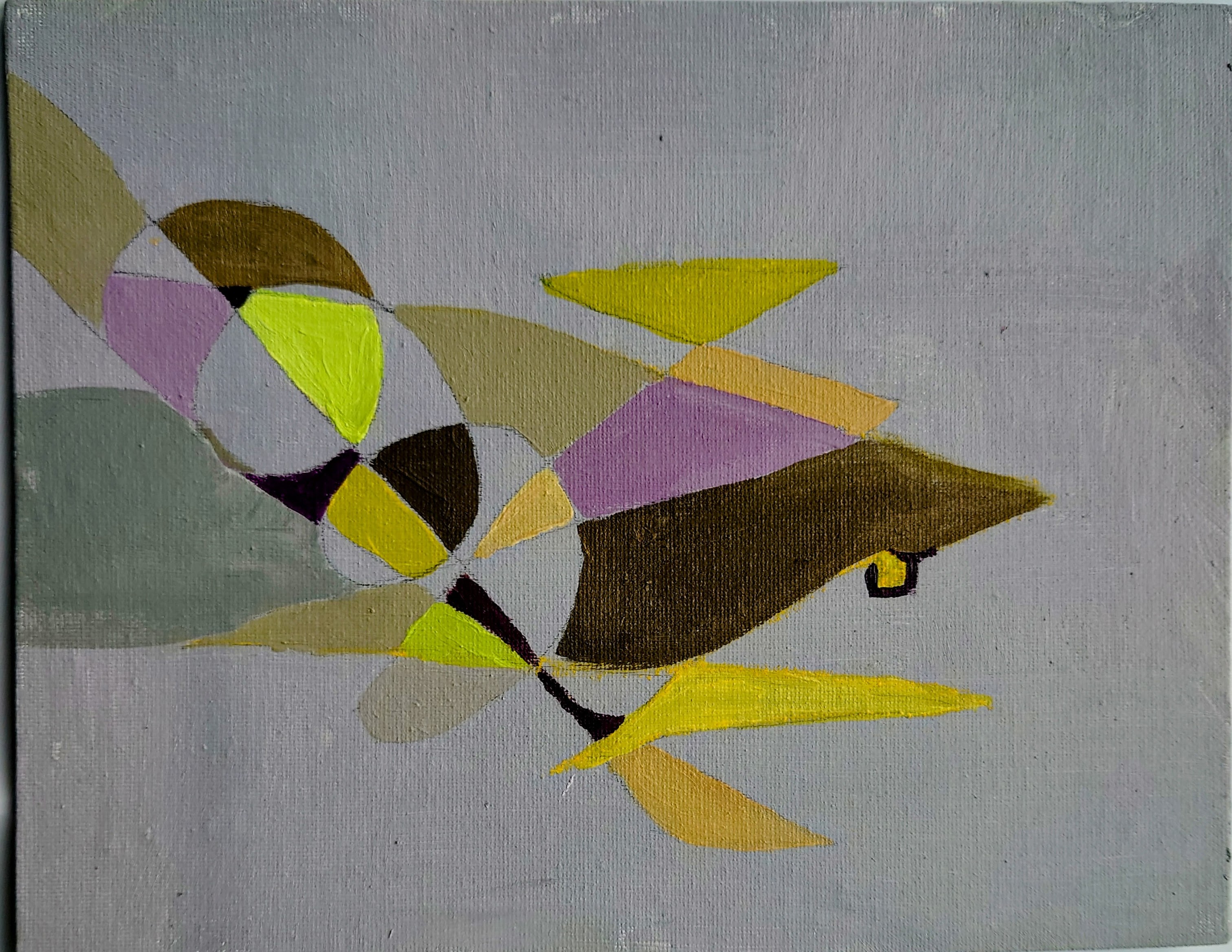
My 45 year old textile design influenced by Mondrain
Recently, I’ve started a series of abstract shapes on a strong colour-drenched background with contrasting curvy forms and deep consideration of using analogous or complementary colours.
My contemporary abstract art inspired by 60’s cultural icons. Acrylic on canvas boardMy contemporary abstract art inspired by 60’s cultural icons. Acrylic on canvas board. My contemporary abstract art inspired by 60’s cultural icons. Acrylic on canvas board
I love the combination of sharp and curvey shapes I created. These works show more of the training and reflections I have done recently. I’m looking forward to completing this series and listing them in the shop in the new year by 3rd January 2023. Being able to reflect on my 1960s cultural influences for my paintings is helping to give meaning and express the significance of my work. I never thought I was a mid-century enthusiast, but it seems to be leaking out. My age means that the 1960s, and 1970s did inform my aesthetic principles, perhaps more than I was prepared to admit. But I am happy to do so now. I guess my retrospective journey has led to some fantastical pieces.
Thank you for following my blog thus far. I wish you a happy new year and all the best for 2023. I look forward to interacting with you further down the road.
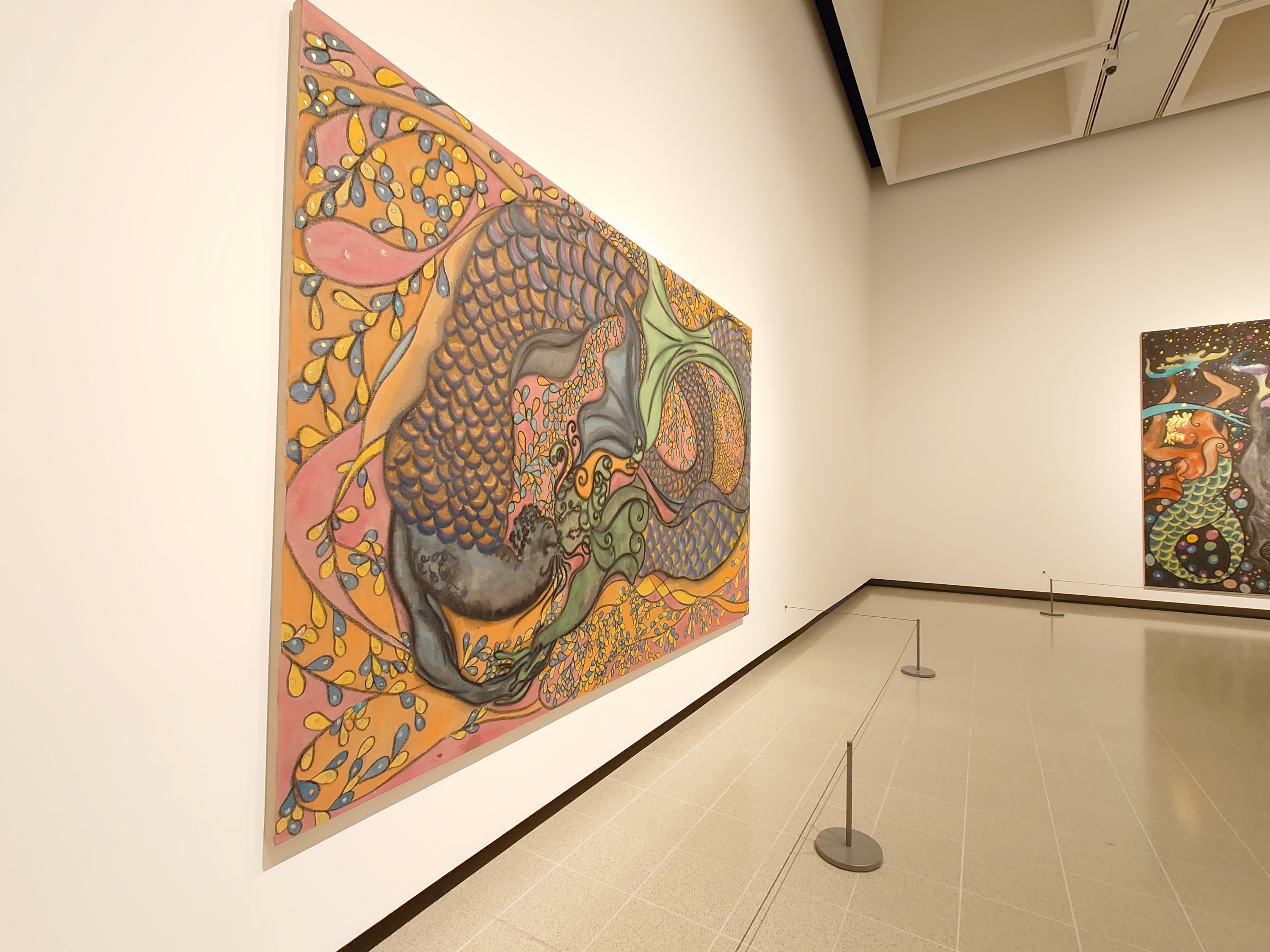
I saw the In the Black Fantastic exhibit at the Haywood Gallery. A big show of artists from the African Diaspora. Including Chriss Ofili, Nick Cave, Hew, Locke and others. Below is the full list of artists at the In the Black Fantastic
Artists at In The Black Fantastic
Wangechi Muto
Lina Iris Viktor
Hew Locke
Nick Cave
Tabita Rezaire
Rashaad Newsome
Ellen Gallagher
Chris Ofili
Cauleen Smith
Kara Walker
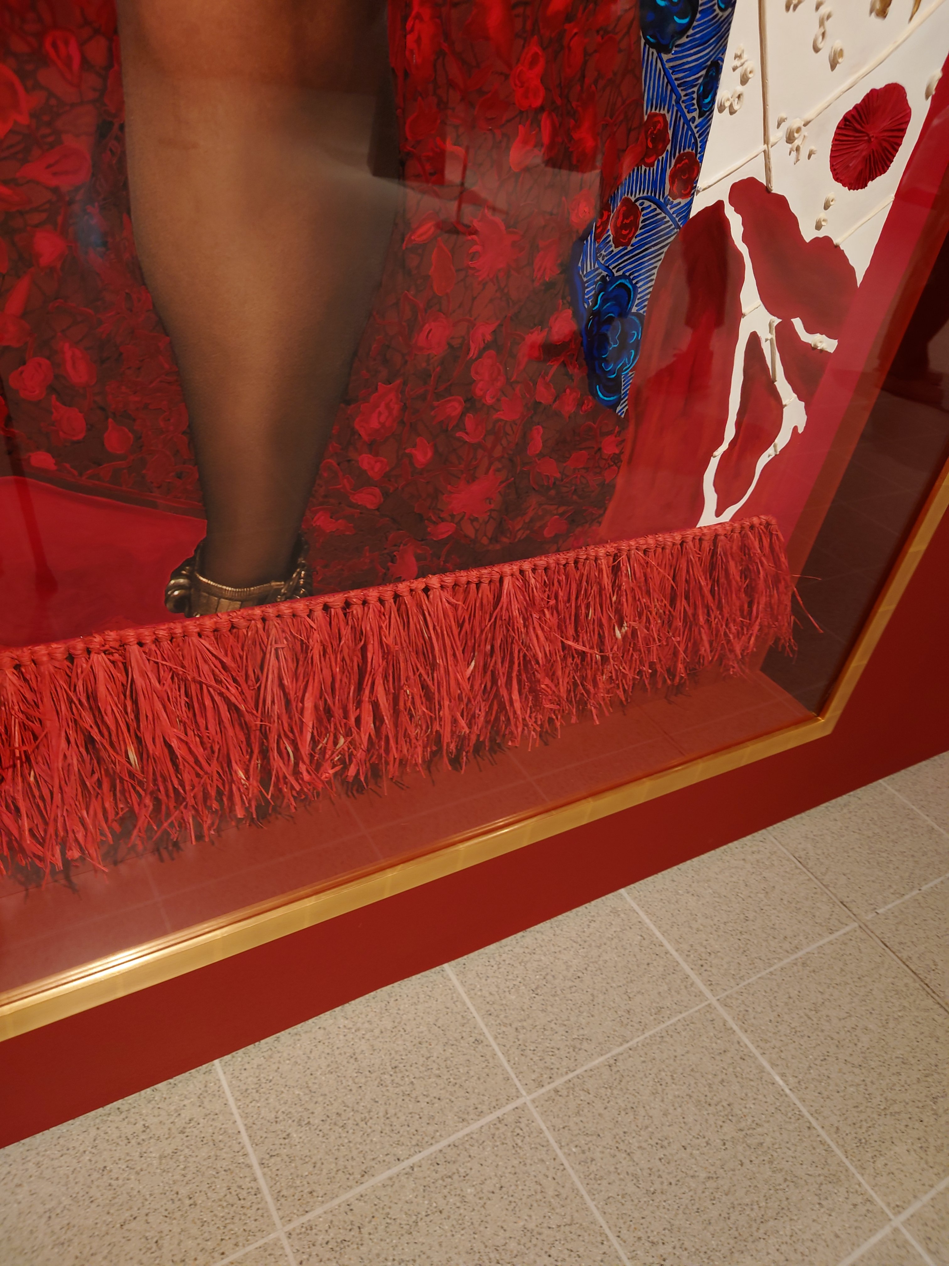
I was excited to feel a sense of affinity developing as I saw the work of these artists. That sense of like mind arose because many of these famous artists used gold or gold leaf, some used gems or Swarovski crystals. I saw gemstones sprinkled and how some used raffia trim as fringing on the edge of a painting. Others used fringing within the painting. I loved the idea of fantastical art as it is an escapist emancipatory healing kind of space to work within as an artist.
I get a sense of hope, but it is not blind hope. It is the kind of surreal conceptualisation of the future that recognises the hurt that has gone before in a beautiful way.
Swarovski Crystals are used to let eyes sparkle
Mahogany and crystals used
Interesting texture with gems
Raffia trim on artwork with 24K gold
24 karat gold, string texture
In the Black Fantastic is showing at the Haywood gallery London until 18th September 2022. It is a little awkward to get there. The nearest entrance is on the south side of the Waterloo bridge,
I recently did an intense course at CSM. It was nice to return to UAL, but to be a student this time.
It made a nice change to discard my old identity as of teacher there and allow some time to learn new mixed media techniques and sharpen my painting focus.
The images show the canvases I am working on and the development of ideas.
The work includes photo transfer, collage, dropping, pouring, oils acrylic, resin, quartz, sand and using paint skins. It was good to have an established artist give voice to my ideas and my approach. I feel more confident in labelling and placing the context of my artwork and how it fits into artworks that have gone before.
Three of the four mixed media I created on the course
Mixed media with pouring, skins with resin pools
Mixed media tools
Products for making the board.
I learned and developed my technique so much. It was fascinating to note how the choice of support, whether canvas, board, and the type of gesso, are also part of the media as they impact the overall effect and desired look and feel of the painting.
My work area for 2 weeks at CSMEven the floor is crafted at CSM with small blocks of wood on The Street runwayAfter pouring before the resin
Watch this space (project showcase) for how the course will influence my future paintings. I’ve got so many ideas and cannot wait to share them with you.
On film
The college’s media person captured my making process and came back to ask if I would do an interview that they would film. I declined the interview for a range of personal reasons. But I am happy to say you might catch sight of my hands painting in the future ads and social media content for Central St Martins when they promote their courses.
This week I have been developing my mixed media practice by doing an intensive full 10-day course at CSM. More on that in a later post.
However, the weekend took my sister and me out to explore our local high street, introducing her to all the amazing colourful things the different shops provide.
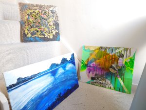
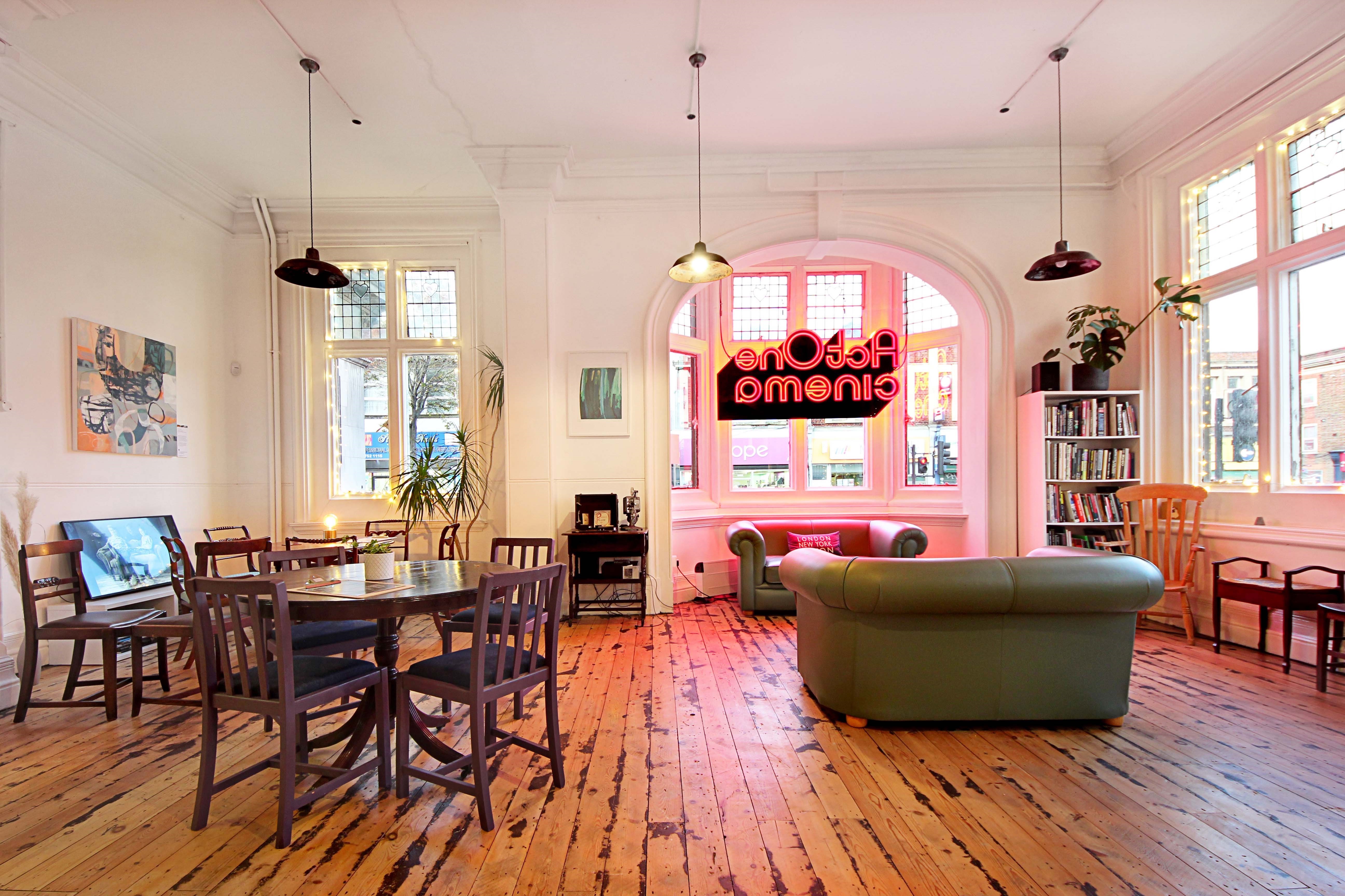
I took her to our local cinema, an art house cinema converted into a cinema from an old library on the high street. It also has an art gallery which you can see in the featured picture, above. They do life drawing sessions there on a Wednesday.
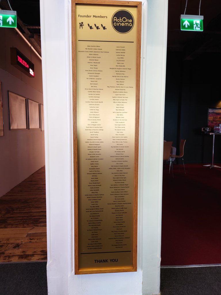
I was one of the founding members. During covid, I donated more money than I would normally to a project or charity because I love film and I like my local high street.
The cinema developers/ organisers then rewarded us by calling us early donators, The Founder Members. And to express their appreciation, they recently put our names on a plaque in the cinema doorway.
The plaque at the doorway of Act One cinema celebrating and thanking donators
Recognition
It was a delight to see my own name on the plaque. I remember them asking how we wanted our names in an email. I can see other people who asked to express themselves, their groups, or their family. However, I am with just my name on the plaque. It is nice to get recognition and public reward for giving to the arts.
Raising funds for another screen.
The cinema has another goal to get a second screen. If you would also like to give to the arts, here is the link for their current fundraising round. https://www.spacehive.com/actonesecondscreen
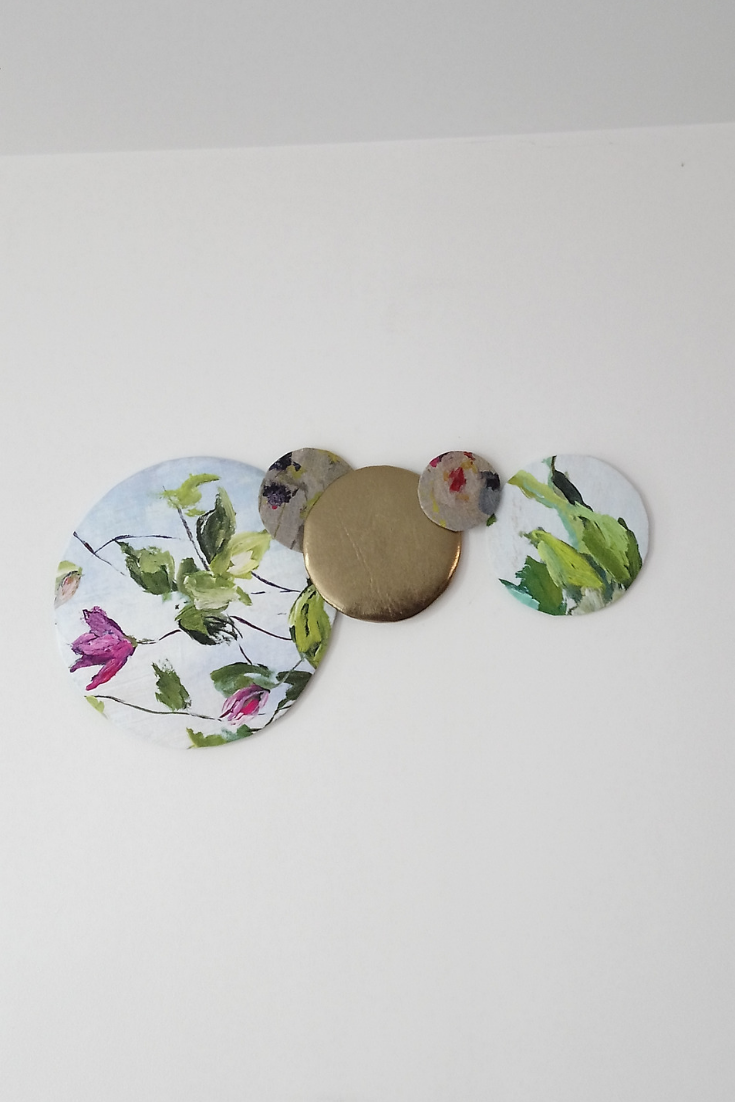
I made these fabric disks in the Christmas break and originally had them on my wall spread out like the old flying duck motif.
But this weekend I was having a tidy up and rearranged some of wall decor. They look better layered up, I think.
I’m back to making and will do a few more of these discs and other shapes.
It’s been difficult finding time to make but I’ve managed to clear the decks for a season of showcasing my hand made office decor creations made from upcycled fabrics, cosmetics and skincare products.
It’s going to be a creative season. If you want to ask me anything about wall. Desk or wall styling drop me a line.
I’ve noticed the more we do Webex, Skype, Zoom meetings the more important it is to hand craft our own mise-en-scène. That’s film talk for how we look on screen.
Forgive me followers, I’ve not posted since the Autumn. Thanks for listening to my confession. 😳 For repentance I’m very pleased I’ve managed to snatch a couple days off work, to paint, make and create.
Next, what will follow is a series of mixed media items and escapades that I think make up for my lost time.
I’ve started with these hand made Christmas decorations that I made from upcycled fabric and plastic tubes from my lampshade making projects.
So all that glitters doesn’t have to be gold it can be upcycled plastic!
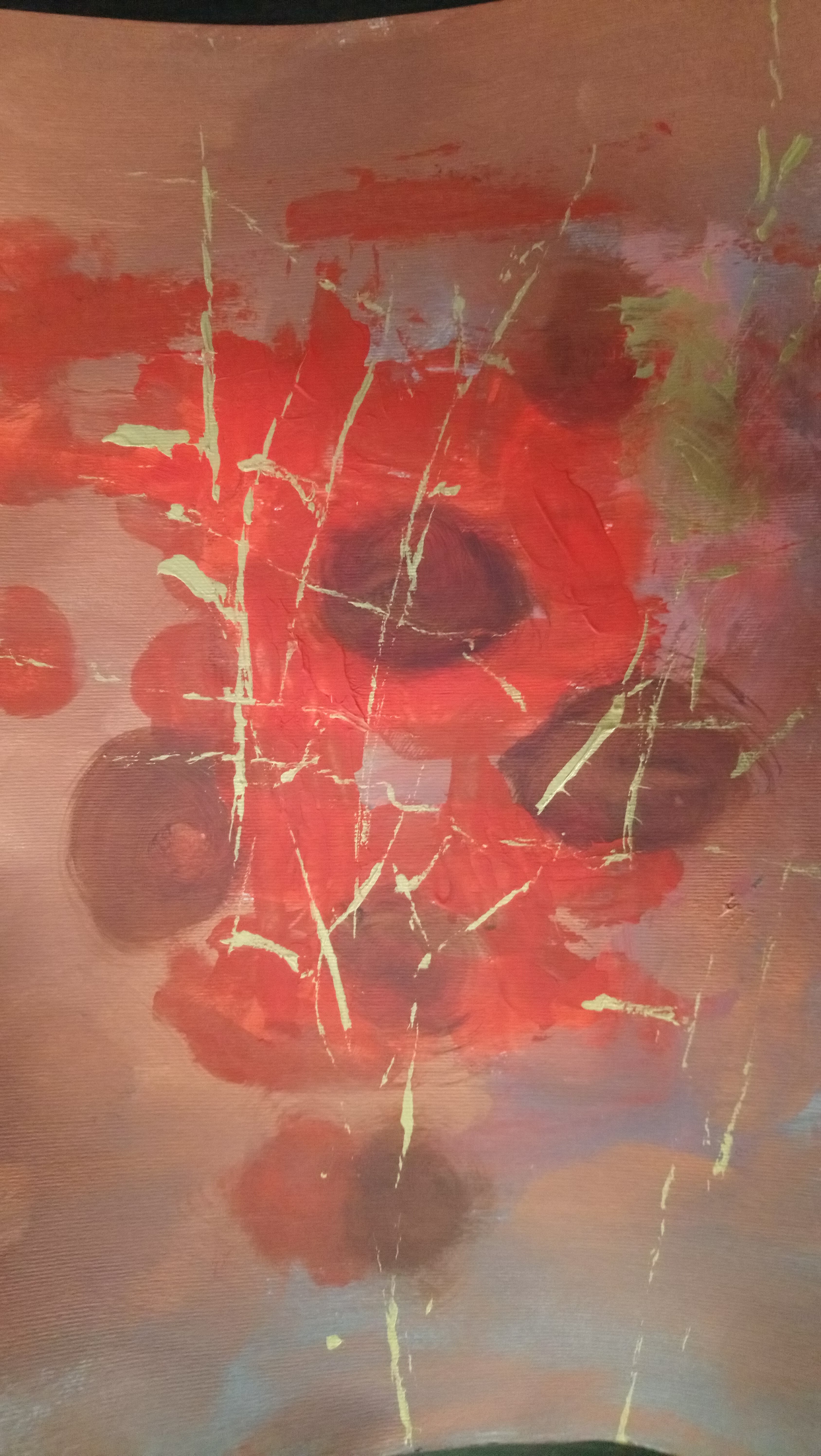
I didn’t mean to. It just happened that way that I created an image with poppies that look like they are Dazed and Confused .
I created this image using my usual atmospheric landscape mindset and experimented with red because I don’t really use red. Red is one of those colours that I hate immensely, so I have always avoided using red in paintings.
But I’m finding I quite like this image. I’m surprised at how beautiful it looks and almost traditional it feels in its floral nature. When I took up the activity of painting, in my mind’s eye, I couldn’t imagine myself being a life painter and that’s why I decided to go down the abstract painting route.
However looking at this rather appealing image of shall we say, spun out poppies, I think it is possible for me to pursue being a painter of floral patterns.
NoFor these painting ideas I used the pour method. But I have to admit it was the poor man’s pour because I haven’t got silicone and all kinds of oils to create cells .
So instead I used water and just wind as I gracefuly waved the painting around so that the liquid paint would just move languidly along the surface of the paper.
During this mesmerising time I watched as the trickles move down the sheet. On noticing the decorative dynamic I would be wondering what shapes they would make.
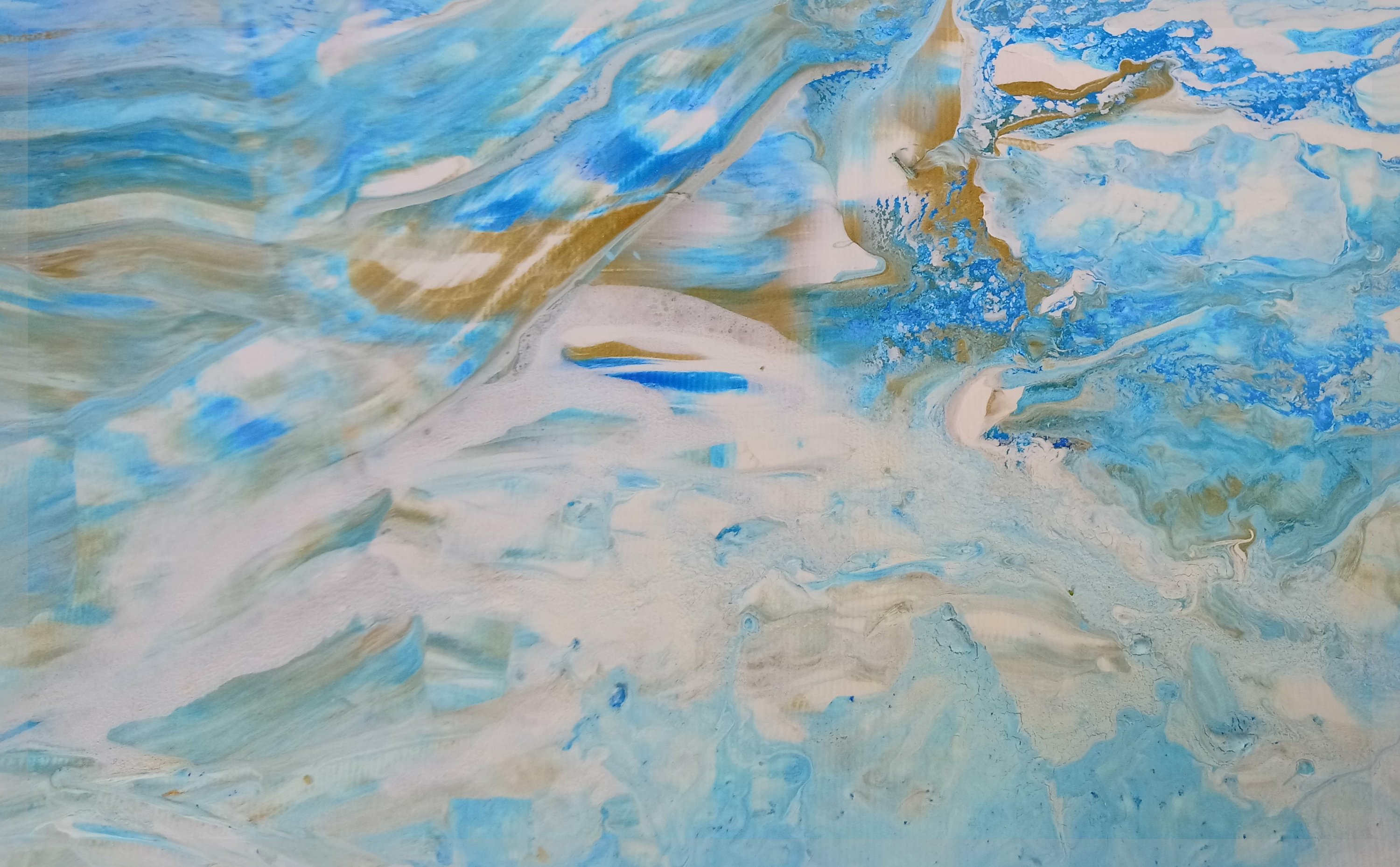
But hey presto the colours of sky blue and sea blue themselves nicely unite to form one of those popular wave scenes that we often see in acrylic pours.
I also did a bit of digital modification of my painting. See below. You see I discovered that with my new fangled phone I’m able to create artworks albeit basic but digital artworks just by using my thumb and finger and the different kinds of tools that the drawing app provides. I was pleasantly surprised to see that I was able to create more original work by blending my traditional acrylic painting skills with the more modern digital art technology that you can find on your mobile phone. It has helped me capture the drama of stormy seas and how vulnerable I would feel in a boat. I guess it is a nod to the need to respect the sea. These sea waters can look beautiful while being dangerous at the same time.
Surprisingly I painted this one while on the phone to my friend Frances. We were gossiping away and I had her on speakerphone and my hands started drifting over to the paints and brushes. While painting I didn’t want her to know that I was distracted so I was keeping my efforts quiet (but that wasn’t hard to do).
I was surprised that by the end of our conversation I had finished two paintings. The other one is in the next post. When I told her what I had done, she said oh you were multitasking. I later realized I was doing a subconscious painting
I also read that this process is called automatism I was painting using intuition and not letting my conscious thoughts about colour and form get in the way too much. Which is why I was surprised that I did put blue and green together. I saw how the forms of flowers and a definite landscape are starting to came together easily too, which challenged me as I always thought I was better at abstract. I never really wanted to paint flowers, meadows and sky, but that’s what came out when I wasn’t thinking to much about what I was doing. Interesting…
I also, in that stroke of madness cut open a lavender pillow (that I had made for my Etsy shop) and sprinkled the dried lavender content where my subconscious thought it was necessary to be on the painting.
I’m rather pleased with the finished product. It has a 3D side to it and smells of rose petals and lavender as well as looking pretty enough to adorn a cushion pad for a grand conservatory.
I’m starting to think about turning my paintings into home decor items. So a couple days after I finished this I was road testing how this image of flowers and some collected in a golden vessel would feel as a statement cushion cover.
So I experimented with recycling some old ESPA Optimal skin pro cleanser as a textured base to this painting. It makes it smell of bergamot or something citrus-y. Wow this has a beautiful fragrance as well as a being a nice looking art work. It also has a touch of Very Berry lip gloss by Jane Iredale in the chocoholic’s range to lend a bit of pigment depth mid range of the painting.
After finishing I stood back and thought how ironic that the optimal skin exfoliate gel mixes interestingly with the acrylic paints helping to add to the painting’s watery feel.
When using it I first thought I was saving the planet (the seas and protecting the lovely marine life- inspired by Blue Planet TV Show) from the scrubs little microscopic balls. Then I remembered that the miniature balls in this skin exfoliation product actually dissolves when worked around and rubbed into skin, they break down because they are soy oil balls.
So the discovery of the virtues of the Espa Pro Cleansing medium means that this skin scrub will come off my up-cycling/ recycling shelf and go back into my bathroom.
However I’m keeping my eyes open for those other offending micro beaded face scrubs. Why? Well because I need them to add to the texture of my future paintings while I do my bit in saving our beautiful blue planet.
On a final note I like how the blue skye in the painting is close in tone to the deep blue of our planet that we all love so much.
This abstract painting I created using a bit of old Jane Irridale lip-gloss as they have great pigments (not a lot of people know that). I love the colours in this one. I worked hard to get the right balance of textures, colours and a bit of gold bling.
The tools I used include pallet knife and surprisingly found that a lip brush as well as eye shadow fan brush was great for blending lines in. How intriguing that the Jane Iridale Chocoholics pack Chilli pepper pinky pigment lip gloss actualy adds some striking depth to the painting and helps to make this dark foreboding river scene look a bit more appealing.
My new tools are very fitting for the new paint mediums I’m using. I’m so glad I’ve found a way to upcycle old cosmetics as well as find a new use for the tools of my old very distant trade.
This painting I used powdered treatment face mask and moisturizing gel that I don’t use to help give some texture to the rough seas of this nautical themed abstract. It reminds me of a buoy, lifeboat and choppy seas.
Continuing my experiments with a painted grey background this fantasy landscape. I have no other words for it except that the marks are mesmerizing remind me of fine gold jewel like trees and a turquoise blue martian (perhaps) moon.
When looking at this its surprisingly easy to bring more images to from your imagination as you try to fathom out the landscape that might exist in the hinterland.
I feel I’m getting better at adding vertical and horizontal lines which is a real departure from the usual sweep curves across the page.
So I had this idea to do a painting with just blue shades. In fact I wrote this bit before I started finding the colors.
The other idea I had was to do one in lime as Elle Decoration said that lime is the colour of the season so here goes.
So these are done with a mixture of acrylics and fabric paints and I used some acrylic pouring technique in the center to get a mottled look with some of the golds and greens.
Using mascara brush and pouring technique with gold and blue acrylic to get some interesting marks. Created by Earth Shine Arts
The up-cycled ( re used) easel came with two pots of fabric paints and I used them to experiment in some deep art work this week. Working among a group of other artists, I started this project on Tuesday and finished it off today (Sunday). The fabric paints on paper have a rather washed out look. But the black, premium red and gold acrylic give it the texture that I much prefer to see in paintings.
So note to self about using fabric paints only on fabric and not on paintings for walls and interior decoration.
I think it the painting looks like some post apocalyptic flower trying to burst through into a beautiful bloom. I wonder if it will make it.
Nevertheless, I am rather glad that I got the easel and the fabric paints from the show flat of the apartment block. Who knows where they might have ended up.
This is my first work. I was inspired by the colors of my sofa and cushions. You might call it cliche but I did actually want a painting that matched my sofa.
So I did this one. It’s a rehearsal to a bigger 2m version I shall do when I get a bit more confident. I up-cycled an 17 piece makeup brush kit to help create the minute marks in this painting. I used the blusher brush and eye shadow fan brush to provide the lighter strokes. I also used the wooden trays of the gourmet takeaway brand. And the rest of the dish makes for a usable paint pallet.
Image Title: 0410181st Significance: Coping with the madness
Today I did a course that showed us how to plan our work and do something called Noting.
But I’m rather pleased with this one as it is picks up the sofa colors nicely so I think it has been a success.


![IMG_9365[1]](https://i0.wp.com/homeofficecharm.com/wp-content/uploads/2018/04/img_93651.jpg?w=920&h=920&crop=1&ssl=1 "IMG_9365[1]")

![IMG_9364[1]](https://i0.wp.com/homeofficecharm.com/wp-content/uploads/2018/04/img_93641.jpg?w=458&h=458&crop=1&ssl=1 "IMG_9364[1]")

You must be logged in to post a comment.