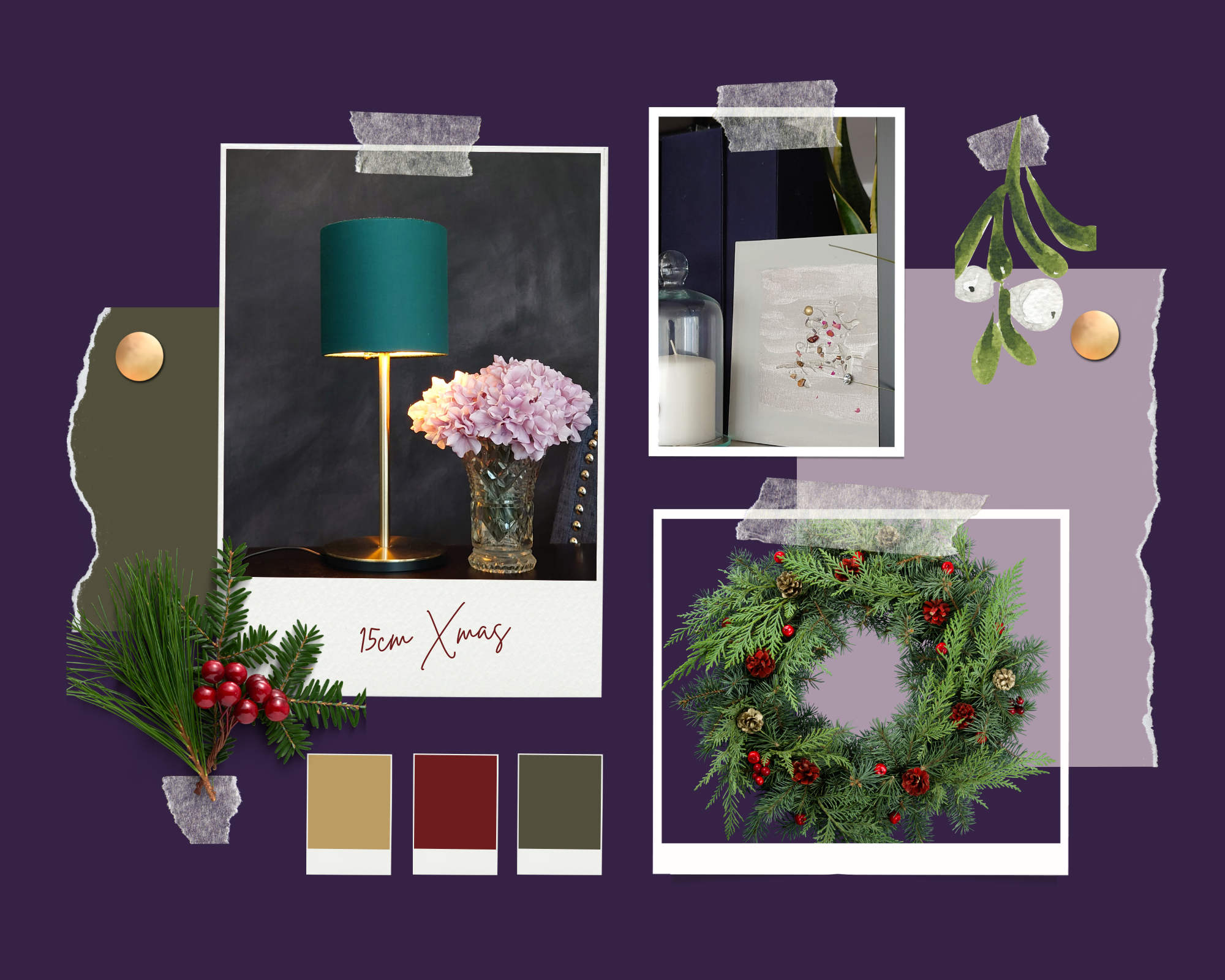
Inspired by Bankers Lights

Here are my latest makes and recently listed in my shop.

It is of the collection inspired by the green and gold or brass Bankers lamp. I wanted to create a softer alternative so that it is a more cosy fit in homes or hospitality.

What is your favourite lighting for creating a comfortable home office space?

Blue and green 3D subconscious painting that never should have been seen or heard

Surprisingly I painted this one while on the phone to my friend Frances. We were gossiping away and I had her on speakerphone and my hands started drifting over to the paints and brushes. While painting I didn’t want her to know that I was distracted so I was keeping my efforts quiet (but that wasn’t hard to do).

I was surprised that by the end of our conversation I had finished two paintings. The other one is in the next post. When I told her what I had done, she said oh you were multitasking.  I later realized I was doing a subconscious painting  

I also read that this process is called automatism I was painting using intuition and not letting my conscious thoughts about colour and form get in the way too much. Which is why  I was surprised that I did put blue and green together. I saw how the forms of flowers and a definite landscape are starting to came together easily too, which challenged me as I always thought I was better at abstract. I never really wanted to paint flowers, meadows and sky, but that’s what came out when I wasn’t thinking to much about what I was doing. Interesting…

I also, in that stroke of madness cut open a lavender pillow (that I had made for my Etsy shop) and sprinkled the dried lavender content where my subconscious thought it was necessary to be on the painting.

I’m rather pleased with the finished product. It has a 3D side to it and smells of rose petals and lavender as well as looking pretty enough to adorn a cushion pad for a grand conservatory.

I’m starting to think about turning my paintings into home decor items. So a couple days after I finished this I was road testing how this image of flowers and some collected in a golden vessel would feel as a statement cushion cover.


Blue green landscape painting and floral attempt

So I had a go at doing an abstract landscape. I imagined a foreground sky and middle ground all based on my imagination. No I wasn’t in a poppy field but I think i was conjuring deep pink red tulips and buds of poppies. I’m still undecided about this one. Though I’m a bit pleased I did something that resembles a flower slightly.  I was encouraged recently when watched a channel 4 ( or was it a more four) program that spoke of American painters of the 19th and early 20th century. Watching their work I began to feel comforted to see that my brushstrokes were similar to what has gone before there. Sorry I cant remember the artist’s name. It will come……

Anyway looking at this work, I think I still need to learn about making finer marks for stems and the earth. Nevertheless, let me know what you think.

Buds of gold: Floral like abstract acrylic

This time last week, I brought this painting home. You see I had joined a deep art work project. I think the philosophy is about the functionality of art. But some of them described it as going deep into the painting and just switching off from the outside world, no distractions, they said and not phones. I kind of took that as my signal not to chat and paint at the same time. So I went deep ( you could say) into creating this with my fabric paints and some acrylics i had to hand like true red (which looks like magenta) and gold metallic.

Golden bud picture

When it can time to pass around the Minstrals (chocolate button sweets for sharing) then it seems were were able then come out focus to talk.

Many said they liked this. I rather like it too.

You see the day before I had learned how to do the special I painting method and how to put the colors together so that there was balance and an appealing composition. So far my learning about doing acrylic art paintings seems to be working. I think this is my favorite of all the pieces I have done so far.

Next time I shall use less fabric paint and more acrylic. But the mix is interesting as fabric paint gives a flat matt finish which helps the gloss of the acrylic and metallic gold stand out.