From Aesthetics to Authenticity: Rethinking Office Decor

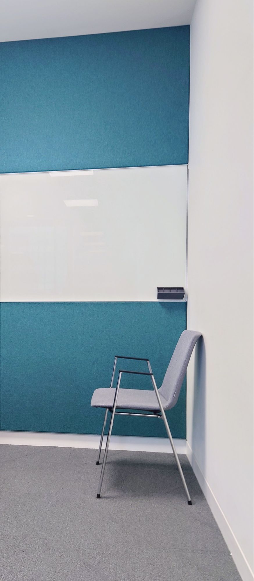
This week, I went to a nice office space in London. You can see that some of the fixtures and fittings nod to the architecture. At first glance, they give off an air of coziness and comfort. Very welcoming for visitors and gives you a sense of being a great place to work.

I also visited a local hotel for my Birthday. While I was at the reception waiting for my family to return, I did some people watching. I noticed a pattern in styling the lamps and floor lamps there, too.

The lighting was closely intertwined with botanical elements. This created interesting shadows and shapes. It seemed to enhance the structure of the original lighting. It gave off an air of consciousness about nature, the environment, and the planet.

This architecture magazine shows how botanicals are now part of the vernacular in office reception design. https://www.arkitectureonweb.com/o/adaptive-media/image/14864267/copertina-hd/NU-MEIS-0511-LoRes.jpg?t=1682673790130

The video below I took when I was people watching in a hotel shows:

Reception areas: the curated threshold where first impressions land. Botanical spill from corners, carefully selected to whisper “we care.” Earth tones, soft lighting, ergonomic chairs—all designed to wrap visitors in the illusion of wellbeing.

But then, I stay a little longer. I ask questions. I meet the people behind the desk and beyond the break-room. I watch the team dynamics. Servers struggle to keep up.

And I begin to wonder—are we decorating over discomfort?

The lush ferns say “eco-conscious.” The velvet sofas say “psych safety.” But I’ve noticed that behind the foliage, the culture doesn’t always flourish as much as the greenery does. I talk to the workers. In some places, it seems that the aesthetic of care has replaced the practice of it. Cozy decor doesn’t always mean corporate kindness. Indeed, green doesn’t mean that the management is grounded.

True sustainability starts not with plant walls—but with people.

I hope to demonstrate that I have created shelf art and wall decor. This art beautifully illustrates the ugly reality of corporate work. While working from home, we can express ourselves through our choice of decor. We can also quietly convey the complexities, tensions, and messiness that our fantastic work emerges from.

Re-imagine your work-from-home space through the lens of truth.

My products are meant to feel like a breath of fresh (and slightly rebellious) air. They are created as pieces that don’t just sit pretty, but speak (like me). They offer a kind of visual activism. It is right at eye level for your bookshelves. This way, you can lead through the screen with authenticity.

Easily Swap Empire Lampshades with Duplex Fittings

This week, my YouTube video addressed a question from one of my subscribers. They asked for a video explaining how the duplex fitting can be used. I show how they’re used to suspend a lampshade from above. Lampshades can be suspended from a ceiling cable or wires on either side of a bed. We often see the suspending of smaller lampshades in industrial-style or fishing rod-style floor lamps.

In the video, I show details of the spider attachment. You get to see how I easily swap over various styles of lampshades. It’s less bothersome to do the same with the usual fittings.

Please ensure your lampshade has the duplex fitting when you buy from my shop. This ensures ease of swapping over. This enables you to use an empire shape. You can suspend it from above or place it on top of a table lamp.

Below is a bonus video showing how the same duplex frame on my Empire lamps can also be used as a table lamp. In essence, you don’t need to turn the lampshade upside down.

Embracing Cosy Innovation in Your Office Space

This week I worked in an amazing training room up in Scotland.

The beautiful and comfortable meeting space was on the Mezzanine and considerately designed by an architect. It had beautiful view of the sea.

The materials used for building the structure and decorating were also fascinating. 

Some of the walls were made of painted straw board and massive bricks of pink salt, which gave off a beautiful light, and it felt good for my well-being, too.

I loved that the room had an eco-friendly vibe, which you could see when looking at the painted stringboard. The stringboard walls also gave it an industrial edge, and the painting of the stringboard made it feel a bit more glamorous than if it was left bare.

I loved the pink blocks of salt used in the wall construction. Apparently, there are many benefits to using pink Himalayan salt as a construction material, including its being inflammable, great for acoustics, creating healthier indoor environments, and reducing pollution.

The design and materials are fascinating because salt bricks are used a lot in spa salt rooms (spaces I used to know well).

From this, I began to understand why the space was good for my well-being. https://pin.it/69njtGSGy. I felt nostalgic and joyful when I realised a designer had considerably considered inner wall construction for building, aesthetic, eco, and well-being reasons.

Salt rooms have a range of untested physiological benefits, such as fighting infection, clearing coughs, and reducing stress.

I also liked how they used giant pink Himalayan salt discs to make the table’s legs.

Another innovative feature of the décor and design was the wall of pots that adorned the main wall. This cute crockery collection offered subtle branding for the business but, most importantly, emitted creativity, camaraderie, and cosiness.

The wall of themed crockery, I imagine, acts as a fantastic backdrop for when they are doing virtual meetings.

Overall, because of the many innovative features I found in this training room, it is one of the more remarkable spaces I visited to facilitate learning workshops this year.

Visiting this space, this week helps to justify integrating more natural elements in decor items in the future. Potentially looking at new ways to integrate pink salt into my making and shelf decor items. I shall also look at collections of items with small words that buyers can use on their walls for more meaningful virtual meeting backdrops.

Here is a link to a product in my shop that gives off cosy office vibes https://homeofficecharm.etsy.com/listing/215250388

Innovative Wall Ideas for Home Office Inspiration

Previously I complained about companies not getting the walls of the training room right for instructors in this post, here.

But recently I was impressed when I visited one major international corporation in the business district of London and saw a well thought out design scheme for delivering learning.

The whole space and training rooms were all thoughtfully designed to inspire and lock in the learning and development of their talent. Read the captions in the images below to discover how the design details support learning.


The designers of this training space clearly recognized the importance of walls for facilitating learning. They understood that walls play a crucial role for trainers and corporate instructors in enhancing the educational experience.

This week’s photo blog showcases the impact of wall decor in corporate training room environments. From functional and stylish fittings to the carefully crafted calligraphy on the walls, each element contributes to creating a memorable impression and inspires innovative ways of working.

We can take some of these ideas and incorporate them into our home office wall decor. For instance, having a large poster with inspirational quotes can serve as a personal reminder of how we want to work. Additionally, when planning the treatment of our walls, why settle for plain paint? Consider creating a space that includes a glass panel for chalkboard sessions with your team. This setup encourages more interactive meetings and gives leaders and managers a reason to turn on their cameras and engage effectively.

Why Transitional Art? On Emerging from an Architectural Imprint

Looking at photos of houses that were once my home I noticed a common theme. The commonality might be about the London Building vernacular. But I’m beginning to think 🤔 more about my home style choices and preferences and how that is expressed in my artwork and making.

Our place in Hackney, I was brought here from the hospital. From year O till about age 4 or 5. We lived on the top floor but we used the whole house and the garden because the landlady was nice and liked our family.
Continue reading “Why Transitional Art? On Emerging from an Architectural Imprint”

Striking double height lampshades for a double height space

I went browsing in Heals of London a couple of years ago and I was inspired by these double height lampshade sizes I saw.

The version I saw was made of Cork but what struck me was the size, they were 20 cm in diameter and 40 cm tall so in essence they were double height lampshades. And because my space is double height ceiling with 5m window height I’ve always been keen on finding how best to balance out the decoration in such a mammoth space .

So I made these double height lamp shades out of some fabric that I got from the Designers Guild sale recently. Then during my break I made these while catching up with a box set of some USA TV.

The name of the fabric is Aubriet lino and the colour is damson .

I love how it looks so floral and pretty but also it looks very organic and earthy with it’s burlap or raw linen backgrounds.

The poor man’s pour in sky and sea blue

NoFor these painting ideas I used the pour method. But I have to admit it was the poor man’s pour because I haven’t got silicone and all kinds of oils to create cells .

So instead I used water and just wind as I gracefuly waved the painting around so that the liquid paint would just move languidly along the surface of the paper.

During this mesmerising time I watched as the trickles move down the sheet. On noticing the decorative dynamic I would be wondering what shapes they would make.

But hey presto the colours of sky blue and sea blue themselves nicely unite to form one of those popular wave scenes that we often see in acrylic pours.

I also did a bit of digital modification of my painting. See below. You see I discovered that with my new fangled phone I’m able to create artworks albeit basic but digital artworks just by using my thumb and finger and the different kinds of tools that the drawing app provides. I was pleasantly surprised to see that I was able to create more original work by blending my traditional acrylic painting skills with the more modern digital art technology that you can find on your mobile phone. It has helped me capture the drama of stormy seas and how vulnerable I would feel in a boat. I guess it is a nod to the need to respect the sea. These sea waters can look beautiful while being dangerous at the same time.