This week, I went to a nice office space in London. You can see that some of the fixtures and fittings nod to the architecture. At first glance, they give off an air of coziness and comfort. Very welcoming for visitors and gives you a sense of being a great place to work.
I also visited a local hotel for my Birthday. While I was at the reception waiting for my family to return, I did some people watching. I noticed a pattern in styling the lamps and floor lamps there, too.
The lighting was closely intertwined with botanical elements. This created interesting shadows and shapes. It seemed to enhance the structure of the original lighting. It gave off an air of consciousness about nature, the environment, and the planet.
The video below I took when I was people watching in a hotel shows:
Reception areas: the curated threshold where first impressions land. Botanical spill from corners, carefully selected to whisper “we care.” Earth tones, soft lighting, ergonomic chairs—all designed to wrap visitors in the illusion of wellbeing.
But then, I stay a little longer. I ask questions. I meet the people behind the desk and beyond the break-room. I watch the team dynamics. Servers struggle to keep up.
And I begin to wonder—are we decorating over discomfort?
The lush ferns say “eco-conscious.” The velvet sofas say “psych safety.” But I’ve noticed that behind the foliage, the culture doesn’t always flourish as much as the greenery does. I talk to the workers. In some places, it seems that the aesthetic of care has replaced the practice of it. Cozy decor doesn’t always mean corporate kindness. Indeed, green doesn’t mean that the management is grounded.
True sustainability starts not with plant walls—but with people.
I hope to demonstrate that I have created shelf art and wall decor. This art beautifully illustrates the ugly reality of corporate work. While working from home, we can express ourselves through our choice of decor. We can also quietly convey the complexities, tensions, and messiness that our fantastic work emerges from.
Re-imagine your work-from-home space through the lens of truth.
My products are meant to feel like a breath of fresh (and slightly rebellious) air. They are created as pieces that don’t just sit pretty, but speak (like me). They offer a kind of visual activism. It is right at eye level for your bookshelves. This way, you can lead through the screen with authenticity.
This video explains why I started creating and making items to help virtual working professionals stage their on-camera backgrounds to emanate meaning about how they work with people, on projects, and in programmes, so they can confidently always feel proud to switch their cameras on.
This week I was delivering professional development training and facilitated workshops in Manchester in the north of the UK and back down in London.
Me setting down after leading a one day professional development workshop about successful meetings
On the way back home I noticed how all the HQ buildings in the area had beautiful Xmas trees. Next year I will do a post on the line up of Xmas trees at corporate HQ buildings.
AI generated image
It told me something about how just putting up a Christmas tree in the spacious reception areas of these building is important for converting a sense of arrival and welcoming.
Seeing how the facilities teams of these massive organisation seriously consider the decorations made me realise that when we work from home we must also create our version of the well dressed welcoming Christmas tree for people that join our meetings online in virtual meetings.
My photo of Ashridge house Xmas decorThe beautiful tree in the entrance to the learner’s breakout area at Ashridge House Me using the decor backdrop of Motel One in Manchester
3 top tips for more festive spirit in your virtual and online office scene
Print off a printable Jolly leadership quiz to have some festive fun amongst other managers to bring some cheer to the workplace and available in my Etsy shop this holiday season.
Hang a stocking on your book shelf to signify and mark the festive season has begun and start conversations about being ready for Christmas and build rapport conversations about Xmas gift giving habits
Arrange some baubles on your shelf to give your audience something to break the ice about when joining your online meetings
What will you do decor wise this season to bring cheer to the office and team?
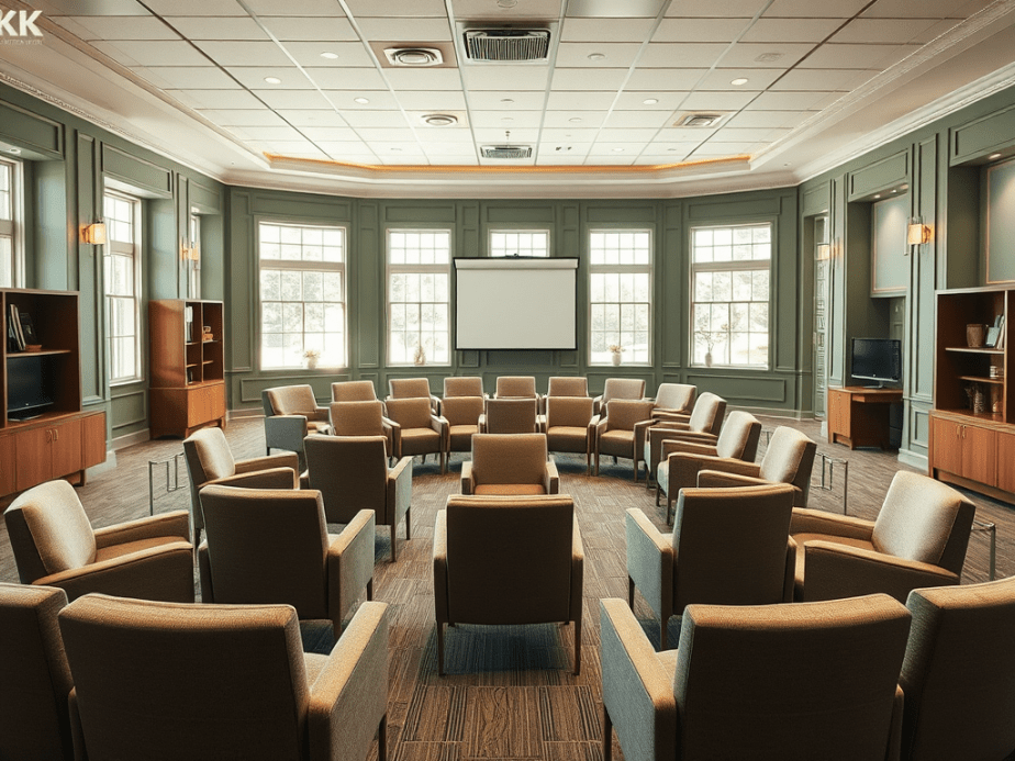
I visited a beautiful training room this week but it was hiding several problems. The issues found made me want to share some tips on training room design for architects, interior design team, facilities managers.
The beautiful training room I visited had fancy comfortable seating, very nice wide desks on wheels, natural looking carpet all the modern technology with two big screens in the front that I could can easily log onto. There were also two beautiful side cabinets storing other trainer’s accouterments like post it notes, marshmallows. There was even room for me to store my coat and bags to keep the room tidy.
Image created with AI based on the word in this post
Style over substance: The impractical training room layout
However one thing I noticed about the room, even though it was large, was the lack of circulation space. The session was originally booked for 14 max but they thought they’d squeeze another two people in. This meant that arranging tables in a U shape pinned everyone to the walls leaving a large expanse of space in the middle. This is not conducive to group working because no one could move around easily.
Style over substance: Training room walls that would not stick
This beautiful training room had deep sage green walls stylishly painted up to seven eights of the wall with a coordinating ivory colour for the last eighth and the ceiling. It reminded me of a beautiful cosey shaker style kitchen. But when it came to me sticking full flip charts up to remind learners of the points we had covered so far it could not be done because the walls seemed to be anti tack. I guess somewhere in the building’s history the facilities manager got fed up of trainers using blue tack to stick things on the walls.
Having anti tack walls is understandable if you have previously spent loads of time and resources getting the cleaners to remove blue tack using the recommended direct heat like a hairdryer on the blue tack itself.
But having anti tack walls creates a corporate learning & development and organisation development problem. You see we trainers need the walls to showcase learning. To show case learning is to have a tangible artifact of ideas generated in the session and that is more than one flip chart stand can do.
We show case learning in the corporate training room in various ways. We typically (display gallery style) the completed flip charts that everyone has done. Learners throughout the day then reread what some of the ah ha’s and moments of epiphany are within the room at moments that suits them. It helps to reinforce diversity in learning & development.
We use the wall to display analytical and creative thinking when working in a group. Walls help to magnify the writing space. Walls expand the written canvas from the individual’s perspective out to the group’s perspective.
Therefore a training room festooned with used flip chart pages and written on post it notes from brain writing sessions, or creation activities or problem solving sprints serves as visible and physical evidence of the individual and group learning work that has gone on in that room.
I’ve seen great examples of corporate training rooms as I travel around the world delivering leadership and management development . The more advanced training room decor takes account of trainers/ instructors needing to use the wall by replacing the inner walls with glass panels and providing white tack for the rest of the walls. .
Glass walls are then perfect for sticking sticky flip chart or post it notes to the walls. I’ve also seen other kinds of vinyl decor panel used. Learners can even write directly on the glass walls, which support creativity and enhances the problem solving process.
But ultimately it would be great if corporate office training room designers could consider installing more white boards and screens so that opportunities to showcase learning is on all four walls, without the need for desks.
Image created with AI Prompt corporate training room like featured image but with screens one windows and all walls with glass wall looking out to greenery and big plants internally. And comfortable seating for eight.
Leadership and management development consultants/instructors and trainers are now in an era where, we no longer want to get managers in a room where they just sit and stare at one square light at the front of the room for six hours.
Image created with AI prompt corporate training room in U shape without desks
We no longer want executive development shaped by the the training room’s limitations. Indeed some of the problems that companies face with with building inclusive working, collaboration or the depth of thinking that is required might be down to the amenities of the training room. The training room is a visible cultural artifact subtly symbolising “the way we do things around here”.
How professionals can make training rooms add value
We now need interior designers and architects of corporate headquarters, campuses and head offices to show deeper consideration of the design of the corporate training room. See my top 10 tips as a summary of this post.
10 Tips to Improve Training Room Decor & Design
Room aesthetics are important but should not devalue function
Create a room with a view of nature
Design in glass panel walls to showcase learning
Plants are nice for oxygen and neuro-aesthetics
Cabinets could be built into walls so they don’t get in the way of circulation space needed for group work
Integrate screens on three walls
Install whiteboards on three walls (if no glass walls)
Design, plan and build writable four walls
Enable table or desk free room for management development suites and executive development zones
Always consider how the training room acts to symbolise the desired culture
Please follow for more. Each week for the rest of 2024 I shall be visiting corporate training rooms of all shapes and sizes up and down the UK. I will post more ideas about best practice and ideas for improvements to corporate training room design, decor and space planning, in the weeks to come.
Comment below on your good or bad experience of corporate training room decor.
The AI created the feature image based on what it read about the blog. The four images above are what I took myself. Other parts of the blog show examples of AI generated images to create design scenarios.
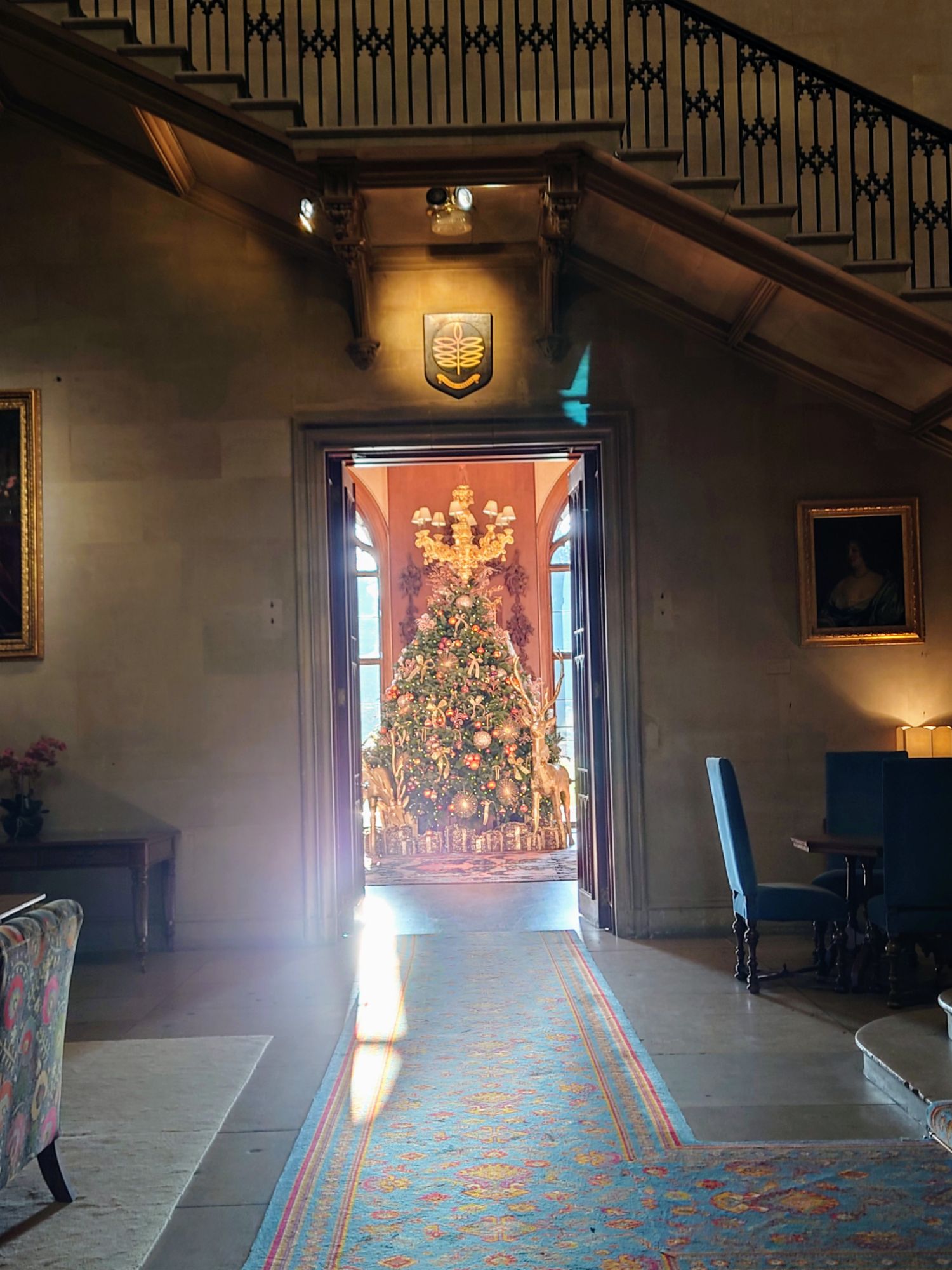
It’s amazing how inspiration for decor can arise in unexpected places.
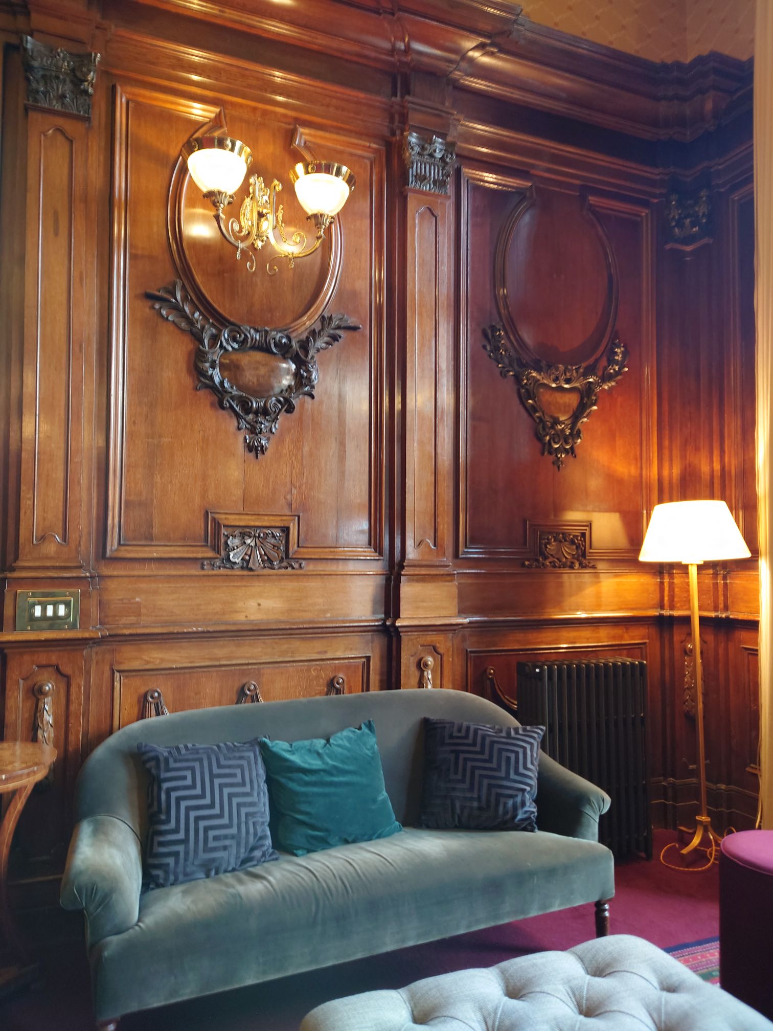
Some of the gardens and Ashridge house
Intricately carved wood paneling
One of the sitting rooms as Ashridge house, showing beautiful decorative carvings
Hopefully these images give you ideas for moving beyond the straight lines and grid forms in wood paneling for your library decor.
When people think about their dream home, they often think about the broad architecture. They might also dream about the interior space, structure and design. But their imaginings often miss considering the tiny decor details like the composition and likely colours needed in styling their shelves, open storage and library bookcases. Instead those finer details are left to chance. Then what we see at best their shelf display is about arranging things neatly. And at worst the shelf seems to curiously be like an exposed front draw with tens (or 100s) of items drowning in layers of sticky dust.
This post gives a few ideas for styling your shelf. It especially shows you how to use pieces of shelf art to anchor the colour scheme and inspire what items should go on the shelf and how to artfully display them so the scene is an amplification of the art.
I’ve been enhancing my photography. The aim is to tell a story in small vignettes. I’ve been learning from iconic professional photographers who specialise in products, lifestyle and jewelry photographs. I’ve learned my photography from various courses online and in classroom settings in London.
Recently I’ve been experimenting with colour intensity and they’re beginning to convey my sense about how we work and contemporary working environments.
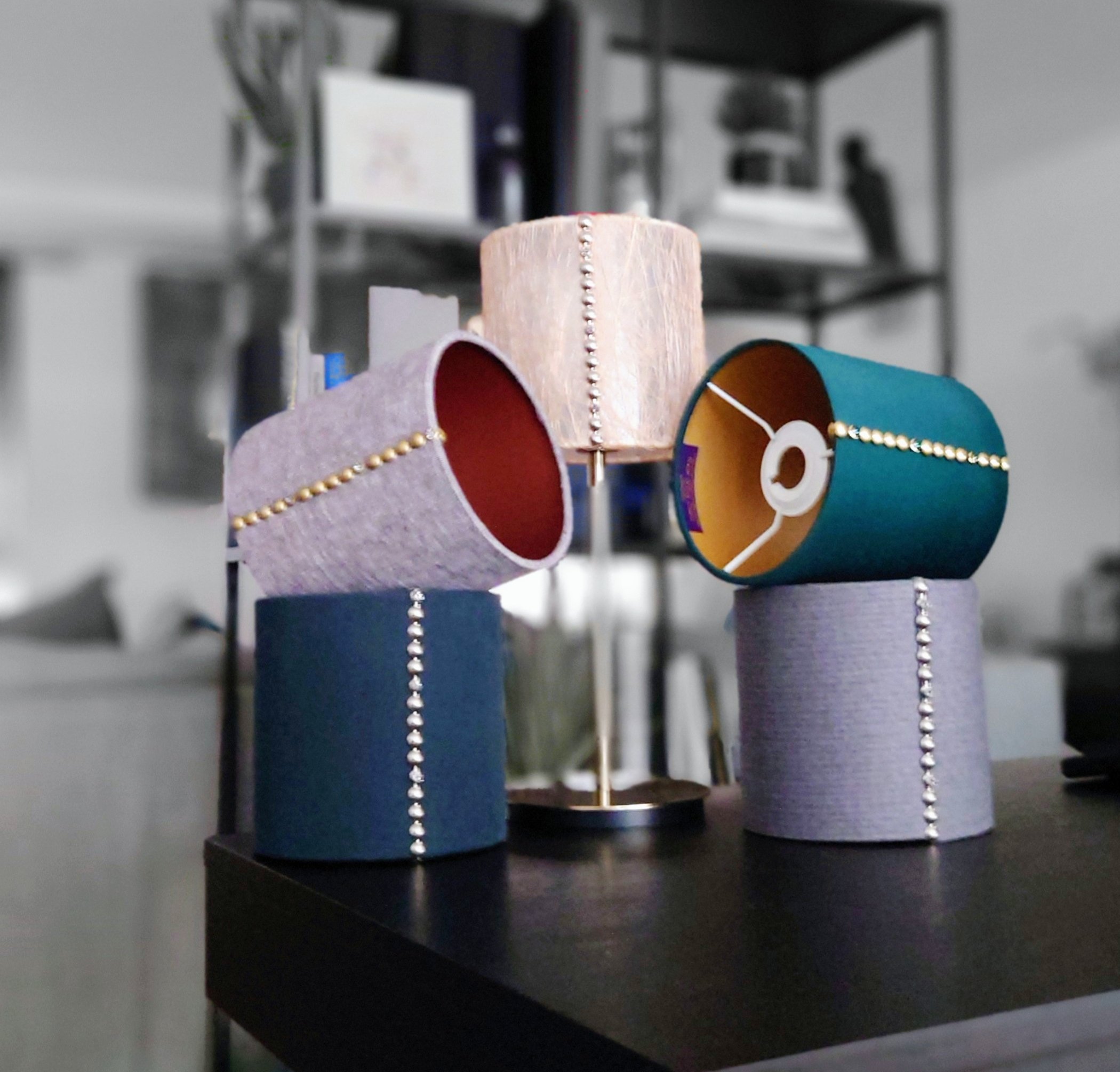
I had an aha moment when reflecting on the look of my shop. I noticed that it was vital to make it easier for my shopping list to find things they want. So I organised the collection by Design.
You will see from the pictures that I have a collection of at least five types. There is the line of Empire framed lampshades, these are new. I also have a collection of metal trimmed lamp shades with beautiful vintage crystal inserts. The collection of drum lampshades is stunning and they are organised by their design of having a simple decorative metal trim. The classical beautiful Victorian lampshades are always popular they get a lot of likes and they are organised under Victorian lampshades, I hand-stitched and stretch these. They are a lot harder to create that’s why they are a bit more expensive to buy. And lastly, there is the collection of stunning table lamps that come already with a plug and you simply just plug it in to get your lighting. With those table lamps, there is no need to buy a lamp base. You just need a socket to plug it in.
Lampshades for cool home office desks organised by design
I hope people find it easier and enjoyable to browse these unique lampshades I designed to add drama to meeting scenes. Amazing backdrops are great ice breakers and they allow the beauty of our personalities to quietly shine.
I shared a video of lux interior designer Sophie Paterson talking us through her husband’s home office decor. I love that she did dark walls and combined the look with a few pieces of antique brown furniture. You can see in this picture I am trying out shades of dark paint as I love that inky almost black look but cannot decide on red/purple inky black or blue inky black.
The video SP refers to a couple of plain and simple square/ oblong lampshades, she got redone. And in the background, you can see some coolie french bell-type shades. See my finger-pointing on the left.
I probably would have been bolder with my lampshade choice. If it were me I would have gone for the taupe shades with amber or the straw in a small oblong or round shape, made of fabric like the ones below. It’s probably that she didn’t want to take away the attention from the beautiful ornate lamp base but I wonder if something in a plain light blue to echo the light tones in the wallpaper and in the blue in the base might have tied these lovely elements together more tightly.
Both the taupe and straw lampshades are available in the shop now. Here


You must be logged in to post a comment.