This week I worked in an amazing training room up in Scotland.
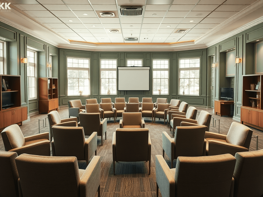
The beautiful and comfortable meeting space was on the Mezzanine and considerately designed by an architect. It had beautiful view of the sea.
The materials used for building the structure and decorating were also fascinating.
Some of the walls were made of painted straw board and massive bricks of pink salt, which gave off a beautiful light, and it felt good for my well-being, too.
I loved that the room had an eco-friendly vibe, which you could see when looking at the painted stringboard. The stringboard walls also gave it an industrial edge, and the painting of the stringboard made it feel a bit more glamorous than if it was left bare.
I loved the pink blocks of salt used in the wall construction. Apparently, there are many benefits to using pink Himalayan salt as a construction material, including its being inflammable, great for acoustics, creating healthier indoor environments, and reducing pollution.
The design and materials are fascinating because salt bricks are used a lot in spa salt rooms (spaces I used to know well).
From this, I began to understand why the space was good for my well-being. https://pin.it/69njtGSGy. I felt nostalgic and joyful when I realised a designer had considerably considered inner wall construction for building, aesthetic, eco, and well-being reasons.
Salt rooms have a range of untested physiological benefits, such as fighting infection, clearing coughs, and reducing stress.
I also liked how they used giant pink Himalayan salt discs to make the table’s legs.
Another innovative feature of the décor and design was the wall of pots that adorned the main wall. This cute crockery collection offered subtle branding for the business but, most importantly, emitted creativity, camaraderie, and cosiness.
The wall of themed crockery, I imagine, acts as a fantastic backdrop for when they are doing virtual meetings.
Overall, because of the many innovative features I found in this training room, it is one of the more remarkable spaces I visited to facilitate learning workshops this year.
Visiting this space, this week helps to justify integrating more natural elements in decor items in the future. Potentially looking at new ways to integrate pink salt into my making and shelf decor items. I shall also look at collections of items with small words that buyers can use on their walls for more meaningful virtual meeting backdrops.
I visited a beautiful training room this week but it was hiding several problems. The issues found made me want to share some tips on training room design for architects, interior design team, facilities managers.
The beautiful training room I visited had fancy comfortable seating, very nice wide desks on wheels, natural looking carpet all the modern technology with two big screens in the front that I could can easily log onto. There were also two beautiful side cabinets storing other trainer’s accouterments like post it notes, marshmallows. There was even room for me to store my coat and bags to keep the room tidy.
Image created with AI based on the word in this post
Style over substance: The impractical training room layout
However one thing I noticed about the room, even though it was large, was the lack of circulation space. The session was originally booked for 14 max but they thought they’d squeeze another two people in. This meant that arranging tables in a U shape pinned everyone to the walls leaving a large expanse of space in the middle. This is not conducive to group working because no one could move around easily.
Style over substance: Training room walls that would not stick
This beautiful training room had deep sage green walls stylishly painted up to seven eights of the wall with a coordinating ivory colour for the last eighth and the ceiling. It reminded me of a beautiful cosey shaker style kitchen. But when it came to me sticking full flip charts up to remind learners of the points we had covered so far it could not be done because the walls seemed to be anti tack. I guess somewhere in the building’s history the facilities manager got fed up of trainers using blue tack to stick things on the walls.
Having anti tack walls is understandable if you have previously spent loads of time and resources getting the cleaners to remove blue tack using the recommended direct heat like a hairdryer on the blue tack itself.
But having anti tack walls creates a corporate learning & development and organisation development problem. You see we trainers need the walls to showcase learning. To show case learning is to have a tangible artifact of ideas generated in the session and that is more than one flip chart stand can do.
We show case learning in the corporate training room in various ways. We typically (display gallery style) the completed flip charts that everyone has done. Learners throughout the day then reread what some of the ah ha’s and moments of epiphany are within the room at moments that suits them. It helps to reinforce diversity in learning & development.
We use the wall to display analytical and creative thinking when working in a group. Walls help to magnify the writing space. Walls expand the written canvas from the individual’s perspective out to the group’s perspective.
Therefore a training room festooned with used flip chart pages and written on post it notes from brain writing sessions, or creation activities or problem solving sprints serves as visible and physical evidence of the individual and group learning work that has gone on in that room.
I’ve seen great examples of corporate training rooms as I travel around the world delivering leadership and management development . The more advanced training room decor takes account of trainers/ instructors needing to use the wall by replacing the inner walls with glass panels and providing white tack for the rest of the walls. .
Glass walls are then perfect for sticking sticky flip chart or post it notes to the walls. I’ve also seen other kinds of vinyl decor panel used. Learners can even write directly on the glass walls, which support creativity and enhances the problem solving process.
But ultimately it would be great if corporate office training room designers could consider installing more white boards and screens so that opportunities to showcase learning is on all four walls, without the need for desks.
Image created with AI Prompt corporate training room like featured image but with screens one windows and all walls with glass wall looking out to greenery and big plants internally. And comfortable seating for eight.
Leadership and management development consultants/instructors and trainers are now in an era where, we no longer want to get managers in a room where they just sit and stare at one square light at the front of the room for six hours.
Image created with AI prompt corporate training room in U shape without desks
We no longer want executive development shaped by the the training room’s limitations. Indeed some of the problems that companies face with with building inclusive working, collaboration or the depth of thinking that is required might be down to the amenities of the training room. The training room is a visible cultural artifact subtly symbolising “the way we do things around here”.
How professionals can make training rooms add value
We now need interior designers and architects of corporate headquarters, campuses and head offices to show deeper consideration of the design of the corporate training room. See my top 10 tips as a summary of this post.
10 Tips to Improve Training Room Decor & Design
Room aesthetics are important but should not devalue function
Create a room with a view of nature
Design in glass panel walls to showcase learning
Plants are nice for oxygen and neuro-aesthetics
Cabinets could be built into walls so they don’t get in the way of circulation space needed for group work
Integrate screens on three walls
Install whiteboards on three walls (if no glass walls)
Design, plan and build writable four walls
Enable table or desk free room for management development suites and executive development zones
Always consider how the training room acts to symbolise the desired culture
Please follow for more. Each week for the rest of 2024 I shall be visiting corporate training rooms of all shapes and sizes up and down the UK. I will post more ideas about best practice and ideas for improvements to corporate training room design, decor and space planning, in the weeks to come.
Comment below on your good or bad experience of corporate training room decor.
On search for design inspiration, I went to the Wow house, down the road from me at Chelsea Design centre. The exhibition is in its third year, which means that I was there at the first Wow house see blog link. But then I had used visiting the Wow house as a tactic to get me out of the house after my pandemic imposed social anxieties.
Now that those wowes are behind me I had a bit more pep in my step as I visited this time. Now, in 2924, I was purposefully looking out for the latest thinking about home office design and where the field is on shelf styling and lampshade trends. This post is about examples of home office styling and accessorising I saw. I have pulled together my top five to comment on.
Study One: Conceptualising Studio Spaces
Subscribers will remember that I love the fantastical in art and this studio by Fosbury Architecture has done it in room design, furnishings and finishings. They have ensured that all work surfaces receive the maximum levels of cosy because every office artefact, tool and piece of equipment is covered by the fabric of the sponsor Dedar. I loved the sumptuous nature of it. It certainly is an answer to the current calling for cosy office or cozy office decor as they say in USA. I later sat in this room with 20 other people when we were on the guided tour.
Conceptual Studio workspace created by Fosbury Architecture for Dedar Nicola Campri and Claudia Mainardi at Wow House 2024
Sitting there in the corner gave me a real sense of belonging and feelings of affinity with the others on the tour. It felt safe, cocoon like. It has given me some ideas about the future of training room design, that I have long complained to my colleagues about. Perhaps training room studios could be like this and the cocooning is the butterflies that will emerge from their day of corporate training.
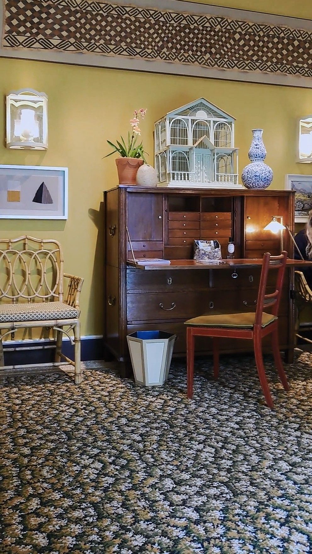
Study Two: Functional Reality.
There were also office and study displays to be found in the showroom windows adjacent to the exhibition. The example below from Ligne Roset. This shows the reality of what people tend to buy. I do love the warmth of a dark walnut wood. It might be the new burled wood style that is coming in.
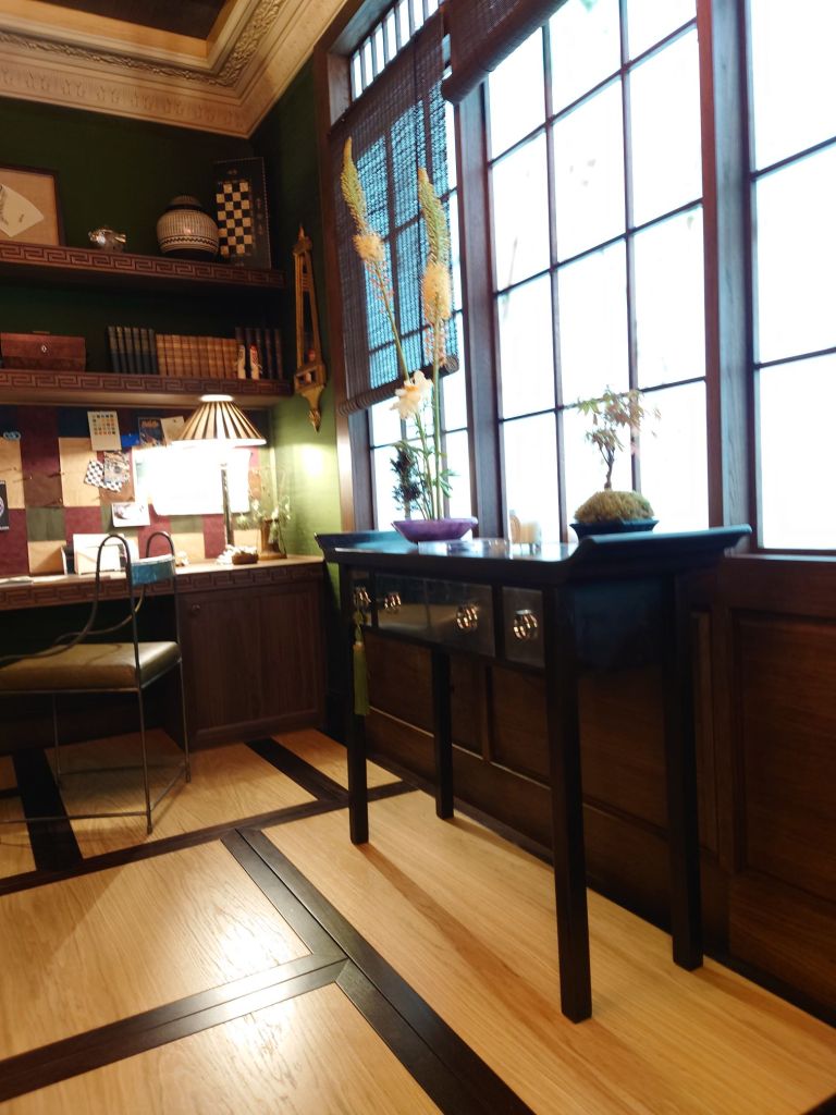
Study Three: Global Style Influences
East meets west. Japan has an influence in the room set up below. By Anahita Rigby’s cool office with a strange zen yet industrious feel. It was one of the rooms that enjoyed sitting in for a long time just absorbing all the textures.
Below are videos of lighter versions of studies.
Study four: How to elegantly place your desk in your bedroom
The exquisite desk arrangement in the Courtyard bedroom of Veere Grenney showing restrained elegance for Schumacher.
Veere Grennay’s elegant desk creating a study area in the Courtyard Bedroom
I think you can hear other viewers giggling about another room, they were hinting at how one of the rooms reminded them of a cosy country cottage. I left the sound on as the music seemed to find to fit the calm feel of this desk arrangement.
Study Five: Library Decor on Stage
And lastly putting on a grand appearance (his background explains why) is the Library by Andrea Benedettini. He used to be a Ballet Dancer and the Library was inspired Swan Lake and theatre curtains. I love the ballet and have seen many productions and this library setting was significant for me as it including floor to ceiling curtains to cover the walls. Andrea Benedetti is said (by the tour guide) to have been inspired by stage curtains for the wall draping. It was beautiful. I love that the overall look acknowledges the importance of presenting those bookshelves. And this room is a great exemplar for shelf styling cabinetry integrated into a room.
Andrea Benedettini Library
Overall I found I was full of wonder at the wow house. I was struck by how every study room appeared to use fabric as a wall covering. There was also deeply considered treatment of the ceilings as a feature or complement the room
Metal tended to feature in the lighting for all office desks and shelves so this might influence what I do with future lighting collections too.
Art was another big feature for shelf and desk displays, with nearly every room acknowledgeing the important role that art plays for personalising the space and conveying the inhabitant’s unique personality. I particularly loved how in the Martin Moore kitchen with Studio Vero (Romanov Brihi and Venetia Rudebeck) they purposefully curated and displayed green and organic themed art for shelves in their kitchen. It complimented the beautiful green and black marble surfaces they used, to make the space feel like a place to spend time and truly enjoy.
As a bonus i have added the Colefax and Fowler Morning Room by Lucy Hammond Giles. For some reason this was the room where everyone seemed to just want to sit in and rest and take in the decor.
Colefax and Fowler, Morning Room by Lucy Hammond Giles
What are the best office set ups or studies you have seen? What did you like about the five studies I’ve looked at?
My work as a corporate trainer/ instructor and coach this week took me for an onsite to our client in their new home in an amazing building. The Arbor Building is in Blackfriars Road in London, UK and it boasts that it is carbon neutral. There are neighbouring buildings and I’m told it is a fossil free development called Bankside Yards which is a major architectural, construction and interiors project feat. I was especially impressed at how beautifully the interiors echoed the sustainability ethos too. See the photos I took below


You must be logged in to post a comment.