Well-manicured: Perfecting my brush strokes

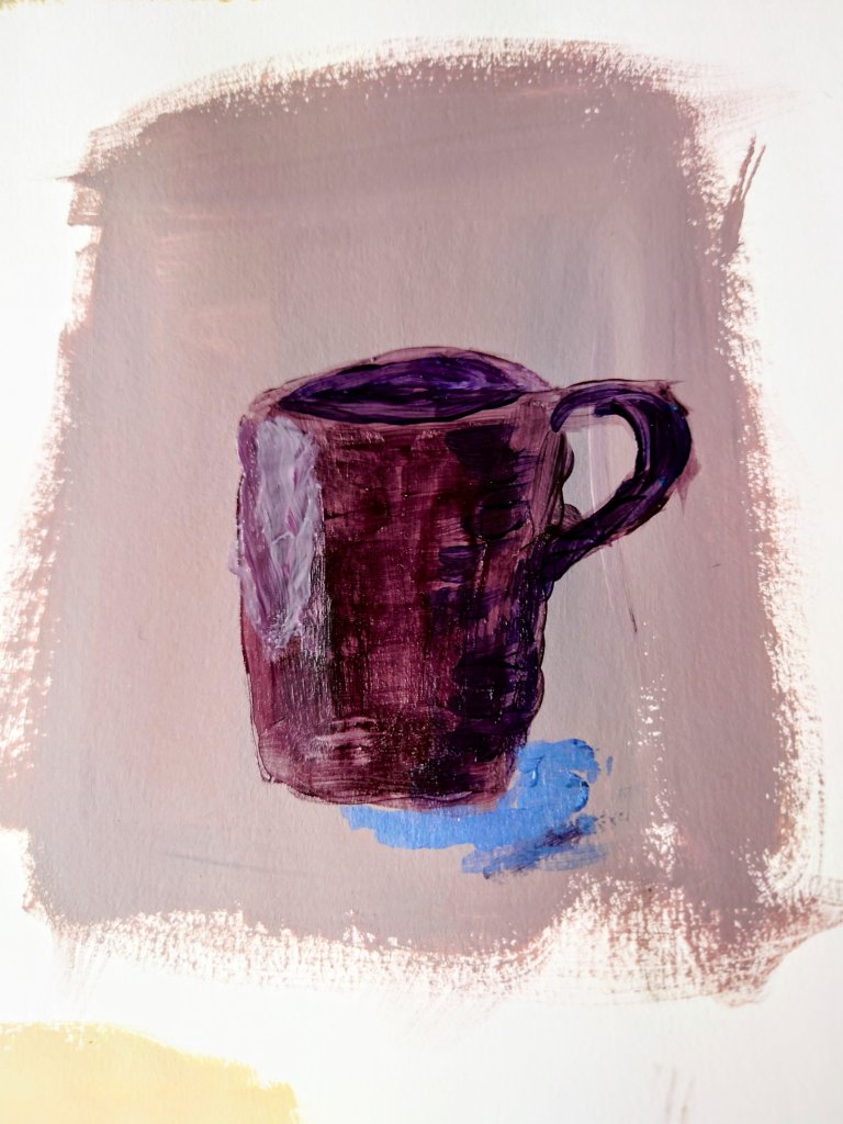
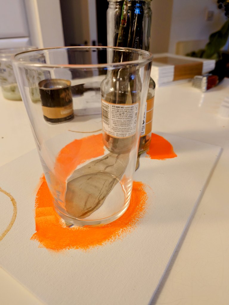
In an earlier blog, I complained about how I wasn’t happy with the brush strokes on the green sauce boat. https://wordpress.com/post/homeofficecharm.com/2811

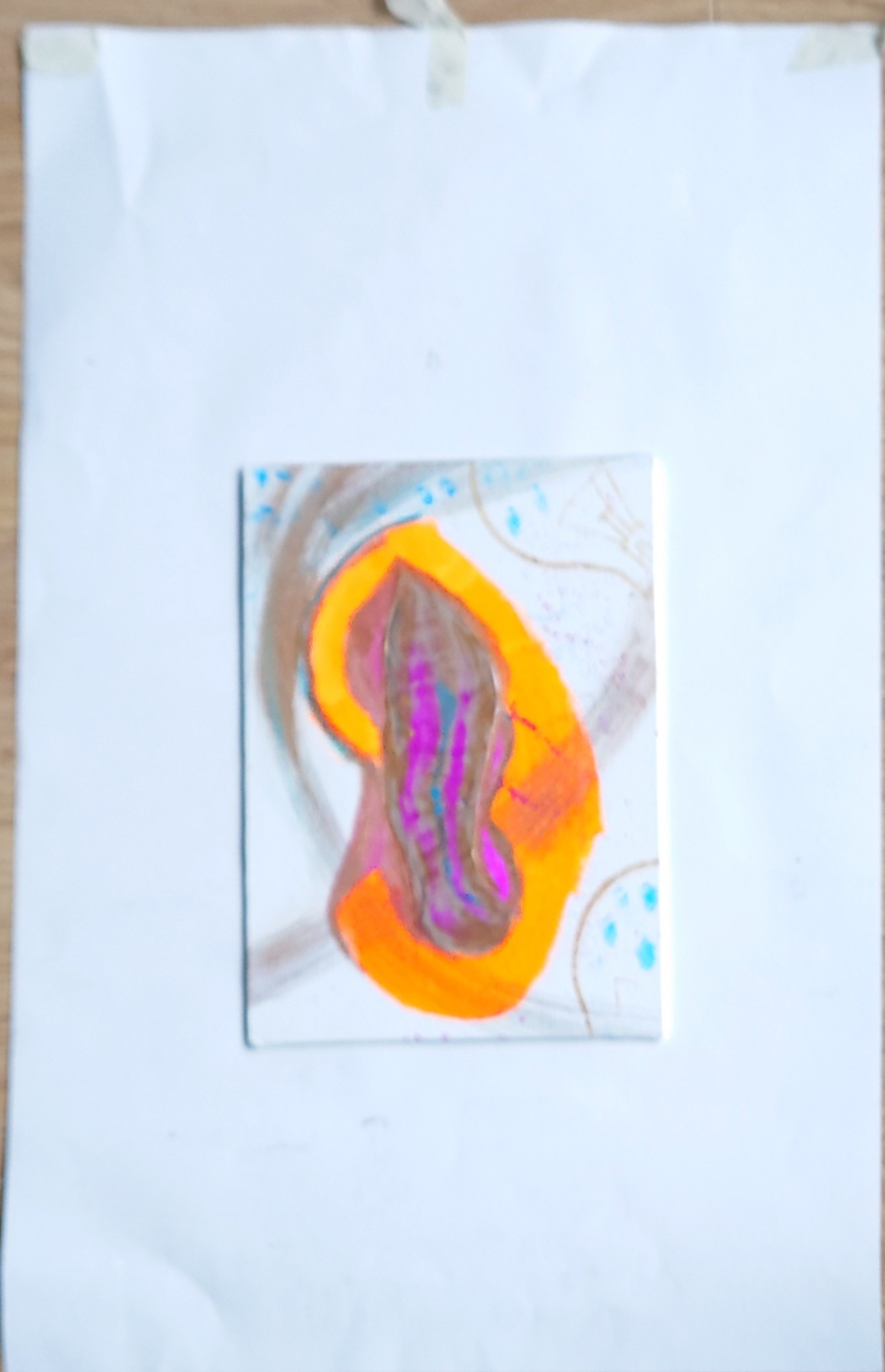
Since then I spent some time practising what I said I would do and remembered that inner manicurist in me. Thus I imagined that I was painting a very fussy client’s fingernails. That seems to do the trick because keeping the medium and paints nice and light and thin and applying several thin layers help me to create a lovely glossy transparent look. It appeared to be like the glossy effect of the original sauceboat

Getting gloss medium layers right

Top tip: I might inspect more paintings for the brushstroke work. It never occurred to me how much time and effort should go into getting the painted effect I want right. And thanks to my old career in beauty therapy and those manicures, french polishes I did I can gain confidence in my painting brush stroke techniques.

Video post: Experimenting with textures and colour grounds

This week I upgraded to allow video posts. Here you can see what I painted this week and listen to my voice as I talk through my art pieces.

Neon Acrylic and impasto on paper

Below is an example of rougher textures. I like the juxtaposition of rough or matt against smooth and glossy to show contrast and tension.

Mixed media sand in acrylic and gel gloss on paper

Colour scales & tone

I got painting in colour this week. The still life got me to experiment with light and shadows.

I did the shadows and dark s without using pure black on the page but instead using primary colours to create a neutral. That dark neutral would also create a lovely grey when white was added to it.

Setting the tone: More than 50 Shades

This week was a difficult week at work as well as with family. Events made me think of mortality and the intended and unintended impressions we might leave on people around us.

Some impressions might linger for decades while others might change more immediately according to the amount of light or shade in our behaviour that is applied.

I noticed how this insight is conveyed with a study of tonal impressions. It changes depending on how much white or black paint is added. There are therefore more than fifty shades of grey as well as any colour possibly

Still life study in tones of black white and grey. Includes dry brushing.
Amazed by different reds and tones from crimsons
Tides of crimson tones

Starting Nano Neon Abstract Paintings

I made a start on a new collection this week. It combines some graphic figures and abstract work. They are on a background of white and have neon and gold iridescence for a fantastical piece that has everyday significance.

I love how the light affects neon colours. They are great for bringing cheer and playfulness into my art. They’ll look amazing in a beach house or sunny climate. I’m halfway through finishing these, and when they are ready, they’ll be in the shop soon.

Neon Abstract from a life drawing in charcoal during speed poses. It is becoming a piece related to body dis-morphia