

A visit that opened a deeper connection
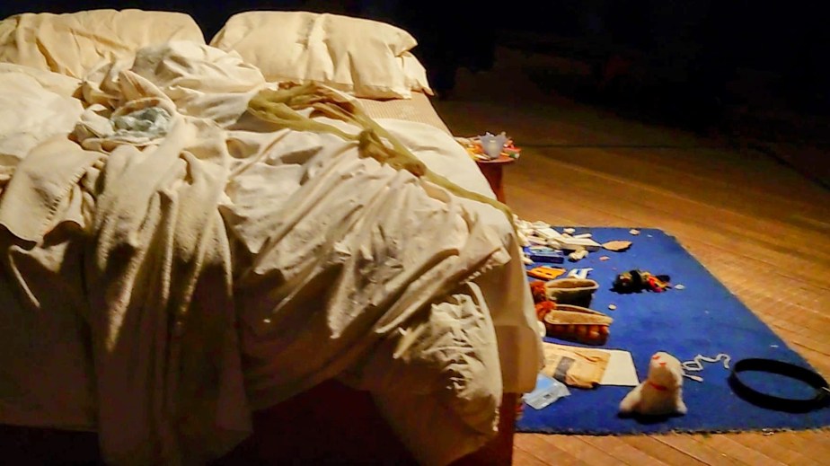
I visited the Tate Modern on a very busy second day of Tracey Emin’s Second Life exhibition. This exhibition runs until August. I went expecting to be interested. However, I did not expect to feel such a strong sense of affinity with her work. Her installation My Bed was there, and I was surprised by how long I stood in front of it. I kept taking it in, noticing the layers, the objects, the emotional charge. There was so much to absorb and I found myself captivated by the honesty of it.
Craft as a language of emotional honesty
As I moved through the exhibition, I realised how many points of connection I felt with her practice. It was not the autobiographical exposure or the presentation of her physical body. That is not where my own work lives.
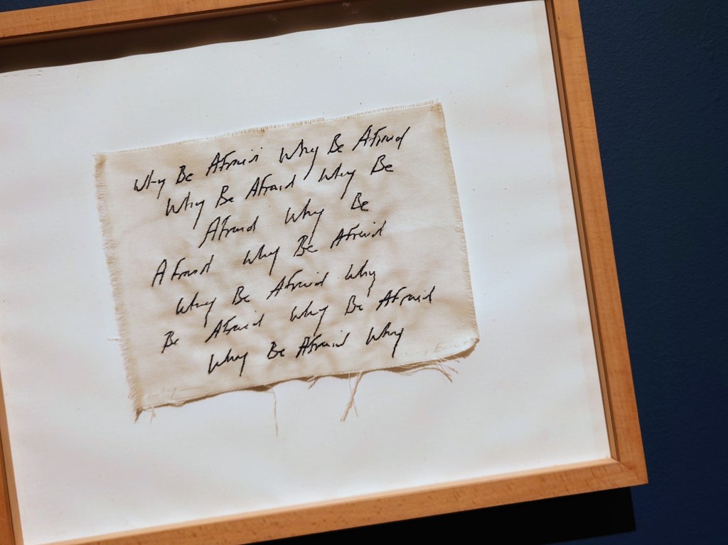
Handwritten text and appliqué as emotional markers
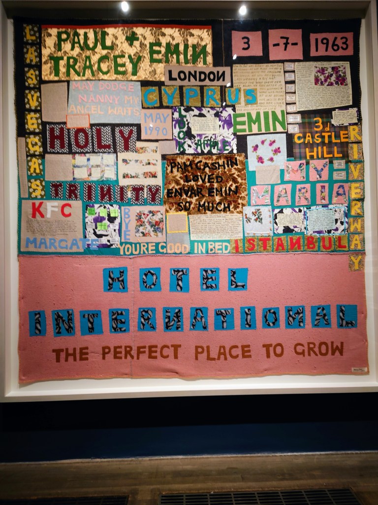
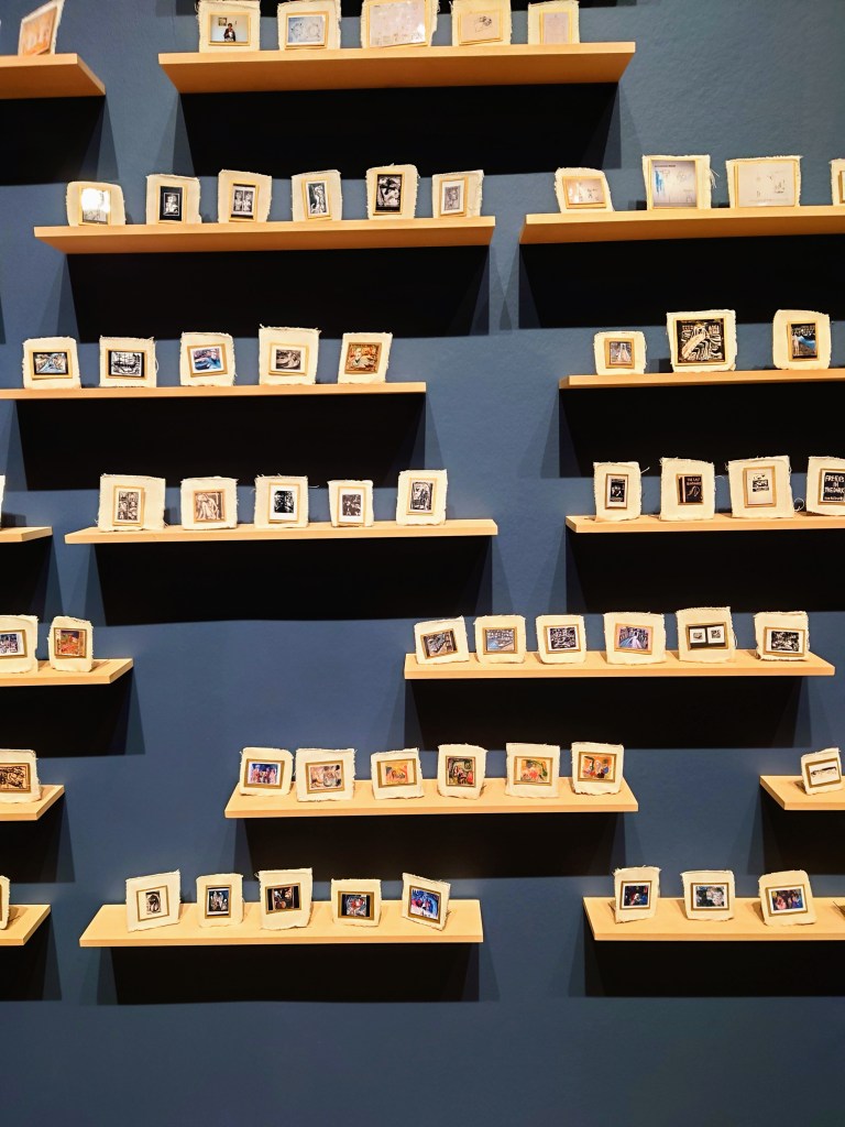
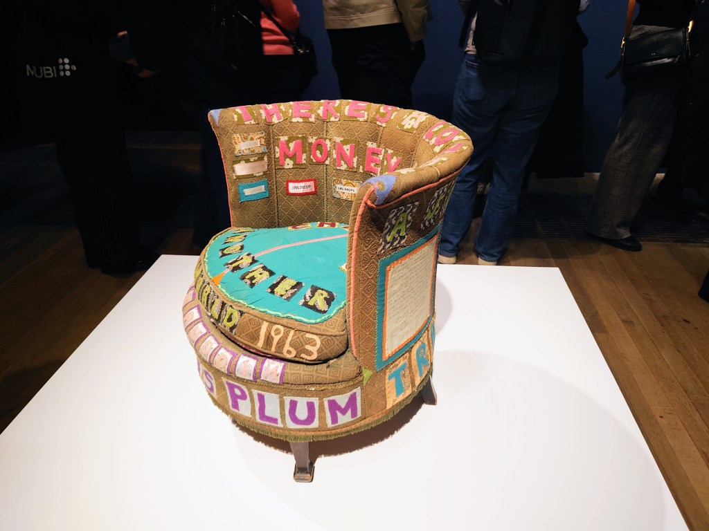
What resonated was her use of craft. The stitching, the embroidery, the appliqué letters, the handwritten text. These are materials and methods I have used quietly for years. I have worked with fabrics, hand sewing, and embroidered photographs. Yet, I have often felt embarrassed about hand stitching. It seemed to belong to a private world that should not be visible in contemporary art. And I was encouraged to see some of the quilters exhibited in USA art galleries like the Smithsonian.
Stitching and embroidery as serious artistic tools
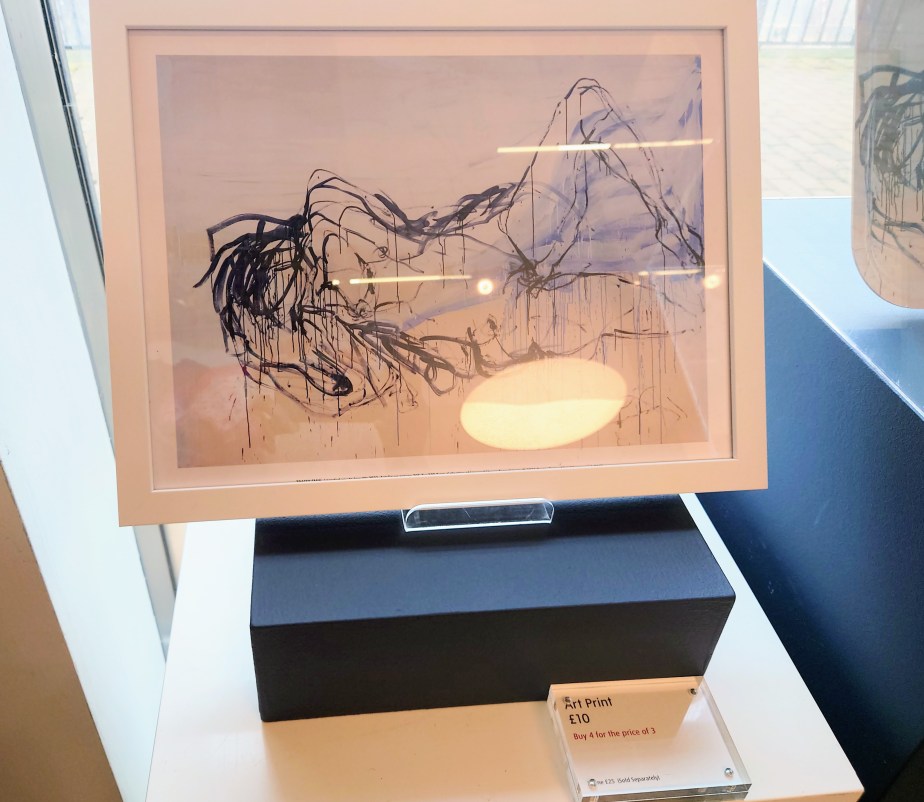
Seeing Emin’s craft presented with such authority changed something for me. Her materials were not softened or made polite. They were not decorative. They were direct, emotional, and unapologetic. Her applique lettering in particular stayed with me. The uneven edges, the rawness of the cut fabric, the sense that the words were lived rather than designed. It gave me permission to explore signage and text in my own work. Her work told me I could do this without smoothing the edges or making everything tidy in my abstract paintings. It reminded me that clarity does not require prettiness.
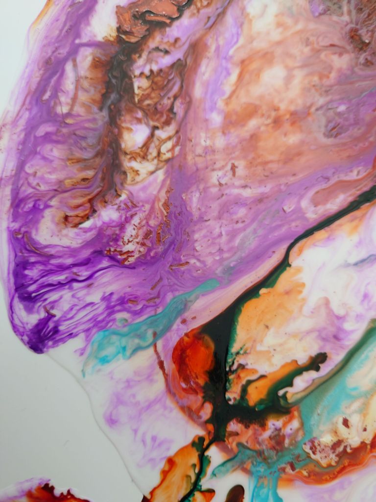
The expressive power of the drip
I was also struck by the messy drips running down many of her large scale works. They were not accidental. They were not cleaned up. They were part of the emotional structure of the piece. I use drips too. I learned this technique at the Central St Martins course I attended.
Drips as a truthful response to organisational life
I often worried that poured pains and drip work make my work look messy or unfinished. But standing in front of her canvases, I understood something important. The drip is not a flaw. It is a form of honesty. In my own practice, the drip acknowledges the realism of organisational life. The parts that are gory, unpredictable, complex, and resistant to cosmetic treatment. To restrain my mark for the sake of prettiness would mean participating in a surface level gloss. This gloss often hides how work actually feels. Emin’s drips reminded me that boldness is not about being loud. It is about being real with the marks.
Where our practices diverge
There are places where our practices diverge. Emin uses her body as a site of truth telling. I use materiality. She reveals the self directly. I reveal it through construction, colour, texture, and layered surfaces. But the emotional triggers behind the work feel familiar. The lived experiences. The internal negotiations. The moments of rupture and repair.
My work expresses these themes through abstraction and craft. This approach differs from confession. This difference helps collectors understand the kind of presence my work brings into a room. It is not autobiographical exposure. It is emotional resonance.
What this means for art in a home office
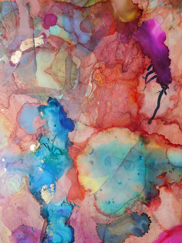
As I left the exhibition, I wrote in the visitors book. I wrote about boldness. I wrote about hope. I wrote about the relief of seeing craft treated as a serious artistic language. And I realised that this is exactly what I want my work to bring into someone’s home office. Pride in who they are and how they work. Courage to express their own boldness. Recognition of the complexities of business, economics, and organisational life. Colour and texture that shift the emotional temperature of a room. A sense of companionship from a piece that understands the messiness of ambition.
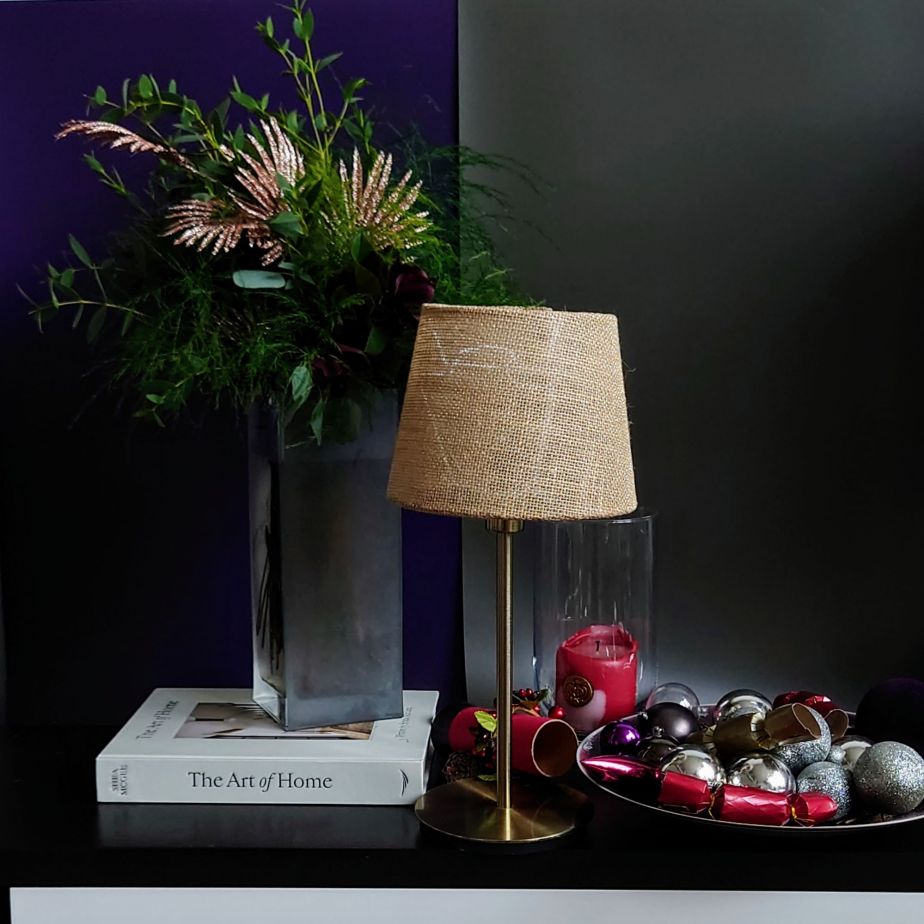
For some people, this will be a small, bright artwork. It sits on a shelf or desk and lifts the atmosphere of the space. For others, it will be a larger commissioned piece. It transforms a moody or neutral room into something alive. The room becomes grounded and emotionally intelligent. Both are part of the same intention. To bring honesty, colour, and courage into the spaces where we think, work, and make decisions.
Closing reflections on boldness and presence
Emin’s exhibition helps me see my own practice differently. It shows that it sits within a lineage of artists. These artists refuse to tidy the truth. The stitches, the drips, the uneven edges, the layered surfaces. These are not imperfections. They are evidence of a life being lived and understood. They are reminders that work, like art, is rarely neat. There is beauty in acknowledging that messiness. It might sit quietly as a piece of original art on your shelf.
Art that shifts the emotional temperature of a workspace
If you want a piece that brings this kind of presence into your home office, explore the smaller works. They are ready to place on your bookshelf.
If you are imagining something larger and more personal for your space, I would be glad to discuss a commission.
I hope this reflection on Emin’s boldness inspires you to bring a little more of your own boldness into the room where you work.


You must be logged in to post a comment.