Inspo Week from Decorex & Frieze London

In London this week we had two big exhibits. Decorex and Frieze were on this week.
Wednesday, I popped into Decorex ( the interior designers’ top show) and found they were showing three big design trends with lighting. The new styles included natural lampshades, ethereal and fantasy. Below are some photos showing those themes. It was showing in Olympia London, and I felt very at home, since I am from the locality. It was my first time going to Decorex, and I got inspired to do a booth there in future as I was inspired by a small cushion maker’s tiny booth. That could be me, I thought. Not particularly making cushions but instead offering my items to the interior design trade.

The second show was Frieze which according to the tour guide “is the Hollywood of the art world”. It was beautifully set up in Regent’s park. I was very impressed. Slightly overwhelmed and a little bit intimidated at the beginning.

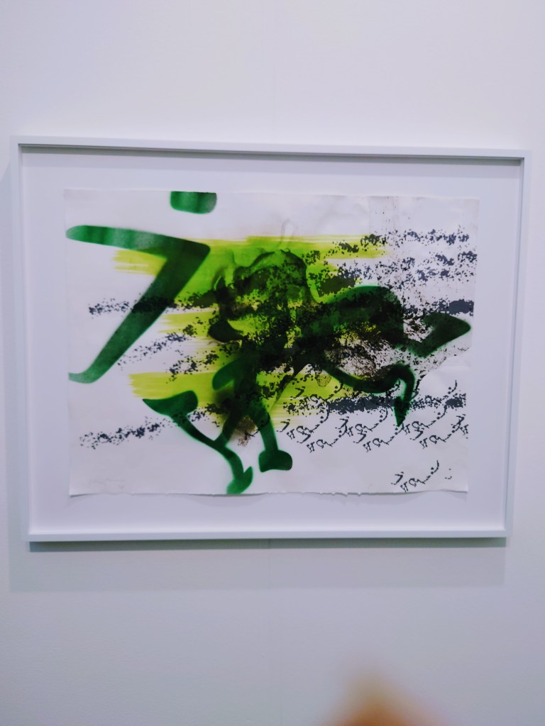
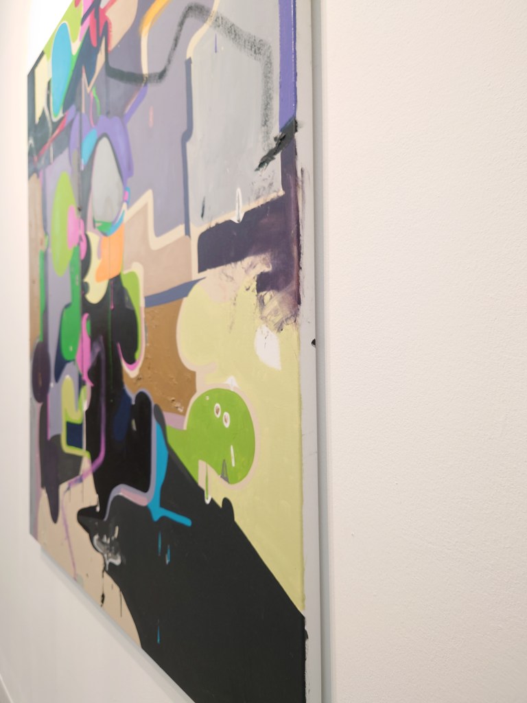
It was great to see so many giant paintings. Some cost £300,000 to a million. Others cost about £6,000. Our guide told us about the process of the gallery pitching then a selection panel decides which work to exhibit. The dominant theme this year and recently is about showing consciousness. There were fewer north European artists and more artworks from voices we don’t always hear about, like native Americans, Vietnam and Brazillian. The underlying themes also had much to do with sustainability, social good, or responsibility.

I’d like to attend next year and will plan to make a whole day out of it with a nice lunch and make it more social.

There is Still Life in My Pencil

I’m growing more confident and intrigued about my mark-making. I am confident because I managed to get some tutored practice last week at my regular new art classes. It is enlightening to see my finished works against others in the still life class.

Some artists go for realism, where their sketching looks exactly like a photo of the object. I’m in awe of those. However, others like me don’t. I struggle with getting it real. It might be that I don’t have the patience or the looking skill. But when I complained that my marks were not exactly like the set up to my teacher, instead of giving me tips to make it more real, she said that was what Van Gough did. This linking of my marking type to an old master reassured me. It also made me curious to see more of Van Gough’s work. Some of my favourites from Van Gough are below. I like the milk jug. As you can see, I show the screen grab with a ring around my favourite of his illustrations.

Sharpening my focus

I went back to basics and relearned drawing, and the strategies used to perfect the representation of the figure.

I learned the intricacies of negative space and what it is used for. I also learned the aligning with a kebab stick. And top tip note to self remember to imagine there is a plate of glass in front of you.

I also learned to insert scaffolding in the drawing to ensure you get the proportion right. All the things they didn’t teach me when I worked towards my A’level art all those decades ago. At least I cannot remember them teaching me. Perhaps when I was aged 15,16,17, I wasn’t listening to what I was taught. But the pictures below show.

I am listening now.

I am listening now to instructions about getting the proportions and balance of my lines right.

Inspired by nature’s little crafters

I had a pile of work to do and spent some time doing the housework, which felt cathartic. But I experienced guilt because I wasn’t doing the additional work I promised I would do to aid my 9 to 5. I looked up and caught a glimpse of a spider web that must have appeared recently. Seeing this gave me a moment to pause.
I paused because I was strangely struck by the beauty of the spider web. The more I looked at it, the more I was intrigued by the amount of work that such a tiny creature might have to do to create such intricate patterns through its mastery of weaving.

I appreciated the thought (if spiders think) in designing the breadth and depth then the shape of the web. I also particularly admired how the sunlight captured what must be hundreds of little notes and intersections of the spider’s web, which made them glisten, emitting all the colours of the rainbow.

They looked like nanocrystals and reminded me of my love for the light in the vintage Swarovski crystals I used to use.

It really was a delight to behold. Seeing the spider’s web was a chance to observe natural beauty and the wonders of a world of creativity that does not come from humanity.

I was transfixed for some time. So took some photos of this incredible piece of installation art created by a spider.

Do not ask me what kind of spider it is. I suspect it might be the kind that enjoys the inevitable spider mite flies around my Calathea and Strelizia plants.

Later in the day, my reflections on the spider’s web produced some ideas for a new line of products. I thought of a way of fusing everything I love to do and weaving my artistic talents with my desire to finish working on those lampshades I had shamefully half made over a year ago. I had suffered from makers block and was dragging my feet towards completing them. But I got my maker’s blank unblocked by being mesmerised by the connections made in the spider’s web.

The sketch shows what the spider’s web gazing taught me. It is an outline plan of three types of new surface designs for lampshades painted with masking and dripping so that the original fabric appears as an underpainting. The masking can aid more graphical forms to appear on the upper paint layer to signify monograms, names or shapes.

Purple Reign II: Cortège Sketching

It was sad that Queen Elizabeth II died on Thursday, last week. I didn’t realise. I was at a work party. Then, on my way home, I saw all the adverts on the bus shelter portray TFL’s tribute/ perhaps public announcement. This is because all digital posters were saying the same thing. They all said Queen Elizabeth II 1926 to 2022 on a grey background. It was not too unlike the image below. That was my first indication that something had changed. I was very surprised.

Today I have been watching her coffin leave Balmoral and travel to Edinburgh. The road from Balmoral to the East is a road I had also travelled when I lived in Aberdeen as an MSc student at the University of Aberdeen. When the BBC TV presenters were calling out the towns like Banchory and Stonehaven as well as Donatoar Castle while the beautiful helicopter camera view of the journey televised its hearse tracking, it brought back my good memories of the Scottish countryside. It also felt quite moving.

Today it felt fitting to create some etchings and quick paint sketchings and draft paintings in royal purple. These are unfinished works. Below are images using purple. I sometimes shy away from purple, but since Queen Elizabeth II’s death, I’ve seen the Empire State Building shine her image amidst purple lights. Purple is currently a big theme.

Queen Elizabeth’s coffin is due to arrive in London via Northolt Airport (not far from where I live). I remember going to Northolt airport 25 years ago to watch Diana’s coffin arrive from Paris, and I (with some friends) watched it travel down the tunnel for the A40. In fact, I’m inclined to go to the A40 on Tuesday to pay my respects to Queen Elizabeth as the hearse makes its way into central London. If I get any pictures, I will post them here. The ritual of watching dignitaries and their coffins travel by road via TV reminds me of when I watched Nelson’s Mandella televised coffin travelling to its burial site in 2013. It is amazing what TV can allow you to do nowadays.