This week I was doing the final varnish and layering on of skins for my artwork while making sense of what the series should be called and the concept behind it.
This first series has taken me over a year to make and there are over 30 mixed media 7” x 5” (178 x 127cm) pieces in the series. I thought of all kinds of names to acknowledge that the pieces express the underlying complexity and tensions I see in organisational life, as I’ve gone about helping workers with changing the corporate landscape. There is an overall name for the series which is abstract botanicals. But..that would be the more appealing acceptable name.
I was encouraged to hear another artist speak of her work conveying the horror and disgust that she experiences with another phenomena. And I realised that this is what my art is conveying too. Thus although this first series shows bright and colourful, botanical patterns of barely recognisable trees, plants and flowers (apparently I’m good at transubstantiation, necessary for abstract work), it sure ain’t pretty.
I’ve started to integrate my two arts. In psychology, that’s a good thing to do to become whole. But I thought about that after and not before I did it.
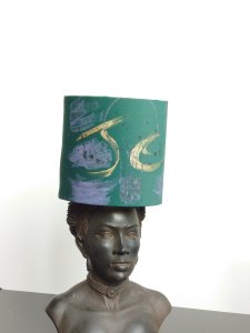
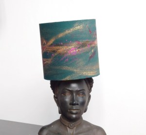
I have integrated my graffiti art onto my lampshades. They look rather cool. I noticed my curly cursive writing when using paint and how it has a unique style of its own despite my dyspraxia dyslexia which allows the lines and the curves to take on another life of their own.
I was also inspired by a question in our Facebook group for lampshade makers. Someone had asked how to display the lampshades when they go to fairs. This question comes up often. The idea to use mannequins to display the maker’s lampshades came up, and I scoffed at the response, thinking it was that gimmicky, and I couldn’t imagine how that might look. It might look hideous and distract from the shades for the person asking. And I also thought that lagging the mannequins around and putting them together at the fair was difficult.
The person had large shades about 30cm 40 cm wide, and ultimately, the look would have been very Ascot-like, as if the manikins were wearing wide-brimmed hats.
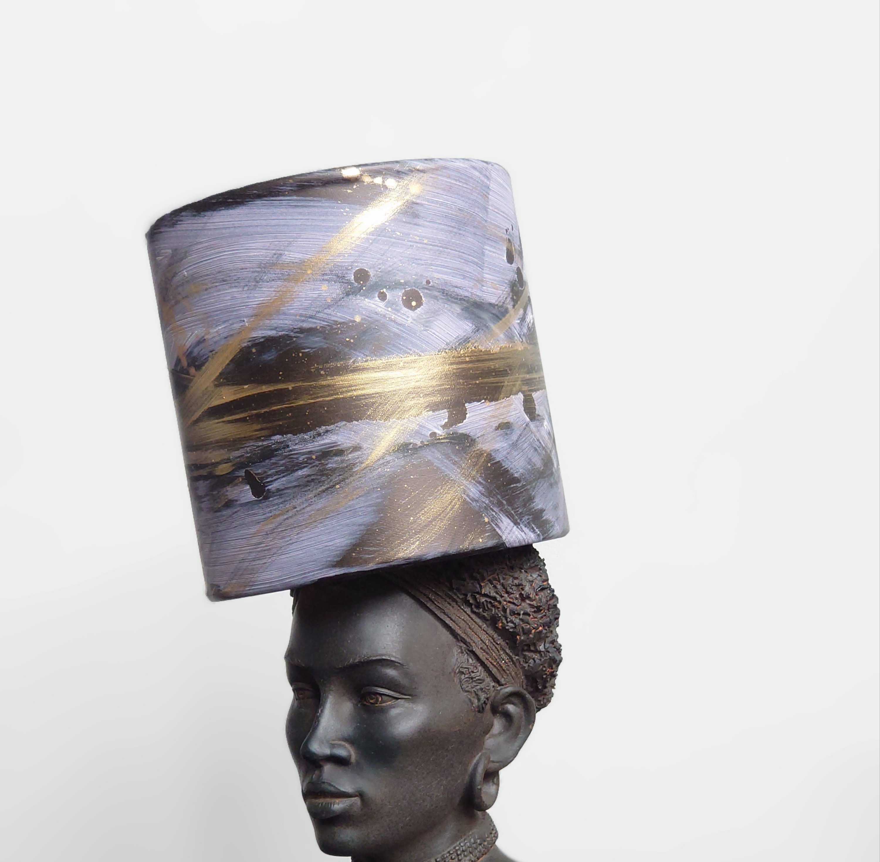
Then I didn’t think about it again until I had to take some images for my 15 cm lampshades for the desks of stylish professionals and their statement yet cosey task lighting. I was searching for inspiration and realised that sitting across from me was a head figure I bought from a trendy interior designer, Abigail Ahern’s shop. I promptly placed one of the lampshades on the statue, which did seem like sacrilege a bit at first.
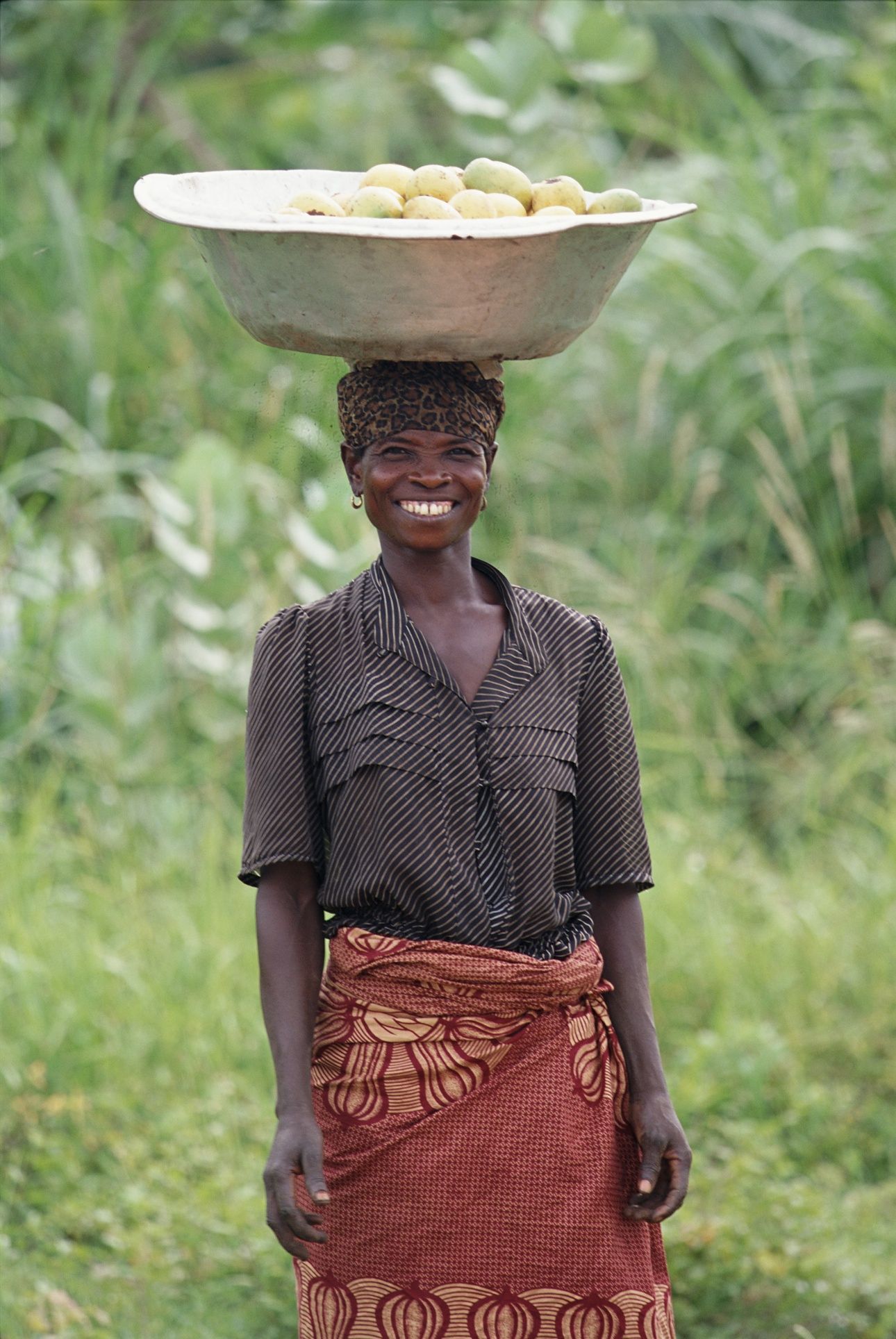
However, after some thinking about it, I realised how fitting and natural it was., Seeing a statue of a magnificent African woman or woman with African heritage with a tall cylindrical object on the head reminds me of what I saw when I visited Africa. I travelled on a Kenya safari and spent some time in Nigeria for work. Seeing a magnificent woman walking around with a cylindrical bucket containing water, shopping or goods for the markets on their head was normal. But it always pains me that the cylindrical buckets the African women (children too and young men to a lesser extent) normally have on their heads were often some garish yellow or blue plastic unimaginative vessels.
Looking at my graffiti lampshades on the figurine in more depth; I began to take pride in what my eyes were seeing. Noticing how my graffiti artwork on the lampshades then placed on the African woman’s head felt like fantastical art because it depicted a more luxurious scene, albeit slightly surreal.
I imagined myself as an African woman and recalled what I saw in the ritual of attending church and weddings and wearing big wrappers that acted like gigantic fabric expressions of a crown. The look is awesome.
But what if there could be something like my beautiful cylindrical vessels (lampshades) that the African women could continue deftly carrying on their heads as they go about their daily life and l chores?
It dawned on me that perhaps my placing of lampshades with graffiti art on sculpture together is another form of fantastical black art. It is indeed my fantasy that those wonderful ladies I saw in Africa had something more glamorous as a vessel to carry on their heads. I would like them to freely cast away those horrible unimaginative plastic yellow buckets and go for something more considered in its design.
Those women are very entrepreneurial and perhaps like taxi drivers in London; they could get the carrying vessels of their future sponsored by local businesses, and a local creative person might be able to use top calligraphy skills and design competence to embellish their vessels with more beautiful graphics that become useful communication collateral for local businesses. Ultimately their new carrier vessel earns revenue through advertising the local firm.
I’m going to look into it and see how I can help. However, I wouldn’t be surprised if the women have probably already done it because African women are reported to be highly entrepreneurial. But I would like to get an insight into what African friends think of my fantastical black art (graffiti lampshades on African head sculptures) and the extent to which it reflects the 21st-century African and African women’s vessels they carry around on their heads.
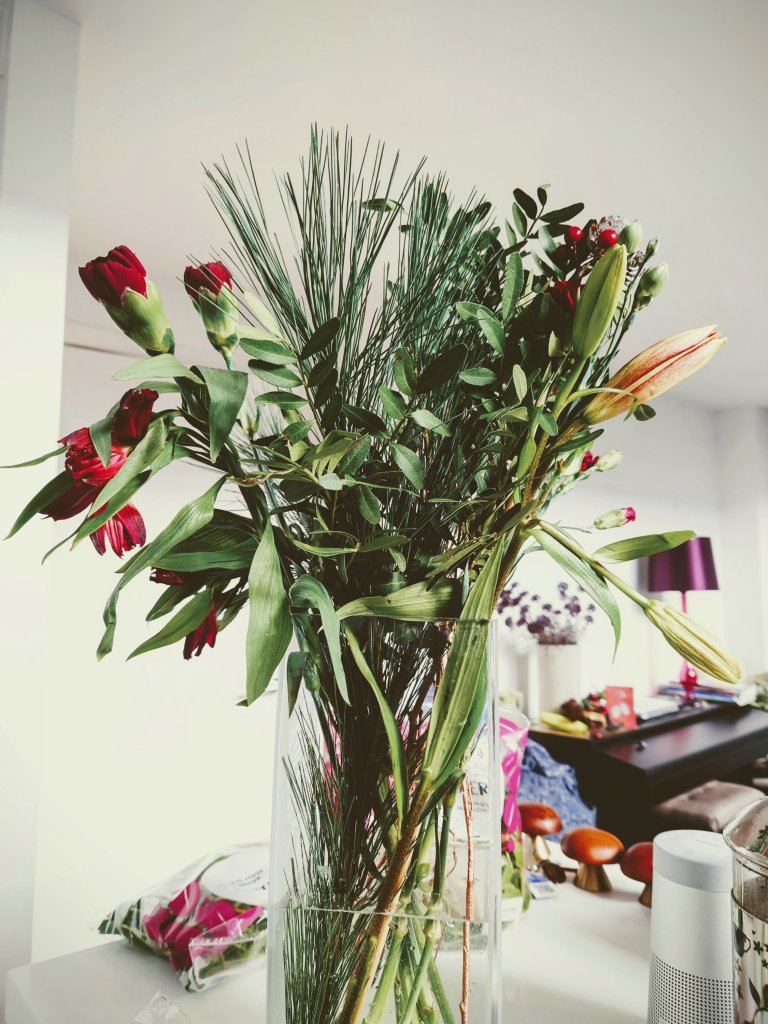
It’s Christmas time 🎄. I hope you had a good one. A few pics from ours are below. And some of my reflections are detailed and in longer form than usual.
With it being Christmas, I’ve been reflecting on how similar tools are used between artists and those performing in other fields.
I started noticing the supply links between various trades when I did the 14 day CSM course. At CSM, we used paraffin wax as a medium to create a ghostly effect on the painting. I told the CSM teacher that we used the same paraffin wax as a moisturiser for hands and feet in my early beauty training (I used it when I taught at LCF). I mentioned how interesting it was that the university might be ordering paraffin wax for many different uses.
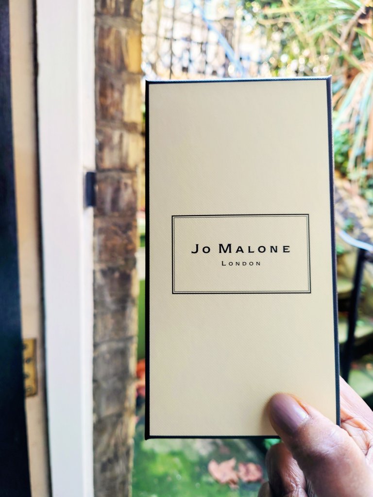
Jo Malone perfume is symbolic of the multiple cosmetics uses in artistic works and expressions of the self.
Another common tool I noticed that artists and hairdressers use this time is hairspray. Hairdressers use hairspray to fix the clients’ waves and curls. Similarly, in the courses I’ve been on for painting, we finish the painting if it’s done in charcoal with hairspray; if we use pastels, chalk or charcoal. It stops the marks from spreading so that it doesn’t get smashed when we roll up our work.
I mentioned in an earlier blog an insight about choosing your flesh colour and the right kind of mixing paint to get the right skin tones. I noticed how the class agonised about mixing reds and yellows to get the right kind of blue to get the right skin tone for painting a portrait. Then I realised I could be more effective if we did a shortcut by going straight to an industry that already had the skin colours right. My makeup artist instinct/ training is linked to these common artists’ dilemmas. The difficulty I faced in painting a life model’s portrait with acrylics is what I recall from trying to find the right colour for the model’s skin for a magazine’s front cover (BTW, I only did a couple of MUI gigs, for now, obsolete magazines, so don’t bother riffling through vogue to find me listed as the makeup artist). I asked the art teacher if she recalled any big cosmetic brands working with artists. Or if artists are working with cosmetic brands. The discussion generated our ponderings over projects like how reusing old foundations is useful because we’re trying to find the right skin tone to match this person’s skin. It’s a universal question between these artistic spheres.
My art teacher said she was unaware anyone was doing it and agreed this was a missed opportunity for some big brands to showcase and do some interesting work with the wonderful big range of colours they now use. She said she thought the problem would be getting the darker tones, and I said that now, big brands like L’Oreal are doing darker tones these days. , it will be a much easier thing. It was weird for me to struggle to find the right blue to turn yellow and red into skin tone colour varieties. The conclusion was that it could be more of an oil painting if I tried it.
So all this made me realise that the next course I need to take would be an oil painting class. So watch this space.
In addition, all these musings gave me this idea about collaborating with other trades doing paintings, doing both of them figuratively. I’m not a fan of figurative paintings (not yet sure why- it might be about labour intensity), but I’d like to experiment and see where I go with doing some portrait paintings using foundation instead of its traditional watercolour and your traditional acrylic. How ironic that it might be the very traditional oil painting class I might need to go on to bring forth a painting that is more meaningful and interesting for me.
It is Christmas time and I’m wishing you and your family every good wish for the season, no matter what kind of artist or creative person you are.
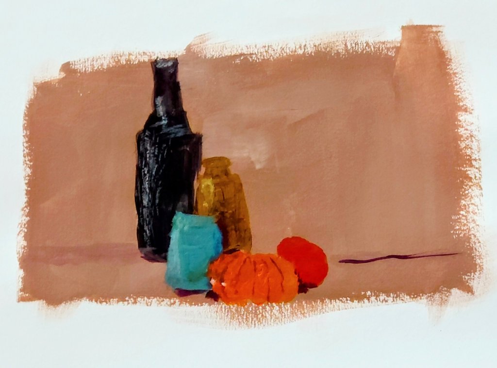
I got painting in colour this week. The still life got me to experiment with light and shadows.
She said it is a lovely little painting 🖌️Acrylic still life on paper on warm peach ground
I did the shadows and dark s without using pure black on the page but instead using primary colours to create a neutral. That dark neutral would also create a lovely grey when white was added to it.
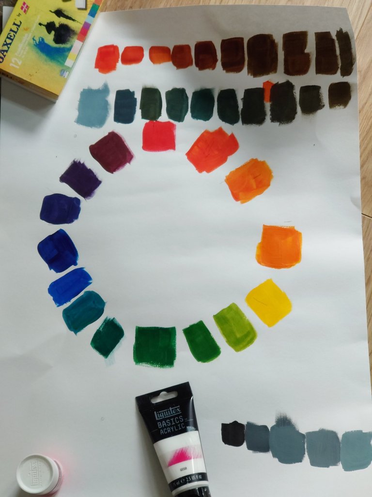
Doing my colour wheel 🎡 meant I squeezed in two extra colours to make 14 instead of 12. My orange colour scales show the journey to dark neutral turning into grey.Developing my colour scales practice


You must be logged in to post a comment.