Following on from the last success with multimedia and because I hadn’t much opportunity to do any brush work recently I have modified one of my paintings using my phablet as it is my new…. toy.
Where art meets meaning, and your space meets you

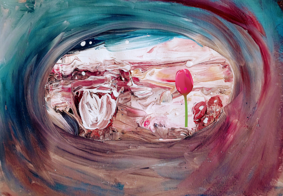
Following on from the last success with multimedia and because I hadn’t much opportunity to do any brush work recently I have modified one of my paintings using my phablet as it is my new…. toy.
Does it look bashful to you? The fantasy flower in this painting appears to be slightly embarrassed.

I wonder why.
Perhaps it is because I used the big bold blusher brush to get all the emotion out to create those swirls.

There is no shame here. Be bold with your crimson connection. Personally I don’t see anything wrong with combining magentaish pink with understated and sultry coral.

Be proud we say!
Here is what the detail of it looks framed.

Shine on with your cool bold emblushered self.
So is it a paradox or irony that I used moisturising masks and serums to help create rough textures in my paintings?


Whatever it is, I rather enjoy indulging in the strangeness of it all.
Some might think to use expensive cosmetics and skin care products is a sin.
Me I’m past caring about the culture of body shaming and image anxieties. So I use my old cosmetics in my paintings. Not to make them beautiful necessarily but to help the earth shine.
What I hate to think is that the excess and waste from the cosmetic industry has the potential of ending up as land fill.
Who knows what harm this could do to the soil, or animals so it’s better we make use of them and keep them on the land surface with us while decorating our houses and homes.

So I experimented last night I’ve been watching all these videos about acrylic pouring . I do like to see the finished results as these amazing sparkly Goldie blingy shiny paintings .

Doing an acrylic pour is one of the items on my activity wish list so I had a go and in this next series of five are the end results.

It’s not strictly an acrylic pour it’s a made up version. Normally a pour needs things like silicon and all kinds of bits added to make the the paint separate so that you get what they call cells.
So for the first one you can see in the next post that I added Environ face mask to it and I added a serum gel something I thought would be making the acrylic separation. But that didn’t work in the same way I would hope.
Instead what I do love is the smooth texture the my upcycled make up brushes make to the painting. Here I used the contour brush. I’m sure I would not be getting such a smoothly sumptuously painted surface if I used ordinary artists paint brushes.
So I did this one when I was chatting to Frances too https://earthshinearts.com/2018/06/29/a-3d-subconscious-painting-blue-and-green-that-never-should-have-been-seen-or-heard/
Words?
I have none. Except that it is upside down but looks better for it, I 🤔.


You must be logged in to post a comment.