Two Ways & One Why on Art for Home Offices: Modern Master, AI or Lowly Crafter?

This week I had time off from my 9 to 5 and immersed myself in making while fighting a head cold. But determined to stock up for my Etsy shop and develop the idea of a decor solution for people working from home. Realised that being a lowly crafter, artist and maker has advantages for pushing the art envelope further to improve how businesses work.

Continue reading “Two Ways & One Why on Art for Home Offices: Modern Master, AI or Lowly Crafter?”

Why Painting Julian Opie Simplicity is Quite Hard

Our teacher took us through some portraits this week in my art class. The usual classics were there for us to study composition, tone, paint strokes etc. But I was struck by how much I was drawn into Julian Opie’s work.


I’d never seen his work before, and I noticed how my eyes were pulled into pattern finding.


However, I took on the challenge of seeing what my marks and finish might be like if I painted in the style of Julian Opie. I initially thought it might be easy; perhaps I was being lazy, but when I realised the attention to detail demanded in getting the contrasting tones right. Another hurdle I had to surmount was the light and the dark shapes to make sure those correctly gave the impression of light and shade. I discovered in class that trying to do this using oil colour is another difficulty because Julian Opie probably uses acrylics. But never mind, it’s all practice.

Urban winter sunrise inspires blue & yellow landscape in oil

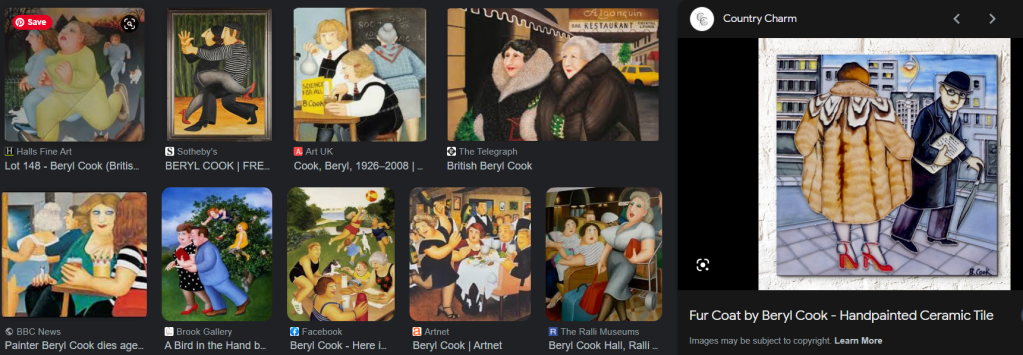
This week I started a landscape. It was based on one of my popular IG posts where we had a spectacular sunrise in London on Monday. From the images below it is clear to see that I am not a photo realist. There is a touch of impressionism, pop art and fantastical influences in my marks. It reminds me of the comical quality of British painter Beryl Cook.

Three-dimensional effect oil painting

This week I joined my oil painting class. It was interesting to join an art class online. We use Padlet to share our work after taking pictures using our phones.
I rather enjoyed experimenting with the different tones of yellow that could be seen and how the shade of the fruit was reflected in some of the shadows, and it was important to convey that in the paintings.
What surprised me was how long it took for the oil paint to dry. But I’m learning how oil painters appreciate the wetness so that you can keep returning and doing this magical chemistry work with the paint.

I noticed the magic as I became mesmerised by the texture, getting colours blended to do the highlights. I was chuffed with the teacher’s comment that she noticed a great 3D effect in my work.

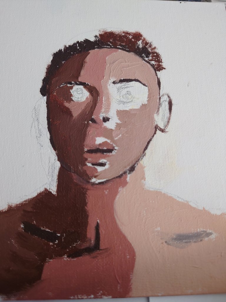
Inspired by exaggerating skin features

My art classes for drawing and painting ended last week and inspired a new focus in my portrait paintings.

I noticed the extent to which I’m interested in the deeper anatomical elements of the skin. For instance, I noticed I spent a lot more time than others in the class on the intricate details of features such as thread veins and fine lines.

While mixing the different colour skin tones, I got the idea of potentially using my cosmetic chemistry insights and knowledge to develop a series of figurative paintings in future. I will link back to this post when I have done the paintings influenced by insights I gained this week.

Character as the X factor in portrait paintings

Less beautiful people make the best models. This week I discovered how people with more character in their faces contribute to making the most interesting paintings.

This picture is about a life model who had a very amazing head shape. In this painting, I am halfway through and hope to have finished it next Sunday.

I still have fine hair details to include and I must get the interesting skin tones and textures sorted.

Only time will tell whether I manage to do justice to this man’s interesting face. Whatever the outcome I shall post my result in a future post.

Well-manicured: Perfecting my brush strokes

In an earlier blog, I complained about how I wasn’t happy with the brush strokes on the green sauce boat. https://wordpress.com/post/homeofficecharm.com/2811

Since then I spent some time practising what I said I would do and remembered that inner manicurist in me. Thus I imagined that I was painting a very fussy client’s fingernails. That seems to do the trick because keeping the medium and paints nice and light and thin and applying several thin layers help me to create a lovely glossy transparent look. It appeared to be like the glossy effect of the original sauceboat

Getting gloss medium layers right

Top tip: I might inspect more paintings for the brushstroke work. It never occurred to me how much time and effort should go into getting the painted effect I want right. And thanks to my old career in beauty therapy and those manicures, french polishes I did I can gain confidence in my painting brush stroke techniques.

Video post: Experimenting with textures and colour grounds

This week I upgraded to allow video posts. Here you can see what I painted this week and listen to my voice as I talk through my art pieces.

Neon Acrylic and impasto on paper

Below is an example of rougher textures. I like the juxtaposition of rough or matt against smooth and glossy to show contrast and tension.

Mixed media sand in acrylic and gel gloss on paper

Colour scales & tone

I got painting in colour this week. The still life got me to experiment with light and shadows.

I did the shadows and dark s without using pure black on the page but instead using primary colours to create a neutral. That dark neutral would also create a lovely grey when white was added to it.

Setting the tone: More than 50 Shades

This week was a difficult week at work as well as with family. Events made me think of mortality and the intended and unintended impressions we might leave on people around us.

Some impressions might linger for decades while others might change more immediately according to the amount of light or shade in our behaviour that is applied.

I noticed how this insight is conveyed with a study of tonal impressions. It changes depending on how much white or black paint is added. There are therefore more than fifty shades of grey as well as any colour possibly

Still life study in tones of black white and grey. Includes dry brushing.
Amazed by different reds and tones from crimsons
Tides of crimson tones

My pictures paint a thousand… faces

My art class this week got us to practise our portrait painting with a live model. It was the first time I painted a portrait. I had always been nervous about painting humans. I somehow felt incompetent.

But I realised I had been here before when I got into it. Flashback: I trained to become a beauty therapist when I left school. And no, I was not a beauty school dropout. Instead, I did well. But what people don’t know about beauty training is the amount of anatomy and physiology you must learn. I had exams in the skeletal and muscular systems and cross-sections of the skin. When I told the art teacher about this, I found myself recounting the Latin names of the muscles of the face. Surprisingly I even told her about each muscle’s insertions and origins. Didnt realise I still remembered those pesky exam type answers.

It was illuminating how my prior experience of understanding what is happening behind faces and below the skin surface was really useful for my drawing. I also remembered the story of Leonardo Da Vinci studying anatomy. It seems he used to study cadavers. But my study of faces was not of dead people. They were the heads of 1000 facials I had done in my 20s in salons and spas in London and around the world.

It was nice to get encouragement to continue still-life drawings. I shall.

An unfinished life drawing of a life model in charcoal.

There is Still Life in My Pencil

I’m growing more confident and intrigued about my mark-making. I am confident because I managed to get some tutored practice last week at my regular new art classes. It is enlightening to see my finished works against others in the still life class.

Some artists go for realism, where their sketching looks exactly like a photo of the object. I’m in awe of those. However, others like me don’t. I struggle with getting it real. It might be that I don’t have the patience or the looking skill. But when I complained that my marks were not exactly like the set up to my teacher, instead of giving me tips to make it more real, she said that was what Van Gough did. This linking of my marking type to an old master reassured me. It also made me curious to see more of Van Gough’s work. Some of my favourites from Van Gough are below. I like the milk jug. As you can see, I show the screen grab with a ring around my favourite of his illustrations.

Sharpening my focus

I went back to basics and relearned drawing, and the strategies used to perfect the representation of the figure.

I learned the intricacies of negative space and what it is used for. I also learned the aligning with a kebab stick. And top tip note to self remember to imagine there is a plate of glass in front of you.

I also learned to insert scaffolding in the drawing to ensure you get the proportion right. All the things they didn’t teach me when I worked towards my A’level art all those decades ago. At least I cannot remember them teaching me. Perhaps when I was aged 15,16,17, I wasn’t listening to what I was taught. But the pictures below show.

I am listening now.

I am listening now to instructions about getting the proportions and balance of my lines right.