Organisational Aesthetics: Unconventional Influence of Spa and Beauty Industry

This week’s AI generated featured image gets an 8/10 it resembles the mess when you are doing product photography.

This week, I was reminded of my academic interest in the Journal of Organisational Aesthetics, which comes out of the highly lauded Tavistock to explore how human senses and artistry inform businesses and many other company practices found in charities and government.

Since I currently work at the intersection of art and organisational behaviour creation, I thought my take on organisational aesthetics might be unique and was looking forward to presenting a couple of papers to this scholarly community.

However, I later discovered that the very thing informing the presentation of my art practice is mostly from my experience in my first career, where appealing to the customer’s five senses was what we were all about in the world of the five-star spa.

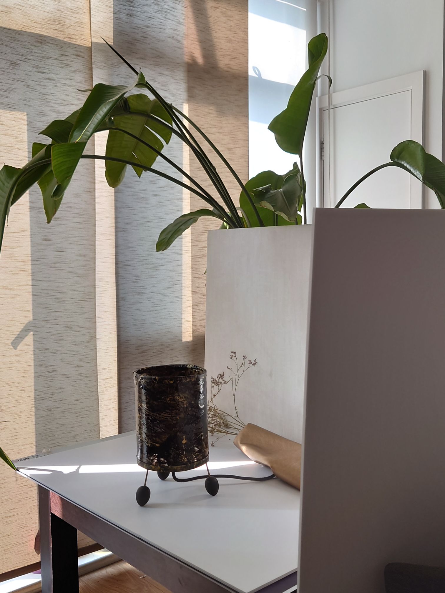
I had an intense weekend. Synthesizing a range of ideas in  re-doing some product photography. I had to fit in with Etsy’s new rules for sizing from listening to some of their reasserting of the preference of the algorithm for light backgrounds, in pictures. I also had to remember what my shelf styling class taught me about arranging items with natural materials. Additionally I integrated what the product photography coach said about getting good lighting with proper window positioning and using tools to get filler light to remove shadows and cast secondary light on areas of the product. Those are the three main main pieces of aesthetics advice that Etsy sellers get. It’s given as a recommendation of appealing to customers and selling more items. And the practice would appear to be in the thick of organisational aesthetics, however the scholars do say they distinctly focus on beauty for the sake of engaging the senses and not just for profit or sales.

I dug deeper into what organisational aesthetics might mean to me and the art I do and how I present it. I asked myself:

Q: What is this Aesthetic that I create and cannot avoid repeating? Where does it come from?

A: It comes from within and some of it might be the imprint of your spa and beauty years.

Hidden Letters: Purple Haze Abstract Mixed Media against lighter background.
Poured pain skin presented around a table lamp frame.
Hidden Letters Beach Blue: Abstract Mixed Media against lighter background.
Hidden Letters: Orange haze Abstract Mixed Media against lighter background.

After a few struggles and wondering why my arrangements do not look corporate in the slightest, no matter how many books and staplers I insert. I then realised my style comes from an imprint from my early career induction into the interior design and decor values of five star spas, Mayfair clinics/ treatment centres head offices and London’s West-End retail (my first proper Saturday job was Miss Selfridge in Knightsbridge).

It also dawned on me that this is a group (except the West End retail) that might welcome some help. I remember being a sole trader in my city of London treatment room, unsure how to fit out the space I was renting. However, my friend Rachel helped to wallpaper in Timinney Fowler and fit the blush-coloured carpet at the reception. I just had a flashback of getting the electrician to install a gothic lamp and fill up our IKEA cabinet; it would have been nice to have someone to discuss shelf displays that might make the products look more appealing through storytelling other than piling the boxes boxes of moisturiser and serum high.

If you are an independent trader or sole operator in the beauty and spa world and agree that product houses could help more with your displays please comment below.

If you are in any other industry and a sole operator and wondering how you learned to present your professional and personal brand and how organisational aesthetics fits with what you do, please comment below.

How did you come to know what your style or aesthic preference is? How does your organisation use organisational aesthetics not only to bring in revenue but just for the value of having something beautiful to look at?

Below is a list of the posts you might have missed from August

Continue reading “Organisational Aesthetics: Unconventional Influence of Spa and Beauty Industry”

Innovative Mixed Media Art: Abstract Monograms and Textured Paintings | Completed

The AI created the above featured image after a few attempts of not getting it quite right. I then asked it to show me an image of a black woman doing finishing touches to artwork and photography. I give it 8/10 this week.

This week I was able to do finishing touches, like mounting an abstract painting on paper onto canvas and setting up for product photography. I also completed the remaining x15 A5 sized artworks on art board.

It has taken over a year to complete the series of about 30 + mixed media artwork featuring paint skins for texture.  I’m also glad to have come up with the concept of paint skin to create abstract versions of the monogram underpainting.

Making an abstract monogram from sculpted paint skins

I love the interesting mix of textures that the offset mosaic like arrangement in the colleage creates.

The knife-sculpted paint skin allows me to extend the boundaries of the canvas, reminding me of overgrown nails. 💅🏽, which I later trimmed down. This has inspired future works.

What things did you finish off this weekK?

Poured Paint Sculpture Lamps: Embracing New Artistic Influences and Future Creations

The featured image above was generated by AI after it analysed all the images on this post. Interesting 🧐 not sure I like it this week.

Now that all the lamps have their feet attatched the look is completed. I like that the feet echo the organic black shapes in the poured skin that surflaces the barrel of the lamp.

In creating a series of painted and poured skins and assembling each onto lampshade making backing I first thouhgt I was a bit crazy, but I didnt mind because people had volunteered that they loved what I had created. I later discovered that I am not solitary in making sculpural forms out of paint integrating a clear foundation for a more etherial spirited look. I had learned about sculptural skins before as we were taught that in my mixed media class at Central Saint Martins. But I hadnt come across an artist who had had integrated the clarity of acrylic sheeting in their work.

Poured paint sculpture lamps: The first trio with all their feet fitted, allowing paintings to be formed into semi transparent tablelamps
15 cm acrylic abstract poured on PVC formed to tablelamp signed on the back..
20cm poured acrylic and ink laminated on PVC framed with black cotton formed to tablelamp

Yet, this week I found new company for this sculpural element of my artwork in the work of Lillian Thomas Burrell. This American artist born in 1927 and five years younger than my mother, wrote a book called From Painting to Painting as Sculpture: The Journey of Lilian Thomas Burwell, by Lilian Thomas Burwell, Hampton University Museum.1997. I have orded a signed copy of it.

I learned about her this week, when Kitty Gurnos-Davis of @artistic.identities posted a reel on IG (16th August 2024) talking about the work of Lilian Thomas Burwell (saying she was ashamed to not yet had discovered her). From watching this reel, I entered into a new world. My internet research took me on a journey. I discovered the images of her sculptures made of painting canvas over a wooden form. There are also images and videos of her use of acrylic sheets with wood in her paintings on canvas.

The Lillian Thomas Burrell exhibition at Berry Cambell Gallery from You Tube

My prior career as a management academic allows me to understand the importance of asserting and connecting with the seminal works in my field. I know that using paint skins is something that is a constant in all my work. Seeing and using paint’s sculptural potential is what only a few artists do. It was encouraging to digitally meet the work of Lilian Thomas Burwell this week. I’ve downloaded the book to discover more about this genre and even asked for a signed copy so I can have it to hand for future reference and inspiration..

I shall be making more of these poured paint sculpure lamps in other colours. Purple and gold was requested on instagram and I might do a deep red and organic green and even a yellow and blue later.

What colour would you like to see?

Cosy Office Decor and Shelf Styling Trends – Wow House 2024

On search for design inspiration, I went to the Wow house, down the road from me at Chelsea Design centre. The exhibition is in its third year, which means that I was there at the first Wow house see blog link. But then I had used visiting the Wow house as a tactic to get me out of the house after my pandemic imposed social anxieties.

Now that those wowes are behind me I had a bit more pep in my step as I visited this time. Now, in 2924, I was purposefully looking out for the latest thinking about home office design and where the field is on shelf styling and lampshade trends. This post is about examples of home office styling and accessorising I saw. I have pulled together my top five to comment on.

Study One: Conceptualising Studio Spaces

Subscribers will remember that I love the fantastical in art and this studio by Fosbury Architecture has done it in room design, furnishings and finishings. They have ensured that all work surfaces receive the maximum levels of cosy because every office artefact, tool and piece of equipment is covered by the fabric of the sponsor Dedar. I loved the sumptuous nature of it. It certainly is an answer to the current calling for cosy office or cozy office decor as they say in USA. I later sat in this room with 20 other people when we were on the guided tour.

Conceptual Studio workspace created by Fosbury Architecture for Dedar Nicola Campri and Claudia Mainardi at Wow House 2024

Sitting there in the corner gave me a real sense of belonging and feelings of affinity with the others on the tour. It felt safe, cocoon like. It has given me some ideas about the future of training room design, that I have long complained to my colleagues about. Perhaps training room studios could be like this and the cocooning is the butterflies that will emerge from their day of corporate training.

Study Two: Functional Reality.

There were also office and study displays to be found in the showroom windows adjacent to the exhibition. The example below from Ligne Roset. This shows the reality of what people tend to buy. I do love the warmth of a dark walnut wood. It might be the new burled wood style that is coming in.

Study Three: Global Style Influences

East meets west. Japan has an influence in the room set up below. By Anahita Rigby’s cool office with a strange zen yet industrious feel. It was one of the rooms that enjoyed sitting in for a long time just absorbing all the textures.

Below are videos of lighter versions of studies.

Study four: How to elegantly place your desk in your bedroom

The exquisite desk arrangement in the Courtyard bedroom of Veere Grenney showing restrained elegance for Schumacher.

Veere Grennay’s elegant desk creating a study area in the Courtyard Bedroom

I think you can hear other viewers giggling about another room, they were hinting at how one of the rooms reminded them of a cosy country cottage. I left the sound on as the music seemed to find to fit the calm feel of this desk arrangement.

Study Five: Library Decor on Stage

And lastly putting on a grand appearance (his background explains why) is the Library by Andrea Benedettini. He used to be a Ballet Dancer and the Library was inspired Swan Lake and theatre curtains. I love the ballet and have seen many productions and this library setting was significant for me as it including floor to ceiling curtains to cover the walls. Andrea Benedetti is said (by the tour guide) to have been inspired by stage curtains for the wall draping. It was beautiful. I love that the overall look acknowledges the importance of presenting those bookshelves. And this room is a great exemplar for shelf styling cabinetry integrated into a room.

Andrea Benedettini Library

Overall I found I was full of wonder at the wow house. I was struck by how every study room appeared to use fabric as a wall covering. There was also deeply considered treatment of the ceilings as a feature or complement the room

Metal tended to feature in the lighting for all office desks and shelves so this might influence what I do with future lighting collections too.

Art was another big feature for shelf and desk displays, with nearly every room acknowledgeing the important role that art plays for personalising the space and conveying the inhabitant’s unique personality. I particularly loved how in the Martin Moore kitchen with Studio Vero (Romanov Brihi and Venetia Rudebeck) they purposefully curated and displayed green and organic themed art for shelves in their kitchen. It complimented the beautiful green and black marble surfaces they used, to make the space feel like a place to spend time and truly enjoy.

As a bonus i have added the Colefax and Fowler Morning Room by Lucy Hammond Giles. For some reason this was the room where everyone seemed to just want to sit in and rest and take in the decor.

Colefax and Fowler, Morning Room by Lucy Hammond Giles

What are the best office set ups or studies you have seen? What did you like about the five studies I’ve looked at?

Like or comment below.

Cultured Complexities Series Released

Welcome to this months’s edition of the newsletter. The cultured complexities series is being released and listed on Etsy this week. Artwork is ready to purchase.

The Cultured Complexities series is of about 30 mixed media painting made small enough for shelf display. It is a series that took me one year to complete as I started April 2023. Below are images that show the processes.

Continue reading “Cultured Complexities Series Released”