

This week I had time off from my 9 to 5 and immersed myself in making while fighting a head cold. But determined to stock up for my Etsy shop and develop the idea of a decor solution for people working from home. Realised that being a lowly crafter, artist and maker has advantages for pushing the art envelope further to improve how businesses work.
Continue reading “Two Ways & One Why on Art for Home Offices: Modern Master, AI or Lowly Crafter?”Tag: Artist

Telling their Stories in my product photography
I’ve realised that product photography needs a story and an artist. I found that product photography needs to be approached like a painting; there is creativity and artistry to behold. So this week I was making decisions about the story behind my by-products and the kind of story my buyers would like to see.

The story is for the adventurous and about charting new ventures and horizons while keeping a reflective eye on the past.
My buyers are unique individuals; they subscribe to goth, dark academia, light academia, steampunk and heirloom. I also note they are comfortable with maximalism and the odd bit of quirk here and there.
I found it worth exploring new setups with product photography this week. I was also inspired by those food stylists that deconstruct a blueberry pie and trickle crumbles of pastry and jam on the table because they sign up to the messy, over-the neat minimalist vibe.
Below is a sneak peek of behind-the-scenes setups I was playing with. They are not out yet. I’m curious to know what my product photography teacher thinks of them. As I clicked away, I thought, at least he’ll see I’ve been trying. It’ll give him something to discover about me to help him understand what I need to improve. But I’m inspired by seeing the photo like a painted canvas. I can work with that.


A whole load of new shades are being uploaded this weekend. Wait till late on Sunday to look at the shop or even late Wednesday evening.

The Freedom of Fantastical Graffiti Lampshades
I’ve started to integrate my two arts. In psychology, that’s a good thing to do to become whole. But I thought about that after and not before I did it.
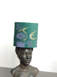
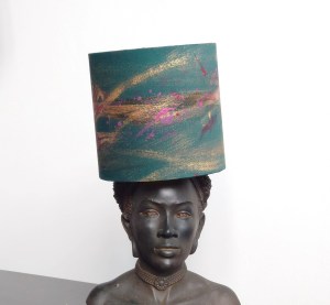
I have integrated my graffiti art onto my lampshades. They look rather cool. I noticed my curly cursive writing when using paint and how it has a unique style of its own despite my dyspraxia dyslexia which allows the lines and the curves to take on another life of their own.

I was also inspired by a question in our Facebook group for lampshade makers. Someone had asked how to display the lampshades when they go to fairs. This question comes up often. The idea to use mannequins to display the maker’s lampshades came up, and I scoffed at the response, thinking it was that gimmicky, and I couldn’t imagine how that might look. It might look hideous and distract from the shades for the person asking. And I also thought that lagging the mannequins around and putting them together at the fair was difficult.
The person had large shades about 30cm 40 cm wide, and ultimately, the look would have been very Ascot-like, as if the manikins were wearing wide-brimmed hats.
Then I didn’t think about it again until I had to take some images for my 15 cm lampshades for the desks of stylish professionals and their statement yet cosey task lighting. I was searching for inspiration and realised that sitting across from me was a head figure I bought from a trendy interior designer, Abigail Ahern’s shop. I promptly placed one of the lampshades on the statue, which did seem like sacrilege a bit at first.
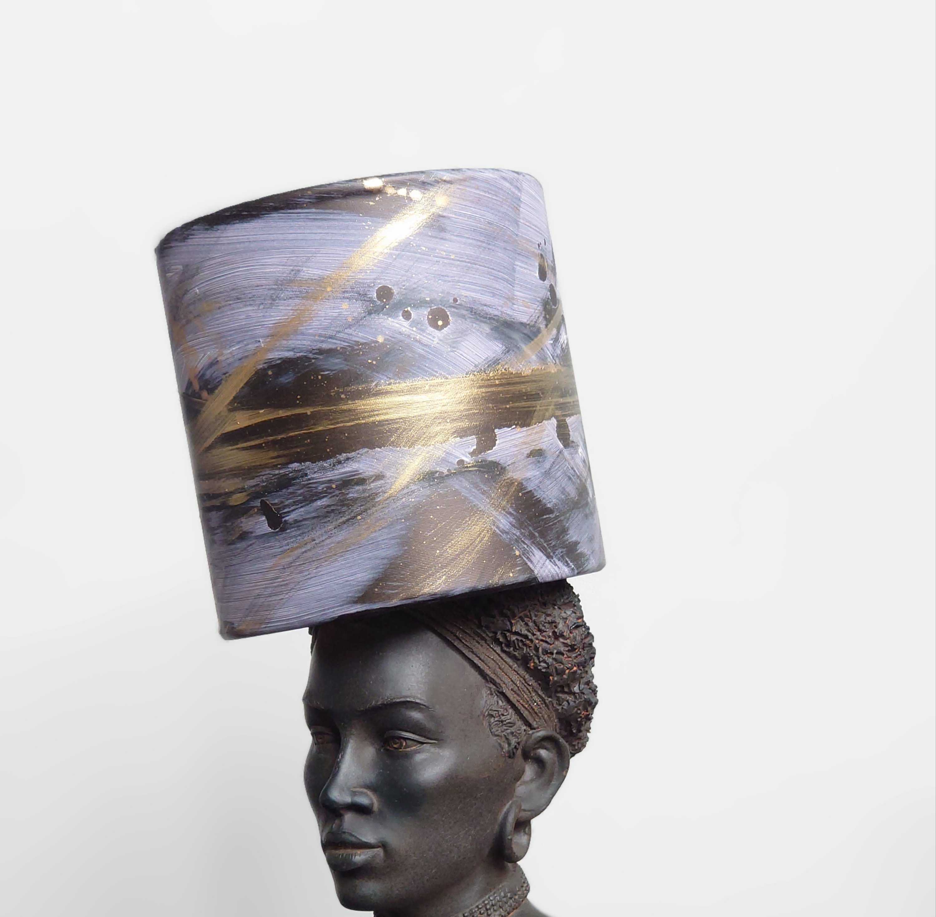
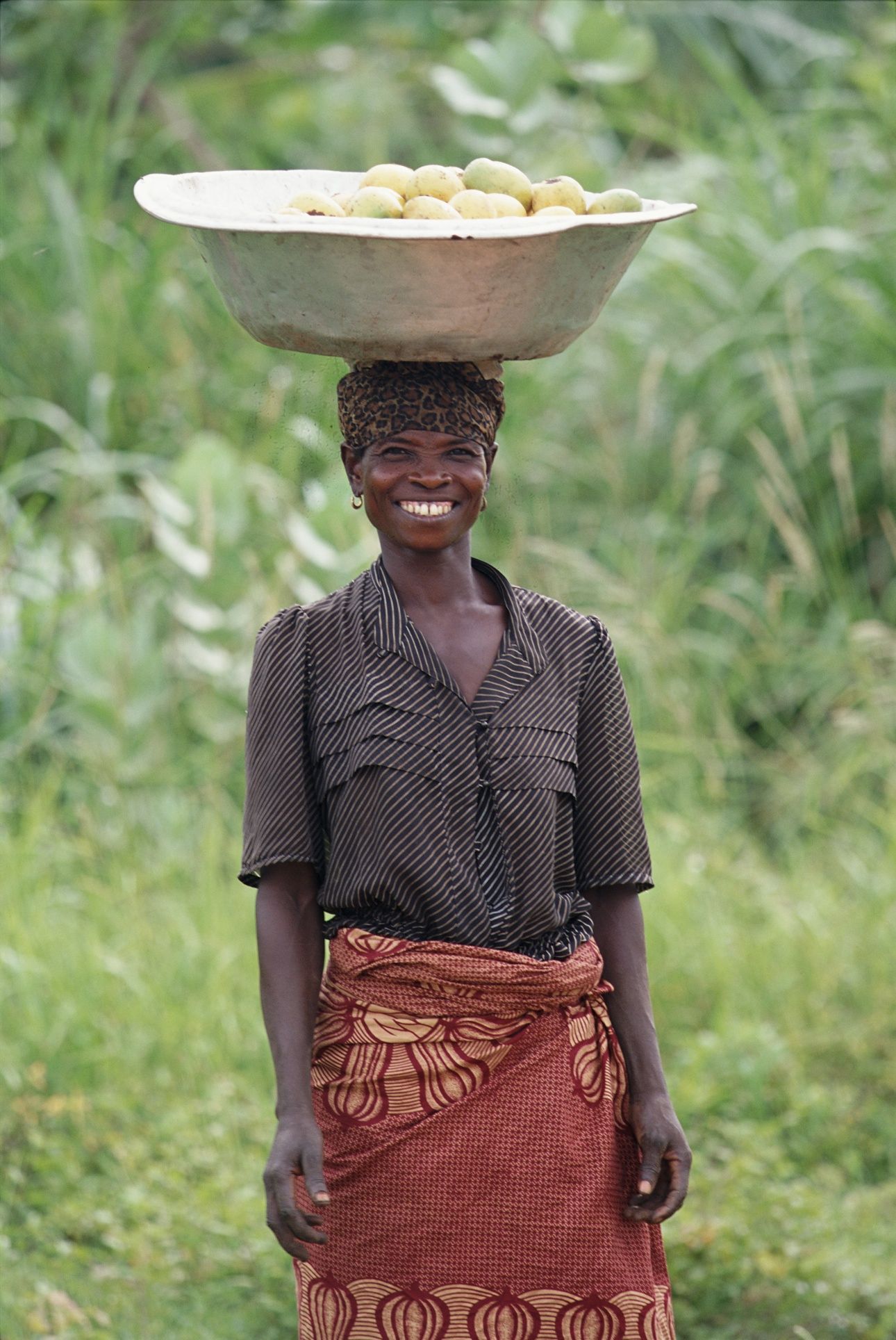
However, after some thinking about it, I realised how fitting and natural it was., Seeing a statue of a magnificent African woman or woman with African heritage with a tall cylindrical object on the head reminds me of what I saw when I visited Africa. I travelled on a Kenya safari and spent some time in Nigeria for work. Seeing a magnificent woman walking around with a cylindrical bucket containing water, shopping or goods for the markets on their head was normal. But it always pains me that the cylindrical buckets the African women (children too and young men to a lesser extent) normally have on their heads were often some garish yellow or blue plastic unimaginative vessels.
Looking at my graffiti lampshades on the figurine in more depth; I began to take pride in what my eyes were seeing. Noticing how my graffiti artwork on the lampshades then placed on the African woman’s head felt like fantastical art because it depicted a more luxurious scene, albeit slightly surreal.
I imagined myself as an African woman and recalled what I saw in the ritual of attending church and weddings and wearing big wrappers that acted like gigantic fabric expressions of a crown. The look is awesome.
But what if there could be something like my beautiful cylindrical vessels (lampshades) that the African women could continue deftly carrying on their heads as they go about their daily life and l chores?
It dawned on me that perhaps my placing of lampshades with graffiti art on sculpture together is another form of fantastical black art. It is indeed my fantasy that those wonderful ladies I saw in Africa had something more glamorous as a vessel to carry on their heads. I would like them to freely cast away those horrible unimaginative plastic yellow buckets and go for something more considered in its design.
Those women are very entrepreneurial and perhaps like taxi drivers in London; they could get the carrying vessels of their future sponsored by local businesses, and a local creative person might be able to use top calligraphy skills and design competence to embellish their vessels with more beautiful graphics that become useful communication collateral for local businesses. Ultimately their new carrier vessel earns revenue through advertising the local firm.


I’m going to look into it and see how I can help. However, I wouldn’t be surprised if the women have probably already done it because African women are reported to be highly entrepreneurial. But I would like to get an insight into what African friends think of my fantastical black art (graffiti lampshades on African head sculptures) and the extent to which it reflects the 21st-century African and African women’s vessels they carry around on their heads.

Why Painting Julian Opie Simplicity is Quite Hard
Our teacher took us through some portraits this week in my art class. The usual classics were there for us to study composition, tone, paint strokes etc. But I was struck by how much I was drawn into Julian Opie’s work.
I’d never seen his work before, and I noticed how my eyes were pulled into pattern finding.
However, I took on the challenge of seeing what my marks and finish might be like if I painted in the style of Julian Opie. I initially thought it might be easy; perhaps I was being lazy, but when I realised the attention to detail demanded in getting the contrasting tones right. Another hurdle I had to surmount was the light and the dark shapes to make sure those correctly gave the impression of light and shade. I discovered in class that trying to do this using oil colour is another difficulty because Julian Opie probably uses acrylics. But never mind, it’s all practice.
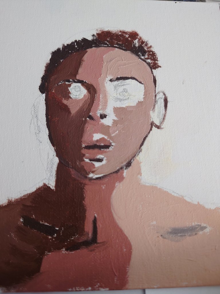
Making my life difficult wit oil on canvas board

Mixing the shades and tones

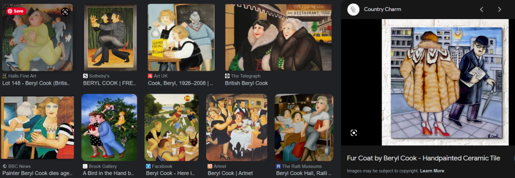
Urban winter sunrise inspires blue & yellow landscape in oil
This week I started a landscape. It was based on one of my popular IG posts where we had a spectacular sunrise in London on Monday. From the images below it is clear to see that I am not a photo realist. There is a touch of impressionism, pop art and fantastical influences in my marks. It reminds me of the comical quality of British painter Beryl Cook.


You must be logged in to post a comment.