Watercolour Conversations

I recently saw the David Remfrey exhibition at the Royal Watercolour Society. I was invited to the exhibition by my old friend Rick who knows the artist. Rick was pleased to see his likeness in a couple of David’s paintings.

The images below show my friend Rick pointing and repeating the pose in the painting “What the Night Tells Me,” which is normally in someone’s private collection.

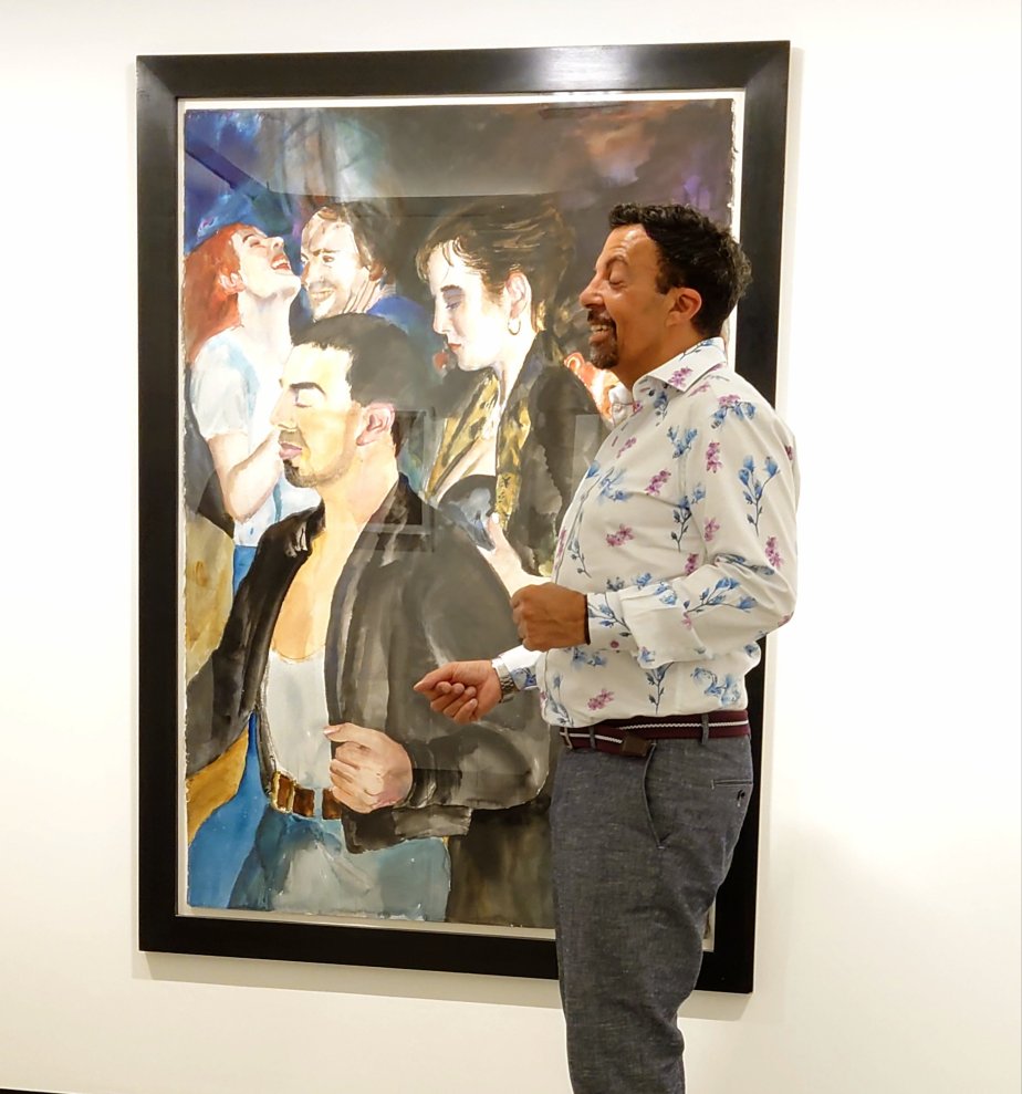
We also met another watercolour artist at the exhibition (viewing David’s work, I think he was from New York). We had wonderful conversations about the different characters found in David Remfrey’s work. My friend was very proud to see his portrait in the painting, and the back story was wonderful to hear. I had heard the story before but seeing the painting in real life while he explained how he knew David and his partner made the tale more significant and profound.

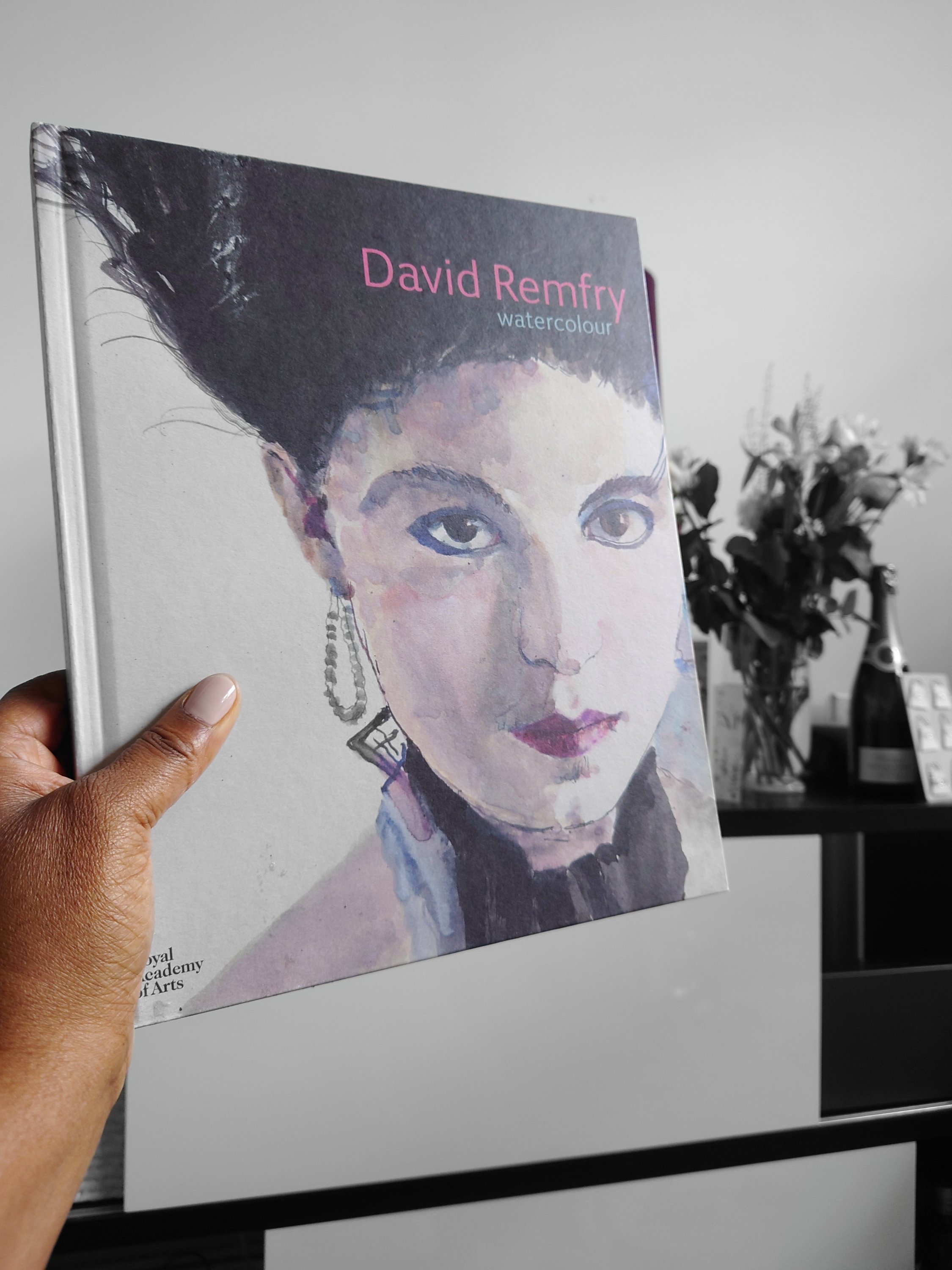
Visiting the exhibition was a real treat for me as a dance and art enthusiast. I was delighted to be given a signed copy of David Remfrey’s book there (it was my birthday). Book title is David Remfrey Watercolour by Royal Academy of Arts and Royal watercolour Society 2022.

I loved how exquisite the paintings were. The impromptu gathering of people was magical. It set off an intriguing, informative and interesting conversation about watercolour art. As someone that uses acrylics mostly, the visit inspired me to try out doing a watercolour series of paintings/ creations at a later point.

I might link back to this post when I post the pictures of watercolour items I create at that later point.

Result of my Recent Creative Pilgrimage

The Journey

I took a short break to St Ives in Cornwall last week. The journey was full of adventures for many reasons. It was my first big trip after two years of lockdown. I had to practice being less anxious about social spaces.

My longest train journey yet: It takes 5 hours to travel from London to St Ives

Purpose

It was meant to be a creative pilgrimage as I was visiting Tate St Ives and Barbara Hepworth museum

Finding affinity

I was surprised to feel less alone with my design style because the hotel room decor was expressive of the cosey smart effect you get when combining pinstripe fabric with nailhead trim as I do in my lampshade collections.

Finding Inspiration

A picture of Barbara Hepworth in her studio. The museum is her studio, interestingly. I was impressed that she might have had lots of parties there. Downstairs is the kitchen and upstairs is the workroom. Similar to my set-up. I felt encouraged.

A chance to practice

The whole experience was affirming for me. I feel that I might be on the right track, after all.

Sister inspired green and lush art: Land of Giant Kiwi

For some reason my sister really loved this painting.

I didn’t like it because it felt a bit muddy in places and mentally I probably wasn’t in a positive head space when creating it.

At the time of painting this I was feeling confused by the water misting method of mark making but intrigued by the new lighter textures and marks forming at the same time.

So when I went to digitally enhance this painting with my phone while on the 49 bus from King’s Road to White City, I noticed upon inserting the kiwi fruit and the couple on the palm tree I immediately felt uplifted. As a result that helped me to feel more cheery about the painting. The woman sitting next to me was obviously wondering what I was doing and I felt a twinge of nervousness about that.

I need not have felt embarrassed as I ultimately felt encouraged when I saw how so many people loved and liked this digitally enhanced version on Instagram and Facebook.

It’s funny how digitally enhancing an image that you’ve painted can end up boosting your own mood more positively.

I created a scene that I wish to be a part of. Enjoying the lush steamy environment of the Land of Giant Kiwi.

Note to self is that I shall look further into the benefits of digitally enhancing items I paint in future.

Gold Spun Poppies

I didn’t mean to. It just happened that way that I created an image with poppies that look like they are Dazed and Confused .

I created this image using my usual atmospheric landscape mindset and experimented with red because I don’t really use red. Red is one of those colours that I hate immensely, so I have always avoided using red in paintings.

But I’m finding I quite like this image. I’m surprised at how beautiful it looks and almost traditional it feels in its floral nature. When I took up the activity of painting, in my mind’s eye, I couldn’t imagine myself being a life painter and that’s why I decided to go down the abstract painting route.

However looking at this rather appealing image of shall we say, spun out poppies, I think it is possible for me to pursue being a painter of floral patterns.

Gold Spun Poppies by earthshine arts