Character as the X factor in portrait paintings

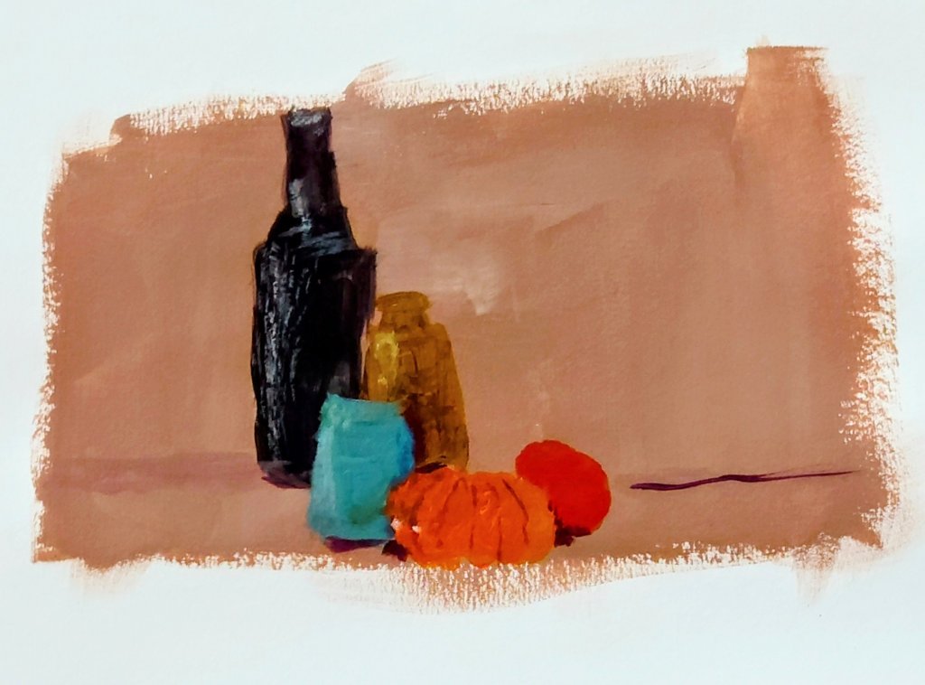
Less beautiful people make the best models. This week I discovered how people with more character in their faces contribute to making the most interesting paintings.

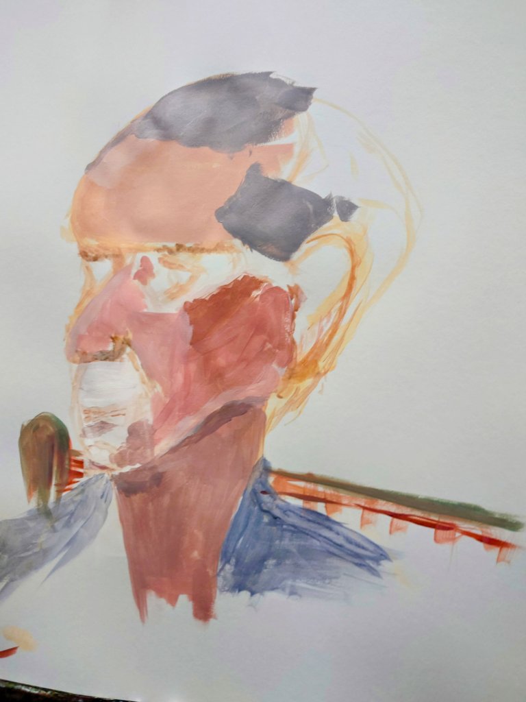
This picture is about a life model who had a very amazing head shape. In this painting, I am halfway through and hope to have finished it next Sunday.

I still have fine hair details to include and I must get the interesting skin tones and textures sorted.

Only time will tell whether I manage to do justice to this man’s interesting face. Whatever the outcome I shall post my result in a future post.

Initial Ideas: One

I’m creating a collection of small finely painted works that contain expressions of the alphabet.

Here are the first 10. Further blogs will have letters J through to Z.

These delightful small oblong paintings with initials might make lovely gifts for those wanting monograms in art. Or these are great for people WFH and they want their initials for their surname displayed on their bookshelf.

Well-manicured: Perfecting my brush strokes

In an earlier blog, I complained about how I wasn’t happy with the brush strokes on the green sauce boat. https://wordpress.com/post/homeofficecharm.com/2811

Since then I spent some time practising what I said I would do and remembered that inner manicurist in me. Thus I imagined that I was painting a very fussy client’s fingernails. That seems to do the trick because keeping the medium and paints nice and light and thin and applying several thin layers help me to create a lovely glossy transparent look. It appeared to be like the glossy effect of the original sauceboat

Getting gloss medium layers right

Top tip: I might inspect more paintings for the brushstroke work. It never occurred to me how much time and effort should go into getting the painted effect I want right. And thanks to my old career in beauty therapy and those manicures, french polishes I did I can gain confidence in my painting brush stroke techniques.

Video post: Experimenting with textures and colour grounds

This week I upgraded to allow video posts. Here you can see what I painted this week and listen to my voice as I talk through my art pieces.

Neon Acrylic and impasto on paper

Below is an example of rougher textures. I like the juxtaposition of rough or matt against smooth and glossy to show contrast and tension.

Mixed media sand in acrylic and gel gloss on paper

Colour scales & tone

I got painting in colour this week. The still life got me to experiment with light and shadows.

I did the shadows and dark s without using pure black on the page but instead using primary colours to create a neutral. That dark neutral would also create a lovely grey when white was added to it.