Improving Corporate Training Room Design

I visited a beautiful training room this week but it was hiding several problems. The issues found made me want to share some tips on training room design for architects, interior design team, facilities managers.

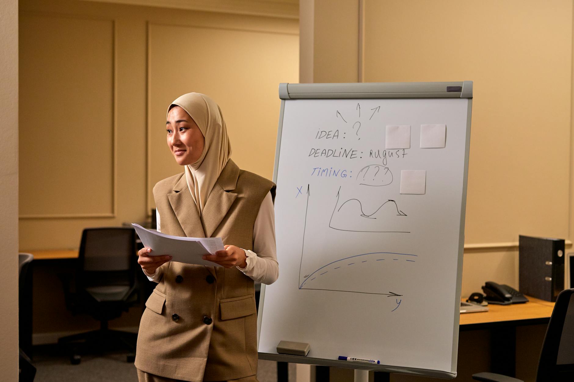
The beautiful training room I visited had fancy comfortable seating, very nice wide desks on wheels, natural looking carpet all the modern technology with two big screens in the front that I could can easily log onto. There were also two beautiful side cabinets storing other trainer’s accouterments like post it notes, marshmallows. There was even room for me to store my coat and bags to keep the room tidy.

Image created with AI based on the word in this post

Style over substance: The impractical training room layout

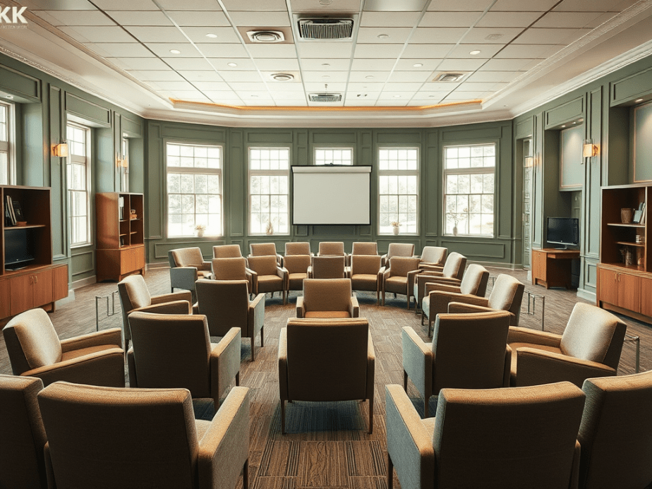
However one thing I noticed about the room, even though it was large, was the lack of circulation space. The session was originally booked for 14 max but they thought they’d squeeze another two people in. This meant that arranging tables in a U shape pinned everyone to the walls leaving a large expanse of space in the middle. This is not conducive to group working because no one could move around easily.

Style over substance: Training room walls that would not stick

This beautiful training room had deep sage green walls stylishly painted up to seven eights of the wall with a coordinating ivory colour for the last eighth and the ceiling. It reminded me of a beautiful cosey shaker style kitchen. But when it came to me sticking full flip charts up to remind learners of the points we had covered so far it could not be done because the walls seemed to be anti tack. I guess somewhere in the building’s history the facilities manager got fed up of trainers using blue tack to stick things on the walls.

Photo by Blue Bird on Pexels.com

Why training room walls are important

Having anti tack walls is understandable if you have previously spent loads of time and resources getting the cleaners to remove blue tack using the recommended direct heat like a hairdryer on the blue tack itself.

Photo by Liliana Drew on Pexels.com

But having anti tack walls creates a corporate learning & development and organisation development problem. You see we trainers need the walls to showcase learning. To show case learning is to have a tangible artifact of ideas generated in the session and that is more than one flip chart stand can do.

Photo by Ron Lach on Pexels.com

How corporate trainers showcase learning

We show case learning in the corporate training room in various ways. We typically (display gallery style) the completed flip charts that everyone has done. Learners throughout the day then reread what some of the ah ha’s and moments of epiphany are within the room at moments that suits them. It helps to reinforce diversity in learning & development.

Photo by RDNE Stock project on Pexels.com

We also show case collaborative working through the post it notes that get stuck on the walls.

Photo by SHVETS production on Pexels.com

We use the wall to display analytical and creative thinking when working in a group. Walls help to magnify the writing space. Walls expand the written canvas from the individual’s perspective out to the group’s perspective.

Photo by Mikhail Nilov on Pexels.com

Therefore a training room festooned with used flip chart pages and written on post it notes from brain writing sessions, or creation activities or problem solving sprints serves as visible and physical evidence of the individual and group learning work that has gone on in that room.

Photo by Alena Darmel on Pexels.com

The Future Design of Corporate Training Rooms

I’ve seen great examples of corporate training rooms as I travel around the world delivering leadership and management development . The more advanced training room decor takes account of trainers/ instructors needing to use the wall by replacing the inner walls with glass panels and providing white tack for the rest of the walls. .

Photo by Gustavo Fring on Pexels.com

Glass walls are then perfect for sticking sticky flip chart or post it notes to the walls. I’ve also seen other kinds of vinyl decor panel used. Learners can even write directly on the glass walls, which support creativity and enhances the problem solving process.

Photo by RDNE Stock project on Pexels.com

But ultimately it would be great if corporate office training room designers could consider installing more white boards and screens so that opportunities to showcase learning is on all four walls, without the need for desks.

Image created with AI Prompt corporate training room like featured image but with screens one windows and all walls with glass wall looking out to greenery and big plants internally. And comfortable seating for eight.

Leadership and management development consultants/instructors and trainers are now in an era where, we no longer want to get managers in a room where they just sit and stare at one square light at the front of the room for six hours.

Image created with AI prompt corporate training room in U shape without desks

We no longer want executive development shaped by the the training room’s limitations. Indeed some of the problems that companies face with with building inclusive working, collaboration or the depth of thinking that is required might be down to the amenities of the training room. The training room is a visible cultural artifact subtly symbolising “the way we do things around here”.

How professionals can make training rooms add value

We now need interior designers and architects of corporate headquarters, campuses and head offices to show deeper consideration of the design of the corporate training room. See my top 10 tips as a summary of this post.

10 Tips to Improve Training Room Decor & Design

  1. Room aesthetics are important but should not devalue function
  2. Create a room with a view of nature
  3. Design in glass panel walls to showcase learning
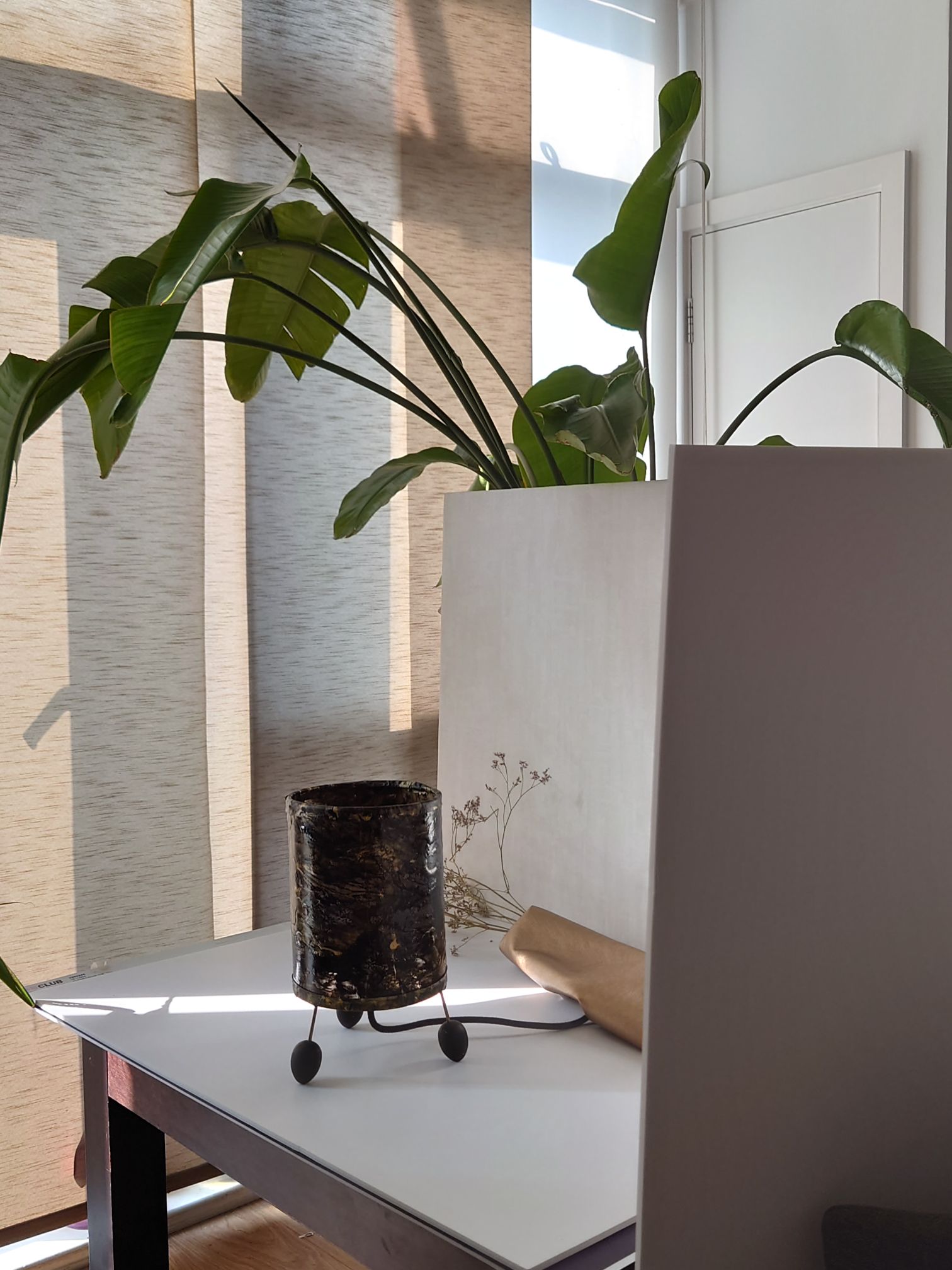
  4. Plants are nice for oxygen and neuro-aesthetics
  5. Cabinets could be built into walls so they don’t get in the way of circulation space needed for group work
  6. Integrate screens on three walls
  7. Install whiteboards on three walls (if no glass walls)
  8. Design, plan and build writable four walls
  9. Enable table or desk free room for management development suites and executive development zones
  10. Always consider how the training room acts to symbolise the desired culture

Please follow for more. Each week for the rest of 2024 I shall be visiting corporate training rooms of all shapes and sizes up and down the UK. I will post more ideas about best practice and ideas for improvements to corporate training room design, decor and space planning, in the weeks to come.

Comment below on your good or bad experience of corporate training room decor.

Inspiration for Unique Decor from Unexpected Places

The AI created the feature image based on what it read about the blog. The four images above are what I took myself. Other parts of the blog show examples of AI generated images to create design scenarios.

It’s amazing how inspiration for decor can arise in unexpected places.

Hopefully these images give you ideas for moving beyond the straight lines and grid forms in wood paneling for your library decor.

Organisational Aesthetics: Unconventional Influence of Spa and Beauty Industry

This week’s AI generated featured image gets an 8/10 it resembles the mess when you are doing product photography.

This week, I was reminded of my academic interest in the Journal of Organisational Aesthetics, which comes out of the highly lauded Tavistock to explore how human senses and artistry inform businesses and many other company practices found in charities and government.

Since I currently work at the intersection of art and organisational behaviour creation, I thought my take on organisational aesthetics might be unique and was looking forward to presenting a couple of papers to this scholarly community.

However, I later discovered that the very thing informing the presentation of my art practice is mostly from my experience in my first career, where appealing to the customer’s five senses was what we were all about in the world of the five-star spa.

I had an intense weekend. Synthesizing a range of ideas in  re-doing some product photography. I had to fit in with Etsy’s new rules for sizing from listening to some of their reasserting of the preference of the algorithm for light backgrounds, in pictures. I also had to remember what my shelf styling class taught me about arranging items with natural materials. Additionally I integrated what the product photography coach said about getting good lighting with proper window positioning and using tools to get filler light to remove shadows and cast secondary light on areas of the product. Those are the three main main pieces of aesthetics advice that Etsy sellers get. It’s given as a recommendation of appealing to customers and selling more items. And the practice would appear to be in the thick of organisational aesthetics, however the scholars do say they distinctly focus on beauty for the sake of engaging the senses and not just for profit or sales.

I dug deeper into what organisational aesthetics might mean to me and the art I do and how I present it. I asked myself:

Q: What is this Aesthetic that I create and cannot avoid repeating? Where does it come from?

A: It comes from within and some of it might be the imprint of your spa and beauty years.

Hidden Letters: Purple Haze Abstract Mixed Media against lighter background.
Poured pain skin presented around a table lamp frame.
Hidden Letters Beach Blue: Abstract Mixed Media against lighter background.
Hidden Letters: Orange haze Abstract Mixed Media against lighter background.

After a few struggles and wondering why my arrangements do not look corporate in the slightest, no matter how many books and staplers I insert. I then realised my style comes from an imprint from my early career induction into the interior design and decor values of five star spas, Mayfair clinics/ treatment centres head offices and London’s West-End retail (my first proper Saturday job was Miss Selfridge in Knightsbridge).

It also dawned on me that this is a group (except the West End retail) that might welcome some help. I remember being a sole trader in my city of London treatment room, unsure how to fit out the space I was renting. However, my friend Rachel helped to wallpaper in Timinney Fowler and fit the blush-coloured carpet at the reception. I just had a flashback of getting the electrician to install a gothic lamp and fill up our IKEA cabinet; it would have been nice to have someone to discuss shelf displays that might make the products look more appealing through storytelling other than piling the boxes boxes of moisturiser and serum high.

If you are an independent trader or sole operator in the beauty and spa world and agree that product houses could help more with your displays please comment below.

If you are in any other industry and a sole operator and wondering how you learned to present your professional and personal brand and how organisational aesthetics fits with what you do, please comment below.

How did you come to know what your style or aesthic preference is? How does your organisation use organisational aesthetics not only to bring in revenue but just for the value of having something beautiful to look at?

Below is a list of the posts you might have missed from August

Continue reading “Organisational Aesthetics: Unconventional Influence of Spa and Beauty Industry”

Innovative Mixed Media Art: Abstract Monograms and Textured Paintings | Completed

The AI created the above featured image after a few attempts of not getting it quite right. I then asked it to show me an image of a black woman doing finishing touches to artwork and photography. I give it 8/10 this week.

This week I was able to do finishing touches, like mounting an abstract painting on paper onto canvas and setting up for product photography. I also completed the remaining x15 A5 sized artworks on art board.

It has taken over a year to complete the series of about 30 + mixed media artwork featuring paint skins for texture.  I’m also glad to have come up with the concept of paint skin to create abstract versions of the monogram underpainting.

Making an abstract monogram from sculpted paint skins

I love the interesting mix of textures that the offset mosaic like arrangement in the colleage creates.

The knife-sculpted paint skin allows me to extend the boundaries of the canvas, reminding me of overgrown nails. 💅🏽, which I later trimmed down. This has inspired future works.

What things did you finish off this weekK?

Poured Paint Sculpture Lamps: Embracing New Artistic Influences and Future Creations

The featured image above was generated by AI after it analysed all the images on this post. Interesting 🧐 not sure I like it this week.

Now that all the lamps have their feet attatched the look is completed. I like that the feet echo the organic black shapes in the poured skin that surflaces the barrel of the lamp.

In creating a series of painted and poured skins and assembling each onto lampshade making backing I first thouhgt I was a bit crazy, but I didnt mind because people had volunteered that they loved what I had created. I later discovered that I am not solitary in making sculpural forms out of paint integrating a clear foundation for a more etherial spirited look. I had learned about sculptural skins before as we were taught that in my mixed media class at Central Saint Martins. But I hadnt come across an artist who had had integrated the clarity of acrylic sheeting in their work.

Poured paint sculpture lamps: The first trio with all their feet fitted, allowing paintings to be formed into semi transparent tablelamps
15 cm acrylic abstract poured on PVC formed to tablelamp signed on the back..
20cm poured acrylic and ink laminated on PVC framed with black cotton formed to tablelamp

Yet, this week I found new company for this sculpural element of my artwork in the work of Lillian Thomas Burrell. This American artist born in 1927 and five years younger than my mother, wrote a book called From Painting to Painting as Sculpture: The Journey of Lilian Thomas Burwell, by Lilian Thomas Burwell, Hampton University Museum.1997. I have orded a signed copy of it.

I learned about her this week, when Kitty Gurnos-Davis of @artistic.identities posted a reel on IG (16th August 2024) talking about the work of Lilian Thomas Burwell (saying she was ashamed to not yet had discovered her). From watching this reel, I entered into a new world. My internet research took me on a journey. I discovered the images of her sculptures made of painting canvas over a wooden form. There are also images and videos of her use of acrylic sheets with wood in her paintings on canvas.

The Lillian Thomas Burrell exhibition at Berry Cambell Gallery from You Tube

My prior career as a management academic allows me to understand the importance of asserting and connecting with the seminal works in my field. I know that using paint skins is something that is a constant in all my work. Seeing and using paint’s sculptural potential is what only a few artists do. It was encouraging to digitally meet the work of Lilian Thomas Burwell this week. I’ve downloaded the book to discover more about this genre and even asked for a signed copy so I can have it to hand for future reference and inspiration..

I shall be making more of these poured paint sculpure lamps in other colours. Purple and gold was requested on instagram and I might do a deep red and organic green and even a yellow and blue later.

What colour would you like to see?