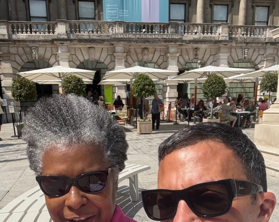
Material Abstraction and Belonging: A Visit to the RA

Last week I spent a quiet morning at the Royal Academy. It was one of those visits where you do not go to see art so much as to feel something shift inside you. I filmed a short piece for YouTube called Finding Space at the RA, capturing a moment of stillness in one of the galleries. It was not planned, scripted or staged. It was simply a pause, a breath, inside a room full of colour, texture and human intention.

As someone who works with paint skins, dimensional surfaces and the emotional life of modern work, I am always drawn to spaces where art creates a kind of psychological room. I have been exploring where my work sits in relation to artists like Angel Otero or Kennedy Yanko, and the RA visit helped me feel that connection more clearly. The RA does this beautifully. Even in the busiest exhibitions, there are pockets of quiet where the atmosphere changes and you can sense your own thoughts rearranging themselves.

This visit carried another layer. I have been exploring where my own practice sits within the wider field of material abstraction, especially as I search for other artists who work with skins, poured surfaces and dimensional paint. Walking through the RA, I found myself noticing affinities. The way certain works held space. The way colour behaved under light. The way material choices shaped emotional tone. It reminded me that belonging is not always about finding exact matches. Sometimes it is about recognising echoes.

That is what I wanted to share in the short video. The feeling of stepping out of the noise and into a space that holds you differently. A space that softens edges. A space that lets you think, and lets you locate yourself.

In my own practice, I am exploring how colour, materiality and dimensional surfaces can create that same effect in everyday environments. Meeting rooms, workspaces, places where people gather to make decisions. The RA visit reminded me how essential these moments of spaciousness are. They are not decorative. They are not optional. They are part of how we stay steady, present and connected in the rhythm of working life.

If you haven’t seen the YouTube Short yet, you can watch it here: Finding Space at the RA

I will be sharing more reflections like this. Small moments, quiet observations, and the ways art helps us navigate complexity with a little more clarity and warmth. Sometimes the most meaningful shifts happen in the pauses.

Why this matters

In leadership development and executive learning, we talk a lot about clarity, presence and psychological flexibility. These qualities do not appear out of nowhere. They are shaped by the environments we inhabit. Art can create the conditions for better thinking. Calmer nervous systems. Softer interpersonal edges. A sense of groundedness that supports wise decision making.

If moments like this resonate with you, you might enjoy the chromatic material pieces I am developing for workspaces. Functional sculptures, paint skin lighting and dimensional surfaces designed to bring clarity and emotional presence into everyday environments.

And perhaps most importantly, I left the RA feeling encouraged to submit next year. A small but meaningful step in claiming my place within material abstraction, and continuing the search for where my work belongs.

Optimizing Your Backdrop for Professional Image and Connections

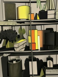
AI created the featured image above after it read my post. I wouldn’t say I liked the first one it chose, but I settled on this one as the colours tied in with the green and gold that I talked about this week. This week, I’m reviewing the different themes in bookshelf backdrop styling that I do for my own shelf in my 9 to 5.

Themes for your backdrops

You can theme your shelf or backdrop beyond the colours of the books. The pictures below show how I have fallen into the trend of colour-coded bookshelves and am working to curate more meaningful staging for myself.

Consider curating talking pieces on your shelves to help you connect with colleagues. Avoid those bland vanilla Items you got because the influencer told you they look great. It might be a good idea to plan your shelf styling. You could take a picture on your phone and get the AI to rehash it to produce a simple outline like the one I did below. This might give you a sense of where the lines of the styling need altering so that they form that V shape or pyramid going across.


Image above based on photo of my bookshelf and the Android AI amended it to produce other stylised versions that I then selected.

Remember that it’s all about your personal branding (the extent to which you, in your backdrop, epitomise the organisation or company brand/ strategy), especially if you are a leader. It is also about your well-being through the social connection that can arise from extended chats about you and your curated collection. So what you place on the shelves should open up tales of your interesting travels, curious pieces of art you bought because you liked what the artist said or the strange way they made their art. There could also be pieces that tell of your scrapes and how you got through things; some examples below have those.

Whatever you do with your shelves in your 9 to 5 backdrop, ensure they are on message for you. Remember, it is your home, but it also plays a significant role in your personal branding and your potential in the organisation. The way we present ourselves on camera is now as crucial as the attire we used to carefully select for meetings with the boss.

Our backdrop is our new jacket.

What do you think or do about your backdrop for meetings? Think about it if you want your professional personality to shine beyond using the standard images available in Teams and Webex. Zoom, etc.

Strategic Shelf Styling for Effective Personal Branding in Virtual Teams

Admiring their backdrop

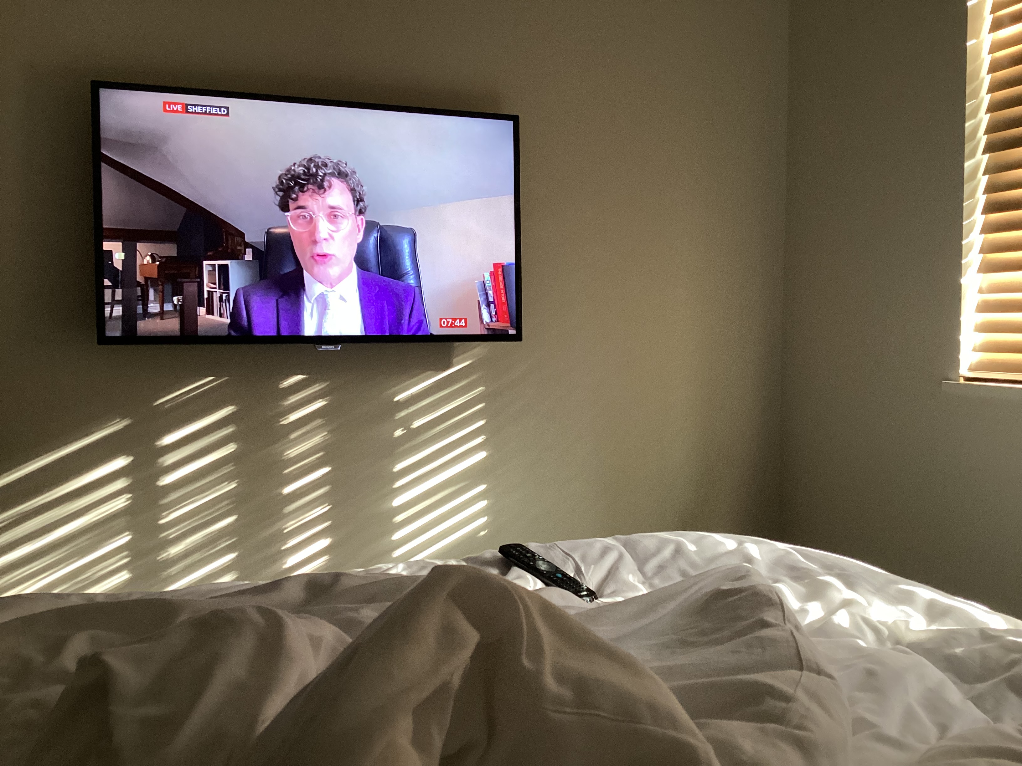
I was watching BBC news while away from home and noticed my eye drawn to what the presenter was saying. It was a psychology Professor in Sheffield interview on BBC.

I noticed how it seemed like he had carefully arranged how his office set up would appear on screen.

Continue reading “Strategic Shelf Styling for Effective Personal Branding in Virtual Teams”

Intensive Pigment Palettes: Creating a Moody and Cozy Home Office Aesthetic

When it comes to home office decor themes I discovered that have my preferences.

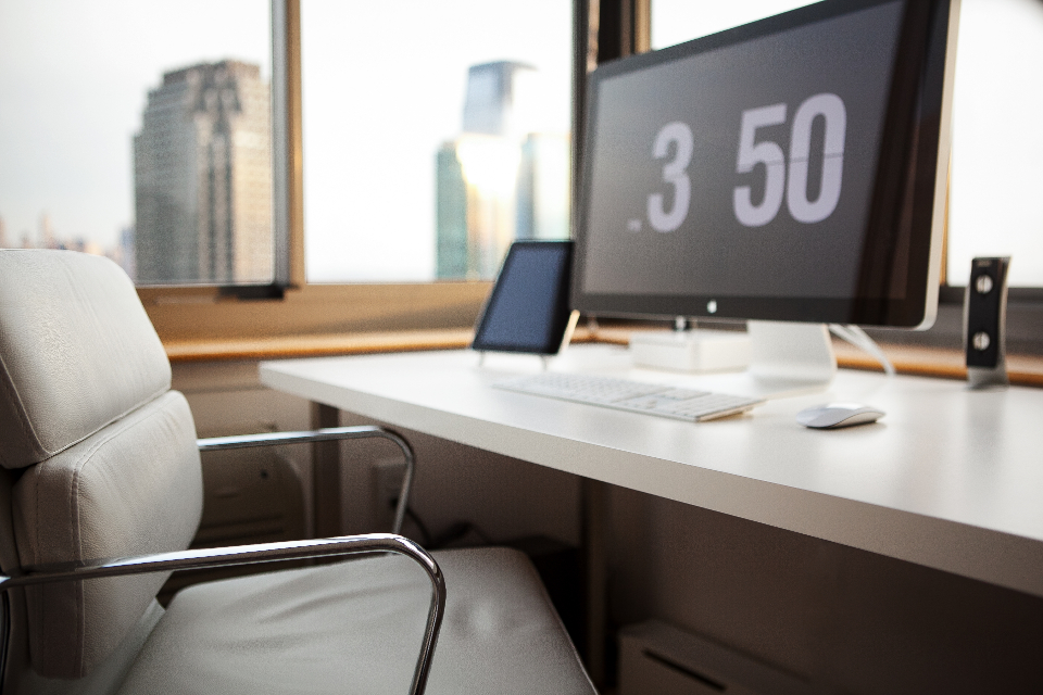
I don’t like the cold, stark, hard surfaces office look. It might seem futuristic (very 21st century to us Baby-boomers). But those images used to be the standard result of search for office decor or desk style as far back into the early 2000’s.  It felt boyish, channeling teenage son lone woolf, building code and gaming in their bedroom and I just couldn’t relate.

White office chair, mac computer on white desk with view to city centre scene
Home Office” by Matt Bango/ CC0 1.0

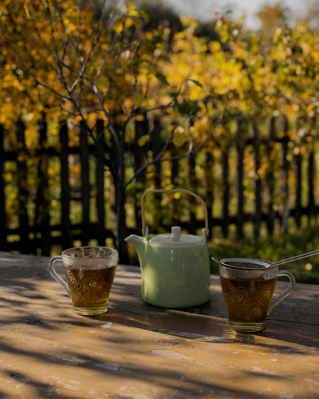
To the other extreme I do not like the overtly feminine big frilly country kitchen table, make shift office desk and ramshackle bookshelf disorganised recipe books; propped up iPad against tiny metal pots of lavender look. That was a trend for a while, fitting in with a cottage core or rustic chic.

English country garden with green teapot and two cups of green brown looking tea in glass cups
Photo by Jovan Vasiljević on Pexels.com

There is also the girl boss look, I see with some YouTubers which is less chintzy but has neon name signs on white walls and lots of fluffy textures incorporated whether the a macrame wall hanging or stringy plants dangling from shelves or wall (for the backdrop). These are combined with sheepskin covered chairs or armrests. It does give off a dreamy fantasy of what a girl’s world of business could be like (pink fluffy and pretty). It seems to be playing at being in business and those of us women working in corporate or refugees from freelancing know that, it sure ain’t no game. However I get the need to convey the light ethereal fantastical vision contrasting the hard realities of our capitalist system.

Woman sitting at a desk with white wall and wispy flower in mint green vase. She wears baby pink dress and has half drunk coffee and white macaroon on saucer
Photo by Moose Photos on Pexels.com

Instead, I like a style that that emanates wisdom, elegance and being grounded. The moody and cozy home office style is indeed a theme on Pinterest. When you look at those images you see a bold cohesive comfortable and elegant look.

The cozy home office

Be mindful, though. This look isn’t that shining high polished look that you might find in Dubai, Knightsbridge or Belgravia show houses where our top interior professionals produce. Perhaps akin to what you see in TV show Buying London (Netflix 2024). No, this cozy home office look is somewhere that you and I will feel comfortable doing everyday business because it is as if our friend down the road was the cabinet maker and our interior design pal (old friend from local comprehensive/ grammar school) helped with sourcing of fabrics for the wall and space planning of our furniture.

Continue reading “Intensive Pigment Palettes: Creating a Moody and Cozy Home Office Aesthetic”

ANCIENT CLASSICS: MY STYLE TOO

I realised how much I appreciate some classical English stately home decor from my trip to Ashridge House in Hertfordshire recently. I was surprised as I thought a lot of my style comes from my Caribbean heritage and London urban living and my immersion in corporate training.

But I discovered how much I love the juxtaposition of earthy stone tones with the bling of gold frames that can be found in some English Stately homes like Ashridge.

The amazing thing about Ashridge house is that it used to be where Henry the VIII and Elizabeth 1st lived. It is also famous for various films like Beauty and the Beast, Malificent, killing Eve and More.

Continue reading “ANCIENT CLASSICS: MY STYLE TOO”