Admitting my 1960’s influence: Wednesday’s dance & Mondrain’s paintings

It was surprising to realise how much of my art is influenced by the mid-century decor, 60’s culture and Mondrain.

Inspo 1: Wednesday Dances Watusi 1964

This year’s memorable Christmas activity was watching the Netflix Wednesday series back to back. Watching it on so many levels was amazing as it helped me recall the 1960s version of the Adams family, which I enjoyed revisiting over the holidays. As a dance enthusiast, I was keen to find my favourite clip of Wednesday Adam’s original dance done by actor Lisa Loring.

My view watching Wednesday Lisa Loring’s lesser-seen dancing clip
Episode: Lurch, the Teenage Idol (1965) Adams Family Season 1, Episode 33- Director Sidney Lanfield Wednesday (played by Lisa Loring) dances to Lurch’s new pop song at 5 min 55 seconds. This snip is a different version of the more commonly found clip. The above is my favourite and is often shown in goth GIFs and David Bowie memes without the original soundtrack.

Seeing the clip was joyful. It reminded me of watching it the first time with my younger sister and being closer to Lisa Loring’s age. At the time, my sister danced a lot like her, and whenever I see clips of Lisa Loring’s Wednesday dance, it brings back happy memories of being that young in the 60s. I’m sure that’s one of the reasons why the current 2022 production of Wednesday on Netflix is doing so well. You see. The new version of the viral Wednesday dance might be boosted because it is enjoying the nostalgic visits from the Baby Boomers and Generation X, who remember the original dance scenes being so poignant for them at the time. I wonder if they have thought of that.

Interestingly, my friend Janet said she had been watching the Wednesday show with her 13-year-old daughter and younger son, She said it brought the family lots of joy. It made us smile as it shows how the Netflix series has mass appeal. Janet and I further discussed (wearing our education experts’ hats on) how the subtext of the 2022 and the original 1964 versions of these shows seem to share a positive narrative about neurodiversity and the tolerance, acceptance and management of difference. I didn’t watch the ’90s version so cannot comment further on that.

Most importantly for my art practice, the research I did and revisiting of the old Adam’s family clips have helped, this week. The images below show how I was influenced to create monochromatic elements and embrace the mid-century look I had created. The crisp white of Wednesday’s dress collar and its oblique triangle shapes is particularly meaningful and is expressed in my paintings this week (on reflection).

However, further analysis of the underpinnings of my painting makes me think of another of my 1960’s cultural influencers—the artist Mondrain.

Inspo 2: Mondrain’s mid-century vibe

If you were to research contemporary abstract art, you get blogs and google results showing what contemporary abstract art is.

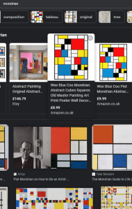
However, I’ve been practising my experimentation with contemporary abstract art. I’ve long been influenced by the artist Mondrian. I like his crisp lines, clear shapes and simple play with colours. Some of my earlier works were too much on the simple side, akin to Mondrain’s primary-coloured iconic squares and grids. When I was 15 and doing my Art A level I recall my art teacher remarking how some of my work was like Mondrain. Below is a snap of some textile designs I created possibly influenced by Mondrian’s works. But at 15 I was probably more influenced by others that were influenced. It wasn’t until my art teacher saw my work that he introduced the artists to me. See below
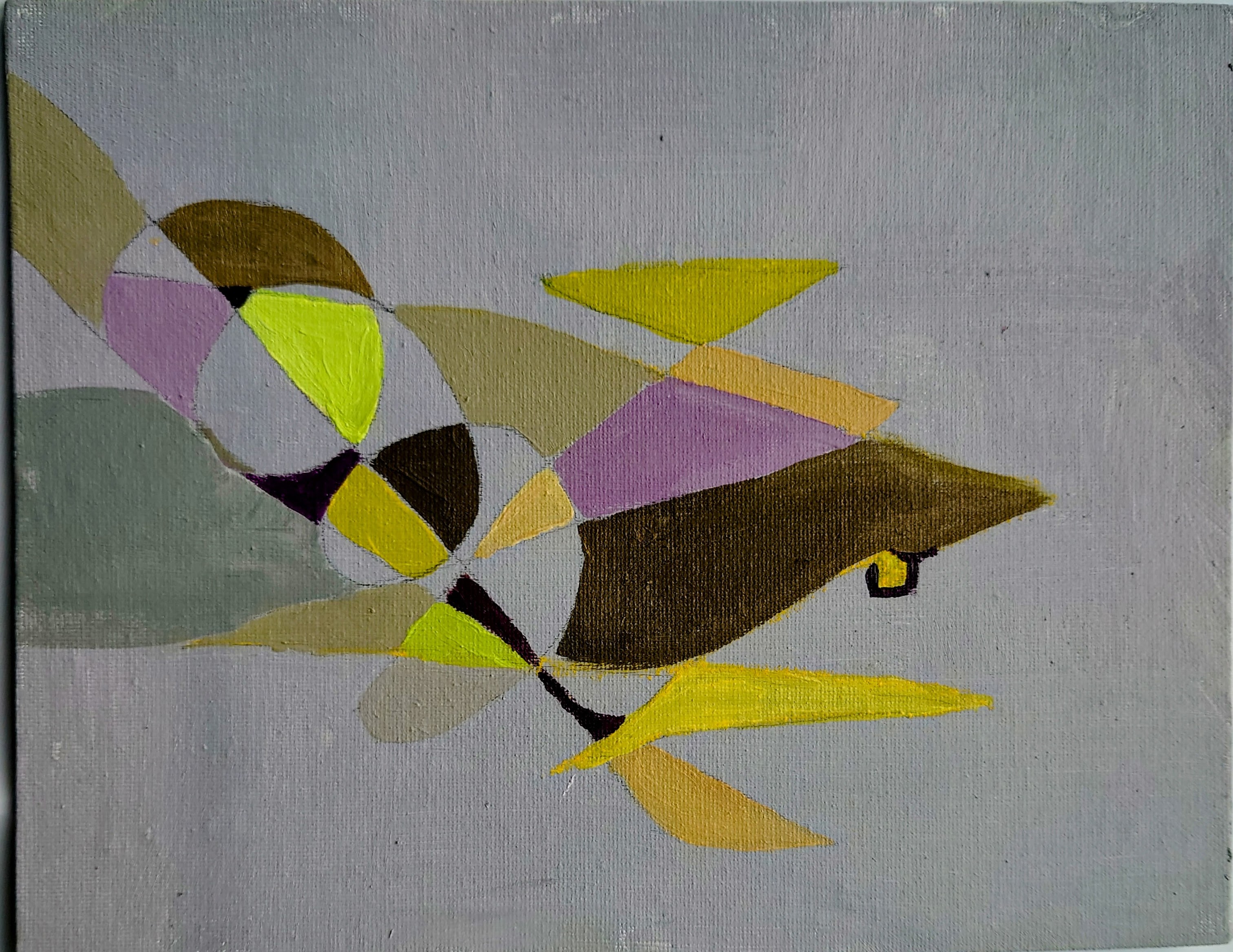
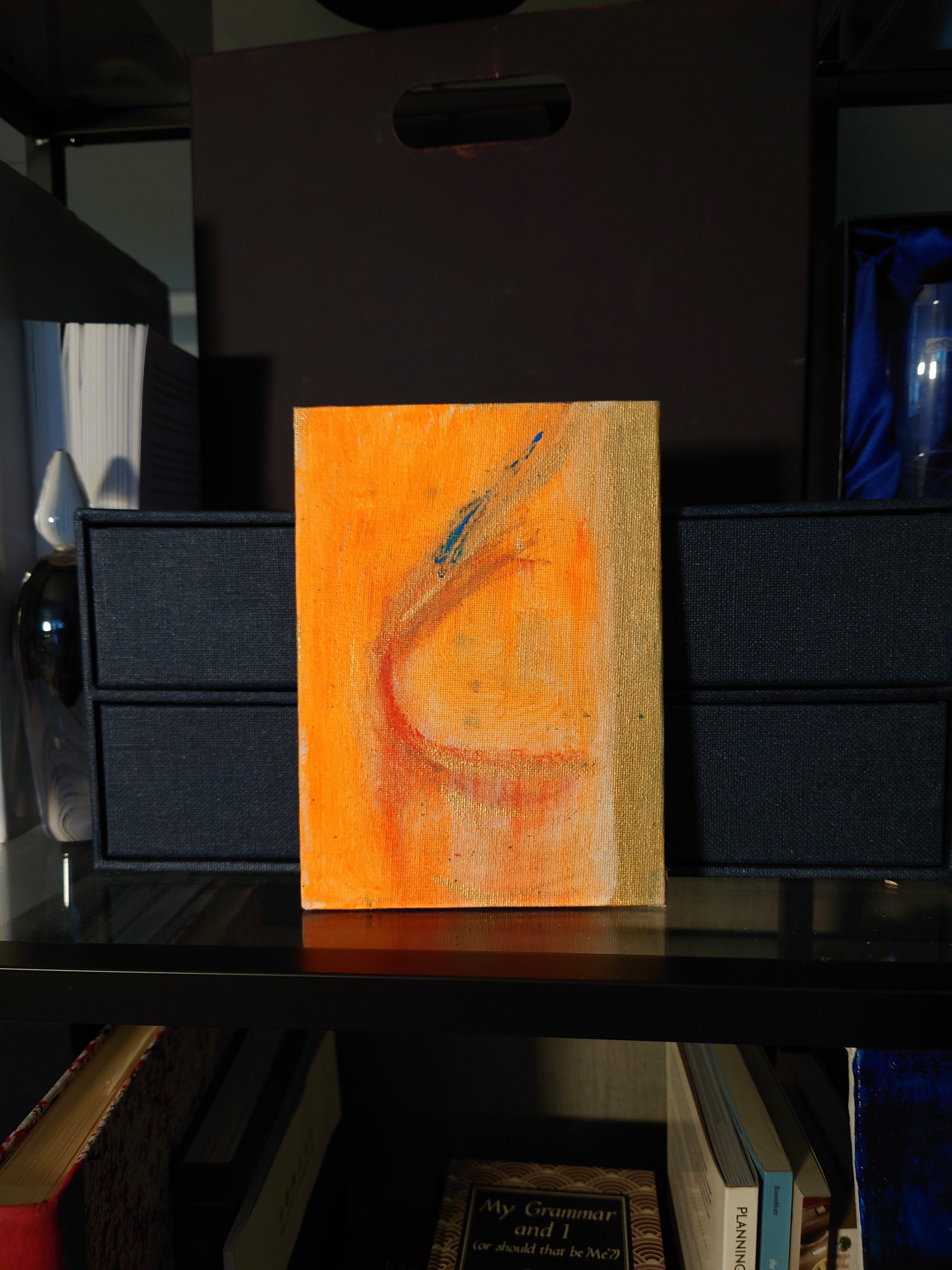
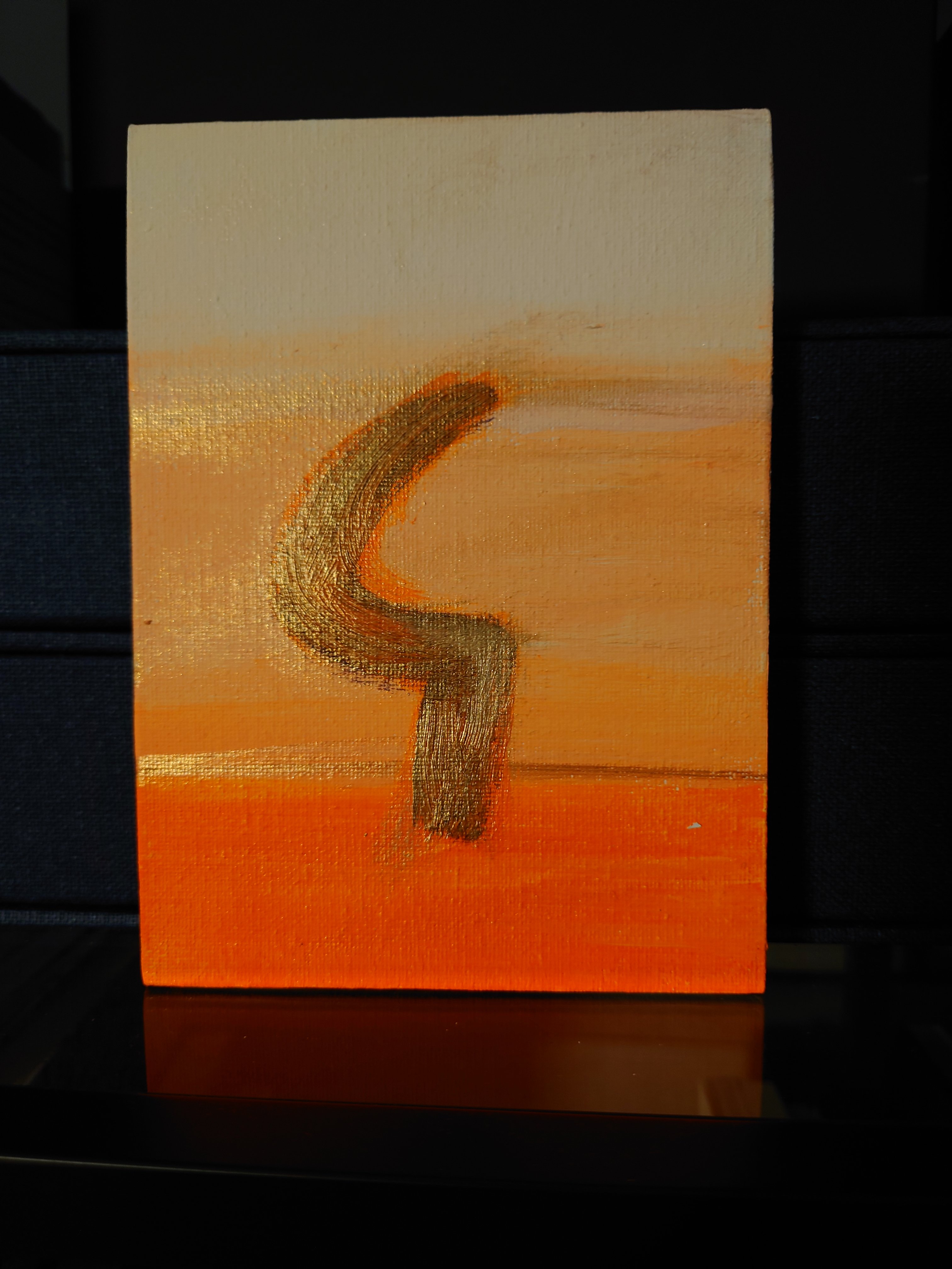
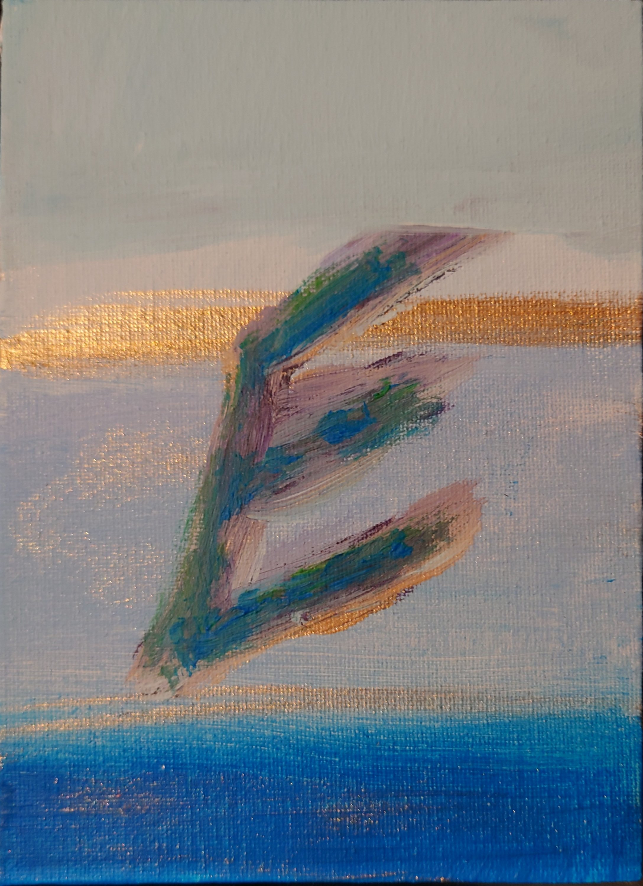
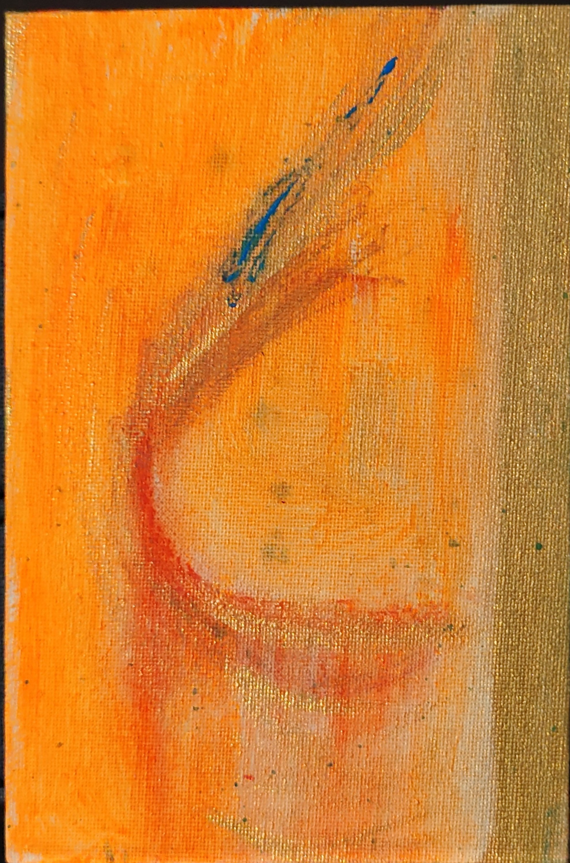
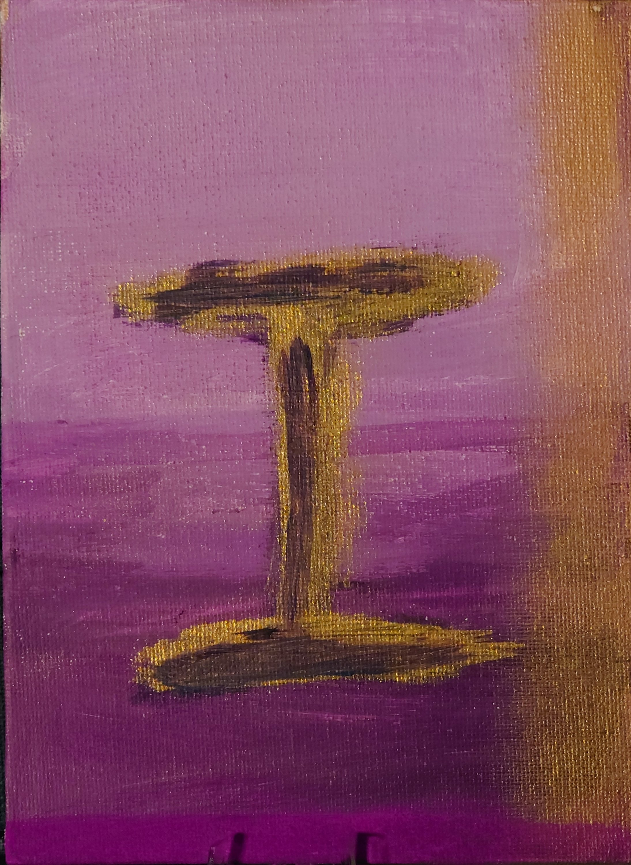
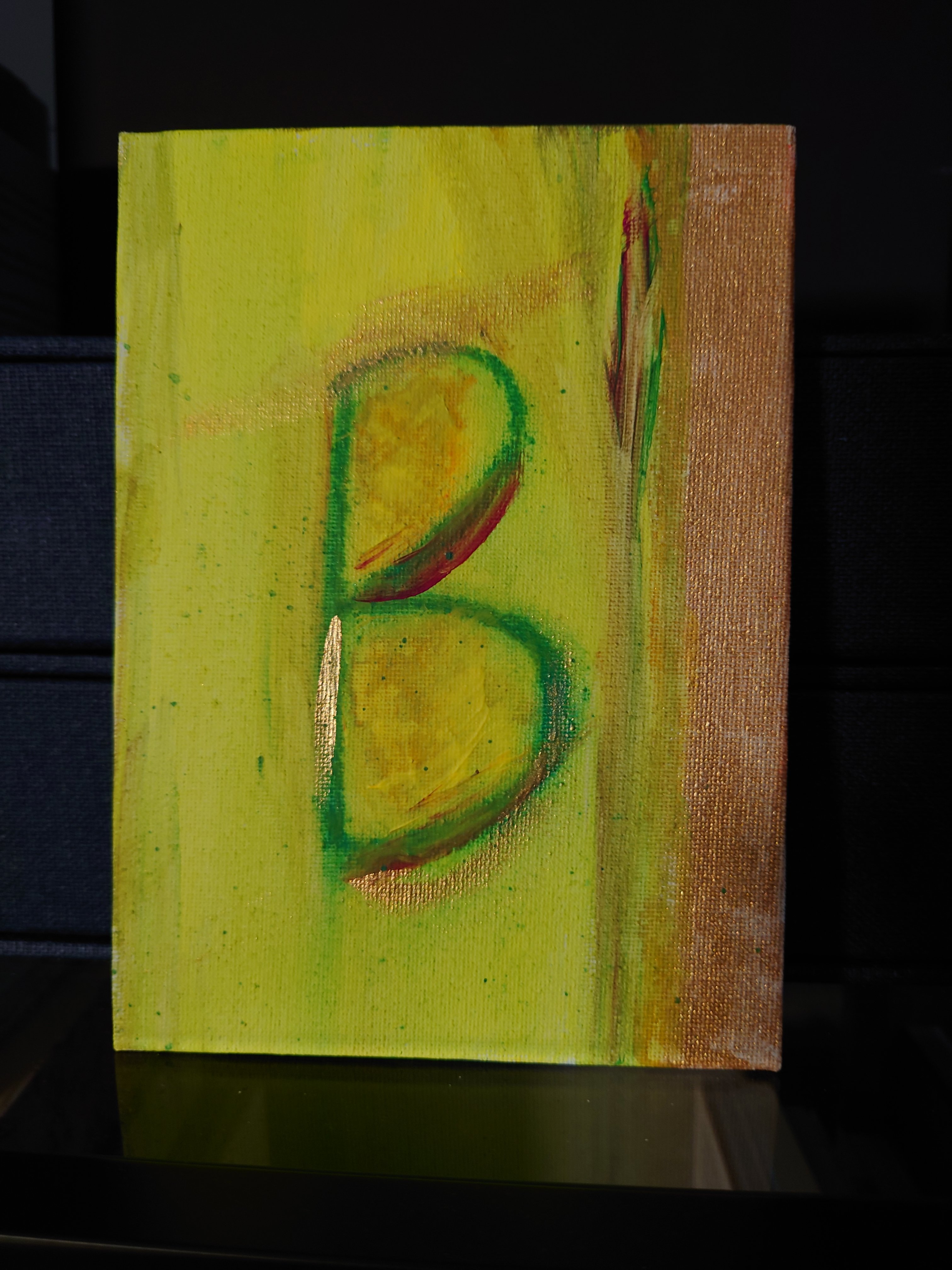
Recently, I’ve started a series of abstract shapes on a strong colour-drenched background with contrasting curvy forms and deep consideration of using analogous or complementary colours.

I love the combination of sharp and curvey shapes I created. These works show more of the training and reflections I have done recently. I’m looking forward to completing this series and listing them in the shop in the new year by 3rd January 2023. Being able to reflect on my 1960s cultural influences for my paintings is helping to give meaning and express the significance of my work. I never thought I was a mid-century enthusiast, but it seems to be leaking out. My age means that the 1960s, and 1970s did inform my aesthetic principles, perhaps more than I was prepared to admit. But I am happy to do so now. I guess my retrospective journey has led to some fantastical pieces.

Thank you for following my blog thus far. I wish you a happy new year and all the best for 2023. I look forward to interacting with you further down the road.

Peace on Earth: Goodwill to all & arts

It’s Christmas time 🎄. I hope you had a good one. A few pics from ours are below. And some of my reflections are detailed and in longer form than usual.

With it being Christmas, I’ve been reflecting on how similar tools are used between artists and those performing in other fields.

I started noticing the supply links between various trades when I did the 14 day CSM course. At CSM, we used paraffin wax as a medium to create a ghostly effect on the painting. I told the CSM teacher that we used the same paraffin wax as a moisturiser for hands and feet in my early beauty training (I used it when I taught at LCF). I mentioned how interesting it was that the university might be ordering paraffin wax for many different uses.

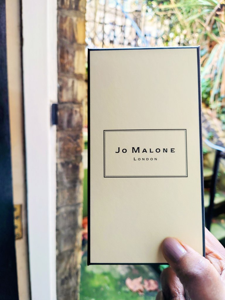
Jo Malone perfume is symbolic of the multiple cosmetics uses in artistic works and expressions of the self.

Another common tool I noticed that artists and hairdressers use this time is hairspray. Hairdressers use hairspray to fix the clients’ waves and curls. Similarly, in the courses I’ve been on for painting, we finish the painting if it’s done in charcoal with hairspray; if we use pastels, chalk or charcoal. It stops the marks from spreading so that it doesn’t get smashed when we roll up our work.

I mentioned in an earlier blog an insight about choosing your flesh colour and the right kind of mixing paint to get the right skin tones. I noticed how the class agonised about mixing reds and yellows to get the right kind of blue to get the right skin tone for painting a portrait. Then I realised I could be more effective if we did a shortcut by going straight to an industry that already had the skin colours right. My makeup artist instinct/ training is linked to these common artists’ dilemmas. The difficulty I faced in painting a life model’s portrait with acrylics is what I recall from trying to find the right colour for the model’s skin for a magazine’s front cover (BTW, I only did a couple of MUI gigs, for now, obsolete magazines, so don’t bother riffling through vogue to find me listed as the makeup artist). I asked the art teacher if she recalled any big cosmetic brands working with artists. Or if artists are working with cosmetic brands.
The discussion generated our ponderings over projects like how reusing old foundations is useful because we’re trying to find the right skin tone to match this person’s skin. It’s a universal question between these artistic spheres.

My art teacher said she was unaware anyone was doing it and agreed this was a missed opportunity for some big brands to showcase and do some interesting work with the wonderful big range of colours they now use. She said she thought the problem would be getting the darker tones, and I said that now, big brands like L’Oreal are doing darker tones these days. , it will be a much easier thing. It was weird for me to struggle to find the right blue to turn yellow and red into skin tone colour varieties. The conclusion was that it could be more of an oil painting if I tried it.

So all this made me realise that the next course I need to take would be an oil painting class. So watch this space.

In addition, all these musings gave me this idea about collaborating with other trades doing paintings, doing both of them figuratively. I’m not a fan of figurative paintings (not yet sure why- it might be about labour intensity), but I’d like to experiment and see where I go with doing some portrait paintings using foundation instead of its traditional watercolour and your traditional acrylic. How ironic that it might be the very traditional oil painting class I might need to go on to bring forth a painting that is more meaningful and interesting for me.

It is Christmas time and I’m wishing you and your family every good wish for the season, no matter what kind of artist or creative person you are.

Inspired by exaggerating skin features

My art classes for drawing and painting ended last week and inspired a new focus in my portrait paintings.

I noticed the extent to which I’m interested in the deeper anatomical elements of the skin. For instance, I noticed I spent a lot more time than others in the class on the intricate details of features such as thread veins and fine lines.

While mixing the different colour skin tones, I got the idea of potentially using my cosmetic chemistry insights and knowledge to develop a series of figurative paintings in future. I will link back to this post when I have done the paintings influenced by insights I gained this week.

Character as the X factor in portrait paintings

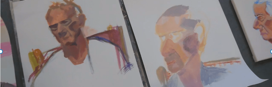
Less beautiful people make the best models. This week I discovered how people with more character in their faces contribute to making the most interesting paintings.

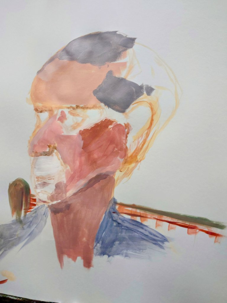
This picture is about a life model who had a very amazing head shape. In this painting, I am halfway through and hope to have finished it next Sunday.

I still have fine hair details to include and I must get the interesting skin tones and textures sorted.

Only time will tell whether I manage to do justice to this man’s interesting face. Whatever the outcome I shall post my result in a future post.

Initial Ideas: One

I’m creating a collection of small finely painted works that contain expressions of the alphabet.

Here are the first 10. Further blogs will have letters J through to Z.

These delightful small oblong paintings with initials might make lovely gifts for those wanting monograms in art. Or these are great for people WFH and they want their initials for their surname displayed on their bookshelf.