Fan Brush Stroke Painting II: Inspired by M

These verticals, I think are curious brush strokes. And I am starting to call these pieces the Missoni influence. Since 1980’s I’ve loved the Italian knitwear designer’s collection.


Ottavio Missoni By Giuseppe Pino (Kind concession of Missoni S.p.A.) [CC BY-SA 3.0 (https://creativecommons.org/licenses/by-sa/3.0)%5D, via Wikimedia Commons

I have to admit that Missoni does come second to my love of everything designers Guild or maybe they come third if I consider Andrew Martin. More on that in a later post.

You know I once bought a lot of Missoni fabric (of an amount I could afford) from the Shepherd’s Bush Fabric shop where all the fashion students go to buy for their cloth for their end of year shows.

Love their new collection for 2018 HERE

I digress. So here is the rest.


A 70’s themed study in brown

So I did this study in various shades of brown. It’s not really an on trend color but i was at the end of a painting spree and had quite a few shades left over.


When i took pictures of the painting and situated them in various parts of the the house I noticed how much it reminded me of African safari with a 70’s vibe. Again not a look that is on trend at the moment, unless you include the appetite for mid century. However I’m rather proud of this. It’s feels like the neatest and more balanced of my works so far.


Maddening mix media

So this week i used some fabric to create a mixed media piece. I was being lazy and I had just watched a video on doing abstract art and the rule of thirds so I experimented with this rule and added some very expensive 100 percent purse wool chalk stripe suiting. I also added a tiny pit of fur that was passed down to me from a friend that got it from a vintage clothes shop in Nottinghill.

Mad mink mixed media painting gold and blue.jpg

Not sure yet what it says. I guess I was experimenting with circles. And where I have incorporated the pinstripe fabric into the painting with pain it reminds me of braces. The red dots look like buttons an all that bling looks rather vulgar to me. It smacks of the ostentatious and excess and commerce for some reason. Perhaps the circles represent coins, money perhaps the red symbolizes blood I don’t know. I’ll have a think….


Fabric paint experiment: Floral abstract

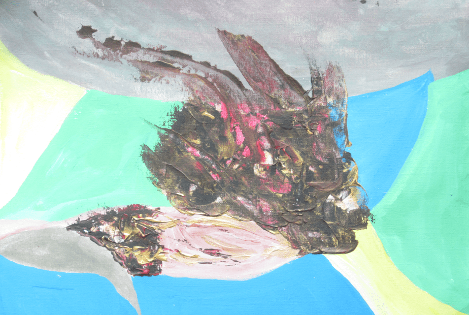
The up-cycled ( re used) easel came with two pots of fabric paints and I used them to experiment in some deep art work this week. Working among a group of other artists, I started this project on Tuesday and finished it off today (Sunday). The fabric paints on paper have a rather washed out look. But the black, premium red and gold acrylic give it the texture that I much prefer to see in paintings.

So note to self about using fabric paints only on fabric and not on paintings for walls and interior decoration.

Metamorphising flower

I think it the painting looks like some post apocalyptic flower trying to burst through into a beautiful bloom. I wonder if it will make it.

Nevertheless, I am rather glad that I got the easel and the fabric paints from the show flat of the apartment block. Who knows where they might have ended up.