Initial Ideas: One

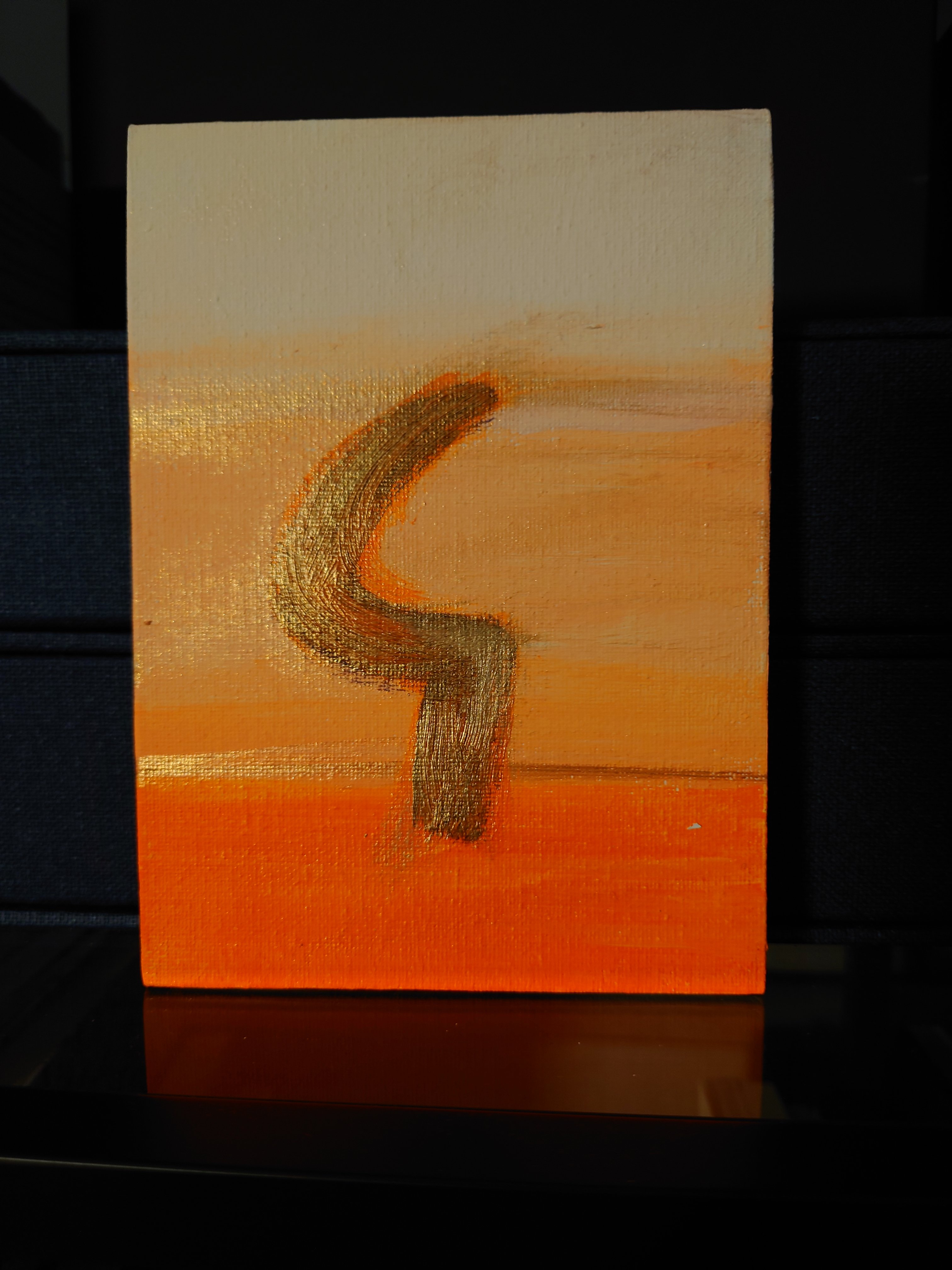
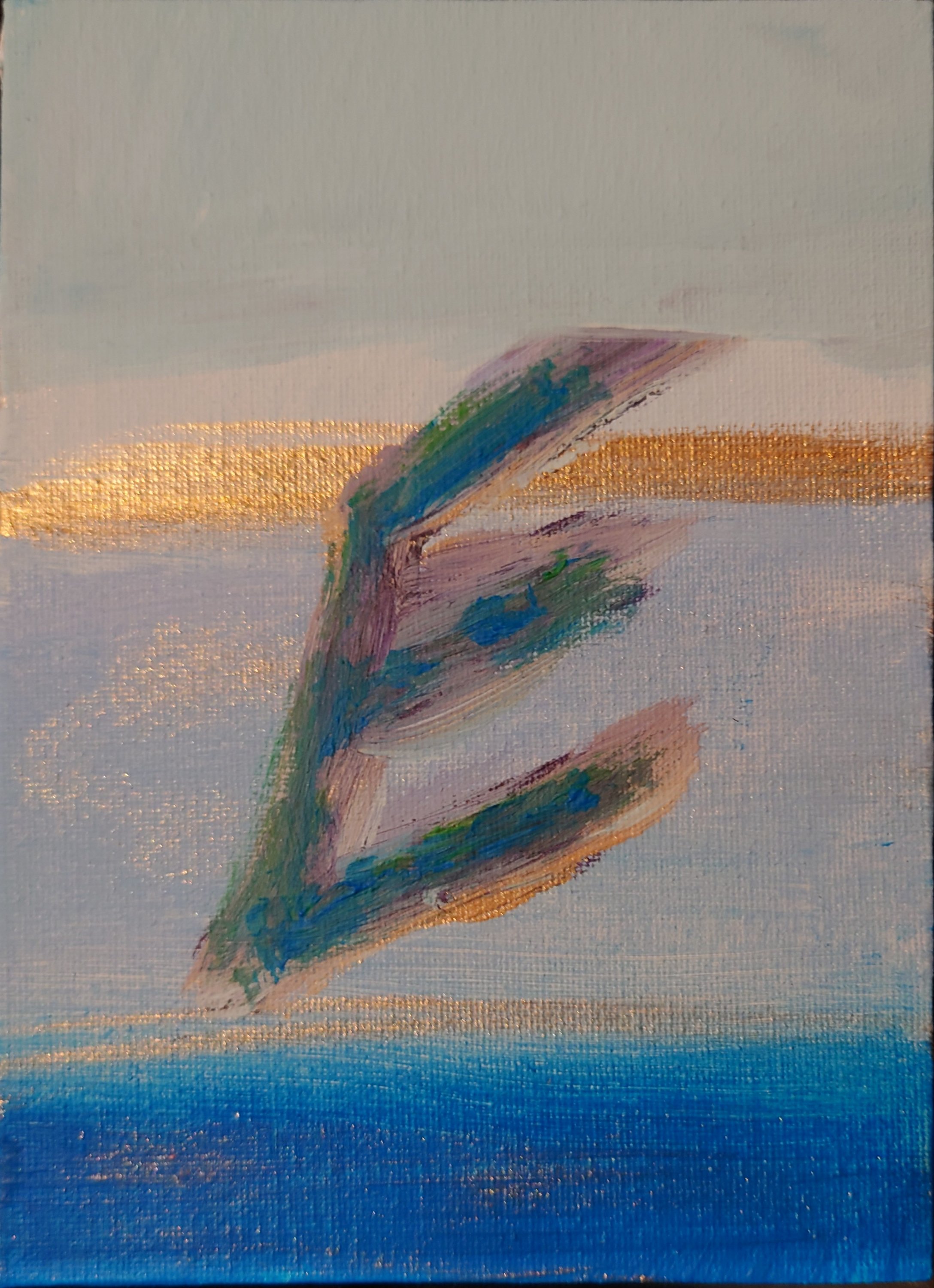
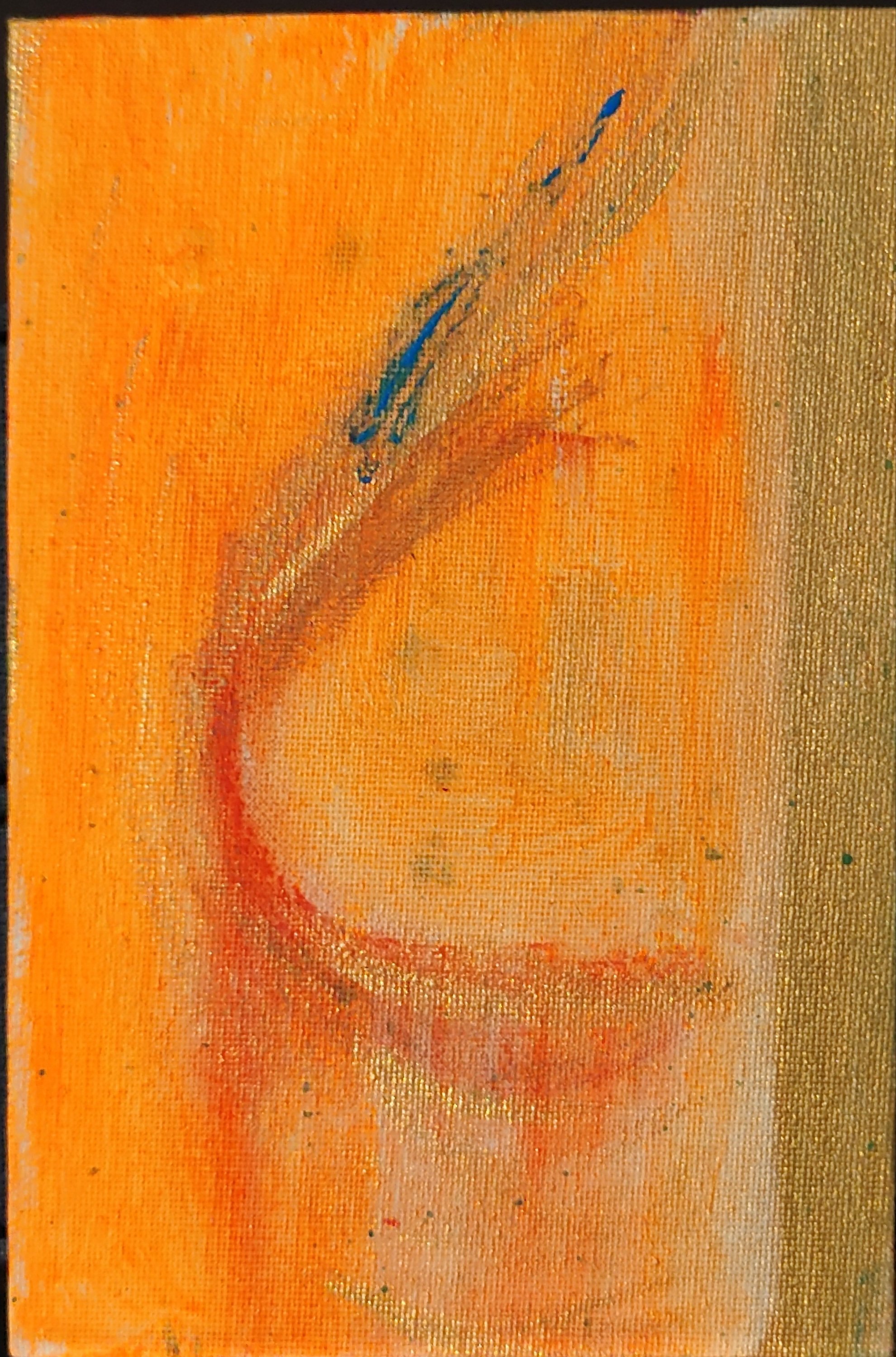
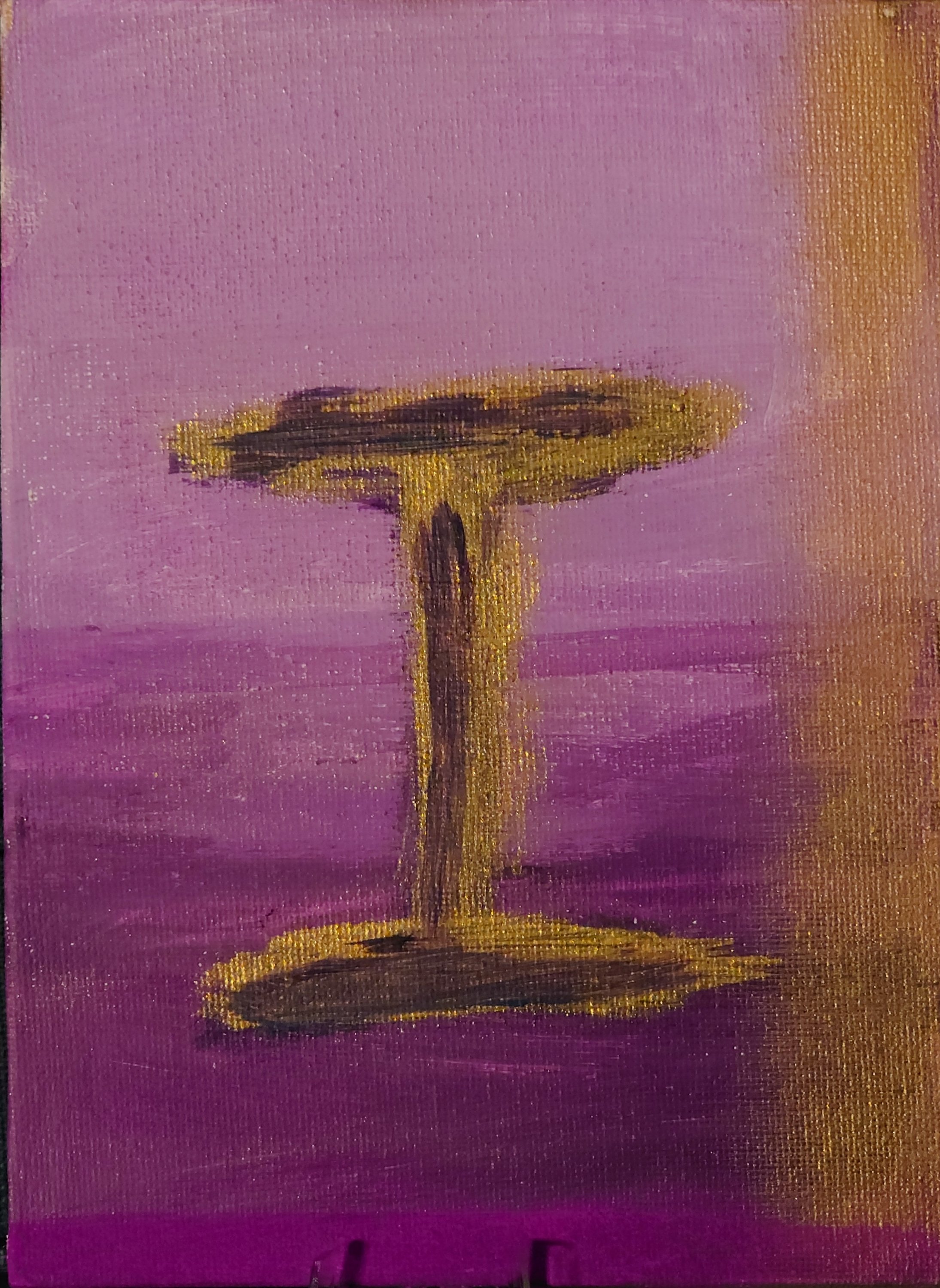
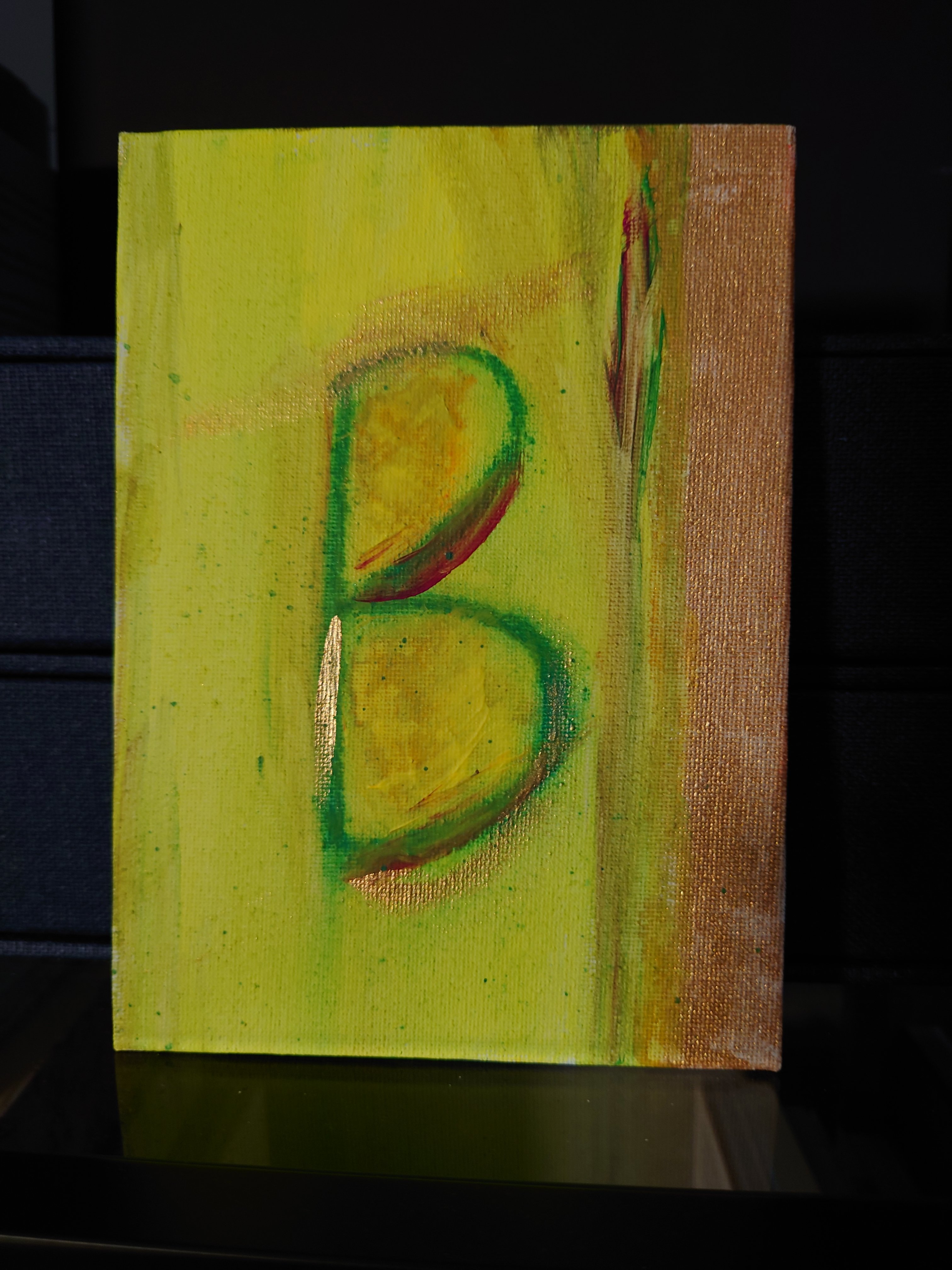
I’m creating a collection of small finely painted works that contain expressions of the alphabet.

Here are the first 10. Further blogs will have letters J through to Z.
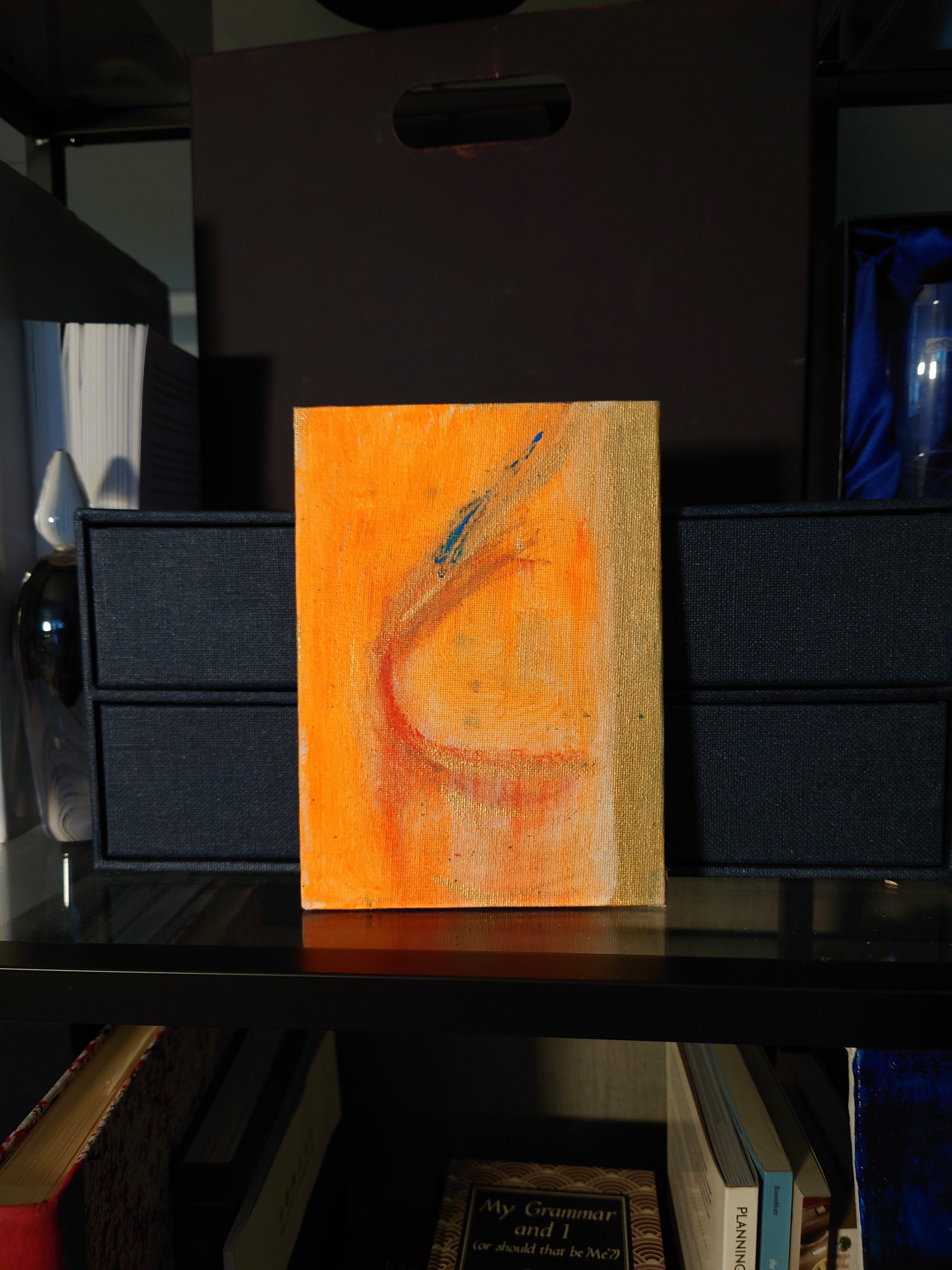
These delightful small oblong paintings with initials might make lovely gifts for those wanting monograms in art. Or these are great for people WFH and they want their initials for their surname displayed on their bookshelf.

Video post: Experimenting with textures and colour grounds

This week I upgraded to allow video posts. Here you can see what I painted this week and listen to my voice as I talk through my art pieces.

Neon Acrylic and impasto on paper

Below is an example of rougher textures. I like the juxtaposition of rough or matt against smooth and glossy to show contrast and tension.

Mixed media sand in acrylic and gel gloss on paper

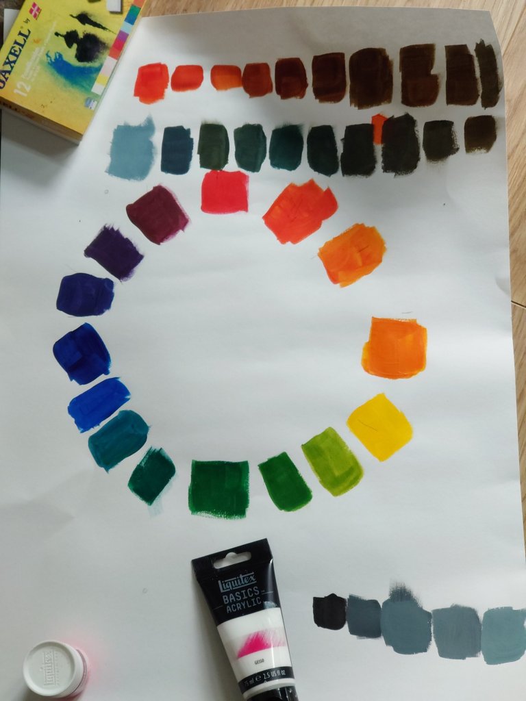
Colour scales & tone

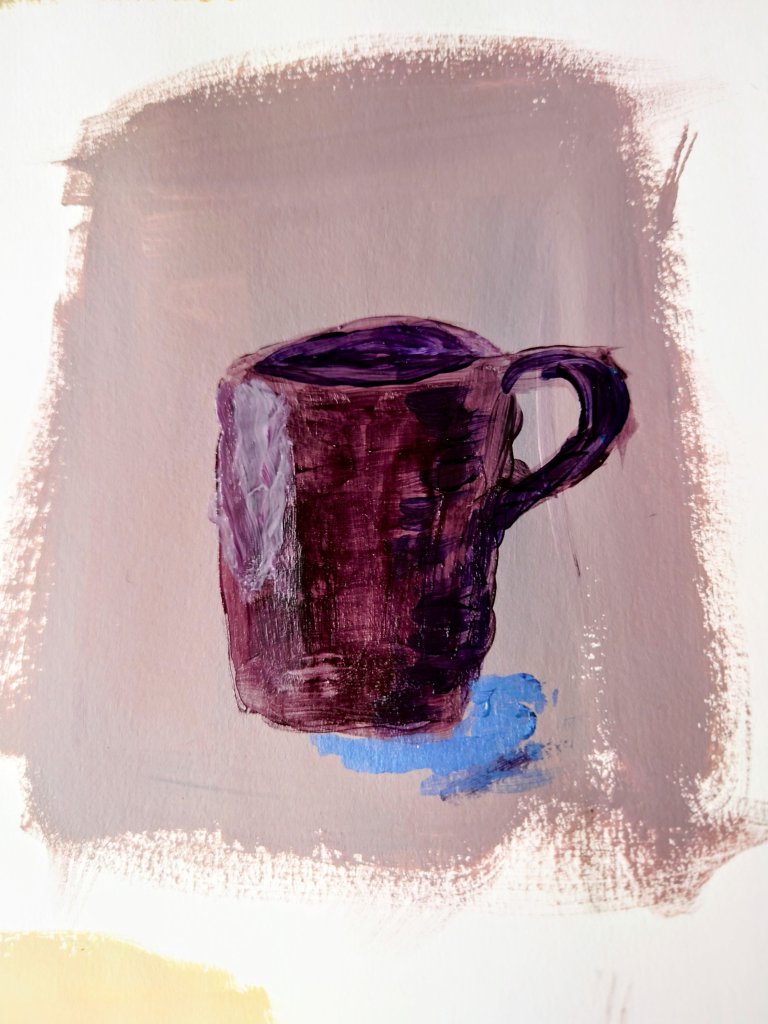
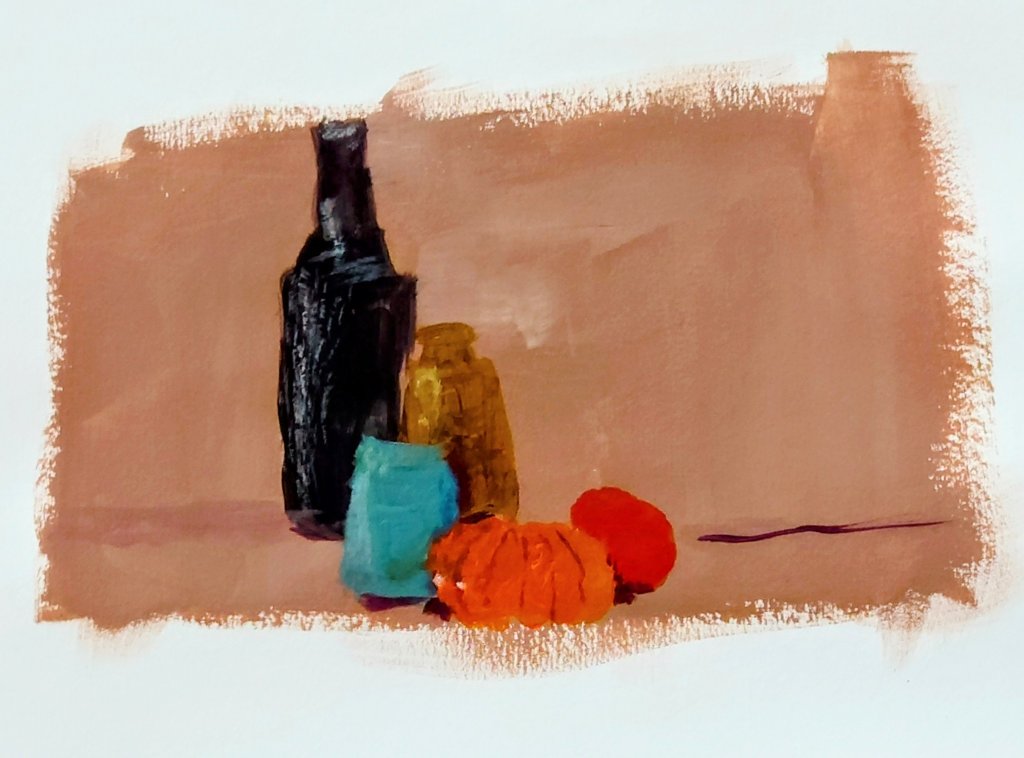
I got painting in colour this week. The still life got me to experiment with light and shadows.

I did the shadows and dark s without using pure black on the page but instead using primary colours to create a neutral. That dark neutral would also create a lovely grey when white was added to it.

Setting the tone: More than 50 Shades

This week was a difficult week at work as well as with family. Events made me think of mortality and the intended and unintended impressions we might leave on people around us.

Some impressions might linger for decades while others might change more immediately according to the amount of light or shade in our behaviour that is applied.

I noticed how this insight is conveyed with a study of tonal impressions. It changes depending on how much white or black paint is added. There are therefore more than fifty shades of grey as well as any colour possibly

Still life study in tones of black white and grey. Includes dry brushing.
Amazed by different reds and tones from crimsons
Tides of crimson tones

Sharpening my focus

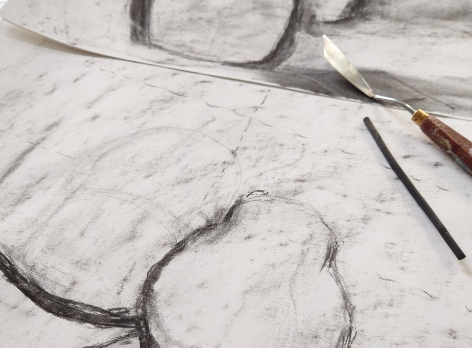
I went back to basics and relearned drawing, and the strategies used to perfect the representation of the figure.

I learned the intricacies of negative space and what it is used for. I also learned the aligning with a kebab stick. And top tip note to self remember to imagine there is a plate of glass in front of you.

I also learned to insert scaffolding in the drawing to ensure you get the proportion right. All the things they didn’t teach me when I worked towards my A’level art all those decades ago. At least I cannot remember them teaching me. Perhaps when I was aged 15,16,17, I wasn’t listening to what I was taught. But the pictures below show.

I am listening now.

I am listening now to instructions about getting the proportions and balance of my lines right.