This week was a difficult week at work as well as with family. Events made me think of mortality and the intended and unintended impressions we might leave on people around us.
Some impressions might linger for decades while others might change more immediately according to the amount of light or shade in our behaviour that is applied.
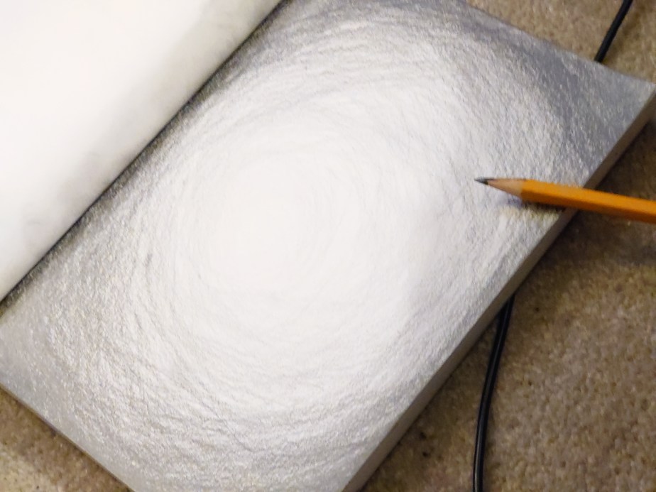
I noticed how this insight is conveyed with a study of tonal impressions. It changes depending on how much white or black paint is added. There are therefore more than fifty shades of grey as well as any colour possibly
Still life study in tones of black white and grey. Includes dry brushing.Amazed by different reds and tones from crimsonsTides of crimson tones
My art class this week got us to practise our portrait painting with a live model. It was the first time I painted a portrait. I had always been nervous about painting humans. I somehow felt incompetent.
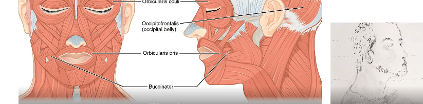
But I realised I had been here before when I got into it. Flashback: I trained to become a beauty therapist when I left school. And no, I was not a beauty school dropout. Instead, I did well. But what people don’t know about beauty training is the amount of anatomy and physiology you must learn. I had exams in the skeletal and muscular systems and cross-sections of the skin. When I told the art teacher about this, I found myself recounting the Latin names of the muscles of the face. Surprisingly I even told her about each muscle’s insertions and origins. Didnt realise I still remembered those pesky exam type answers.
Muscles of the faces
First portrait
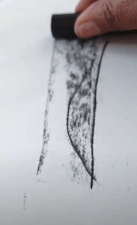
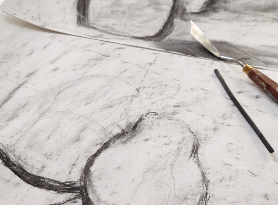
Drawing using charcoal
Getting the feel of the block
Drawing using charcoal flat
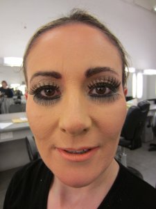
It was illuminating how my prior experience of understanding what is happening behind faces and below the skin surface was really useful for my drawing. I also remembered the story of Leonardo Da Vinci studying anatomy. It seems he used to study cadavers. But my study of faces was not of dead people. They were the heads of 1000 facials I had done in my 20s in salons and spas in London and around the world.
It was nice to get encouragement to continue still-life drawings. I shall.
An unfinished life drawing of a life model in charcoal.
I’m growing more confident and intrigued about my mark-making. I am confident because I managed to get some tutored practice last week at my regular new art classes. It is enlightening to see my finished works against others in the still life class.
Some artists go for realism, where their sketching looks exactly like a photo of the object. I’m in awe of those. However, others like me don’t. I struggle with getting it real. It might be that I don’t have the patience or the looking skill. But when I complained that my marks were not exactly like the set up to my teacher, instead of giving me tips to make it more real, she said that was what Van Gough did. This linking of my marking type to an old master reassured me. It also made me curious to see more of Van Gough’s work. Some of my favourites from Van Gough are below. I like the milk jug. As you can see, I show the screen grab with a ring around my favourite of his illustrations.
I went back to basics and relearned drawing, and the strategies used to perfect the representation of the figure.
I learned the intricacies of negative space and what it is used for. I also learned the aligning with a kebab stick. And top tip note to self remember to imagine there is a plate of glass in front of you.
I also learned to insert scaffolding in the drawing to ensure you get the proportion right. All the things they didn’t teach me when I worked towards my A’level art all those decades ago. At least I cannot remember them teaching me. Perhaps when I was aged 15,16,17, I wasn’t listening to what I was taught. But the pictures below show.
I am listening now.
I am listening now to instructions about getting the proportions and balance of my lines right.
I was filming my art and editing the MP4 files for a long time (see picture below). Then after a week, I decided that I wouldn’t say I liked the movies and thought these images of the painting as originally imagined being placed (see the project showcase (https://homeofficecharm.com/portfolio/snaps-of-the-lampshades-in-situ-as-imagined/).
I used Camtasia to edit movies for reels but didn’t publish them in the end. I think IG might have an easier editing function. I’m sure Camtasia is great for other things.
All the editing gave me time to reflect. I make the paintings small so that people like me still doing online teaching or online meetings can adorn their shelves with some backlighting that will sit on the shelf. I know that as an artist, it is a big no-no to consider the end user. But I cannot help it. Just as you consider the support for the artwork, I believe you should also consider where your artwork will be placed in your home or office, probably because of my business background. And thus, I’ve always found it easy to imagine where people might place my art.










You must be logged in to post a comment.