I stayed in two very different hotel rooms this week. Monday and Tuesday I was in the beautiful Angus wing of in Ashridge House which was wonderful and very cosy with their natural decor and big spacious rooms.
My room in Angus lodge in Ashridge House’s grounds was spectacularly welcoming after traveling through the storm Bert to get there. Furnishings and finishing all had a natural organic theme with cools touches of industrial chic with open shelving.
I also stayed in Motel One in Manchester. I found it good for one or two nights but the room I stayed in was the smallest room I’ve ever been given. It was tiny but beautiful it was sized just enough to get the furniture and one person in. I think if there were two of us it might be a squeeze.
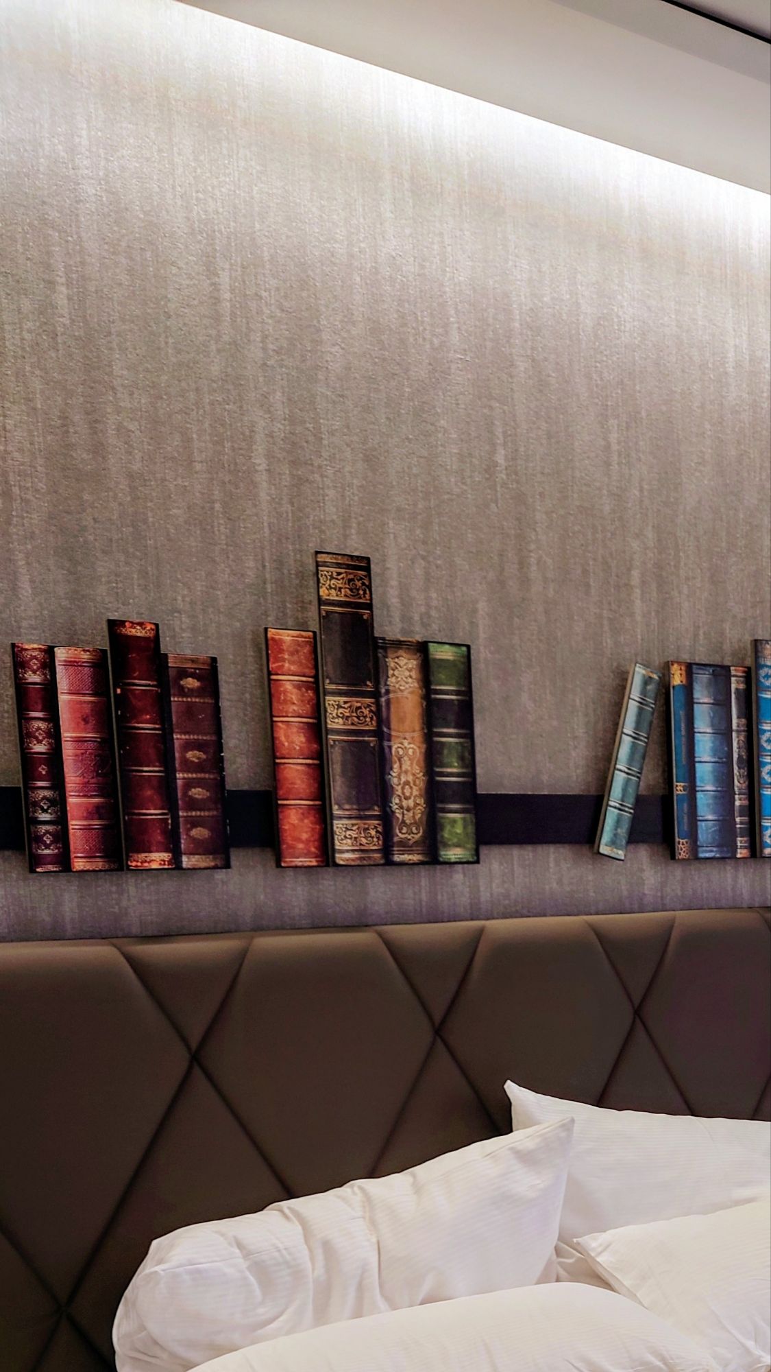
I loved how this chair stood out its brown leather juxtaposing nicely with the blue velvet cushions and curtain fabrics. This was clever wall decor. It made it look like a bookshelf but it was actually cutouts and wooden type moldings placed on the wall, to look like books.. Everywhere you looked in the room you got the sense that decor items were artfully and purposefully placed.
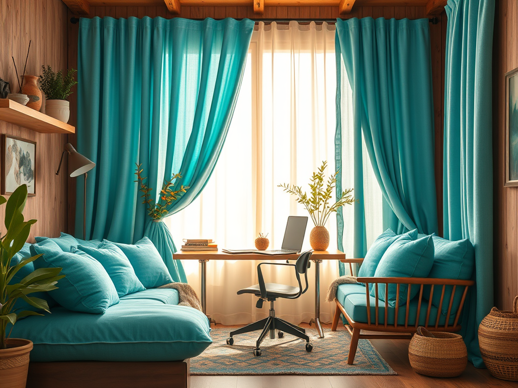
The featured image is created by the AI which made a composite of the words in this blog and the images. I asked it to do a mock up of a cosy home office inspired by the visits to two hotels this week. What it created looks nice after its 3rd attempt because it has the colours of the cushions as well as the natural elements and industrial elements from both hotels i stayed at. The nod to home office comes especially from the clever wall art over the bed at Motel One. The AI image used books too which seems to be one of the cultural devices to signify serious office and home working vibes.
AI generated images of a would be home office.
Five tips for incorporating boutique hotel decor into your home office designs.
Sort your favourite pictures of hotel rooms you have stayed at. Filter down to 10.
Use your summary of those images to decide on what your ideal design style is (whether industrial, beach auntie, cottage core, classical etc).
Do a search on Pinterest using that design style name and then add home offices and create a board to curate inspiration for your shopping list.
Share a picture with AI and command it to create a home office image inspired by the photos that are your favourite.
When you do your home office revamp show your contractor the images you and AI have created
AI generated image based on the three pictures I took of my hotel stays this week.
How have your travels influenced your office decor?
Please let me know in the comments.
Since it’s the end of the month. This also is emailed to my email subscribers. If you would like to read previous weeks posts, they are here.
Sleek and sophisticated fittings and Furnishings for Hard Working Zone
Boucle textured seating
Elegant breakout area
Japandi meeting room
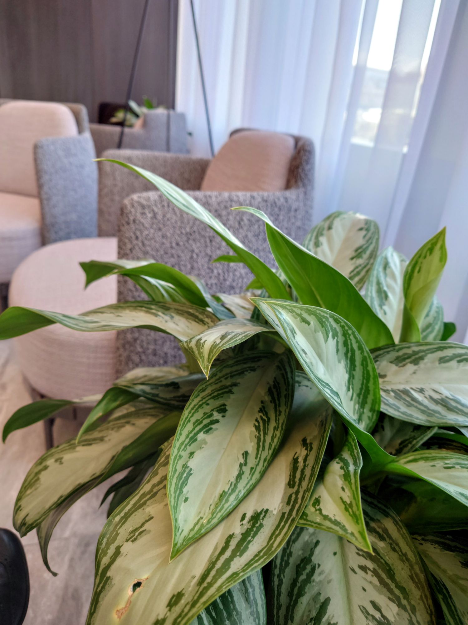
Plants bring organic
An Effective abundance of textures
While visiting some London City offices recently, I found some authentic Japandi. Working as a facilitator corporate trainer/ instructor I was able to see how the combination of textures used in the external meeting rooms and breakout area fittings created a captivating and calming atmosphere. Colours are neutral and highlighted by the colours from natural elements such as metals and woods and watery looking glass panels.
A spacious training room with rubberised tableMinimalist and well considered details
Natural wood accents Beautiful combination of natural textures.
If you want to create the Japandi look in your home office here’s five things to remember
Natural elements wood, marble, wool and metal
Paired back details
Double the circulation space for that sense of spaciousness
Juxtaposition of natural textures such as mats verses glosses
Tiny elements of metal craftsmanship to admire
Comment below to share what your favourite elements are in Japandi office or home interiors. Do you like light Japandi or dark Japandi?
But recently I was impressed when I visited one major international corporation in the business district of London and saw a well thought out design scheme for delivering learning.
The whole space and training rooms were all thoughtfully designed to inspire and lock in the learning and development of their talent. Read the captions in the images below to discover how the design details support learning.
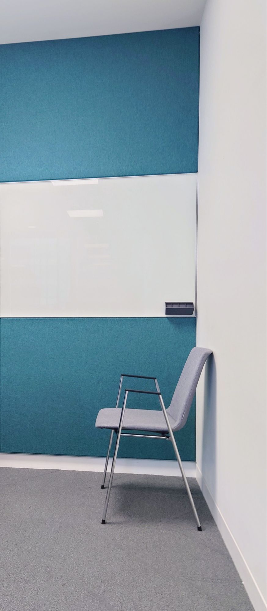
A functional mix of fabric and glass for soundproofing and capturing thoughtsRest and digest areas have words of inspiration and empowerment enshrined Whiteboards that run the length of the room.
The designers of this training space clearly recognized the importance of walls for facilitating learning. They understood that walls play a crucial role for trainers and corporate instructors in enhancing the educational experience.
This week’s photo blog showcases the impact of wall decor in corporate training room environments. From functional and stylish fittings to the carefully crafted calligraphy on the walls, each element contributes to creating a memorable impression and inspires innovative ways of working.
We can take some of these ideas and incorporate them into our home office wall decor. For instance, having a large poster with inspirational quotes can serve as a personal reminder of how we want to work. Additionally, when planning the treatment of our walls, why settle for plain paint? Consider creating a space that includes a glass panel for chalkboard sessions with your team. This setup encourages more interactive meetings and gives leaders and managers a reason to turn on their cameras and engage effectively.
I visited a beautiful training room this week but it was hiding several problems. The issues found made me want to share some tips on training room design for architects, interior design team, facilities managers.
The beautiful training room I visited had fancy comfortable seating, very nice wide desks on wheels, natural looking carpet all the modern technology with two big screens in the front that I could can easily log onto. There were also two beautiful side cabinets storing other trainer’s accouterments like post it notes, marshmallows. There was even room for me to store my coat and bags to keep the room tidy.
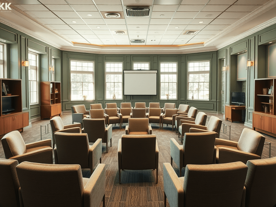
Image created with AI based on the word in this post
Style over substance: The impractical training room layout
However one thing I noticed about the room, even though it was large, was the lack of circulation space. The session was originally booked for 14 max but they thought they’d squeeze another two people in. This meant that arranging tables in a U shape pinned everyone to the walls leaving a large expanse of space in the middle. This is not conducive to group working because no one could move around easily.
Style over substance: Training room walls that would not stick
This beautiful training room had deep sage green walls stylishly painted up to seven eights of the wall with a coordinating ivory colour for the last eighth and the ceiling. It reminded me of a beautiful cosey shaker style kitchen. But when it came to me sticking full flip charts up to remind learners of the points we had covered so far it could not be done because the walls seemed to be anti tack. I guess somewhere in the building’s history the facilities manager got fed up of trainers using blue tack to stick things on the walls.
Having anti tack walls is understandable if you have previously spent loads of time and resources getting the cleaners to remove blue tack using the recommended direct heat like a hairdryer on the blue tack itself.
But having anti tack walls creates a corporate learning & development and organisation development problem. You see we trainers need the walls to showcase learning. To show case learning is to have a tangible artifact of ideas generated in the session and that is more than one flip chart stand can do.
We show case learning in the corporate training room in various ways. We typically (display gallery style) the completed flip charts that everyone has done. Learners throughout the day then reread what some of the ah ha’s and moments of epiphany are within the room at moments that suits them. It helps to reinforce diversity in learning & development.
We use the wall to display analytical and creative thinking when working in a group. Walls help to magnify the writing space. Walls expand the written canvas from the individual’s perspective out to the group’s perspective.
Therefore a training room festooned with used flip chart pages and written on post it notes from brain writing sessions, or creation activities or problem solving sprints serves as visible and physical evidence of the individual and group learning work that has gone on in that room.
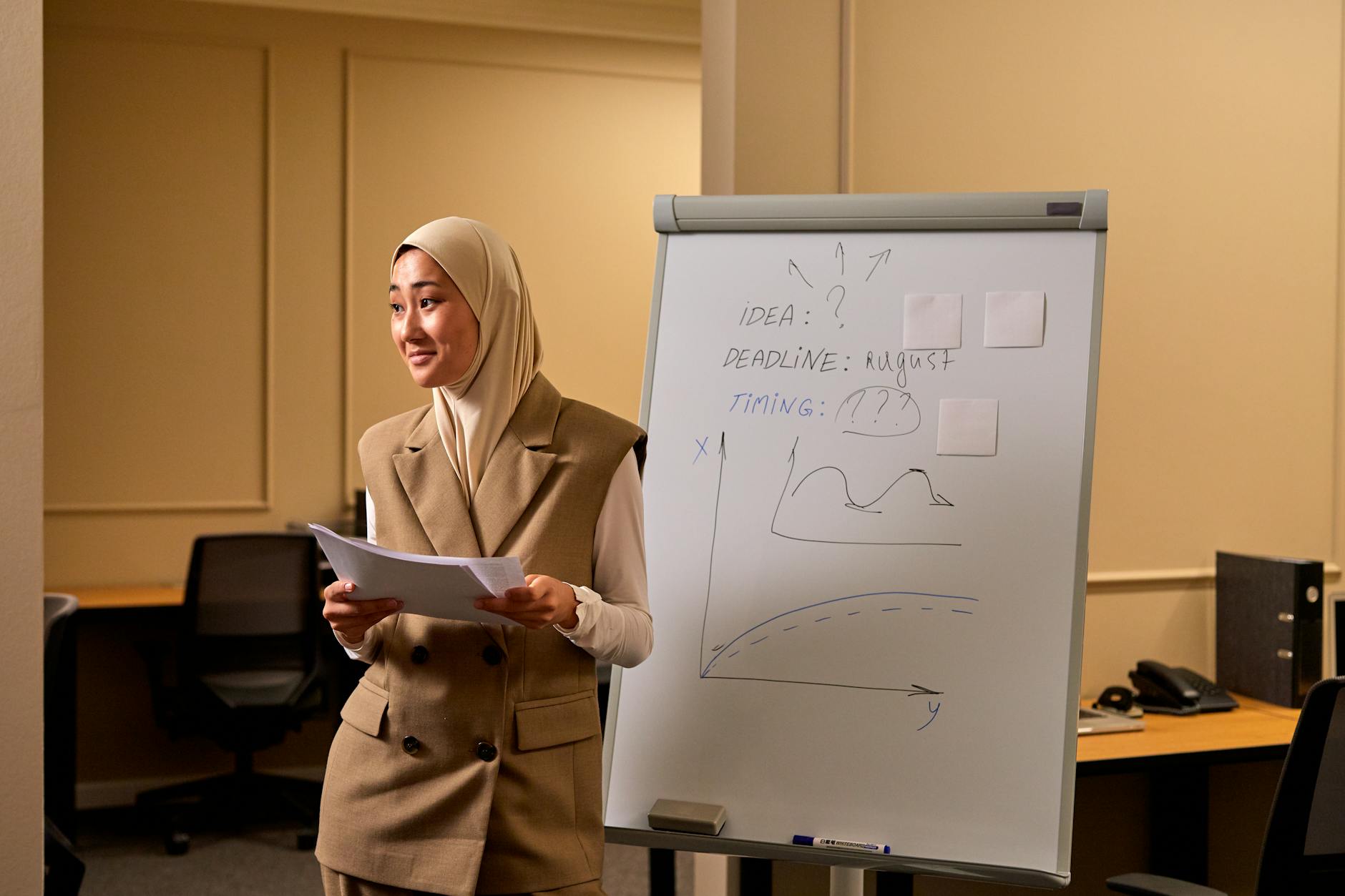
I’ve seen great examples of corporate training rooms as I travel around the world delivering leadership and management development . The more advanced training room decor takes account of trainers/ instructors needing to use the wall by replacing the inner walls with glass panels and providing white tack for the rest of the walls. .
Glass walls are then perfect for sticking sticky flip chart or post it notes to the walls. I’ve also seen other kinds of vinyl decor panel used. Learners can even write directly on the glass walls, which support creativity and enhances the problem solving process.
But ultimately it would be great if corporate office training room designers could consider installing more white boards and screens so that opportunities to showcase learning is on all four walls, without the need for desks.
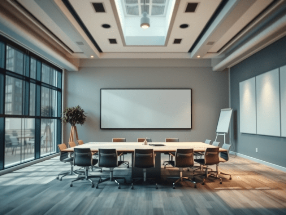
Image created with AI Prompt corporate training room like featured image but with screens one windows and all walls with glass wall looking out to greenery and big plants internally. And comfortable seating for eight.
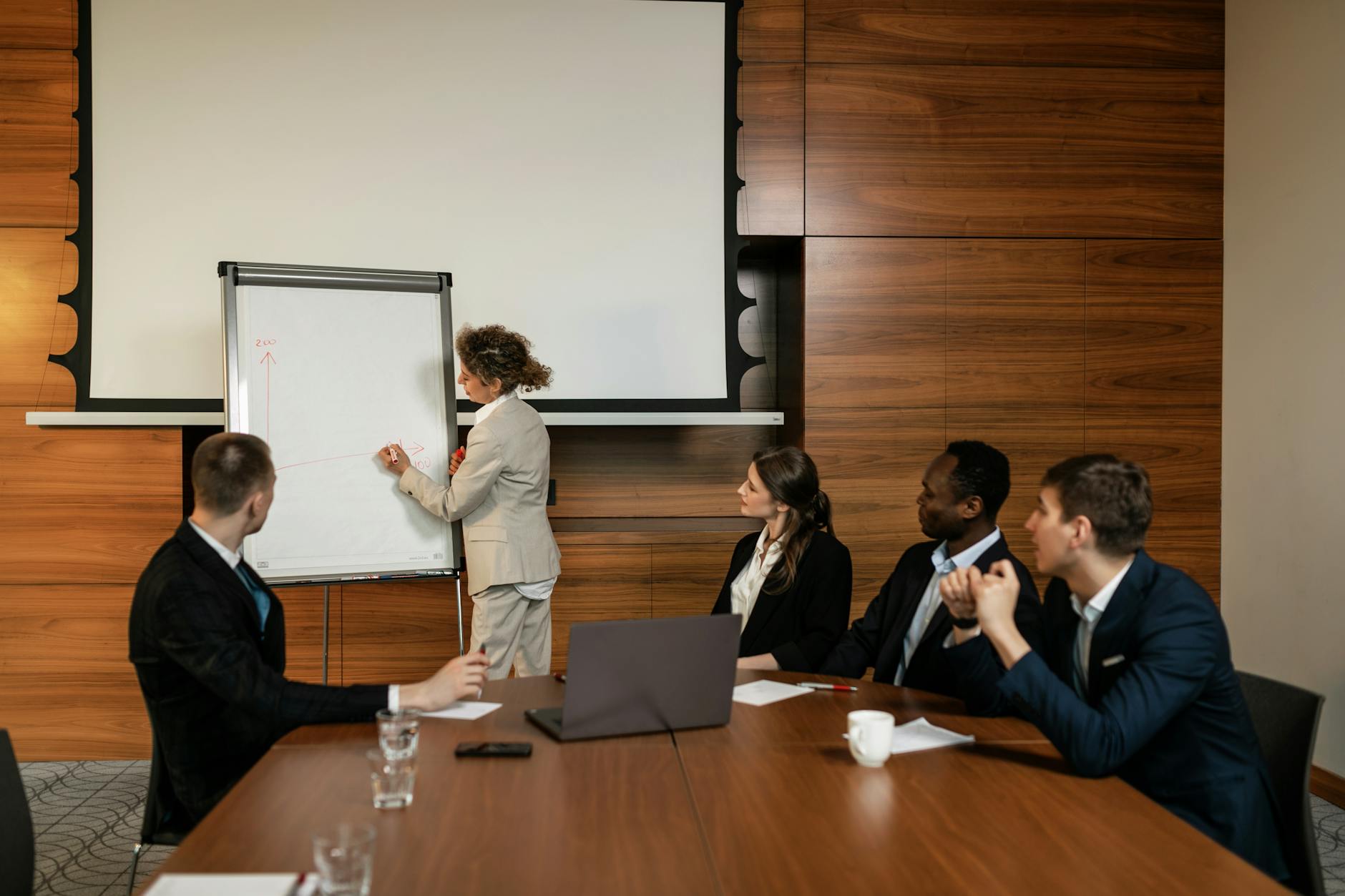
Leadership and management development consultants/instructors and trainers are now in an era where, we no longer want to get managers in a room where they just sit and stare at one square light at the front of the room for six hours.
Image created with AI prompt corporate training room in U shape without desks
We no longer want executive development shaped by the the training room’s limitations. Indeed some of the problems that companies face with with building inclusive working, collaboration or the depth of thinking that is required might be down to the amenities of the training room. The training room is a visible cultural artifact subtly symbolising “the way we do things around here”.
How professionals can make training rooms add value
We now need interior designers and architects of corporate headquarters, campuses and head offices to show deeper consideration of the design of the corporate training room. See my top 10 tips as a summary of this post.
10 Tips to Improve Training Room Decor & Design
Room aesthetics are important but should not devalue function
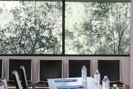
Create a room with a view of nature
Design in glass panel walls to showcase learning
Plants are nice for oxygen and neuro-aesthetics
Cabinets could be built into walls so they don’t get in the way of circulation space needed for group work
Integrate screens on three walls
Install whiteboards on three walls (if no glass walls)
Design, plan and build writable four walls
Enable table or desk free room for management development suites and executive development zones
Always consider how the training room acts to symbolise the desired culture
Please follow for more. Each week for the rest of 2024 I shall be visiting corporate training rooms of all shapes and sizes up and down the UK. I will post more ideas about best practice and ideas for improvements to corporate training room design, decor and space planning, in the weeks to come.
Comment below on your good or bad experience of corporate training room decor.
The AI created the feature image based on what it read about the blog. The four images above are what I took myself. Other parts of the blog show examples of AI generated images to create design scenarios.
It’s amazing how inspiration for decor can arise in unexpected places.
Some of the gardens and Ashridge house
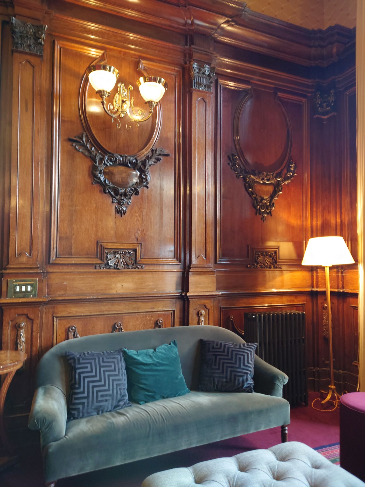
Intricately carved wood paneling
One of the sitting rooms as Ashridge house, showing beautiful decorative carvings
Hopefully these images give you ideas for moving beyond the straight lines and grid forms in wood paneling for your library decor.























You must be logged in to post a comment.