Colorful vs. White Lighting: Wow House Display Insights

The current lampshade and lighting trend is for big white empires with the gathered version emerging as being a preference.

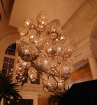
However, please enjoy the feast of table lighting fashions taken from my recent trip to the various rooms in Wow House at Chelsea last week.

This white lighting trend at some areas of the Chelsea design centre appears to echo what I wrote about in my previous posts, especially the one anbout high street table lighting.

As a lampshade maker, I don’t make big white lampshades.

More white drum lampshades

Instead, I specialise in creating small lighting and shade accessories so that they both fit on a shelf system or bookcase arrangement on bedside tables adding a pop of colour, to support shelf styling and staging themes.

I’m here to support those whose tastes for colour are not yet met by monotonous style trends or lackluster supplier management tactics. Did the mainstream lampshade suppliers suddenly say you can have any colour as long as it’s white (just like Henry Ford said about cars in the early 1900s)? I also understand, the plethora of white lampshades might also be down to the minimalist’s quiet assertion and retaliation against the rise of maximalism.

Despite the dominant theme of white lighting, I was pleased to notice more bold and characterful displays of table and ceiling lighting for the home. These seemed to be more fun and cheeky suggesting a personality of their own. Alas, there wasn’t many of the colourful ones to find.

They are rare find indeed. I noticed that the more colourful ones were displayed in the trade shops in the Chelsea Design centre, while a couple of select dark red, purple hand sewn table lamps with or without gathers were thoughtfully placed in the Wow house display.

This was a development from previous years as those with colour in the Wow house previously were looking a bit anemic, washed out. Might we see more colourful table lamps in the Wow house next year?

Update: 1st July. Just Seen Homes and Gardens on Instagram just posted a thought provocation, asking scrollers to consider the whimsical style featuring colourful lamps and various colour palettes Homes and Gardens on Instagram thus we live in hope of the un-bland-ing of ambient lighting pieces.

The main thing to remember when selecting your lighting or designing your lights for ambiance within  a colour scheme is to not be pulled in by what is obviously available. Dog deeper for more interesting suppliers. Go for colour drenching, harmonising or coordinating until you are happy that you are making your own mark and showing your personality.

Do you prefer a colourful light for ambient lighting or white lights?

Let me know in the comments, below.

Click on the link to view the colourful lighting I have in my Etsy Shop

Since it’s the end of the month here are links to the previous four weekly posts, just in case you missed them.


Strategic Shelf Styling for Effective Personal Branding in Virtual Teams

Admiring their backdrop

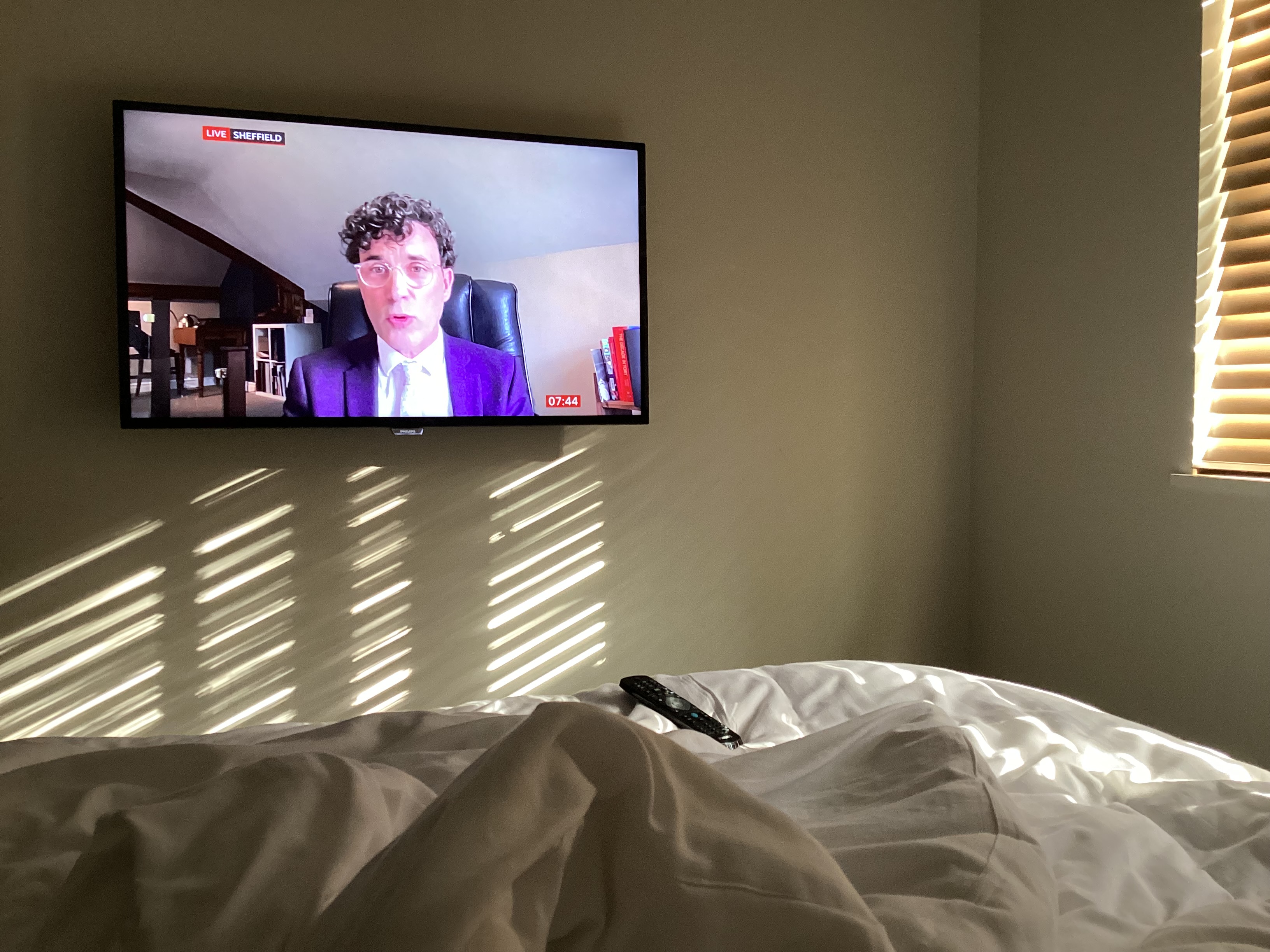
I was watching BBC news while away from home and noticed my eye drawn to what the presenter was saying. It was a psychology Professor in Sheffield interview on BBC.

I noticed how it seemed like he had carefully arranged how his office set up would appear on screen.

Continue reading “Strategic Shelf Styling for Effective Personal Branding in Virtual Teams”

Intensive Pigment Palettes: Creating a Moody and Cozy Home Office Aesthetic

When it comes to home office decor themes I discovered that have my preferences.

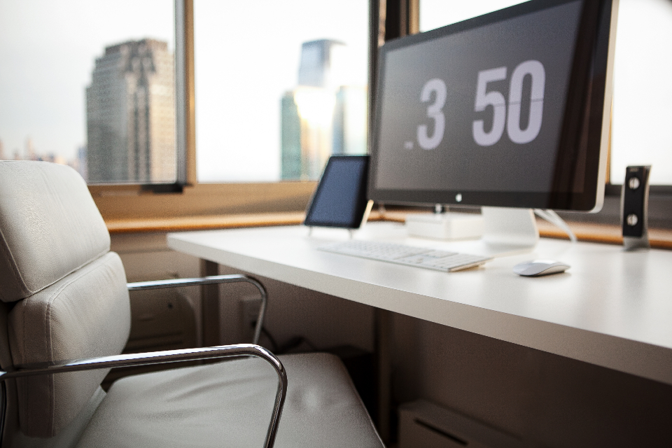
I don’t like the cold, stark, hard surfaces office look. It might seem futuristic (very 21st century to us Baby-boomers). But those images used to be the standard result of search for office decor or desk style as far back into the early 2000’s.  It felt boyish, channeling teenage son lone woolf, building code and gaming in their bedroom and I just couldn’t relate.

White office chair, mac computer on white desk with view to city centre scene
Home Office” by Matt Bango/ CC0 1.0

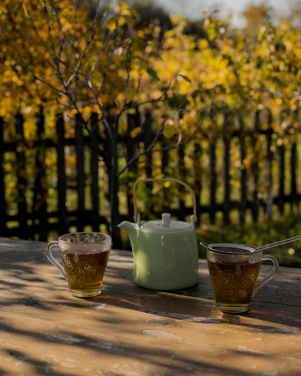
To the other extreme I do not like the overtly feminine big frilly country kitchen table, make shift office desk and ramshackle bookshelf disorganised recipe books; propped up iPad against tiny metal pots of lavender look. That was a trend for a while, fitting in with a cottage core or rustic chic.

English country garden with green teapot and two cups of green brown looking tea in glass cups
Photo by Jovan Vasiljević on Pexels.com

There is also the girl boss look, I see with some YouTubers which is less chintzy but has neon name signs on white walls and lots of fluffy textures incorporated whether the a macrame wall hanging or stringy plants dangling from shelves or wall (for the backdrop). These are combined with sheepskin covered chairs or armrests. It does give off a dreamy fantasy of what a girl’s world of business could be like (pink fluffy and pretty). It seems to be playing at being in business and those of us women working in corporate or refugees from freelancing know that, it sure ain’t no game. However I get the need to convey the light ethereal fantastical vision contrasting the hard realities of our capitalist system.

Woman sitting at a desk with white wall and wispy flower in mint green vase. She wears baby pink dress and has half drunk coffee and white macaroon on saucer
Photo by Moose Photos on Pexels.com

Instead, I like a style that that emanates wisdom, elegance and being grounded. The moody and cozy home office style is indeed a theme on Pinterest. When you look at those images you see a bold cohesive comfortable and elegant look.

The cozy home office

Be mindful, though. This look isn’t that shining high polished look that you might find in Dubai, Knightsbridge or Belgravia show houses where our top interior professionals produce. Perhaps akin to what you see in TV show Buying London (Netflix 2024). No, this cozy home office look is somewhere that you and I will feel comfortable doing everyday business because it is as if our friend down the road was the cabinet maker and our interior design pal (old friend from local comprehensive/ grammar school) helped with sourcing of fabrics for the wall and space planning of our furniture.

Continue reading “Intensive Pigment Palettes: Creating a Moody and Cozy Home Office Aesthetic”

Modern Corporate Furnishings & Fittings: The Arbor, London

Clever Corporate Decor

My work as a corporate trainer/ instructor and coach this week took me for an onsite to our client in their new home in an amazing building. The Arbor Building is in Blackfriars Road in London, UK and it boasts that it is carbon neutral. There are neighbouring buildings and I’m told it is a fossil free development called Bankside Yards which is a major architectural, construction and interiors project feat. I was especially impressed at how beautifully the interiors echoed the sustainability ethos too. See the photos I took below

Continue reading “Modern Corporate Furnishings & Fittings: The Arbor, London”

ANCIENT CLASSICS: MY STYLE TOO

I realised how much I appreciate some classical English stately home decor from my trip to Ashridge House in Hertfordshire recently. I was surprised as I thought a lot of my style comes from my Caribbean heritage and London urban living and my immersion in corporate training.

But I discovered how much I love the juxtaposition of earthy stone tones with the bling of gold frames that can be found in some English Stately homes like Ashridge.

The amazing thing about Ashridge house is that it used to be where Henry the VIII and Elizabeth 1st lived. It is also famous for various films like Beauty and the Beast, Malificent, killing Eve and More.

Continue reading “ANCIENT CLASSICS: MY STYLE TOO”